


Worth a Thousand Words
 31 Comments
The Icethetics-related news really tends to dry up this time of year, but I hate to let the blog dry up with it. So I'm declaring today Picture Day. Later this week, I'm planning an update to NHL JerseyWatch 2011. But for now, I'm just offering some things to look at. Feel free to add your comments at the end.
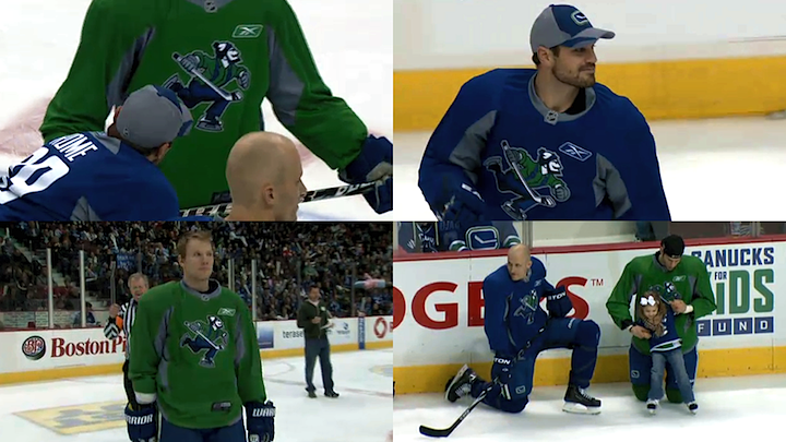 Canucks sport new practice threads at SuperSkills / Vancouver Canucks
For those that missed the Facebook post, over the weekend the Vancouver Canucks were wearing special practice jerseys at their SuperSkills competition, featuring the updated Johnny Canuck logo. It was Team Blue vs. Team Green and these sweaters made it clear that logo doesn't belong on the front. Maybe the shoulders. But definitely the helmet, where it already is on the alternate uniform.
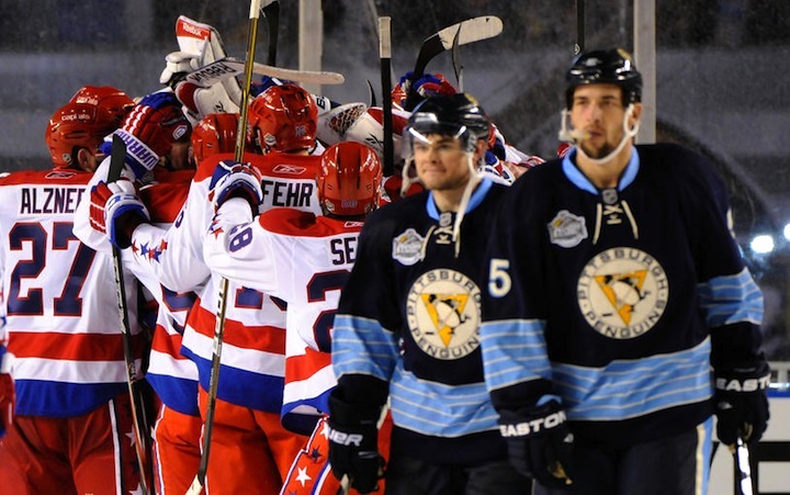 2011 NHL Winter Classic / Pittsburgh Penguins
It's a shame I haven't posted pictures from any of the outdoor games yet. Way back on New Year's Day, we all saw the Washington Capitals defeated the Pittsburgh Penguins on their home turf. (Haha, turf.) If you've been following along with the Jersey Gallery updates, you've seen the Caps' uniform, but I haven't gotten around to the Penguins yet.
I'm torn on it, by the way. Dark blue just doesn't work for the Pens. I think I like the '08 version better. Still...
 Dan Bylsma coaching at the 2011 Winter Classic / Pittsburgh Penguins
Nobody rocks a hat like Dan Bylsma.
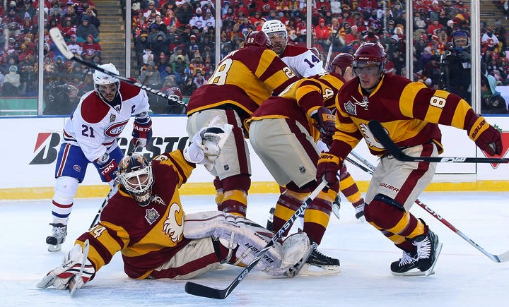 2011 Heritage Classic / Calgary Flames
You know what, I'm only all right with this because it was one game. But let's not do this anymore, Calgary. Let's not look like a skating advertisement for a Big Mac. It wasn't a good look a century ago and it isn't now. Even more disappointing than what the Flames wore was what Montreal wore. They're the Habs and they're classic but they've got an entire arsenal of throwback jerseys from a hundred years ago. Why not?
 Miikka Kiprusoff in a cloud of snow / Calgary Flames
So many thoughts on this one: Is there supposed to be a goalie hiding in there? ... This is what I imagine to be the Canadian version of walking around with a raincloud over your head. ... If any player could just manifest a cloud of snow around himself, it would make cherry-picking a lot easier. ... Goalies are not born; they simply appear after a snowstorm. ... Should I stop now? ... Abominable goalie? ... Yes, stop? Okay.
 WHL's outdoor game / Dylan Lynch
The WHL's Calgary Hitmen and Regina Pats borrowed the temporary ice rink at McMahon Stadium just prior to the Heritage Classic. And like their NHL counterparts, they sported retro-style sweaters. They're pretty much the same jerseys, just in different colors. Spooky.
 Canucks' hall of sweaters / Vancouver Canucks
And we'll finish where we started — Vancouver. I'm sure Canucks fans are well aware of the sweaters hanging outside the team's locker room, so you can ignore this. For everyone else, how cool is this? From the Vancouver Millionaires on through to the orange third jersey from the '90s, they have a very rich and very colorful uniform history and it's nice to see they don't bury it and pretend it never happened.
That's all. If you've got any pictures you'd like to share, shoot me an email.

Reader Comments (31)
I actually LOVE LOVE LOVE those 1920s Calgary look! Wish they'd use it in other games. Anything's better than their current mishmash.
Haters gonna hate on the Calgary get up. White pants are number one.
That Canucks historical gallery is so awesome. That room is damn sleek - I never realized they filmed the X-Men films at the former GM Place. jk
What I don't get is the Vintage White pants that the Flames wore at the Heritage Classic. At least the Hitmen didn't copy them there.
The Johnny Canuck logo on the plractice would look far better than the current Vancouver wordmark with the orca. Hopefully theyll bury the orca for next season. Even the Canuck superskills trophy was all Johnny Canuck.
There's a very easy way to make the Johnny Canuck logo work. Right now it's an illustration.
Totally disagree with you Chris about Johnny Canuck logo. The "V head" logo doesn't feel strong enough to be a chest logo. This full body though, has a cool feel to it. Would love to see it on a green third down the road. Think it harkens back to the retro logos like the penguins. Maybe remove the white trim make it feel more retro.
Love the idea of white pants, agree it doesn't work with the tigers jersey the flames wore, but i still think those jerseys are slick. Would be cool if the flames lost the black, and went with a road version of the third and this as the new third.
White pants needs to be executed well for it to work. As i said before, there are a bunch of teams in the nfl that look awesome with white pants. Why can't the NHL do it? whats so bad about that?
By the way Chris, great work lately on the site. Lots of great stuff up these days. meaning to make more concepts soon. Just super busy these days
I do agree that the Habs should've gone further back with a true throwback, although about the only untapped designs left were the c.1936 white version with the stripes across the top of the chest, and the c.1940 white version that was almost entirely plain. The c.1936 design would've looked good, though, and I believe that was a popular choice when the HC was first announced, before the unis were unveiled.
I still think the Flames should've worn the sleeve numbers on the wider red band, instead of the middle gold stripe.
The Pens should've gone with black and gold, to replicate the old-school Patrick Division rivalry of the 80s (and pay homage to their host, by the way); alternatively, they could've used their c.1978 navy design with the white upper sleeves, or their c.1975 medium-blue design; either would've replicated their Norris Division rivalry of 1974-79.
I thought I would hate the Flames' uniform, but I loved them. But I agree with you - JUST FOR ONE GAME! They would get old fast. I hated the Hitmen jerseys, but loved the Pats.
Broda: White pants don't happen becuase pads are built into the pants, making them really hard to wash. Football pants can be washed after every game. The caps tried white pants their first year, but switched halfway through the season when they found out that the white started to tan from the sweat rather quickly.
As to Downruplyb's question about hwy they did them for this game, it was to be faithful to the Calgary tigers. White or tan pants used to be much more common, and I'm very happy to see teams actually being faithful to those aspects. The uniform the red wings wore a few years ago should have been paired with white pants, but they chickened out.
The white Calgary "pants" are actually shells. If you look closely you can see the regular padded pants under neath.
This is the easy way to produce different looks and a lot of teams do it.
I would give my left nut for that jersey case... magnificent. Speaking of jerseys, Chris, are you still planning on having an Icethetics "jersey contest"? I've got some goodies I'm dying to show, and I'd love to see what everyone else has in their closets. P.S. - I landed a game worn Pats from that outdoor game (#27 Shayne Neigum, the fellow who fought and had to take an awfully long walk back to the dressing room!)! They're wonderful in person, even with that Habs logo on the sleeve...
The cartoon bushwaker Canucks ... its simply awfull !!!
The caps should have wear a blue helmet or the original white one ... and it would have been perfect ... otherwise its seems wrong
The Pats jersey its a beauty !
coolest hallway ever?
...most likely, yea.
Anyone realize the Reebok logo on the socks of the Hitmen and Pats?
I didn't get to see the WHL game during the whole Heritage Classic weekend. I didn't realize that they just piggy-backed on the Flames jersey design. No creativity. I hate those Flames abominations, even though as a fan I own one. I'd hope if the Flames were going to revert to a 3rd jersey as a main uniform, I'd hope they go back to the current 1980's adaptation and adopted a white road jersey based on the same.
If the Canucks change (again...seems to be the time), that retro "stick in the rink" is the way to go and have a green "Johnny Canuck" Lumberjack as the 3rd. Pretty much anything except the Vancouver Millionaires sweater. Not that there is anything wrong with it, I just don't feel the Canucks should have the license to wear the sweater of a team that's won the Cup, when they haven't.
@David...AFTER THIS YEAR THEY WILL!!! Sorry, little glimmer of hope moment for me there. I'm sure the team will find some way to choke it in the second round.
I'm kind of shocked that you don't like the full-body Johnny Canuck Chris, seems like the thing that you would love. I too think that the V-head logo is pretty weak. I remember seeing a mock-up of the blue-green-white jerseys with the now well-worn logo encircled with the team name written around it and thinking that those would be pretty awesome. Unfortunately, the novelty of that style has worn off a bit, but I'd love to see a green Johnny Canuck third.
yes yes canucks fans know that theres a jersey gallery.... that millionaire's jersey is going to be worn at the heritage classic next year
calgary sucks, but i agree that those jerseys are amazing. but everyone should look up "calgary tigers jersey" on google and click on the first picture..... it looks barely anything like those flames jereys.Like most canucks fans, I'm dying for a lumberjack on the front and a green jersey, and personally i think that if they put some traditional striping on that ugly looking practice jersey, took out the grey, and put some lace on the neck, it would be great. the lumberjack looks great Chris, sorry to disagree with you. The Pats jerseys were originals from back in their long history, they didn't copy the canadiens, although the hitmen stole the idea from the flames. I wasn't a fan of the penguins jerseys because of the terrible historical inaccuracy, navy blue is fine. The caps had great uniforms though, amazing jersey.
Given the choice, I'd wear the Flames retro reds, followed by their Heritage Classic jersey. Their Edge uniforms are an eyesore.
I remember that Canucks wall just being a painted mural of jerseys. That display case is a huge improvement.
Chris, I am totally shocked by your disapproval of the Johnny Canuck logo. I know you like the Johnny Canuck V, which I do as well. However, I totally agree with both Broda and S. If the Penguins can have the Skating Penguin, then what is wrong with the Canucks having the skating lumberjack that bears the team's proud name? As much as I would love a future green 3rd, I would put Johnny C on a navy blue sweater with lots of green trim only because his green shirt would stand out a lot more.
Just to let S know, the Canucks, unfortunately are keeping the orca with the cluttered VANCOUVER wordmark next season. Team ownership say that they like both the orca and the Stick 'n Rink. However, what they say and what they do are two different things. It might be possible that the current orca home and away sweaters were contracted for 5 years when they debuted in '07. So, there may be contractual licensing issues going on. I want that orca gone asap like most Canuck fans.
the Hall of Jerseys is pretty cool, is it accessible to fans?
I know I spent more time looking at the jerseys in the HHOF than anything else.
If you go back and look at the Presser for the Heritage classic the Habs jersey had the old neckline, i was extremely upset that they went with the RBK edge neckline over the classic one. - 1 for that, but + 1 for the numbers.
Like the pats jersey very much, but i think it's a bit busy on the shoulder yoke and sleeve with all of the patches. 3 on each shoulder, then the tv number, then the habs logo on the sleeve. Doesn't take away from the front and back though. I would like to see someone take a risk with off-white or yellow on the road (was hoping nashville would) just for a change of pace. It works very well.
@BEANS. I could be wrong, but I'm pretty sure all CHL teams wear reebok socks with the logo on them like that. Google some teams uni's and most of them appear to have socks like that. I always thought that was weird.
lol i love Calgary's jerseys, I wear mine at the ODR all the time and it always gets good comments.
The Johnny Canuck is a great possible identity for the Canucks, but the V head and the ful body logo just don't cut it. I'm not really a fan of either, but I know somehow it could be made into a great logo.
the johhny canuck logo rocks. how about next year johnny canuck logo as the main and the hockey stick c as a shoulder patch?
The Pats jersey looks so much like the Habs because it's based on the jerseys they wore in the '50s, when they were one of Montreal's junior affiliates.
If Vancouver ever gets an outdoor game, they so need to bring back those Millionaires jerseys. Maybe they could even change the name full-time to Millionaires. A lot of Vancouverites would support that.
Unless we win the Cup, of course, because then the Canucks name would have some decent history behind it and changing it would be out of the question.
I think the Johnny Canuck logo would look better on a white jersey. Or put some sort of white shape behind it on the dark jerseys. It's too dark and blends in too much on those practice jerseys.
The funniest part is that Vancouver actually needs an entire hall to show their jersey history. I see just about every single color ever used on a jersey down that hallway.
Oh, and Dan Bylsma looks ridiculously good in that hat. Seriously, I wish I could pull of a hat like that.
It may also be worth the mention that the outdoor WHL game featuring the Pats and Hitmen wasn't prior to the NHL game, it was the day after.