Ducks 3rd Jersey Schedule 2011-12
 Saturday · Sep 10 · 2011 | 11:04 AM PDT
  15 Comments
  Just like last season, I'm hoping to compile third jersey schedules from around the NHL here on the blog. We've already taken care of the Sharks and have a partial schedule for the Senators. You can access them from the Quick Links box in the sidebar.
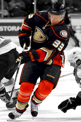
Today, we have a look at the sophomore season of the Anaheim Ducks' alternate uniform. The schedule comes to us by way of a reader named James who tells me he got it from his season ticket representative.
 Jason BlakeThe Ducks' 2011-12 third jersey calendar includes 15 games, four of which take place away from the Honda Center this season. Take a look:
- Sat., Oct. 8 – vs. New York Rangers (Stockholm)
- Fri., Oct. 14 – vs. San Jose Sharks
- Fri., Oct. 21 – vs. Dallas Stars
- Fri., Nov. 11 – vs. Vancouver Canucks
- Fri., Nov. 25 – vs. Chicago Blackhawks
- Fri., Dec. 2 – vs. Philadelphia Flyers
- Sat., Dec. 17 – at Winnipeg Jets
- Fri., Jan. 6 – vs. New York Islanders
- Fri., Feb. 3 – vs. Columbus Blue Jackets
- Fri., Feb. 10 – at Detroit Red Wings
- Tues., Feb. 14 – at Minnesota Wild
- Sun., Feb. 26 – vs. Chicago Blackhawks
- Fri., Mar. 2 – vs. Calgary Flames
- Fri., Mar. 16 – vs. Los Angeles Kings
- Sun., Apr. 1 – vs. Edmonton Oilers
For the game on Oct. 8 in Stockholm, the Ducks are noted as the "home" team, so technically the jersey will be worn for 12 home games. Ducks fans, it looks like your best bet to see the thirds in action will be pretty much any Friday night game at the Honda Center.
If you've seen a third jersey schedule posted on any team websites or can get the inside scoop from your ticket rep, feel free to share it with us.


Reader Comments (15)
Whenever I design a uniform in the NHL games that uses a non-traditional colour scheme, I like to make the socks a different base colour than that of the jersey, but that's definitely the only thing nice I can say about those Ducks' alternates. Worst jerseys in California.
I just dont understand why Anaheim wont make these their home jersey. These uniforms are head and shoulders above their incredibly bland and boring regular home and roads. It actually pops out at you and they have an identity to them.
I just sincerely hope, that they can bring back the Original Mighty Ducks jerseys for just one night. Do what the Devils do each year with their Green and Red uniforms. I think of any year to do this would be this year, to honor the late Ruslan Salei, who was a Mighty Ducks mainstay for 10 years.
"Turn Back The Quack Night" The old Mighty Ducks jerseys are extremely popular by Hockey fans, it is instantly identifiable and iconic.
But hopefully they slowly make this jersey into the home and create a matching road jersey for it. Then it will finally be in the mix of the great jerseys we have in the game now.
does anyone else find it weird that they are bringing this uniform to Europe to play one game in them....
Simply my favorite Ducks jersey right next to the Mighty Ducks jersey. Love the orange socks as well. Reminds me of the bruins who wear yellow.
As a UK-based Ducks fan for over eight years, my very first time seeing them in person will in fact be the Stockholm game. The third's my favourite of the current set, but just the fact that the original Mighty Ducks logo is even going to be on the ice - despite it not being highly visible from afar - has me excited.
The only thing that bothers me about this jersey is the white inside the shoulder logo, it looks too plain and sticks out on a black jersey, should have been colored in with orange or gold.
Hopefully the next thing that I see on the Ducks third jersey schedule; Placed in mothballs, where they belong.
well ill make sure not to watch any of those game
@ Winnipeg
@ Detroit
@ Minnesota
Are we going to see a whites v. darks flip flop in these games? Or are we going to see some specialty jerseys from the Jets, the Wings(doubtful), or the Wild? I will be pulling for the latter. Should be interesting.
This jersey is far from perfect. The jersey showcases the goofiness of the color palette, and the design is quite awkward. There are too many stripes of varying styles. Going back to the old jerseys in some format is inevitable. They have already begun with the shoulder patches. Sooner or later fan demand will be too great to ignore. I love the old uniforms, as well as the colors. They weren't forced retro (i.e. Panthers, Wild, Columbus etc.), nor were they too "futuristic". As a loyal Ducks and Mighty Ducks fans, I will patiently await their return.
The socks are what kill the jersey. Having different colored socks (especially half-colored with multiple different color stripes) is very tacky in my opinion.
If the shoulders had orange on them, the socks might be passable - split color socks tend to look good with a flip of the uniform. So orange angle, black knee if the shoulder is orange and the body is mainly black.
Horrible design otherwise. Should have gone back to the originals, we need less black.
like what todd said, 3 road games. very interesting. clearly the jets and wings won't be sporting anything other than their white jersey (for reasons unknown as it's their choice what sweaters are worn, home team gets first pick). however the wild's white jersey is pretty ugly and don't see why they'd choose to wear that at home (though i prefer whites at home). perhaps a throwback that we're unaware of?
Not quite sure why people on this site are saying they don't like this jersey. Fans in Anaheim, including me, love this jersey, and it had widely become the most popular jersey out of all the choices. If you don't like the color orange, then I can see why you may not like this scheme. To me though, I think this is miles above any other jersey any other NHL team has. Plus, it throws a shout out to Orange County, in which the Ducks play.
You don't have to like it, but the Ducks fans love it, and so do I.
When these uniforms were leaked, I hated them. But they have really grown on me to the point where these are probably my favourite sweaters in the league now. Are they the best looking uniforms? Probably not. But something about the way the orange pops on the black makes is awesome to my eyes.. Can't forget that the wordmark (which I really don't think is as bad as some people on this website seem to think) makes way for a much better looking D logo. Plus, the Mighty Duck returns on the shoulder!
I love the idea of the big D on the front, but as a whole these jerseys are mediocre. They're better than their regular home and away jerseys though. It's probably only a matter of time until these are the new home jerseys and an away jersey is made to look like this. However, what the Ducks should do is bring back the old Mighty Ducks jerseys. Those were possibly the best jerseys ever!!! By far my favorite jersey ever!!!