


Winnipeg Jets Uniforms Unveiled
 Winnipeg Jets officially unveil uniforms / Jets
They're here. The Winnipeg Jets officially unveiled their uniforms today. I don't really have a lot to say on the matter at this point. Give me a day or two and I'll get back to you with my thoughts on it.
 Back of new Jets jerseys / CBCThe unveiling ceremony was held this morning at 11 AM central at 17 Wing in Winnipeg and was well-attended by local media. You can read more details about the design in the club's official release.
A few pictures have started turning up on Twitter, so that's all I have to share at the moment. I'm sure it won't be long before we have something more official from the team.
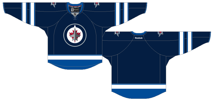
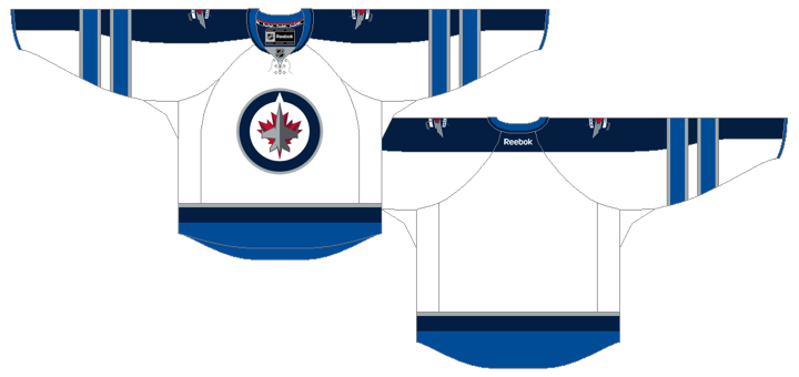
Both jerseys feature a unique double-striping pattern on the sleeves that hasn't been seen before on Reebok Edge jerseys in the NHL. The number and letter styles are also new are very modern.
Like I said, I'll get into my analysis later in the week when I have a little more time to dedicate. For now, feel free to share your thoughts on the new jersey designs. I'm sure we're all curious to see how they're being received.

 Chris
Chris
Now a closer look at those new Jets threads.
Home jersey
Road jersey
 Now what do you think?

Reader Comments (159)
Very good job by the Jets. I was skeptical after they unveiled the logo, but these jerseys are quite nice in my opinion.
Those are awesome.
I really enjoy the jerseys themselves, i find them to be very unique, especially with the striping. I am also a big fan of the Numbers and letters, the modern style is a good fit. The only thing that still bothers me is the logo. If they could have come up with a more interesting logo, the jersey would have been very good!
I think more thought went into the road whites than the home navy jerseys. Not bad overall though.
Very good job on the jerseys! Take the somewhat odd blue elbow band stripes off the white ones and these are both pretty much ideal
Well, it could be a lot worse. That being said, they really aren't all that exciting either. I like the home jersey more than the road jersey. The arm-length stripes on the road jersey do not look very good. The font for the two jerseys, however, is pretty cool. Overall, not bad. But I really, really think the Jets should have used the lighter blue (aviator blue, or whatever they call it) as the primary colour, the home jerseys are gonna be a hell of a lot of dark blue. I give the set a 'pass,' but I'm pretty underwhelmed.
I'm a big fan. The home jerseys are extremely classic and contemporary in design, yet because of the silver/grey they pop more than other jerseys of a similar design. I also love that double striping. It's different enough, yet not TOO different.
The away jersey, however, is my favorite. That they chose to do a full wrap-around on the striping is fantastic. Sets it out completely, and keeps the jersey from being boring or same ol'.
I'm impressed, and enjoy these jerseys very much. For all the anticipation, the fact that they didn't screw up in some futuristic verticle/pin-striping reebok way is A-1.
Way to go Winnipeg. I look forward to watching you against Montreal on CBC in HD on Oct. 9th!
BORING! UNINSPRED! AVERAGE! MEDIOCRE! UNEXCITING! All the words I would love to have identified with my team jerseys
I like the dark jersey, it's similar to what I thought it would be. As for the white ones, I really can't say that I'm a fan of the intersecting stripes on the sleeves.
Not bad... hoping for 3 stripes instead of 2 (for the Avco Cup wins) but not enough room with stripes that thick. The font on the letters reminds me of what the Everett Silvertips use but the numbers are different... looks a bit like Carolina's, actually, but it's not. At first the navy one looked best, but I'm starting to really warm up to the white one. I'm getting a Fehr jersey for sure. Overall, not bad... would have liked to see what they would have done with a bit more time.
Home jersey is nice, hoping the socks have the same double stripe to tie it all together. They should have taken the same thing over to the road jersey. I dont like the clash between the blue sleeves and horizontal stripes on the arms, and the pattern on the hem. Overall though they arent' bad.
I like the stripping on the sleeves. I like the numbers. But you can replace the Jets logo by the one of the Maple Leafs and it would look as is if the general design was meant for the team in Toronto. They should put a hint of red somewhere, apart than on the logo.
Disappointed. The eye goes right to the thick sleeve stripes and not to the logo. The sleeve stripes are also too low making them seem heavy, almost like weights. I keep thinking orangutan arms.
Ew. Absolutely horrible!
they didn't have to use the horizontal sleeve stripes on the white jersey. Different home/away styles would certainly be nothing new for the franchise. I think it wouldve looked better had they used the lighter blue to outline the dark blue yoke all the way to the cuff, maybe with a seam of white in between. I do like the look of the sleeve stripes on the dark jerseys.
OK these are not awful, but I think we can all agree that the Chinese counterfeit concept jerseys are head and shoulders better.
like:
1. the colour scheme. LOVE the fact that there is no red in the striping. They don't look like just another blue and red team.
don't like:
1. the absolutely unnecessary LACE-UP. It's becoming such a joke that every team has to put one on a new uniform.
2. the Reebok mix of intersecting stripes on the road jersey. Uggg. I don't like the long yoke. Leave the Manitoba Moose cues in the past please.
3. the stripe pattern is kind of ugly. Again, the Chinese counterfeit jerseys are so much better.
The home jerseys are great but there is too much going on with the sleeves of the away jersey...not something I would pick.
Home Jersey: 8/10
Away Jersey: 3/10
Those are my rankings.
That's the best they could come up with, really?
I keep comparing these to the old Jets jerseys, which I loved. I should probably start comparing them to the old Atlanta Thrashers jerseys, which I did not like. So compared to Atlanta, these are a welcome relief, and will make the NHL a better looking league. But, compared to the old Jets jerseys (and logo), they have a bit to go to replace them in my heart.
The logo looks a lot more acceptable on a real jersey, but the light grey of the jet still blends too much into the white background. But overall, they've found a way to make the Jets look a little different even though they employ the blue-is-the-new-black color scheme. The yoke/arm stripe intersection is odd though, but at least it sets them apart. Overall, I like it.
I mean, these jerseys are pretty cool, but damn, they could have been a little less conservative.
My opinion the color scheme is too much like the Quebec Nordiques color scheme and the cuff stripes interrupting the arm and shoulder yoke kinda a bad look. I can't believe i'm saying the jersey needs more red for accent, but thats what i'm saying.
not bad, i quite like it... here's where i think they could have gotten creative: the secondary logo (set of wings) should have gone on the back above the players name where the "Reebok" logo currently resides. Push that logo to the bottom right like the CCM jerseys used to do. Leave the shoulders clean with just the players number on the sleeve, nothing at the shoulder level. That way when they really need a commemorative shoulder patch it would truly stand out as being unique.
all in all, i like the end result. Clean and easy on the eyes. Look forward to seeing it moving on the ice!!
They look pretty underwhelming to me. I was hoping for something that stands out a little more.
Much better than I was expecting- the striping around the arms had me worried for a sec that they'd pull a Reebok Oilers/ Panthers move with the stripes only going 1/2 way around the elbow but thankfully they're full circles.
I like the shoulder stripes, going all the way down the arm hearkens to the original Jets' kit from 1979-90, and I guess the arm striping is similar-ish to the 90-96 unis.
The shoulder patch looks good. Not crazy about the letter/ number font... looks kinda Predator-like.
Laces are classy :)
But I sigh as I've sighed since July.... another two-tone blue sweater won't make any great waves. At least Florida's moving in the other direction and the Preds have gone for gold. Maybe they shouldn't have been so quick to write off more red in the jersey.
In any case, they look like a legitimate Canadian team and haven't done anything dumb (piping-crazy, assymetrical sweaters) and will fit right in like the Thrashers never really did.
They're distinctive, immediately recognisable, and not at all horrible. The dark looks better than the light. The slight oblique on the numerals gives a dynamic look that goes with the team moniker. I'm not a fan of the lettering style, but at least it's legible.
Over all, a pretty good jersey given the timeline they were on.
I love it. I think that this is a really sharp jersey and although i thought that the fake jersey looked pretty cool, I think that this one is even nicer and look forward to seeing them in action this season.
I'm not so excited about the odd sleeve striping. They look like they were made in a video game.
Home jerseys: nice!
Away jerseys: c'mon pick a style ffs!
Logo: still hideous...
I like them, having the arm stripes go over the shoulder yokes looks way better than the opposite which other teams have done. Like the font as well. The only thing I would wish for is more contrast on the collar of the home jersey, more white or silver. Still, I give them a PASS.
Just knee-jerk reactions...
Like the double-stripes, but otherwise pretty plain.
Could have used the light blue accent color better... the skirt end looks a bit strange. Hard to add an accent color and then use it as the bottom border of a design. Go big (make it more prominent) or go home (keep it to thin striping, etc) with accents.
Don't Like the full shoulder-to-wrist sleeve schtick (a'la Leafs' alternate).
A shame that some of the dastardly bootlegs looked more appealing.
Good font.
Should have gone with just shoulder yolks instead of the full sleeves...looks really stupid between the stripes...otherwise they are OK, not great, not bad, but OK.
I like them actually. I think they make up for the lackluster logo.
Boring. Unprofessional. Cheap. Minor league. Ugly. Failure.
This entire military theme has gone too far. Hockey players walking off Hercules transport planes, CF-18 Hornet jets in the background and politicians speaking at the event solemnly invoking the good works done by the Royal Canadian Air Force is making the Winnipeg Jets look like a unit of the Department of National Defence.
The jerseys -- much like the logo -- are staid, boring and corporate. I wouldn't be surprised if a Department of National Defence bureaucrat was assigned to the design team.
The previous Jets logo was fun and most certainly not an homage to Canada's military.
I have to say this new Winnipeg Jets as air force theme is turning me off this team and I was a big supporter of Winnipeg's return to the NHL.
In short: Not good.
Bland. The light blue seems forced into this color scheme, just as it seemed out of place in their secondary logo. I would say they shot themselves in the foot by eliminating red as well. I haven't understood many of True Norths' decisions, and this is another one. Of all the concept jets jerseys I've seen this might be the 10th best. It's not a horrible jersey (like say, the isles 3rd), but they really missed the mark here, I think.
In my opinion, the jersey needs a larger splash of red. Maybe it can be put on the shoulders if it's possible.
Away Jersey would of been better with a simple shoulder yolk with a gray or Light Blue outline. Home Jersey is fine, though the bottom stripe following the hem instead of it just being a stripe is a tad annoying.
I dig the homes. The aways leave something to be desired. The brighter blue seems strangely out-of-place on the aways while it fits fine on the homes. The horizontal stripes intersecting the vertical stripes on the sleeve don't work for me at all. A dark blue shoulder yoke would've been a better choice. I'm also just not a fan of vertical stripes on sleeves anyway.
I like them!! Definitely a different template, although I feel the dark home jerseys could use a bit more light blue at the top. Maybe a similar shoulder outline to the ducks new third jersey, but instead of orange, light blue obviously. And maybe have the strings be light blue, as well as the collar part with the NHL symbol.
Not a huge fan. It is a strange mix of classic (collar) and new elements (modern numbers). I don't like the coloring. Why skip the red? The road is too white and the home is too dark.
Wow... a team wearing dark blue with powder blue. I've NEVER seen that one before.
The Jets had an opportunity to forge a unique identity and they put out the same jersey as a bunch of other teams. Their symbol is even a circle. The entire NHL looks the same now. I'm disappointed.
Personal thoughts: Not bad. Sorta plain, but I like the striping. I wouldn't say that they are "Nothing like" the ones taken by RCMP last week, I took that to imply drastic differences, but they are different enough I guess.
Love it. I thought it was going to be a train wreck, but this is fantastic!
Overall, I really like them. I'm impressed that they don't look like a copy of anyone else's, yet they still look like a hockey jersey and they don't have any of that stupid excess piping that Reebok seems to like. My only criticism is that I don't like how the striping down the arms on the road jersey intersects through the striping accross the arms, but that's minor. I think if they stopped the downward strip as soon as it meets the horizontal stripe, it would be an improvement but, as I said, very impressive overall.
Well I'm glad the jerseys are finally out. They don't blow me away but they aren't terrible. I like the shoulder striping that goes down the sleeves on the road jersey. I also like the numbers and the colors aren't bad. I do wish it had more red in the jersey but as part of the new brand image they were moving away from that. While the colors also are very similar to the Columbus Blue Jackets 3rd, which I can't say I'm a fan of, at least these are the true colors of the team and are being used as such. I imagine there could have been better options but these jerseys aren't bad at all.
They're....ok? i was expecting more of a surprise i guess. But these are fine.
Wish it was the lighter shade of blue, but well done. Classy and played it safe.
I really like the jerseys, i just think the logo is so average... at best. I like the secondary mark a lot more than the actual logo. The numbers, and the lettering on the back is pretty good though.