


San Francisco Gets the Horns
 11 Comments
 Photo from San Francisco Bulls official website
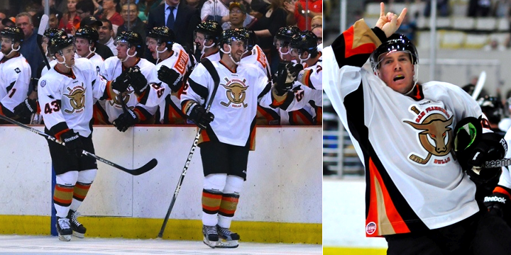
The San Francisco Bulls made their ECHL debut over the weekend, giving us our first opportunity to see the team in action. And if you were paying attention when the club unveiled its uniforms last March, you'll notice a few differences.
 Photos from San Francisco Bulls (Facebook)
Mainly, the name and numbers on the back of the jerseys have been changed. But apparently, that was the plan all along. When it was pointed out via Twitter (by @Puckguy14) that the numbers looked a lot like those of the MLB's San Francisco Giants, a response came from the guys who actually do the jersey customizations for the Bulls, Junkyard Athletic.
@puckguy14 @icethetics @sfbullsThe font is indeed the Giants.Reebok's mockup showed standard block, just to show name + numbers.
— JunkyardAthletic (@JnkyrdAthletic) October 4, 2012
They also added that that was the team's plan from the beginning. (I think someone has an unhealthy attachment to the Giants. What happened to building your own identity?)
You may also note that conspicuously absent from these jerseys is any sign of a shoulder patch designed by one of our talented Icethetics artists. A week before the Bulls unveiled their jerseys, they said they'd be interested in looking at secondary logo proposals from our designers.
Well, they were interested in a couple but after a communication breakdown, the whole idea went nowhere. So instead, the jerseys feature the ECHL's 25th anniversary patch on the right shoulder and another smaller patch on the left that I haven't been able to make out. (Looks like it says BAT or something.) Can't tell if it's a sponsor or some kind of memorial patch.
 Photos from San Francisco Bulls official website
I can't say I'm impressed with the uniforms and I still hate the logo, but I do like how Justin Bowers and his teemmates keep giving the horns to Bulls fans at the Cow Palace.
Does seeing the Bulls' uniforms in action change your view on them? Love 'em? Hate 'em? The comments await.


Reader Comments (11)
1/3 Ducks, 1/3 Flyers, 1/3 Sabres (old Sabres, when they were red black silver).
Yet I actually like them. Logo misses the mark, I think, but as for jersey style I think it works
Why? WHY must we keep doing reverse colored nameplates?!
Seeing them in action definitely changed my opinion! I thought they were terrible when they first came out! After seeing them on the ice with the black helmet/pant/glove combo I REALLY like them.
i kind of like the orange jersey. But the the white jersey is awful and i have played for beerleague teams with a better logo.
logo still looks very basic (seen worse tho), too much orange, kinda prefer the white, wouldn't buy either.....
The only thing I can say is that they could have been much worse. Just think of what came to mind when the ORIGINAL logo was released. In fact, I think I may put that logo on my door to scare off the trick-or-treaters!
I, too, detest the logo when "Bulls" has so much potential to create an awesome, original logo. I am on board with the orange uniform as well, but the reverse colored nameplate ruins both jerseys. Fix that logo, though, and most other stuff can be overlooked.
Not a big fan of the logo, or the reverse coloured nameplates, or the sabres knock off design. But what got me the most, those socks certainly do not work with those jerseys! I think the best choice would have been the original Ottawa reebok designs with the two curved stripes. But other then that, it's nice to see the Bulls on the ice!
The font and logo look like its trying to be too "Old Western". It just seems dated.
.
Not a fan.....
That logo is just awful.