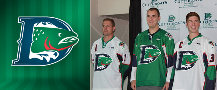
Denver Cutthroats Unveil Uniforms
 Tuesday · Oct 16 · 2012 | 2:10 AM PDT
  15 Comments
 On Monday, the CHL's Denver Cutthroats officially unveiled their jerseys. The expansion team gave us our first look at its logo back in May. To say I disliked it is putting it mildly. But I was very much a fan of the color scheme. Both opinions hold five months on.
With the jerseys, I'm torn. How can I hate a green hockey sweater? I love green hockey sweaters! But this an abomination. It's basically the generic Reebok Edge template employed by the Penguins, Senators and even Lightning for a few years. Worse than that, the jersey isn't even made by Reebok. It's made by SP Apparel but has the look of a cheap knockoff.
All right, you know I'm not a fan of the Cutthroats look, but they're actually putting NHL players on the ice this season — unlike, you know, the NHL itself. That's right, the team also used this jersey-unveiling press conference to introduce their newest member, ex-Av Kyle Quincey.
 Photo from Denver Cutthroats (Facebook)
What does it say that the Central Hockey League is the best Quincey can do right now? That's him, second from the left. This lockout needs to end now! Anyway, the unveiling of these jerseys was also the first time we really got to see the Cutthroats' secondary logo.
It's not bad if you can look past the crossed hockey sticks cliché. It incorporates elements of the city of Denver's official flag, which is actually a pretty nice flag (as city flags go, anyway).
To sum up, I love the colors, dislike the crest and hate the jerseys. The shoulder patch gets a pass. What do you guys think? Are we on the same page or am I being too harsh?


Reader Comments (15)
Terrible! Why is there a fish penetrating a consonant on the front of their shirts?
Granted it is hard to make a fish logo work (see Victoria Salmon Kings), they really missed the boat on this one.
Blue, White, Green, and Red are good team colours, but the way they've been placed together looks awful.
The shoulder patch is ok, but I think it looks a little too much like a baseball diamond.
These jerseys are confused.
Amateur effort.
Minimal red is a bit "Christmassy". The green is rich. Kyle Quincey is listed on the Red Wings roster on their BlackBerry app.
i wholly agree i've nothing but vitriol for that template, not even green can save it.
I like the fact that they don't use black in the jersey/logos. I think it is a shame that they did not do a more original/interesting jersey. To me the crest is lacking something, and the shoulder logo does not match the crest at all... the crest is also just too big.
Quincy makes his offseason home in Denver. He also has a relationship with head coach Derek Armstrong from his days with the L.A. Kings.
Wow you guys are way too harsh. It's a good look for a CHL team, the only thing I dislike is the Block number font, I feel a rounded one would look sharper. I plan on purchasing one of the green beauties at an upcoming game. GO FISH!
Candidate for the worst jersey in North American Hockey?
Hideous
damn those are ugly, and could the logo be any bigger.
I actually like the logo, but it's not a modern logo at all (the font the D is in is very old school and the fish isn't very stylized) which makes me think a more classic jersey design (probably like a Bruins template) would have worked MUCH better. It's this original six era looking logo on a modern reebok jersey design. Major clash.
the secondary logo looks like a baseball diamond to me.
really cant think of anything positive to say about either of these jerseys, so as i was raised right, i wont say anything nasty either!!
Love the fish. Love the mountains and water above and below the fish. Love the colors. Love the jerseys.
Yea this looks really bad, I agree with many others they could've been much better had they selected a more appropriate template/jersey design. Can't lie the look on the fish's face cracked me up a bit too.
Love the home green jersey and love the logo. Don't care for the shoulder patch. Want a home green one!!
GO FISH!!!!!!!!!