Blazers Aim for Modern-Retro Mix
 Tuesday · Nov 6 · 2012 | 1:46 AM PST
  16 Comments
  Photos from Kamloops Blazers (via Facebook)
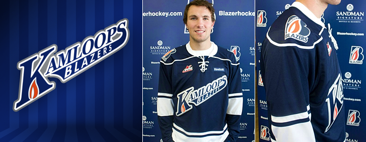
The string of great new WHL third jerseys continues with the Kamloops Blazers. The club debuted these new blue sweaters on Sept. 21 (and yes, I'm just now getting to them). And while they may look rather familiar, there's nothing wrong with that.
The looks is based on the fantastic green third jersey of the Minnesota Wild. From the script crest to the simple striping, it's hard to go wrong with a classic feel such as this. But that's not the only reason for the new alternate uniform.
Blazers director of sales and marketing, Dave Chyzowski, tells me that part of the reason for the new sweater was to give a little love to the city of Kamloops. And while that required a move away from the traditional Blazer "B," the new crest does include a variation of the primary logo to "give it that subtle flavour of the Blazers."
 Photos from Kamloops Blazers (via official website and Facebook page)
Chyzowski says the blue of this jersey is darker than the normal Blazers blue to help the new logo stand out. Basically, the team was looking to keep it simple and clean with a design that mixes retro and modern design elements. I'd say they succeeded.
Do you think the Blazers hit the mark with their new third jersey?


Reader Comments (16)
This is everything an alternate jersey should be, different, simple yet defined. It lacks gimmicks although the piping around the yolk could be considered such but all in all a very sharp jersey. Perhaps a little too dark on the jersey colour but hey it's nice.
I would definitely buy it. It's not a mess and there are still elements of the Blazers in the jersey.
In my opinion, best look the Blazers have sported. I like it.
On almost every other occasion, I vehemently oppose a word marked logo on a hockey jersey. This might one rare exception.
I like the jersey a lot. The change I would like to see is some orange. I like the Blazers blue and orange colour scheme.
It's the Minnesota Blue Wild!
I really want to love this jersey, but I can't get past the fact that it's basically identical to the Wild 3rd, jersey script and all. I also think a little orange would have helped this jersey out, but then again, that might just be me.
As a Blazer's fan and a Kamloops native I am actually kinda disappointed in this one. I think that their jerseys have always been the best in the league, if not all hockey! This one is a little....plain.
I love this jersey! I agree with some of the above comments that a little more orange would be nice, but that's a minor quibble. I'm brand new to Kamloops and bought one of these at my first game! I'm proud to sport it. I really enjoy how they incorporated the flame from the normal logo into the "K" of the word mark, it's a nice touch.
Sharp look. Nothing spectacular, but definitely good. 8/10.
Oh, and hope you do something special for the Los IceHogs sweaters on this site that you tweeted about a couple days ago!
any idea how the blazers are going to place the captain's letters? it seems to me it would be impossible to place it on the players right, with the text angling up that way, and the reebok wordmark. Also on the other side it would be very crowded...
Hate it, really bugs me when teams cant create their own new ideas or templates
Colin: The C/A goes above the Reebok logo on the right shoulder. See more photos here.
Love it. A lot. Don't support Kamloops but I cannot resist adding this little fella to my collection!
I love it... in fact I bought one just a few weeks ago!
I'm so tired of script, tie-down, faux-back (copyrighted) jerseys. Disgusting marketing ploy and the idiots eat it up.