


Draft Day 2012 Disappoints
 8 Comments
Over the last few years, jersey geeks like us have counted on the NHL Entry Draft to see the league's newest members sporting its newest looks. But after years of upheavel and change in team branding, I'm sorry to report that we're in for a bit of a lull in 2012.
 That, of course, means the 2012 draft, held over the weekend in Pittsburgh, was kind of a disappointment in that regard. There really aren't any new sweaters coming this year apart from Winter Classic threads for Detroit and Toronto as well as rumors of a new alternate in Tampa.
Still, even if there weren't any teams debuting new sweaters, at least there were a couple new sweater patches that will be in use for the coming 2012-13 season.
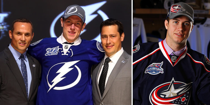
 On Friday, the jerseys handed to Lightning draftees featured the new 20th anniversary patch. It's a simplified version of the 20th anniversary logo that was officially unveiled at the team's draft party that night.
 In addition to that, the 2013 NHL All-Star Game logo could be seen on the sweaters being donned by Columbus Blue Jackets picks. They're both nice looking patches. I don't think any other teams are planning special event patches for their uniforms this season.
It is odd that while the Lightning and Ottawa Senators both joined the league 1992, they chose to celebrate their 20th anniversaries a year apart. The Sens were marking the years while the Bolts are just counting the seasons played (we all know 2004-05 was canceled due to the international shock of Tampa Bay winning the Stanley Cup).
Depending on how the Florida Panthers and Anaheim Ducks interpret anniversaries, they could both be marking 20 years either this season or next, having both been founded in 1993. Kind of straying from the topic now. Back to the draft...
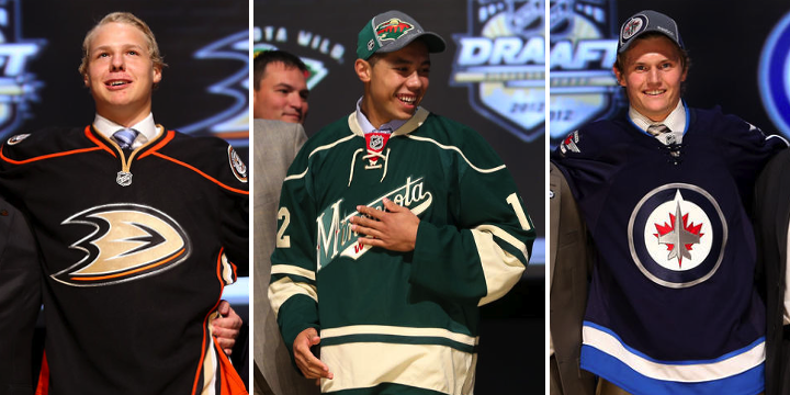
Really, the only other thing worth a mention (and that's only because there's nothing else to talk about) would be these three jerseys. The Ducks and Minnesota Wild both opted for third jerseys at this year's draft. It's nothing new for the Wild, but it was a first for Anaheim.
Also, it's the first time the new Winnipeg Jets jersey has appeared on the draft stage. Famously, you'll recall that Mark Scheifele was given a generic NHL jersey last year, only moments after team owner Mark Chipman announced the team's name. Jerseys had yet to be designed.
In past years, I've outlined which jerseys were handed out to draftees by the teams. This year, there's not much to say. All but four teams gave out their home jersey, keeping the draft nice and colorful. As reported above, Anaheim and Minnesota used third jerseys. That leaves Nashville and Colorado doling out the white road sweaters — also known as the uglier ones.
By the way, the next two draft hosts were announced as well. New Jersey will handle things in 2013 while Philadelphia gets it in 2014. Logos to come at a later date.
Hope this draft recap was as fun for you as it was for me.

Reader Comments (8)
It wasn't disappointing for me! My team made out like bandits!
I'm guessing Mark and I are pittsbugh fans? hahah.
i was also hoping to see new jerseys but it was cool how Anaheim and Minnesota used their thirds. im thinking that maybe nashville is adding something new or changing the colors of their yellow jerseys. it doesnt seem like colorado would change their dark jersey though
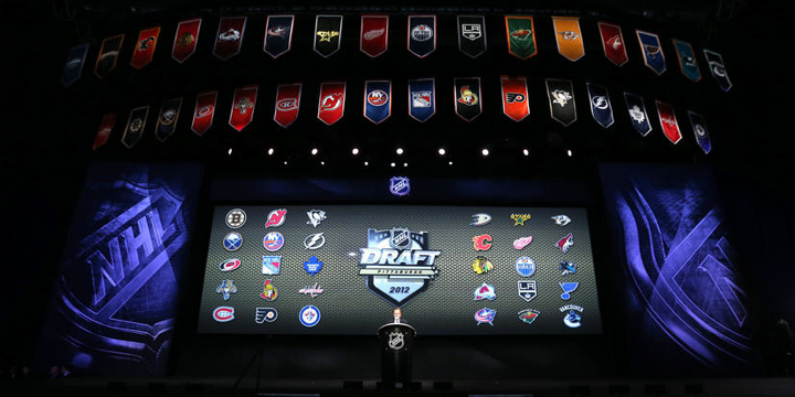
You know what I find weird? The fact that, on the top picture, the Eastern Conference teams are on the WEST side of the video board and the Western Conference teams are on the EAST side of the board... Maybe because Eastern comes before Western, alphabetically speaking, but I still find this odd...
@Black[Box]- Heck no! I'm a Habs fan! After last season's disaster, this draft has made me excited to be a Habs fan again! That being said, Pittsburgh did great with the draft and the Staal trade.
The Ducks have been using their 3rd for most of their promotion and media since its inception, which makes me wonder why they don't just make it their home set. It is a vast improvement over their current home set.
Any word on when the Lightning are going to put the victory stripes back under the arms WHERE THEY ARE SUPPOSED TO BE?!
I really think its time to start a Bring Back the Black campaign. With all due respect to our friends in Toronto, I'm really sick of looking like the Toronto Bay Maple Bolts. Even if it means we stick with this design, at least allow our third jersey to be black...
Regardless, we really need to bring back our victory stripes. Look at the evidence: 2011 w/ stripes = one win away from the Stanley Cup Finals.
2012 without stripes = fail.
Yeeeeeeeah, Minnesota's thirds!
I totally have a design boner for their third jerseys. More specifically a typography boner.