Entries in draft (14)

Sunday
Jun302013

NHL Draft Yields Anniversary Logos

The 2013 NHL Draft was held this afternoon in Newark, N.J. and it treated us to a few new uniform decorations for the 2013-14 season. By that I mean it was positively lousy with special anniversary patches. I'll review those and some other items, team-by-team, in the order it all happened.

Photos from Florida Panthers

With the second overall selection, the Florida Panthers took Aleksander Barkov. They handed him a red jersey featuring the new 20th anniversary patch on the chest. This wasn't our first time seeing the logo, but it was the first time in patch form on a sweater.

Photos from Carolina Hurricanes

The Carolina Hurricanes picked fifth, nabbing Elias Lindholm, giving us another opportunity to see the new threads. I'm still not a fan. Where's the originality of days gone by? Not to mention, the poor kid looks pregnant wearing that.

Photos from Yahoo! Sports

With a pair of first round selections, the Dallas Stars decided to get creative with their new sweaters — handing out one of each. At No. 10, Valeri Nichushkin got the green home jersey while Jason Dickinson got the white one at 29th overall. And the uniforms still look amazing.

Photos from Yahoo! Sports

Skipping ahead to the 18th selection, we find the San Jose Sharks avoiding the jersey redesign question by letting Mirco Mueller have the black alternate. Look at his face. He sees what they did there.

While we're on the third jersey subject, the Minnesota Wild also kept to their tradition of making green the first thing their greenhorns get to wear. Pictured above is Dylan Labbe, taken 107th overall. That brings us to the third and final team to hand out a third jersey today.

At No. 26 were the Anaheim Ducks, who are about to mark two decades in existence. They selected Shea Theodore of the Seattle Thunderbirds. His alternate jersey featured the Ducks' new anniversary logo, which got its official unveiling with today's festivities.

Photos from Anaheim Ducks

I won't lie. I'm disappointed. It's a rehash of the Ottawa Senators' 20th anniversary logo from two years ago. It doesn't tie in to any existing Ducks branding — apart from the D stuck on it like a game of pin the tail on the donkey. It's all set in the stale Bank Gothic font every other sports team has used at some point. And it's packed with lazy gradients. My favorite.

The Ducks unveiled the logo via Twitter this afternoon following Theodore's selection. They also posted this press release to their website, detailing plans for their 20th anniversary season. One interesting note is a "Throwback Night" set to take place "near the start of the 2013-14 regular season, paying homage to the inaugural 1993-94 Mighty Ducks of Anaheim season."

Does this foreshadow an eggplant-and-jade specialty jersey? One can dream. The release says more details will be announced at a later date.

Photo from Boston Bruins (via Instagram)

The Boston Bruins didn't get their first crack at the draft pool until the end of the second round, 60th overall to be precise. But they did have jerseys on hand for the later picks featuring their 90th anniversary patch. It was revealed via their Instagram account during the draft. (Also a couple of photos on Twitter.)

I've yet to see it in any digital art, but it looks all right. It's the standard giant number above a ribbon with the team's logo tacked on the middle. It resembles the club's 80th anniversary logo more than its 75th — which is a good thing. And while it conforms to the dull conventions of an anniversary logo, it's unique enough to be a solid logo as far as I'm concerned.

(And for the record, I think Icethetics concept artist Justin Nahhas is somewhat psychic. Compare this logo to a design he created almost two years ago.)

One final note. I did a tally of all the jerseys handed out to draftees today. Out of 30 teams, 25 used their dark home jersey, three went with a third jersey (read above) and three used white road sweaters, including Colorado, Winnipeg and double-dipping Dallas.

That's it as far as jerseys are concerned. But there's one more item. We learned at last year's draft that Philadelphia will take on hosting duties in 2014. But we didn't get the full version of the logo until today.

I love the bell shape of the shield for this one. Just outstanding execution of what can be a tired concept. The Liberty Bell is in Philly, we get it. But this is a neat logo!

What do you think of all the new stuff we got to see today? Hit or miss on the anniversary logos?

Wednesday
Feb272013

New NHL Draft Logo Emerges

New logo design officially appears on NHL.com

It was back in December that we thought we got our first look at the logo for the 2013 NHL Entry Draft. But that was evidently not an official version. This week, a new mark prominently featuring the outline of the state of New Jersey started appearing on NHL.com.

Personally, I like it better than what we saw a few months ago. The strange drawing of the Newark skyline was out of place. But this map-centric design makes me wonder if it'll set a new trend for future draft logos. Philadelphia hosts in 2014, so will that logo feature an outline of Pennsylvania?

Do you have an opinion on NHL Draft logos? Ever even thought about them before today?

Monday
Dec102012

NHL Draft Logos for 2013 and 2014

Apparent 2013 NHL Draft logo turned up online in September

First up is this gem. It appears to be the logo for the 2013 NHL Entry Draft, which will be hosted by the New Jersey Devils this summer. I say "appears to be" because I haven't yet been able to track down and a solid source for where the logo came from.

(UPDATE: Turns out this was a concept designed by a fan that got picked up by more than a few sites since the NHL took its time releasing the real one.)

From what I've been able to find, it looks like the logo first showed up online in early September in a blog post on PuckCentralHQ. It was a post discussing preseason draft rankings. But there's no reference to where they got the logo which appears at the top of the page (and as a repeated background image).

It has also popped up on a number of other minor websites and blogs (which you can find via a quick Google search). But no official NHL sources or media outlets have posted this logo. That said, it certainly looks like it should be the real thing.

It has the same design theme we've seen on past draft logos. However, what's interesting is the typeface that identifies the city and year. It's not the NHL's standard font. This could indicate a change moving forward, or it could be that this logo isn't the real thing. You can draw your own conclusions.

Abbreviated draft logos for 2013 and 2014 seen on NHL websites

During the 2012 draft, held in Pittsburgh, the NHL announced the next two draft hosts as New Jersey and Philadelphia. Photos showing the 2013 and 2014 draft logos showed up in photo galleries on the host teams' websites shortly thereafter.

The photo on the left was posted on the Devils' website. The photo on the right can be found on the Flyers' website. The two logos seen in background of these images are the simplified versions. The current NHL draft logo standard was introduced in 2010 when Los Angeles hosted.

For each, the abbreviated versions are the same shape and design but with the host's name and color (except for Los Angeles, which was blue). The full shield versions have all been unique shapes. You can see all three previous logos below. The 2013 logo at the top of this post fits in nicely.

By the way, it's disappointing to think that if this NHL labor dispute doesn't get resolved soon, the draft may just be next NHL event that takes place.

Sunday
Jun242012

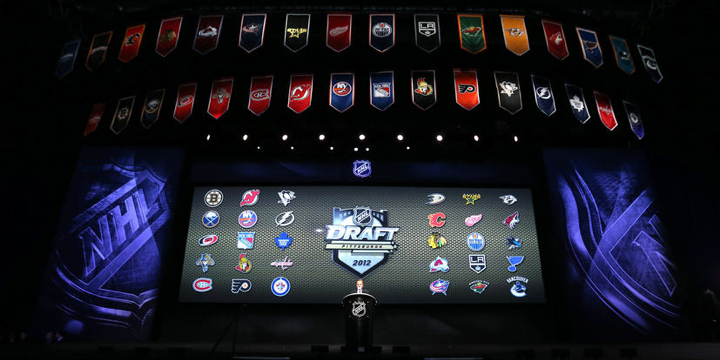
Draft Day 2012 Disappoints

Over the last few years, jersey geeks like us have counted on the NHL Entry Draft to see the league's newest members sporting its newest looks. But after years of upheavel and change in team branding, I'm sorry to report that we're in for a bit of a lull in 2012.

That, of course, means the 2012 draft, held over the weekend in Pittsburgh, was kind of a disappointment in that regard. There really aren't any new sweaters coming this year apart from Winter Classic threads for Detroit and Toronto as well as rumors of a new alternate in Tampa.

Still, even if there weren't any teams debuting new sweaters, at least there were a couple new sweater patches that will be in use for the coming 2012-13 season.

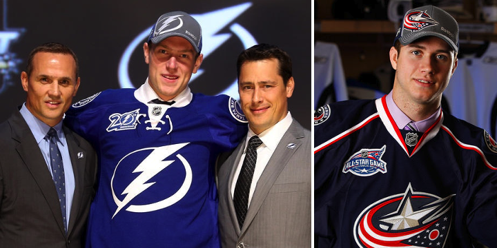
On Friday, the jerseys handed to Lightning draftees featured the new 20th anniversary patch. It's a simplified version of the 20th anniversary logo that was officially unveiled at the team's draft party that night.

In addition to that, the 2013 NHL All-Star Game logo could be seen on the sweaters being donned by Columbus Blue Jackets picks. They're both nice looking patches. I don't think any other teams are planning special event patches for their uniforms this season.

It is odd that while the Lightning and Ottawa Senators both joined the league 1992, they chose to celebrate their 20th anniversaries a year apart. The Sens were marking the years while the Bolts are just counting the seasons played (we all know 2004-05 was canceled due to the international shock of Tampa Bay winning the Stanley Cup).

Depending on how the Florida Panthers and Anaheim Ducks interpret anniversaries, they could both be marking 20 years either this season or next, having both been founded in 1993. Kind of straying from the topic now. Back to the draft...

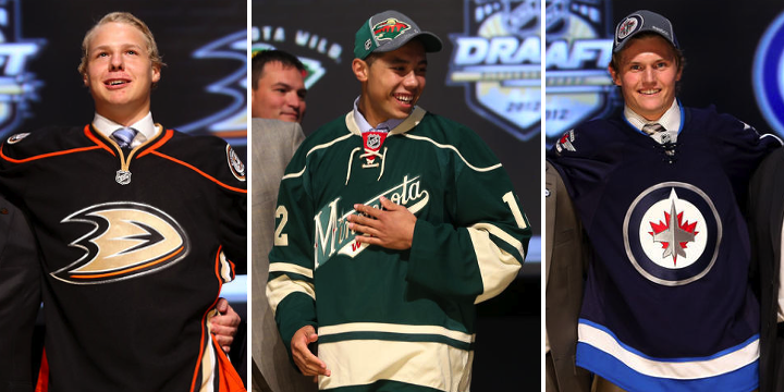
Really, the only other thing worth a mention (and that's only because there's nothing else to talk about) would be these three jerseys. The Ducks and Minnesota Wild both opted for third jerseys at this year's draft. It's nothing new for the Wild, but it was a first for Anaheim.

Also, it's the first time the new Winnipeg Jets jersey has appeared on the draft stage. Famously, you'll recall that Mark Scheifele was given a generic NHL jersey last year, only moments after team owner Mark Chipman announced the team's name. Jerseys had yet to be designed.

In past years, I've outlined which jerseys were handed out to draftees by the teams. This year, there's not much to say. All but four teams gave out their home jersey, keeping the draft nice and colorful. As reported above, Anaheim and Minnesota used third jerseys. That leaves Nashville and Colorado doling out the white road sweaters — also known as the uglier ones.

By the way, the next two draft hosts were announced as well. New Jersey will handle things in 2013 while Philadelphia gets it in 2014. Logos to come at a later date.

Hope this draft recap was as fun for you as it was for me.

Thursday
Jun212012

Branding the 2012 Draft Parties

The 2012 NHL Entry Draft opens in Pittsburgh tomorrow. With that, a number of teams will be celebrating with their fans. I've never understood why teams feel the need to brand their draft day parties with special logos, but every year we always get a few.

Here are the ones I've tracked down for this weekend.

The Chicago Blackhawks, Columbus Blue Jackets, Montreal Canadiens and New York Islanders are all promoting their draft day events with specially-designed logos. I don't really have anything more to say about them, but the blog was getting a bit stale.