


What's New in the New Season
 31 Comments
The NHL opened its shortened 48-game 2013 season tonight with a few changes and new logos hitting the ice. So let's run down what's new in the new season.
Kings, Bruins start ugly Stanley Cup banner trend
We begin with what I consider a pretty ugly trend over the last two seasons. This afternoon, the Los Angeles Kings raised their 2012 Stanley Cup championship banner. Then each player skated out wearing that same banner as a shoulder patch.

Now that's just tacky. I'm all for being proud of an accomplishment like this, but doesn't a sweater patch go a little bit too far? Is the 20-foot banner hanging in the rafters not enough?
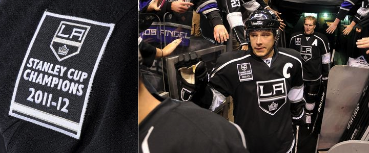
But the Kings aren't the only guilty party. Last year, the Boston Bruins started this awful trend by wearing their banner on their sweater as well. Just uncalled for.

Come on. We all know you won. Nobody missed the banner raising. The patch is unnecessary. Fittingly, both of these teams lost the games where they flaunted their titles. The Bruins fell to the Flyers 2-1 last year. And earlier today, the Kings were stung by the Blackhawks 5-2. Serves them right.
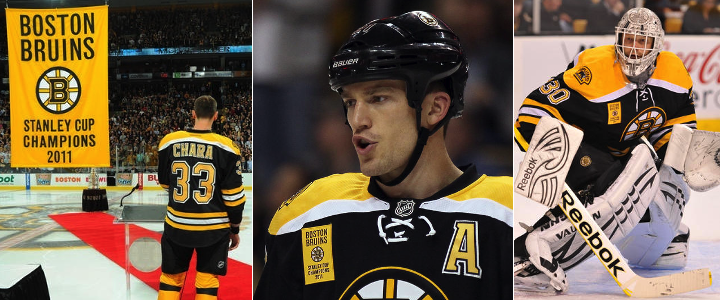
We'll note that the Chicago Blackhawks, after raising their 2010 Stanley Cup championship banner, did not wear any kind of gaudy patch to commemorate their commemoration ceremony. Nor the Red Wings or Penguins in 2008 and 2009. So kudos to them.
Before I wrap this up, I do want to point out that at least the Kings and Bruins weren't as bad as the AHL's Hershey Bears — who you may remember actually wore the logos of the teams they beat for championships back in 2011.
Lightning and Stars mark 20th anniversaries
Next up are a couple of sweater patches we can't argue with. First, the Tampa Bay Lightning turned 20 in 2012 — but the lack of hockey between October and December means their celebration starts a little late. But better late than never. It's a cool logo!

The Lightning's 20th anniversary patch is a simplified version of the full logo unveiled over the summer. And for what it's worth, this isn't the first time we're seeing it — just the first time it's making an appearance on the ice. The logo debuted in June at the draft.
The Ottawa Senators, who joined the NHL with the Lightning in 1992, celebrated their 20th anniversary last season while assigned All-Star Game hosting duties.
The Dallas Stars moved from Minnesota in 1993 — a year after the league expanded to Ottawa and Tampa. But they're also marking 20 years during this lockout-shortened season.

This is the first we've seen this logo. It prominently features the American Airlines Arena Center — home of the Stars — as well as the skyline of the city of Dallas. It's a pretty sharp logo even if there is a lot going on.
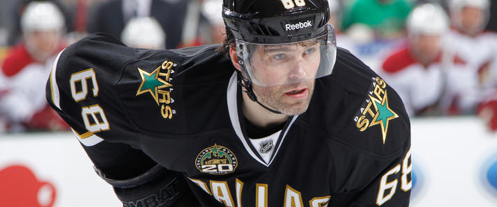
Here you can see it being worn by newcomer Jaromir Jagr.
Capitals reverse colors on socks
This last bit of "news" would get a big shrug from a lot of hockey fans. But not Icethetics readers. Hold everything because the Washington Capitals have changed their socks!
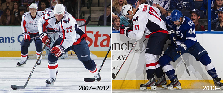
I think that visual aid tells you all you need to know. But just in case, they've reversed the colors. On the road uniforms, the blue is now used on the bottom half going into the skate instead of the top half coming out of the pants. The configuration is now more like what we see in the rest of the NHL.
Presumably the socks on the home uniforms will see the same change — red on top, blue on the bottom now. But we'll find out for sure when the Caps open their home schedule on Tuesday against the Jets. Unless they wear their third jersey, that is. But the next home game would be Thursday.
Did I miss any 2013 uniform changes? If so, shoot me an email or comment and I'll update this post as needed.

Reader Comments (31)
Worse than the banner was the cup parade on the ice before the game. They all got their day with the cup and they got to raise the cup during their win in June, why do it again?
The Caps did change the home socks, as show during their home scrimmages at Verizon Center. http://25.media.tumblr.com/c3a3bf4169097a777152a2036dee8012/tumblr_mgwp3jsVNa1qa1724o1_500.jpg
Regarding the Capitals. Since hockey socks don't have feet, I wonder they ordered the same socks from the previous seasons and just wear them up-side-down.
That was the most pretentious Cup ceremony I have either seen. Keep it classy, LA.
I like the banner patches. I thought they were cool. It's their first cup in franchise history. I think they can celebrate it as much as they want.
Hockey socks are smaller at the ankle end, and the Reebok Edge socks have a clip at the top, so they're definitely one-way.
The banner patch is absolutely a horrible idea, and they really made too much of a to-do about the Cup today. In fact, it's rather annoying that the other two 3:00 games were delayed so that they wouldn't start until after the Kings' ceremony was done. Massive overkill. And the patches - just ugly.
As much I hate this new trend of Stanley Cup banner patches, I got news for you - $$$$$$$$$$. Just like the Stanley Cup final patches that are worn by the two Stanley Cup finalists during the finals. Just like the stupid finals champion and conference champion ball caps that are slapped on the players' heads after clinching their respective series. Money talk$.
Andre: Out of curiosity, how does a team make money from a sweater patch?
*American Airlines CENTER.
AA Arena is in Miami, not Dallas.
If I won the Stanley Cup- I would shout it from a mountain top. I'd proudly wear the banner patch. The Kings did something that only one team out of 30 gets to do every year- win the Stanley Cup. As a fan of the game, watching a team play 82 games and then however many in the playoffs- if they do win the Cup, they deserve every bit of recognition no matter how "tacky".
Don't get cynical on us now. ;)
Tyler, I may be missing some sarcasm in your comment, but since I can't tell, I'll correct you anyway. Hockey socks can only be worn one way :-P
The new socks for The Caps are WAY better. Differentiating where the pants stop and the socks start makes for much better design. This change is akin to re-introducing horizontal strips to jerseys for teams like the Leafs, where the pants and shirt looked like a babie's onesie. Nice that the caps don't look like they're wearing clam-diggers now.
Banner patches wouldn't be so bad if they didn't have the team logo in them, or if they were in the shoulder. The biggest offense in them that I see is the hideous giant rectangular design. Much of that space being occupied by the team logo which is already on the front of the jersey. So you either put that shit on the shoulder, remove the logo from it, or at least design it AT ALL. Overall, both LA, and BOSTON failed hard in this area.
Finally, I'm a bit miffed that the Dallas 20-year logo doesn't explicitly communicate that it's "years in Dallas" in some way. The team is older than 20-years. The franchise has much more history that, in the hockey world, it seems a sin to ignore. Not impressed by how this logo seems to cover that history up.
the caps socks thing is a big improvement IMO. Hated that hockey knickers look -- nashville and buffalo had the same thing going on their first EDGE uniforms but they've both had a redesign since then
I'm really bumbed about the caps switching there socks, I really loved the way the blue looked coming out from under the blue pants. Oh well...
I don't know how many of you guys watch Premier League soccer from England. However, since it's creation in 1992/93 all clubs have worn league logo's on the sleeves, much like the NHL logo now on the Reebok shirts. The Championship winning team always wears a gold version of the badge for the whole of the following season, and yes they do sell them in shops and whilst I don't know much money is made from them its obviously going to be enough for clubs to do so.
Perhaps instead of a banner patch, having the NHL logo on the shirts say gold for the season might be an idea. It would be good merchandise sales point for teams. I know it's not tradition in the NHL, but it's an idea to generate more money. However, you don't want to be in the situation of the Premier League where clubs change jersey designs every season.
Hey does anyone remeber when then Flyers won their first cup in the 70s?
They had an actual image of the Stanley Cup as a jersey patch.
I seem to recall that they were instructed to remove it.
As well, going way way back Montreal had a globe as their primary logo representing World Champions in the 20s.
I agree that the patches look tacky. I can live with all the pomp and ceremony before the game, but the patches are just a tad unnecessary. I'm with you on that.
I also probably wouldn't have done the 'pass-the-cup-around' thing again either but whatever. Just introduce the players, show a cool video, raise the banner and get on with it. Glad they lost, maybe other teams will start to realize it's a bad idea to distract the team so much.
The St Louis Cardinals and San Francisco Giants wore championship patches for the ENTIRE SEASON. Dallas Mavericks had gold trimmed jerseys opening day 2011. The Heatles wore a patch for their first game. annoying, Yes. End of the world, No.
Absolutely ridiculous that anybody would be so up in arms about wearing a jersey patch on the night that they unveil their Stanley Cup banner.
Very hypocritical considering that the playoff patches are always worn, yet it's painted on the ice as well. Nobody seems to have a problem there. We all know it's the finals.
If you won the Stanley Cup, you would never want to stop the celebration. The jersey patch is a great idea, and as far as jersey sales go, it's a nice way to let fans commemorate the championship.
Give the guys a break.
Not a fan of Washington's new socks. It just doesn't look right to me.
Any word of a new Oilers third being debuted on Tuesday? There's been some rumblings on twitter and I'm curious as to what it will look like. Primarily orange?
In soccer most teams wear stars on their sweaters to mark past championships. I LIKE the idea of the defending champs wearing a patch ALL SEASON. It gives them a bit of swagger, would build rivalries, and increase the desire of other teams to knock off the champs. It would bring even more emotion into the NHL and, I can't think that would be a bad thing.
Has anyone noticed the stickers some teams are sporting on the left side of the back of their helmet? I know Minnesota and Buffalo both have one. They appear to be some form of alternate logo. I kinda like them. Anyone notice any other teams with them?
Alex,
Yeah, I just checked, and you are right about the stickers on the back/left of the helmets. The sabres have two white sabres crossing over each other. Minnesota has the "Wild" word mark. This is interesting because they already have player number (top and back centre), a team logo (both sides), NHL shield (back right), and now some teams with this alternate mark (back left).
Seems like the helmets just get busier and busier.
Saying the Kings (or Bruins) deserved to lose because of a patch or the ceremony, or that losing might teach other clubs a lesson is pretty ridiculous. The players have to go along with whatever the organization plans. That's part of the job. Even if they hate it. You could tell from Dustin Brown's interview (and Sutter's elsewhere) that they just wanted to get it over with and play.
I like what the English Premier League does with the gold league patch on the sleeves. I wouldn't be against the NHL doing something similar (I'd rather they did nothing at all) just so long as its not some ugly rectangle on the front of the jersey which is what it usually is. It's unwanted clutter. It's one of the main reasons why I'm dreading sponsorship logos on jerseys one day. Keep it clean.
Wow, I really can't believe there are people getting up in arms about the Cup Champions wearing a replica banner patch for a single game. Seriously people, they're just commemorating a huge accomplishment. Then they usually auction off the jerseys anyway.
If they were wearing them for the entire season, I might get why people were upset; but, whining about them wearing the patch for the night of the unveiling. Freakin' unbelievable.
I may be in the minority but the new Capitals socks are not appealing. The old style was a better match for the uniforms. The navy on top gave the impression that the legs were a continuous piece. I can live with either design, just not a fan of the new design.
The sabres have a new decal on their helmet. It is the crossed swords from the logo. Possibility of logo for new 3rd jersey?
For me, it's not that they have any patch, it's that it's a banner replica, rather than a proper championship logo. If you must do a patch, I'd rather see that than a banner.
As for the "playoff patch" thing mentioned above, that's only for the Stanley Cup Finals. Sorry, "Final" (what the hell is with that BS, anyway? It was "Finals" for ages, and the NBA championship round is still "Finals", then we come back from the 04-05 lockout and suddenly the NHL goes singular? I'm still calling it "Finals", bollocks to the NHL).
Rob S
I see where you're coming from, and if these were patches being worn for the entire season, I'd agree with you.
But the patches are just being worn for the first game, which isn't known as the "Championship Game" or any variation--it's the Banner Raising game.
The night is especially to raise the banner, so I would expect the patch to be a banner replica.
Any idea if the Kings will be traveling with the Cup and raising it in each city before each game? Or maybe have it on the bench with them, and as each player comes off the ice he gives it a smooch?