20 Years After the Redesigned Penguin
 Monday · Jan 21 · 2013 | 7:10 PM PST
  20 Comments
Design firm reveals work that led up to new logo in 1992
It was the summer of 1992. The Pittsburgh Penguins had just completed two consecutive Stanley Cup victories. Enter a controversial new owner and a controversial new logo. Now, the company that Howard Baldwin hired to design that new mark is taking a look back at how it all came together.
First of all, believe it or not, it wasn't Baldwin's idea to rebrand the Penguins in the first place. He was just following through on a plan that had already been set in motion prior to his arrival. Vance Wright Adams was the Pittsburgh firm he called upon to come up with the team's modern new look.
And no matter what you think of that look, it's always refreshing to see the design process and some of the options that were rejected on the way to the final look. Vance Wright Adams is now sharing a few of them with all of us two decades later.

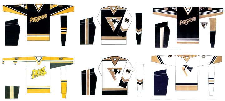
A nickname jersey proposed before it was "cool"
These are some of the hand-drawn options that were considered during the design process. Note that Vance Wright Adams came up with a "PENS" jersey long before those "BOLTS" and "SENS" jerseys ever became a reality. And what do you think of the more realistic looking penguin trapped inside the gold triangle?

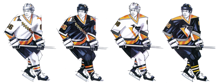
Vance Wright Adams proposed the Penguins use 4 jerseys
According to a video produced by the Penguins to introduce their new look, VWA actually proposed four jerseys that season — two homes and two roads. The NHL wasn't too keen on that, of course. But those four sweaters might've looked a little something like what you see above. Really like the black one on the right!

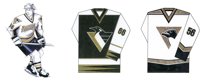
Vegas gold was a possibility long before it was a reality
And here's proof that Vegas gold was in the running long before the third jersey it was introduced with in 2000. That third jersey, by the way, resurrected the classic skating penguin eight seasons after it was retired. Only two years after that, the new streamlined penguin was relegated to the shoulder patch by owner Mario Lemieux. And when Reebok came along in 2007, it disappeared from the uniforms for good, ending a 15-year run.
See more concepts and sketches from Vance Wright Adams
You can find more high-resolution uniform concepts and sketches from Vance Wright Adams by visiting their website. I highly recommend it. I also have to send up a huge thanks to those guys for posting their old work. It's not often we get to see this stuff but always a treat when we do.
Vance Wright Adams is also responsible for creating the AHL's Wilkes-Barre/Scranton Penguins logo as well as logos for a number of other teams.
Now I'll leave you with the video the "Back-Checking the Penguins" video produced by the team to launch their new look back in 1992.


Reader Comments (20)
Lets just say I was happy when the old logo came back, in the new design. But the process is very interesting, I would have never seen some of those unused designs, so it. Was good info. Nice job.
Awesome!!
At 1:00 in that video, im pretty sure that is the Wilkes-Barre/Scranton logo on one of those jerseys. Terrible to think that it may have become the Pittsburgh Penguins logo... ugh..
I feel like this is a case of the fans just just siding with nostalgia, and I don't necessarily disagree. I just don't think this was a bad rebranding, but Pittsburgh fans probably felt a strong identity with what they already had. I feel bad for whoever is tasked with rebranding the Dallas Stars right now because I'm anticipating the fans to have a similar reaction. They've had only one logo in their history and they've had it for 20 years. It's going to be hard making them embrace something new. I look forward to seeing what they roll out though.
The logo design always reminds me of HC Slovan Bratislava logo. While introducing this eagle design, the team denied any connection to or inspiration by Pens logo. What do you think?
http://download.ksd-team.com/hc_slovan.jpg
btw, HC Slovan Bratislava is Lubomir Visnovsky's KHL team
I was always a fan of this logo, and not that I don't like the skating penguin. To me it seems that most Pens fans like the logo but did not like the change. Especially after 2 cup wins, it was poor timing.
I grew up with both logos and am equally happy with both. I wouldn't be against a return of this logo on a 3rd jersey.
Always liked this Pens logo. Maybe not as much as the skating penguin, but still, it's pretty sleek. Sort of wish they still used it as a shoulder patch on their current set, though.
As a Pens fan, this is pretty cool to see. Thanks for posting it. The wordmark in the concepts is something the Pens actually did use on a lot of apparel (not the shortened version, though). I think I still have some old stuff with that wordmark. Also, Brad, you're correct - that looks awfully like the Baby Pens' logo.
Aside from the weird alternate sweater we wore, I actually have always liked the simplified Penguin and I wish they wouldn't have phased it out entirely.
NOW!! if they can get rid of the Babyshit Gold & go back to the original colors
Brad / Andy - that looks like an early version of the Baby Pens logo, if you look at the designer's website, you'll see that they designed the WBS Penguins logo as well.
I remember that logo floating around prior to this rebrand, I think KDKA used it for their post-game show and/or Pens news segments. If I recall correctly, there was some sentiment at the time around Pittsburgh that the Pens should've used that for their primary mark. Glad it went to the Baby Pens though.
Any news on a another change of jerseys with the Pens? I hate that they still use the same template as Ottawa. No team should still use the original Edge templates.
As a Penguins fan...this was the worst embarrassment of a logo I could ever imagine. It was a nice read, but I firmly hope that that logo (and all of the designs that went with it) stay firmly stuck in the 90s.
It would've been awesome if they would've been able to use 4 jerseys, especially the black version of what was the home jersey then. It's cool to see what could've been, I'd like to see this from more teams.
Did pressure from the Bruins force them to change to Vegas gold?
I've never understood the extreme dislike for this logo. I much prefer this logo to the current skating penguin. I started buying jerseys last year and bought Penguin jerseys in my order of preference: #66 black "flying penguin", #10 white "flying penguin", #87 black current, and just recently bought a black diagonal Pittsburgh without a #/name. I know Mario dislikes the logo so I know it isn't coming back, but I like it.
I was 17 when the Pens made their change, and while I liked the old unis with the skating penguin and the gold upper sleeves, I didn't mind the new ones. I hadn't been a Pens fan for particularly long, though, so it wasn't like there was any long-time attachment to it (as a Detroiter, I grew up a Wings fan, after all). But, by the time Mario retired for the first time, I decided I'd rather have the skating penguin back, and I really wanted to get one of those gold-sleeved jerseys (I eventually got a black one).
It's interesting to see that the Pens' 1993 home and road jerseys had their opposite-color counterparts in the design phase.
@ MP, I don't think the Bruins had anything to do with the change to Vegas gold! I do know that when the Pens first changed from Blue/White to Black/Yellow Gold '79-'80 season that the Bruins protested! However they lost that protest due to the fact that the Pgh Pirates Hockey Club (1925-1930) wore Black/Yellow Gold while the Bruins in that same era wore Brown/Yellow Gold. As far as the Pigeon logo goes and Chris can tell you (from my many posts about it....LOL) I cannot stand that logo and am grateful that it's dead and buried. Yes it's neat to see the concepts/ideas but..... I have much love for the B's, Hawks, Wings, Habs simply because their logos are their identity (those logos haven't changed much, a tweak here a tweak there but same idea). Not trying to take a shot here but look at the Canucks, They've had what 4 or 5 different logos/color schemes in their 40 seasons, what is that teams identity?
It's pretty awesome to see the vegas gold and nickname'd jerseys were conceptualized this early. I'm a fan of both logos, so I won't get into that debate.
I'm an art director at a Pittsburgh design firm right now, and I can't imagine how awesome it would be to have a client like the Penguins!
Taken from the website: pittsburghhockey.net
Hanging up the Skates
Gary Adams, an artist with Vance, Wright & Adams Design Group, came up with the "corporate-style" logo that was used on the shoulder patches until the start of the 2007-08 season.
Adam's said new Penguins' owner Howard Baldwin wanted something more "marketable" and even considered changing the name back to the Hornets."
"Baldwin said: 'They're gonna kill me for changing the logo, why not the name?' " recalled Adams. "We even looked at replacing gold with the Vegas Gold color scheme."
The design was met with skepticism and superstition. Loyal fans thought the logo change was a Baldwin gimimick simply to generate money in jersey sales. Others, including Gessner, thought the logo change would ruin the Pens' mojo.
"They just won the Stanley Cup two years in a row and they wanted to change the logo?" recalled Gessner. "I was stunned and saddened. They were really on a roll and they decided to change horses."
Hate the pigeon logo, the baby shit gold is dull and lacks the
Boldness of the pittsburgh (yellow-gold).
Also, I like all pittsburgh teams Steelers / Pirates/Pens to have the same
Colors.