Heritage Classic Uniforms Unveiled!
 Thursday · Nov 28 · 2013 | 10:47 AM PST
  33 Comments
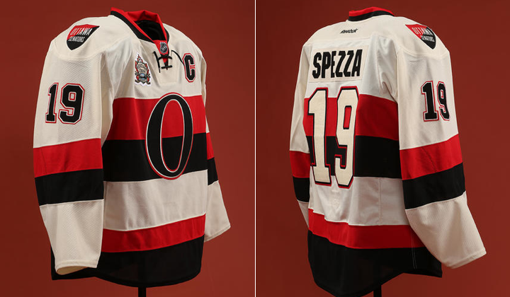
 Senators officially reveal new outdoor jersey
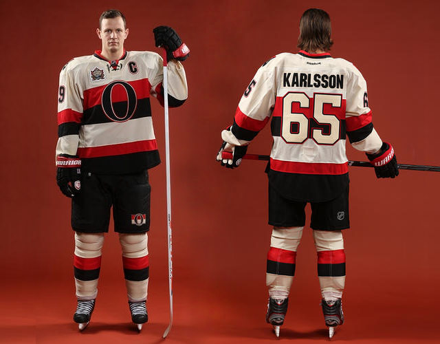
The Ottawa Senators unveiled their 2014 NHL Heritage Classic jersey at a special press event this morning in Ottawa. And it looks even better than it did in yesterday's leaked photo.
In essence, though, it's nothing more than a light version of the black Heritage jersey the Sens debuted two years ago — which is all it needs to be. Here's a look at the full uniform.
The third Heritage Classic will take place at B.C. Place in Vancouver 99 years after the original Senators club met the Vancouver Millionaires for the 1915 Stanley Cup series. The Millionaires swept them. Will history repeat itself this winter?
We were treated to a few sneak peek photos of this jersey over the past week, but one aspect we hadn't seen was the shoulder patches. They are, of course, the same as what we find on the black jersey. The team's name in English on the right shoulder, in French on the left.
Canucks will reprise Millionaires sweater
The other big news to come out of this morning's announcement was confirmation that their opponent, the Vancouver Canucks, will indeed bring back last year's Millionaires jerseys for the big game. Jason Spezza and Henrik Sedin were on hand to model the throwback-inspired sweaters.
 Photos from Ottawa Senators (via Instagram)
Should be a great-looking, stripe-filled game! And I'm looking forward to being there.


Reader Comments (33)
I love that Vancouver uniform. I'm an Islanders fan, but I think I'm going to pick up a Millionaires jersey forsure.
Different color numbers on the back and on the arms is kind of strange, i like it though!
Beautiful, just beautiful to both. Sedin is still missing the heritage classic patch on his chest. Had Reebok put these out in pro model an the old 6100 CCM cut, I would have bought both. Sadly Reebok has ruined the hobby for me.
Vancouver should make that their permanent jersey, maybe with minor modifications.
I've produced a series on the defunct teams for another website; by accident, I nearly copied the Senators' Heritage Classic whites. Oops.
Can someone please tell the Senators to use these and the black alternates full time? Once again, I say they have the opportunity to brand themselves as the "Original Seven" team.
Amazing jersey. I really hope this leads to Ottawa switching to this an the alternate as the full time home/road set.
Perfect set-up, really looking forward to the game now.
Love the Sens' jersey!
boring! I understand the concept of the game but I still find it boring.
Now that the Sens have a matching home/road jersey, can they make these their full time jerseys?
Interesting that they go with the cream numbers on cream jersey. Different but a good different. Look sharp. Would like to see them make a full switch to these and their current thirds full time. The millionaires jerseys also sharp. Like to see teams use unique colours for jerseys and not the typical blue black or red.
no patch on the vancity unis?
Anyone else just wish Ottawa would adopt this look full time already? I know a giant 'O' is not really much of a primary logo, but it's historically accurate if anything. I really like it.
why haven't the senators made their black thirds and this white one their official set again? would be the best looking team in the league.
Vancouver was smart to reprise the Millionaire jersey, those were hugely sought after after releasing them last year and tough to find. They will sell, well, a million of them. Ottawa's reversal of the Big 'O' jersey turned out really well. Good moves by both franchises, for sure.
I think if the Sens keep this. They will be in the top 5 best dressed teams.
I agree, a full switch to these would be unique and much needed.
I like the Sens' jersey. Vintage white is kinda like circular logos - overdone around the league, but it's overdone for a reason (because it looks good). I'm not as big a fan of the Vancouver jersey. I appreciate the history behind it, of course, but, from a purely aesthetic perspective, it needs a little more color.
The senators' heritage set will become their regular in a few years I believe.
Ottawa should just go to the third as the home and this as the away and leave it and never change it again. These are amazing and it would be the best set in the NHL. Im a Sabres fan and cant stand Ottawa but man they would look good in those.
I like them both. I think a wider red stripe on the bottom of the Sens jersey would have looked better. The bottom cut of the Reebok edge jersey doesn't work well with the vintage look. I have mixed feeling on the "vintage white". It works well on these jerseys but traditional white would look even sharper. I'm not a big fan of either team, but I wouldn't mind owning either of these jerseys.
Forget about a Heritage Classic being played in a retractable domed stadium in rainy Vancouver. This is going to be a BEAUTIFUL uniform matchup. Like many others, I would love to see the Senators ditch the "Mark Messier" 3D senator and uniforms for the classic O uniforms. Just change the back numbers on the whites to black and change the off-white to regular white.
As for the Canucks, it would have been great if they had started their NHL existence in the Millionaires' colours with the original skating Johnny Canuck on a similar V in the background. This would have made the Canucks stand out among the other NHL clubs. That's not to say I don't love their classic royal blue and kelly green look.
Both are absolutely beautiful!
I to, would love to see the Sens pair full time, but for that, I think regular White would be better.
Think I might be getting the Canucks one
Both jerseys look cool. The Sens' jerseys were as expected but still are appealing to me. I wouldn't mind if the Canucks changed to those colors right now. And for anyone who wants to know, the Ducks and Kings Stadium Series jerseys are expected to be revealed on Tuesday.
That shield shoulder patch doesn't belong on such a great jersey. It's cheap and boring. They have lots of great marks to choose from without slapping that thing on their heritage jerseys.
Both jerseys look great. I'm just getting sick of the "heritage white"/beige thing. The colour that they're trying to emulate only appeared after they discoloured from age.
Yep , these and their 3rd HAVE to become the full time road/ home set
Definitely like the Sens jerseys, but not a huge fan of the Canucks ones. They're decent but not great. I wish the Sens would use these and their black 3rds full time. Also, speaking from personal experience, having both teams wear jerseys with dark, horizontal stripes can be confusing for players, especially in peripheral vision. Weird note.
I can't believe I'm actually stringing these words together, but I like those Senators jerseys.
This should become their new alternates, screw the dark version of this unform.
Buying one for sure. Thumbs up.
Those Sens jerseys are sick. I agree with everyone who says they should become the regular jerseys along with the black ones, why not? the Roman theme is cool and everything but it really doesn't tie into Canadian history or culture very well. This is a perfect nod to the original Senators.
Those Sens jerseys are great. The current Ottawa home and road jerseys are very bland and minor league looking. These new jerseys and the black ones should be used as the home and aways.