Several recent stories require follow-ups so I'm squeezing them all into tonight's post.

Sabres release 2013-14 third jersey schedule
Believe it or not, there are still skeptics out there. Those who don't believe the gold third jersey unveiled by Buffalo Sabres in September was the real deal. Those who thought that Steve Ott business was just a prank. Wishful thinking, I suppose.
Either way, this faction will finally and officially be proven wrong on Sunday when the Sabres debut their controversial new threads. The team released its 10-game third jersey schedule today. You can see it in the graphic below.
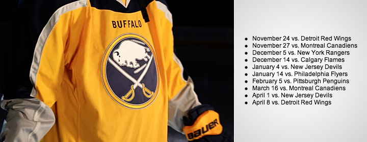 Photo from Buffalo Sabres
The schedule begins and ends with Detroit, a new divisional rival for the Sabres in the Atlantic Division. The jersey will not see action on the road this season.
Before I move on, it should be noted that the genesis of this design is explained for the first time in today's press release. Take a look:
The third jersey, which was revealed via the team’s social media platforms in September, was designed by the Sabres’ creative team in collaboration with Reebok. Challenged by Sabres ownership to use gold as the primary jersey color for the first time in team history, the design team looked at jerseys and uniforms from across the full spectrum of professional sports for inspiration. The result was a two-tone jersey with gold as the primary color on the front and navy blue on the back. This design concept is believed to be a first for the NHL.
"Believed to be a first"? The NHL's jersey history is fully documented. There aren't any mysteries. (In fact, if you've never been to NHLUniforms.com, I highly recommend it.) Point is, this is definitely a first, for better or worse.
Now, to Ottawa.

Senators start offering up Heritage teasers
We're now a week away from the Ottawa Senators unveiling of their 2014 Heritage Classic jersey and the ancipated teasers are well underway. In fact, we've gotten two this week.
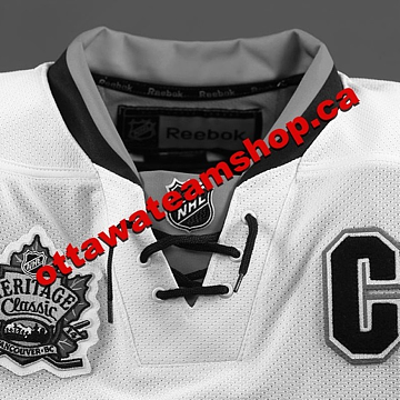 Photo from Ottawa Senators (via Facebook)
This photo (right) was posted to the Sens' various social media platforms, including Facebook, Twitter and Instagram.
It's a gray-scaled photo of the top portion of the sweater. Because of the lack of color, though, it's tough to tell whether the jersey is white or "vintage white" — but I still made a vintage white graphic for the top of this story.
I'm not sure that's a great color for a jersey, however, so it's probably white in reality. A future teaser may answer that question for us before next week.
The "C" on the chest is the only element that gives anything away. But so far, it's looking like a reverse of the black Heritage third jersey the Sens have been wearing for a couple years.
In other words, it'll probably look a lot like this concept by Mat Ware.
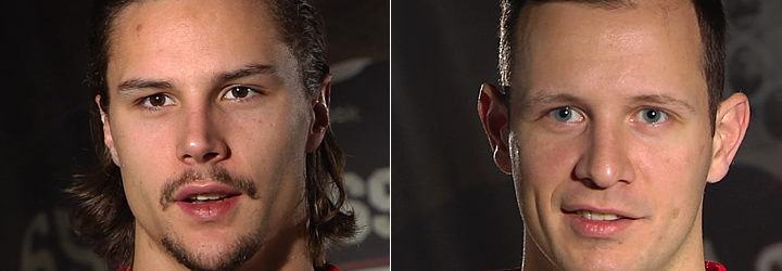
But this wasn't the Sens' first teaser. On Tuesday, they gave us a bizarre video of Erik Karlsson and Jason Spezza recounting their reactions to seeing the sweater for the first time. As teasers go, this was one of the worst I've ever seen. And there have been some bad ones this year.
 Video stills from Ottawa Senators
Nonetheless, it's worth reporting, so let's get through it. Erik Karlsson went first. He said:
It's different. I think it looks good with the color that it is. And it actually looks like it is old. The combination is a little bit older than probably what team uses nowadays. The first time I saw it I right away thought of something old. But still good looking.
I like it. I like it a lot. I think it tells a lot of history with the way it looks. I think the numbers on the back are looking a little better I think than maybe the red and the white. It's a little more special. And everybody on the team says the same thing. It's a great looking jersey that right away gives away a lot of history.
Based on Karlsson's description, it doesn't sound as similar to the black jersey as we're expecting. He makes specific note of how "old" it looks (perhaps it could be vintage white after all?) and the numbers on the back (different from the third jersey?).
But then again, I'd be very surprised if Karlsson put as much thought into hockey sweaters as we do here, so I don't want to put too much stock into what he's saying just yet. The photo below was shown while Karlsson was speaking.
 Video still from Ottawa Senators
Could it be anymore clear?
Then Jason Spezza expressed his take:
It's something that, to me, seems like a hockey jersey. It's a traditional jersey. I like the way it looks and I think it's been good for us. It's a great jersey. I think they've done a great job with it. It's something that the players will like, the fans will like. It kind of ties in to the whole "heritage" aspect of it all.
I think whenever you can take a modern jersey and put a bit of a traditional twist to it, I think it's a cool thing. It's something you can tell is well thought out. And it's nice to tie to the two generations together.
What stuck out to me was "it's been good for us." Yet they've never worn it before. So either it is the reverse of the black jersey, or Spezza misspoke. The following photo was shown while he spoke.
 Video still from Ottawa Senators
When I first watched this video, I was thinking the jersey could be full-on barber pole with stripes top to bottom. But today's teaser photo killed that theory, of course. In fact, there's not a single stripe visible in the teaser.
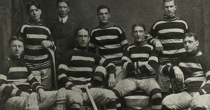
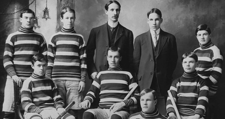
One more thing caught my eye. This old Senators sweater was also shown during the interviews.
 Video still from Ottawa Senators
Is it possible the Sens could revive this script on the new sweater as opposed to falling back to the big black "O"? It would definitely stand out and wordmark-based throwbacks seem to be trending lately. What would you prefer?
 Video still from Ottawa Senators
Canucks sticking with Millionaires sweater?
While we're on the subject of the Heritage Classic, an email sent to Vancouver Canucks fans today regarding tickets was decked out in Millionaires colors. That combined with the lack of any talk about a new Vancouver jersey is making it look more and more like that's what the Canucks will wear on March 2. And that's definitely a good thing.

More clue-laden Stadium Series gear shows up
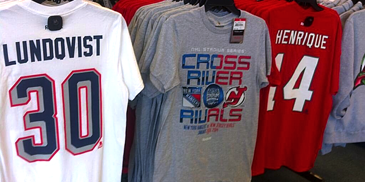
Since we last spoke (two days ago), more 2014 NHL Stadium Series gear has appeared online. First, we've gotten front and back looks at the New Jersey Devils' T-shirts. Take a look.
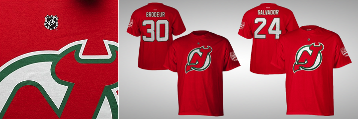 Photos from Shop.NHL.com
This version doesn't make use of the chrome logo, as you can see. Turns out this series of shirts includes two versions for every team — one with chrome, one without. Here's what I mean.
 Source unknown
This might be a good time to point out some news about the Devils' Stadium Series jersey. Beat reporter Tom Gulitti tweeted the following on Wednesday morning.
So it sounds like those St. Patrick's Day jerseys will be returning — and perhaps "futuristic" doesn't accurately describe all seven Stadium Series sweaters. Time will tell for sure.
Now on to more treats from Shop.NHL.com.
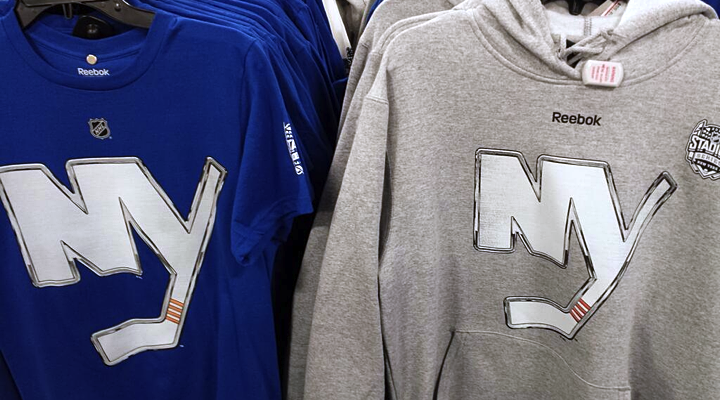
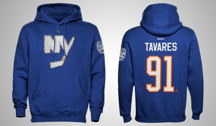 Photos from Shop.NHL.com
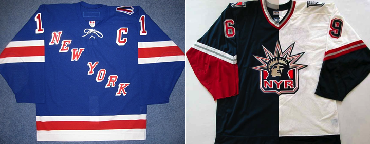
This blue hoodie gives us a look at the Islanders' elongated numbers — a lot like what we saw Tuesday with the Rangers, Blackhawks and Penguins, but not the Devils, interestingly. And if you're still wondering about the California clubs, they too have elongated numbers.
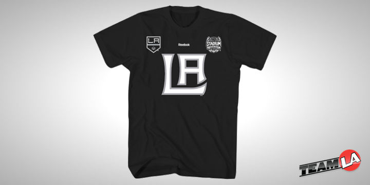
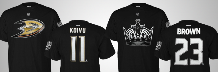 Photos from Shop.NHL.com
Of course these shirts are confusing because both are black. So maybe these shirts don't say as much about the jerseys as we thought. Plus, we already know the Ducks will be wearing orange. The question then, is about the numbers. Will they look like this after all?
Let's wrap this thing up with a few unusual Stadium Series shirts.
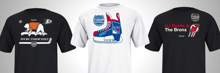 Photos from Shop.NHL.com
What's with the "Hockey Bear" on the Ducks shirt? Is that a thing I'm unaware of? (UPDATE: Everyone is telling me it's a nod to the state flag of California. I can see that. And it fits thematically with the others.) The other two at least make a little sense to me.
Anyway, these jerseys should be unveiled soon so we can stop all this speculating.


 55 Comments
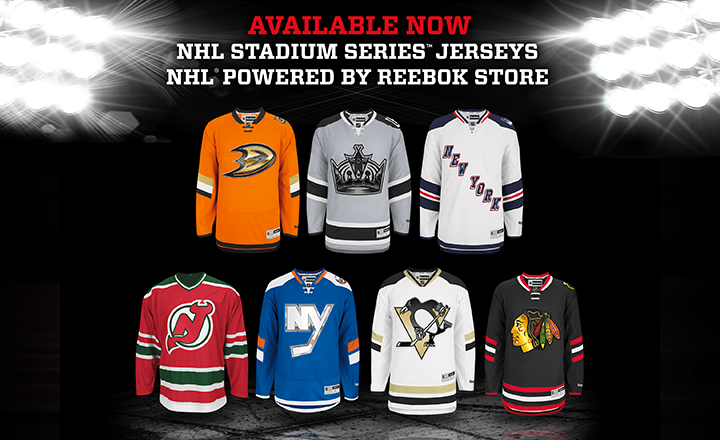 Screen shot via NHL