


All 7 Stadium Sweaters Revealed
 55 Comments
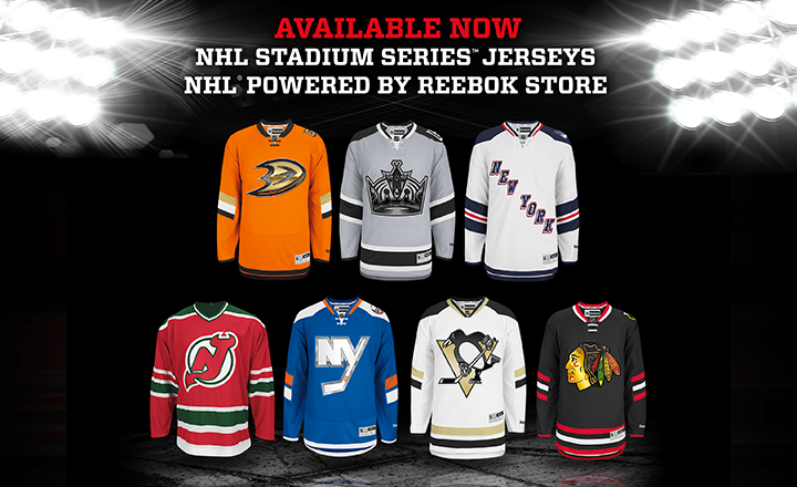 Screen shot via NHL
Promotional email seems to confirm Devils throwback
An email sent out by the NHL Store in New York City shows the seven jerseys that will be worn for the 2014 NHL Stadium Series. And interestingly, it includes a photo of a non-game version of the New Jersey Devils' 2010-launched throwback sweater.
Check out the screen shot above, courtesy of Icethetics reader Ryan Holmes. We know it's a "non-game version" pictured because since 2007, every NHL game jersey has featured that little NHL shield on the collar. No exceptions.
Of course a game version does exist. The Devils have worn it a couple of times in recent years for St. Patrick's Day games. But because this graphic doesn't show us the exact jersey the team will wear, we're still left to wonder whether they've really avoided the chrome crest catastrophe.
I'd say one of our New York-area readers should pop into the store and snap some photos for us, but in all likelihood the jersey pictured is probably the one you'll find on the shelf. It just won't be the one the Devils wear at Yankee Stadium on Jan. 26.
All that aside, what do you think of seeing all seven of them together? Should be easier to compare and contrast now.

Reader Comments (55)
I like Anaheim and Islanders most. Colors really stand out in this photo.
As an isles fan, I was pissed at first, now I can see that they all could have been way better and think that the isles jersey is kinda flashy compared to most of the chromed out messes. At least the blue color will be easy to see and isn't super bland like the Ducks or dull in color like the Rangers. The Rangers really should have pulled the old lady liberty logo since it was already partly chromed out and would have looked real good because it did have a "futuristic" look to it. The Penguins jersey is nice and so is the Kings, Blackhawks and Rangers are kinda dull and the ducks looks... well... traffic cone-ish and the Devils still refusing to have a little fun.
Mediocre at best. Islanders have the best one by far. The others look like cheap, discarded design options from the past. I know the NHL doesn't want a "classic" look, but are people going to break the bank to get a jersey that looks very similar to the ones they already own? I hope not.
Wouldn't it have been a better layout to have the three New York teams together on the top row with the Rangers in the middle? Then the "pairs" could be side by side on the bottom row. Just a thought, make it more together.
I like the Rangers and Kings the most but the rangers should have used the liberty logo and I think the chrome and numbers ( slanted and longer) are stupid and should never be used again
Boo on the Devils if they don`t do anything! Sure, the Stadium Jerseys aren't great but they will look worse if they don`t look the part.
Yes, the Devils are wearing the Christmas Trees because Lou doesn't do chrome cookie cutters.
That jersey has never been release as a Premier replica so that's why they only have the old CCM 550 replica in that picture.
Seeing them all together, not as bad as I originally thought. But man, that Rangers jersey is just begging to have lady liberty on the front. Such a missed opportunity.
Every one of those jerseys has the slanted half-sided stripes. The Devils jersey looks so out of place with the rest of them. Geez, Lou, it's ONE time you have to break tradition. You'll probably never be asked to play in an outdoor game again, why not milk it for all it's worth?
The retail jerseys are missing the stadium series patch on them. Also the retail jersey logos and lettering on the Rangers jerseys are quite dull and really doesn't "POP" at all. Another epic fail by Reebok and the NHL.
Hey Chris, didn't the Habs wear their old white CCM alternate jerseys without the NHL logo on the collar back during their centennial season?
Will be around Rockefeller Center for a doctor's appointment in an hour, so I will drop by the store right after I'm done
Seeing them together like this, it really bugs me that the Ducks logo is high on the chest then the Kings logo. These are all 'interesting' jerseys for a one-off event, but I hope none of them (or their ilk) slither their way into regular season use. However, I've always wanted LA to have a gray/silver alt and with a little tweaking this could be great - dump the chrome and futuristic elements. I'd also like to see Chicago return to a black alt.
One more thought - as bad as the Ducks jersey is, is it really that much worse than their usual awful minor-league set? Less black in California please.
NOBODY BUY THEM!!!!!!!!!!!!!!!!!!!! IF THEY HAVE NO SALES NEXT YEAR THERE MIGHT BE SOME DECENT JERSEYS!!
I would have given a thought to the Ducks' jersey had they put actual waist stripes around it. Of those, the Isles' jerseys are the best of an otherwise average, at best, bunch. Seems like everyone decided to play it safe than think outside the box, especially the Rangers and Blackhawks.
When I see them all together like this, I think the Penguins, Blackhawks, and Rangers win. Their Stadium jerseys are closest to normal for their teams.
Maybe if the Islanders had stuck to their normal crest instead of that big NY monogram, they'd be in there, too. Then again, seeing that NY along with the Lou-ain't-changin'-the-NJ logo and the Rangers "New York" diagonal, selling up the regionalism makes more sense.
That California game is gonna be ugly. The Ducks should have used an eggplant-and-jade throwback design instead of Screaming Flyers Wannabe Orange, and the Kings are wearing Monroeville Zombies jerseys.
And am I the only Pens fan here who'd like to claim this template as a new regular jersey? Just wrap the slanted arm stripes all the way around (the Pens have a long history of angular sleeve patterns), finish that gold collar stripe in the back (that bugs me), and ditch the Stadium-specific metallic crest and stretched numbers. The Pens get a great new look, and they wouldn't be sharing a template with friggin' Ottawa anymore!
I give Lou credit for sticking to his guns, but at this point - he's the negative nancy at an ugly sweater party that just doesn't want to participate.
And no, that's not an analogy, this really is the NHL's ugly sweater contest.
I was just at the NHL store yesterday. They do not have the Penguins or Devils jerseys hanging.
just my personal order of preference......
1. LA Kings.
2. NYR.
3. New Jersey.
4. Pittsburgh Penguins.
5. Chicago Blackhawks
6. NY Islanders.
7. Anaheim Ducks - which will always be one of the damn ugliest jerseys EVER!!!
I dislike the Isles & Ducks the most. Orange just isnt a great look for them, the OC screen print patch is so cheap looking, at least put it on both sleeves & the hem is too plain w/out a stripe. I'll give the Isles points for being very different but idk I'm just not a fan of the NY out of the normal logo crest. The Kings are a bit too dark but works, Rangers as every1 mentioned need Lady Liberty, but I really like the Hawks back in black, Pens design is cool, & I like Jersey sticking to the old school but they could've had a bit more fun with it. Maybe I'll change my mind when I see them on TV.
Well its time for my two cents and its not even worth that much but here goes. Order fro best to worst.
1 Devils-Always loved that uniform. I know they didn't change and that upsets some people but I think it is a beautiful jersey and wish they would go back to this scheme full time.
2-Islanders- Its simple but somewhat beautful.
3-Ducks- When it was released I wanted to throw up, but I think it was because of the model they had wearing it. It looks simple and maybe could use some more striping but the color pops.
4-Penguins- I like the design but would have loved to seen the yellow instead of vegas gold.
5 Rangers- Simple but looks kind of classic.
6-Kings- Kudos for trying something new in the grey but the grey is what ruins the jersey. It looks washed out
7- Blackhawks- With a team that can be so colorful, why just use a black one that is dull and we have pretty much seen in the past.
Overall pretty disappointing but maybe not as bad as I originally thought.
Bravo to Lou and the New Jersey Devils for standing up to Reebok. I wish my favourite team, the Calgary Flames, would do the same.
It's likely for the stadium patrons' benefit, but now that all are laid out, the crests are disproportionately large and unsightly, especially the Kings and Penguins.
It actually reminds me of some Superman t-shirts of all things - when the logo is too big, it just looks wrong
wait so is New Jersey getting through this chrome treatment unscathed? if so, who did they have to pay-off to get this special treatment?
When they're all viewed together, Anaheim's looks really, really plain. I guess the orange was supposed to make it stand out, but without significant striping, it just looks like a bad practice jersey. Same goes for the Islanders and Rangers (though to a lesser extent); they all look like cousins of that awful kit the Oilers had around 2007 . I'd say the LA, Chicago, Pittsburgh designs are the best overall, because they actually look like hockey sweaters.
Is it only me or does the Rangers jersey suck compared to the rest?? Lady Liberty Logo is all I have to say about that.
I like the Kings jersey the best, but the rangers/islanders will be the best looking game, the Ducks really blew it for the Kings. The Devils jersey just looks awkward and out of place without any "futuristic" aspects.
If I had to rank these, I think it would go something like this…
1. Penguins: A total Upgrade from their current jersey set. The Vegas Gold compliments the Chrome Logo look nicely. Only thing I'd change is have the arm stripes wrap completely around.
2. Kings: It's funny to think the Kings have never worn an all grey jersey cause they pull it off very well. I hope it sticks around, the Third Jersey potential is great.
3. Blackhawks: I've never really liked Chicago's black jersey, I've always preferred the black one they wore in the Winter Classic. Compared to the rest of the Stadium Series Jerseys though, it gets a pass.
4. Devils: Considering New Jersey's conservative stance on jerseys, this was definitely predictable. It does however look very out of place with the modern look the rest of these jerseys have.
5. Rangers: It's not bad, but personally, I think the shield logo might have looked better here or perhaps they should have mimicked the look of their New York Third Jersey. The blue arm stripes are way too broad and the lack of waist stripes hinders the look.
6. Islanders: Definitely the most Out There of these Jerseys, but still better than those god awful black third jerseys. Perhaps if they had mimicked the Penguins' look by adding waist stripes this jersey would have worked. Hopefully the NY logo sticks around for a future third jersey.
7. Ducks: So much potential to pull off a good orange jersey and they missed the mark entirely. Perhaps with waist stripes or a shoulder yoke this would have looked better, but it just looks way too plain.
That's about All I have to say to these.
I was just about to share pictures I took in the store today; but you scooped me! :)
I have to say, as an Long Islander who moved to Chicago, I liked the Isles sweater (can I still use that term given what Reebok has done to them????) was nicer in person than I had expected - the chrome works nicely as is really only effects the silver outline of the NY. As a Hawks fan since 2005, I have to say, what Reebok did to their amazing embroidery is a travesty - if you know what the Hawks normally have, this will make you cry. I also don't feel the "Coors Can Chrome" effect works on the crest.
Well, that's my $0.02. Thanks for sharing though!
I'm mad at Lou. This was the once chance to do something special for the fans and give them a cool souvenir, a one-off jersey for them to enjoy for this special event. The money that could have been made off this jersey alone... this is why I hate the Devils sometimes, the fans aren't allowed to have any fun whatsoever.
The Blackhawks have more tradition in their sweaters than the Devils and their Stadium Series jersey didn't come out half bad. The Devils could have had a jersey with only a slight twist to their classic greens, but of course, Devils fans aren't allowed to have fun or enjoy anything. Thanks Lou!
The Ducks will look great on the ice. The black helmets, the black shorts and the black gloves will 'framework' the orange sweaters so that the orange will really pop out and outshine the dull kings uniforms. Mark my words.
I was at the NHL Store in Manhattan yesterday and I can confirm that the Devils are not going chrome. I also must say that the Ducks jersey looks far better in person than it does in the pictures. I almost bought one but they didn't have the nameplates and numbers in yet to do customs (I wanted a Selanne jersey). Rangers looks better in person too, even if it's just the Hartford Wolfpack jersey with a different wordmark.
I disagree; I like that Lou held his ground and didn't let Reebok screw around with the jersey; he wants the Devils to have one identity and to not have a series of different jerseys like the Vancouver Canucks have had. He won't sacrifice the identity and brand of the Devils just to make a quick buck on a novelty jersey for one game that will never be worn again.
He has stated numerous times that he follows 3 teams to model the Devils after; the Montreal Canadiens, New York Yankees, which he is part owner of, and Green Bay Packers. He follows their models for sustained success, no facial hair stance, tradition, pride, and its paid off considering the Devils are the second most successful NHL franchise in the last 27 years after the Detroit Red Wings.
In the last 24 seasons the Devils have made the playoffs 20 of 24 seasons - 13 times in a row at one point - 19 of 20 seasons with .500 record or better, and won 9 Division titles, 5 Eastern Conference titles, 3 Stanley Cups in that span. So the Devils have a ton of tradition and success wrapped up in their sweaters considering they have only been around since the 1982/1983 season so in my mind their is no need for them to "have fun and tweak them".If it ain't broke don't fix it! Islanders should take note on how its done and stop making alternate jerseys!
It's probably just the fact that the Rangers have never put New York on a white jersey, but it still reminds me of the Sabres special 9/11 jersey.
http://fc05.deviantart.net/fs27/f/2008/151/f/1/Rare_Buffalo_Sabres_Jersey_by_allzquiet.jpg
Still like the Kings jersey and it fits well with their existing brand. I could see a slightly altered version as a good alternate, but I want to see more forum blue and gold one too!
BRAVO Robert G BRAVO!!!! As a Pens fan, I have been saying that about the Pens ever since Howard Baldwin changed the logo/uniform during the '92/'93 season (HATE the Pigeon logo, so glad Mario brought back Skating Pens logo). Not saying the Pens '91/'92 Stanley Cup uniforms would be on par with Chi/Det/Mtl as far as being Classic but when you change logo/uniform after winning Back to Back Stanley Cups, it looked like a money grab!! Like I said in a previous post! Vancouver has had so many different logos, so many different uniforms, so many different color schemes over the years that they have NO true identity
Seeing all of these jerseys together they're all pretty boring.
Nothing too exciting here.
All of these could easily be normal everyday jerseys during the season.
I was expecting something more special for the outdoor games.
Robert G is the MVP of this comment section. A noble defense on behalf of we, the disciples of Lou Lamoriello.
I agree with the guy who said that this is one really big UGLY CHRISTMAS SWEATER party... The Rangers is passable, The Ducks is an upgrade from what they regularly wear, But all the chrome is an eyesore, particularly since all the graphics are plastic/heatpressed/not embroidered.
The Devils are the only ones who actually got anything right in all of this. Good on Lou for saying "not no, but HECK NO" to this ridiculous gimmick. Classic is hot. Throwbacks, or faux throwback styles sell. I just hope I can get my hands on a Devils Xmas Tree sweater in an authentic 58G or 58+G so I can put Cory Schneider on a sweater.
I wish the Ducks would have used an orange Mighty Ducks jersey instead. The Kings are not bad at all. I like the idea of a grey jersey for a change. As for the Rangers, I would have liked to at least see them remove the side panels and put a waist stripe on the jersey that matches the arms. Even with the 'NEW YORK' script, that would have been much better and I think it is a nice change to see the 'NEW YORK' script on a white jersey for a change but, this jersey is perfect for the Lady Liberty logo. I wish they used that instead. I understand people wanted to see the Devils do something new. I don't think it would have been a bad thing but I think that it is awesome that they are sticking to tradition. These jerseys are alright and I do like that they are new jerseys, (No pun intended.) but seeing the Devils bringing back the throwback is awesome. The chrome logos are alright for a game or two but they just aren't the same. The Islanders' jersey is a decent look for a game. I don't mind the chromed 'NY' logo. I think it pops on the blue jersey. It's meant to be futuristic and I think it accomplishes that without looking ridiculous. The Penguins jersey is better than their road jersey in my opinion but come on Pittsburgh, go back to the 80's or late 70's jerseys. As for Chicago, they should have pulled a Lou Lamoriello and just said NO. The jersey is alright but the chrome does not work for that logo. As for the stripes, they should be complete, especially on an Original Six team like Chicago. It would have been awesome to see the Winter Classic jersey come back or even the 91' throwback but for one game, this isn't that bad, though the jersey this one is based off of is a lot better too.
The Ducks jersey underwhelms. For a team that had always been out there with wacky angles and curves on their jerseys, the only thing this accomplished is the most plain and uninspired jersey in their collection.
If you straighten the slanted arm striping and throw on the Gretzky era logo, I wore that exact Kings jersey way back in tyke and again in bantam or peewee. This is only new to the NHL. That said, trying grey is long overdue.
I like the Rangers jersey. I think a Lady Liberty of shield would make it look more plain and uninspired like the ducks.
The Devils are no fun. If anything they needed to do something more than any of the other teams to breath some life into their fan base, give it a pulse, a flashpoint to ignite passionate conversations for or against.
I like the Islanders. Any other logo would look out of place on that jersey.
Pittsburgh has a lot of potential to be a really nice new set of jerseys with a little tweaking. Like the Kings, that egregiously oversized crest is going to be a bit of a bothersome distraction on the ice for the players.
Chicago is my favourite. Still unsure about the new hem line and resulting stripe design.
If anything, this set of stadium series jerseys has made me come around 180 on the Senators vintage white jersey that was under the tree for me. Ottawa / Vancouver is going to look way, WAY better than any of these pairings.
Thank you Mr. Lamoriello for not taking part in this pathetic gimmick. A classy guy and a classy organization.
Although the Devils retros are really, really awesome, Lou screwed up by not playing along. The retros look out of place with the theme of the Stadium Series, especially if there is no Chromo logo.
These are the same jerseys the Devils have used before for normal games, they are the 1st team to break the tradition of teams getting a new sweater for outdoor games.
Though I don't like or agree with the NHL breaking with the "classic retro" theme for outdoor games, Lou is an absolute fool for using the exact same jersey thats already been used. Marketing failure. Failure for the fans as well.
Just a quick question for all the people who decry these jerseys as a "money grab": Do you not want your favorite team to make money?
NHL store is selling the CCM version of the devils throwback jersey that is available at the prudential center, and guy who works there told me they had to pull the penguins jersey because there was "something wrong with it." Also jerseys come without the stadium series patch (they are sold separately and are sold out at the store) however he informed me if you track one down elsewhere they will put it on for you in store. Blank jerseys are retailing for $200 which is a huge jump from the normal $135 for a blank jersey. They also do not have any lettering for any of the jerseys but expect to get them in mid-January. They do however have about 4 different ranger player jerseys they randomly got in pre made.
DUCKS: went to nhl store in NYC. Jersey looks great in real life. Orange really stands out and screams Anaheim.
KINGS: Keeps with the blackish trend. Like the jersey a lot. I think this jersey would have been better than a purple/yellow throwback. Though could add some purple on sleeves to make it better.
RANGERS: Looks classic. Being a Rangers fan, I like the Lady Liberty colors but could use the Lady Liberty logo.
DEVILS: I like the jersey, but they should have added a new jersey to the mix. Should have added chrome effect in my opinion.
ISLANDERS: like the use of the chrome uniform on the jersey. Like the use of the blue here.
PENGUINS: Needed a "new" jersey. Almost copies road jersey except for a few stripes and chrome logo.
BLACKHAWKS: great job using black but destroyed Reebok's logo sewing. That would have made this jersey 100% better.
As an Islander fan the jersey has grown on my slightly but it's still extremely disappointing and a shame to not have the original logo on the front. I think the "NY" monogram is ugly and won't buy the jersey without it.
I like the Isles one, aside from the name-plate they'll be using. Kings color should be more silver than grey. Blackhawks and Penguins aren't much of a stretch from unis they've had before, though I'd only want Pittsburgh to consider using theirs, or a version of it, as a regular uni in the future. Will the Devils logo not be chrome? I was sure I read that would at least be happening. And aren't the Ducks wearing orange pants as well? As for the Ducks jersey, think about this - how would they look if they used a different crest. Heck, the Oakland Seals (the non-script one) would look 100% better! Anyhoo...
I have no inside knowledge of the process, and I'm a Devils fan. Even though the Devils are an extremely conservative franchise, I'm sure that the team was willing to work with Reebok to develop something new for the outdoor game; however, it seems like Reebok only offered a few templates/styles to work with for these jerseys and they ended up being too radical for Devils management to consider without going too far outside their comfort zone. I'm glad the team stuck by their guns and didn't cave in to Reebok. I'm only hoping that they decide to actually get red and green gloves for the players this time around...
I dislike everything about these stadium series uniform sets, including the templates for the pants that a few of the teams are sharing. They sets are not unique; they just offer giant sublimated crests, more unfinished striping patterns (now with kooky angles!), and they look cheap. Even the Hawks, which seem to preserve the classic look without deviating too much, look like cheap rush jobs because of the chrome effect and unnecessarily angled stripes and numbers.
These are some truly awful jerseys The only one that is passable is the Devils. This series had so much potential. We should have had The Mighty Ducks facing the Kings in vintage yellow, and the Islanders Fisherman playing the Rangers Liberty Head Jersey, and the Penguins in old school yellow and black. Instead we got these cookie cutter practice jerseys. It's very disappointing.
The jersey concepts ( especially for a rush job) aren't that horrible . With that said they are not great either. Best design is Isles by far followed by Ducks and Kings. Worst hands down Rangers. It looks like a cheap knock off projection from China. With my opinions out of the way, here are the facts. People, fans can deal with crappy designs. Eventually a fan will find some positive in a bad design and live with it. The problem here first and for most is the horrible quality of these uniforms, mainly the crest. I have had the chance to have all of the jerseys from the stadium series at my disposal. All the logos on the authentic as well as the replicas are a printed patches except on the non-chromed devils uniform. So as a fan I thought, ok I will just deal with it( just for the stadium series of course) and purchase the ones I wanted( Isles, Ducks, Kings) for my jersey collection. Il use the Islander jersey as the easiest and best example. In the emailed add above all the logos have been edited to look more attractive than they do in reality. So back to the Isles logo, in the photo above the white separates from the chrome outline pretty nicely and cleanly. This is not true when seen in person. The white looks like a lighter grey than the outline grey(silver/chrome) which makes the logo look horrible and cheaper( yes possible ) than it already is. It looks blended and simply like a rush job that was too late to fix. The Hawks logo is so dark in person it does not look chrome at all. The crest looks like the printer was running low on ink. It's dull and lacks color. Now to the name plates on the pre-made jerseys being shipped out by reebok. The name plate on Isles jerseys is so long it is dipping into the shoulder yolks, this is also present with the Rangers jerseys as well. White name bar is dipping into the blue shoulder yolk. I'm sure that is not supposed to be like that, but oh we'll I guess it was a rush job indeed. When it all comes down to is that fans can live with the designs, BUT when it comes down to dishing out 150+ dollars on a jersey it better be good quality. These jerseys are not. The shoulder patches have been plastic print on crap ever since reebok took over. Now having crappy patched main crests is just not worth purchasing, not giving in to that new wave. See the jerseys in person and you will see what I'm talking about. It's a shame since I don't really hate the chrome series designs(except for Rangers, really bad all the way around,the rest could have still been better/ more creative )that they skimped out on putting a quality product out.