


More on the L.A. Stadium Game
 34 Comments
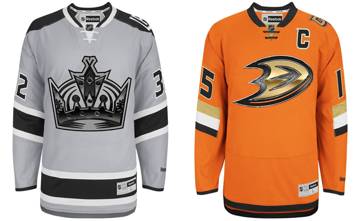
Taking another look at the new Kings, Ducks uniforms
It's been a bit slow around here lately. Not necessarily because there's nothing to report, but rather I've been a little busy away from the blog. While I try to make time to put together a few more posts this week, I wanted to look back at the Ducks/Kings Stadium Series jerseys.
First, the images above are the official artwork from Reebok. They show the full jerseys, including the waist stripes (or lack thereof) which weren't visible in the images posted on the blog last week. The TEAM LA Store is currently taking pre-orders online if you're interested in buying.
I also wanted to do a bit of a link dump. Both the Ducks and Kings shared a lot of information related to these Stadium jerseys.
- Ducks' Stadium Series jersey press release
- Kings' Stadium Series jersey press release
- Kings' Stadium Series jersey: Q&A
- Kings' Stadium Series jersey: The Facts
If you're not interested in reading through all those articles, I've pulled a few fascinating facts below.
Stadium Series jerseys available in January
While you can currently pre-order any of the three unveiled Stadium Series jerseys, you can't take any of them home yet. According to the Ducks' press release, the jerseys will be available in stores and to ship in January. The Islanders' Stadium Series jersey order form, says "early January." No specific date has been made public yet — that I'm aware of.
Elongated numbers intended for fans in the cheap seats
The Kings' "The Facts" article explains the elongated numbers on the jerseys.
Player numbers on the back of the jersey are enlarged, making them more visible to fans in outdoor venues. Sleeve numbers are angled on five of the Stadium Series jerseys aligning player arm position with visual angles typical for fan viewing of the game in motion.
Honestly? I've never had a problem reading the sleeve numbers because of the angle. Let's just admit this is more about form than function. I guess the idea is that when the player is bent forward with arms outstretched to grip his stick, the angle of the numbers will be more horizontal. I have my doubts.
On the other hand, the elongated numbers make perfect sense now. There's so much real estate on the backs of jerseys that isn't being used. And because these stadiums weren't designed with a 200-foot hockey rink in mind, fans are forced to sit pretty far away from the action. The numbers can't be any wider, so making them taller makes sense.
The chrome crests use "high tech" printing
The chrome logos are cheesy but I suddenly understand the need. From the Kings' "The Facts":
This new technology fuses print and embroidery manufacturing process, allowing the logo to be displayed as a high-resolution image incorporated into the crest. This technology also reduces the weight of the crest, promoting a lighter jersey for improved athlete performance.
Ok, "weight of the crest" again? First the stripes weigh too much (San Jose!) and now it's the crests. Come on. But whatever it takes to make the players happy, right?
The first line of that quote is a crock. "Fuses print and embroidery"? No. Look at the photos. It's a printed crest stitched onto the jersey. Nothing about these crests are embroidered. And that explains the chrome logos. I'm guessing when Reebok experimented with printing crests, they realized it looked cheap.
So the logos required a little digital texture and beveling to give the same impression you get when looking at an embroidered crest. Unfortunately, however, it's probably a safe bet that printed crests are the way of the future when you take cost and player comfort into consideration.
The odd lace-up collar design explained
Once again, we'll turn to the Kings' "The Facts" piece:
The construction of the lace-up collar streamlines the cut and sew cosmetics of the collar for a seamless feel and better wear and performance, while still delivering the timeless style of the traditional hockey visual cue.
Now they're not even trying to hide their manipulation of us. It's just a "visual cue." But if we're being honest, the lace-up collars we see today are form over function anyway. They don't serve any purpose other than aesthetics. Which is fine.
I actually like the look of these new collars. They're just clean and unique.
Stadium Series jerseys were designed in 3 months
Teams usually spend a year or two developing new jersey designs. These were slapped together in just three months, according to Kings COO Kelly Cheeseman (a real name!). He was the focus of the Kings' "Q&A" article. He says the Kings' jersey design was a collaboration between the NHL's marketing department, Reebok, and the team's staff. (Note the lack of fan input. Not unusual, but the design seems to be going over well anyway.)
Feel free to weigh in on these new details in the comments.

Reader Comments (34)
4 comments:
#1: Is that Ducks jersey ever bad!
#2: If the Olympic jerseys had this new-look lace up style, I wouldn't hate those as much.
#3: That ducks jersey keeps getting worse and worse the more I look at it!
#4: Are the players REALLY complaining about a few extra GRAMS of material on their jerseys!? Seriously!?
I feel like Reebok's recent designs are getting unnecessarily technical. A lot of the new features in recent jerseys seem very gimmicky. I understand experimenting with new looks and features is necessary but I really don't think any of these jerseys will have that long of a shelf life, both on the ice and in the closets of NHL fans.
I feel like Reebok's recent designs are getting unnecessarily technical. A lot of the new features in recent jerseys seem very gimmicky. I understand experimenting with new looks and features is necessary but I really don't think any of these jerseys will have that long of a shelf life, both on the ice and in the closets of NHL fans.
Ducks jersey is so close to being a decent jersey. Everyone and their mother has said it's too orange, so why not extend the armbands all the way around? The Kings did it.
The more I look at the jersey, the more I want to buy it and swap out the crest for a non-chrome one.
I'm a big fan of both jerseys. The kings fits there brand well, and while the ducks is simple it is something that they normally stuggle with with there (in)famous slanted stripes.
3 months to design the jersey.. IceBorn was unveiled a little over 4 months ago, I'm not saying that the Cut off corners of the kings jersey was my idea but hey no one did it before me...
Just a little FYI, Kelly Cheeseman is a guy.
The chrome logos are hideous. They look like someone without much graphic design training just ran a few Photoshop filters on them.
And yet somehow, the Blackhawks managed to win 2 Stanley Cups in 3 years wearing a beautiful sweater with intricate embroidory on the crest and shoulder patches; quit trying to sell me on your cheap jerseys.
@Rafa: You know, I actually knew that. Shows my heart wasn't in this one.
I think what they mean by "Fuses print and embroidery" is that it's a printed logo that has the "embossed feel" that you could only get with embroidery... until now.
Let's hope Bauer wins the bid for the rights to supply the NHL its sweaters in 2016. I'm getting pretty tired of Rebook's buzzwords for cheap patch stitching and cheap materials.
@ tyrone2k, THANK YOU brother!! You mean to tell me that today's "well conditioned" athletes can't handle the weight of a jersey? How is it that Mario Lemieux (who at the start of training camp, wouldn't order fries with his burgers,,,that was his way of dieting/conditioning....lol) was able to win 2 Stanley Cups, multiple Scoring Championships and league MVP's while wearing a heavy CCM (box cut) jersey. Mike Bossy won 4 Stanley Cups while wearing a heavy jersey, Gretzky won 4 Stanley Cups while wearing a heavy jersey. This is just another reason why I flat out REFUSE to purchase those rbk edge craptacular jerseys.
I hear that the Penguins are supposedly unveiling their Stadium Series jersey on Friday. Is that true, or is it just a rumor or as Chris said in this post, "A crock."? :p
Clarification on release date, I preordered my Kings jersey and it said that it wouldn't be available to ship until the 12th of January
SubliTwill, not just for beer leaguers anymore.
They're trying to overhaul the traditional expectation for a jersey and these designs do so relatively well. It doesn't help that the press release makes them seem even more gimmicky, but that kind of exaggeration and enthusiasm is to be expected from any press release.
Regarding the weight, the logos seem to be much bigger than a normal logo. I've played in jerseys with a huge logo like that on the front (think giant oval shaped Rangers shield) and it can subtly interfere with your cross body arm movement and when you bend at the waist. Maybe the lighter material helps resolve this issue by making it more bendable?
Given the focus of their painfully worded press releases on the technology of the materials, I'll wait to see one in person before I pass final judgement. That being said, glad to see the Kings were able to make a grey jersey look really good and @stryker said it best about the Ducks: "so close".
I think that everybody should just calm down. Thoses are special jerseys for special event. This is the perfect occasion for Reebok to try some new things... don't you guys think? See what work and what don't.
I personnaly think that those one and the NYI one are a little out of the box, but not that much. Like those two more than the NYI one actualy.
I am so tired of hearing about "weight" of a logo or any element of the jersey. Its not like the players have been skating around with kettle bells on their chests for the past 100 years. The first I heard of it was when the Carolina Hurricanes went with a smaller crest because it was lighter for the players and it's snowballed since. And the Sharks dropping a STRIPE because of its weight? Give me a goddamn break. This chrome effect logo is just the start of what will, eventually, lead to manufacturers just printing any image (ie: Gordie Howe's picture for a special Red Wings' jersey for his 90th birthday) and stitching it on a jersey, totally cutting out any graphic logo design whatsoever. It's these new fangled, uninspired, "hurry up and get it on the shelves" innovations that are slowly making me lose interest in hockey logo and uniform design all together, which I have been fascinated by since i was a pre-teen.
the captain 'C' doesn't match from these to the photos of tubby Getzlaf. Looks like a bad photoshop job from Reebok.
I wonder if the elongated numbers will become more of a trend in the future, and also would make more sense to why they stopped players from tucking their jerseys. hopefully its for this purpose rather than to place ads..
I don't mind the LA sweater; however, I don't like the Ducks' one. To me, it looks like a Flyer and Penguin jersey had a baby, and slapped a crappy looking Ducks logo on it.
the way they talk about the crests, you'd think they were made of lead!! was thinking of buying the isles & kings jerseys (not the ducks - that hurts my eyes just looking at it), but if the crests are mostly cheap looking and printed, then i think i wont bother and save my $$$......
Seems to me when they are concerned about the weight of the logo, they are talking about how the logo's weight can drag down the front of the jersey a bit, affecting how it looks. None of us ever complained about that though.... I think most of us would rather have nice-looking logos.
I don't remember where I saw this but it sounds like the Kings will wear these jerseys for fan-appreciation night which is also against the Ducks on April 12.
Craptacular jerseys, from a craptacular company, designed to appeal to the craptacular generation suffering from craptacular ADD disorders, worn by the craptacular players of said craptacular generation who care about nothing but their craptacular contracts so they can make craptacular amounts of money with the least amount of effort possible. And yes, hockey is getting more craptacular by the year.... So fed up with the whole of Pro-sports and pro athletes and the idiots running those shows.... I was watching the Habs game the other day, and couldn't believe when I looked closely how HORRIBLE the white Canadiens jerseys have become with that Reebok Edge crap.... They look like football jerseys that are glued to the equipment underneath and that you take off all at once.... Marketing vomit at its best, with the usual self-congratulatory press releases to accompany that mess...
Ducks should be going with the original logo. the Mighty Ducks one, or add more Black to this one.
I've warmed up to the Ducks' jersey a bit. I still think it'd look way better with stripes that wrap all the way around the sleeves, but what's up with that visible line on the torso? are they two pieces and it's just the visible stitching or something? don't think i've ever seen anything like that. at least it's never been so seeming noticeable if its actually common.
Ducks' shirt (refuse to call it a jersey) looks like it had an extra panel sewn on to the bottom to make it into a womens' cut. Just terrible. Hate it even worse than I did in the portly Getzlaf photo.
Actually, some of those multilayer embroidered twill logos and numbers could get very heavy, often being easily the heaviest elements on the jersey, and some teams have been using printed logos like this for years as a response. You can get twill numbers and logos printed up that look like layered twill right down to the stitching, and some NHL teams will get sets ordered for their game jerseys. If you don't print them to look shiny, printed logos can look perfectly normal. I doubt that the Blackhawks will ever give up the chainstitch, but I think most teams will be open to it.
Actually, now that I think about it, I wonder if reebok just bought the company that makes those logos. That might explain why they're suddenly cropping up in official announcements.
The Islanders jersey had me worried cause I don't like it, however I love both these jerseys.
They have a modern feel but keep it simple and classy.
I can understand that to some perhaps they are a tad generic maybe? But I honestly don't see why some have such a vitriolic reaction to them.
I also think the reasoning for the oversized numbers are a neat touch as well.
Can't wait to see what my Rangers will look like.
I hope these chrome logos don't get used more often. I'm not a fan of them. I like the Kings jersey since it is something new but now that I finally see a good picture of the jerseys, the crown is too big. If it was a normal sized logo, the jersey would be a lot better. As for the Ducks, it is too simple. All this weight reduction stuff is getting ridiculous, I don't see how removing the weight of the logos or removing stripes or even shoulder yokes for that matter makes any uniform that much lighter that it will improve performance because last time I checked, the gear under the uniforms is heavy enough that you wouldn't notice any significant difference, if there is even a noticeable difference at all. I think that lately, Reebok has been trying to be more like Nike with all these "Innovative" features on uniforms because these crazy ideas such as this plain and boring Ducks jersey that is as simple as the jerseys that will be used in the Olympics, a half-navy, half-yellow turd burger, and these chromed logos all reek of Nike. Why do I have the feeling that they will take over as the jersey producers once Reebok's contract is up. I hope not. I'm cringing at the thought already. :(
Seeing them side by side like this just illustrates even more that without a proper thick stripe around the bottom, and to a lesser extent some kind of shoulder addition (only when coupled with the lack of waist stripe), it's really hard to make a hockey jersey not look like a pajama top.
I too am tired of this lament that the jerseys are too heavy. I just imagine today's player playing in the 80's and 90's and just falling over because of the weight of the sweater.
Pre ordered a Kings from the team LA shop, it says they'll be ready to ship January 12.