


Penguins Tease Stadium Jersey
 Photos from Pittsburgh Penguins (via Twitter)
Friday will bring Pens' third outdoor jersey in five years
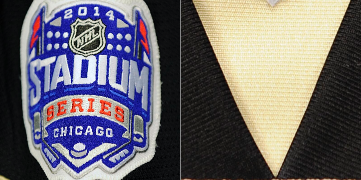
The Pittsburgh Penguins hopped on the jersey teaser bandwagon today — seems like they've been coming nonstop from around the league since last spring. The Pens offered up a pair of photos today that, frankly, don't tell us very much.
The team will travel to Chicago after the Olympics to face the Blackhawks at Soldier Field. It'll be the Pens' third outdoor appearance since the NHL started making a habit out of it in 2008. Earlier today, the Penguins announced they will unveil their 2014 Stadium Series jersey on Friday at 2 PM ET.
No word yet on whether the Blackhawks will join them.
The Pens followed up their Twitter announcement with a sneak peek of the jersey — if you can call it that. We got a close-up of the Stadium Series shoulder patch (above, left). Then a few hours later came a second teaser photo. It showed a gold triangle over a swatch of black.
I'll be honest. I have absolutely no idea what we're looking at there. There is a small white triangle at the top of that photo, which could be a patch. But is it on the shoulder? There's something going on at the bottom edge of the photo. Maybe a sleeve number?
What do you see in these photos? Share your theories below!
 Chris
Chris
Pens share another cryptic teaser photo
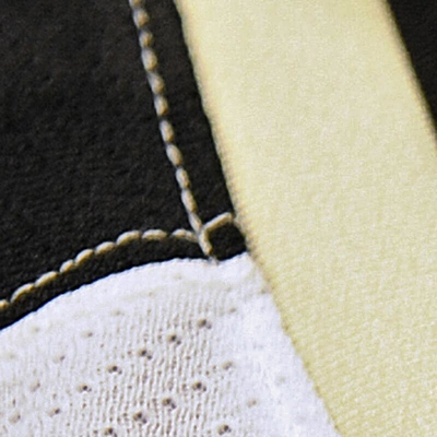 Photo from Pittsburgh Penguins (via Twitter)The Penguins will unveil their Stadium Series jersey in about 16 hours. But to hold us over, they've shared a third "teaser" photo.
I'm not sure the point though. They're definitely "Sabering" this. Yeah, I just said that.
Sabering. It's a verb. To "Sabre" a jersey unveiling (yep, two different spellings) is to reveal teaser photos that are so vague they weren't even worth seeing.
Case in point, I haven't been on Twitter all day so I didn't see the Pens tweet out this photo this morning. But it's so useless that not a single one of my 7,300 Twitter followers bothered to point it out to me. Which is unusual.
For what it's worth, Sabering has an antonym. Hurricaning your jersey unveiling means you're doing it right. (Used in a sentence: The Wild Hurricaned the crap out of their road jersey unveiling this summer.)
These terms have no relation to the design quality of the jerseys in question.
All right.
For immediate news on the Penguins' new Stadium jersey, keep an eye on Twitter tomorrow. I'll have the blog updated as soon as I'm able.

Reader Comments (53)
"The Pens offered up a pair of photos today that, frankly, don't tell us very much". You know what they do tell us though right? Vegas gold.... NOOOOOOOO!!!!!!
I'll bet its the bottom of the collar where the NHL patch goes. Im also going to take a wild guess and say its a gold jersey?
Chris, on the photo with the Stadium Series patch, if you look at the bottom left-hand corner, you will see that puke color the Pens still call Vegas Gold. The photo on the right would most likely be the triangle on the collar of the jersey with the NHL crest on it. My guess is that the Penguins will have the same cookie-cutter look as the Islanders and the Kings with that new shoulder yoke treatment on a Vegas Gold jersey. I think the stripes will be cutoff. That's my guess.
I think the second shot is the collar - the white patch is the bottom of the NHL shield
its the collar, the bottom of it anyway where the tie down should be. The white triangle is the very bottom tip of the NHL crest. No throwback yellow to my disapointment... more vegas gold and black. boring!
Looks to me like the picture on the right would be the collar area. The little white triangle at the top of the picture looks like the bottom of the NHL logo on jersey collars.
I missed it my last comment, apologies.... but theres something along the bottom edge of the picture, maybe writing embroidered onto the front just under the collar, maybe something akin to the sabres third jersey.
Hoping for a gold jersey, but expecting a white one.
Shoulders will be black (where the patch is shown) and done in same style as Islanders and Kings. If you look real close, you see a small amount of gold below the black though, so perhaps gold outlines the shoulders or the jersey is gold.
As for the other picture, I still think it is the neck collar. Same look as on current white jersey. Based on the pictures, you can tell the material is different looking, not the mesh (air-knit). The small white at top is probably the bottom of the NHL logo.
Wilkes-Barre created a gold jersey recently as a third jersey. I think the color would work well for Pittsburgh as well.
Fairly certain the second image is the bottom of the collar. The tiny triangle at the top is the bottom spike of the NHL shield.
Looks to me like it could be the shoulder shown there. Not much to go by, but I think it's going to be a modified version of the white 'robo-Penguin' jersey from the 90s, updated with their current color scheme. That jersey had a triangle shoulder design.
I'm thinking the neck w/o laces. The top triangle would be the bottom of the NHL shield... But I could be easily off by a mile.
I believe the second picture is the front. So, the "v-neck" part.. And the beginning of the logo on the bottom of the picture.
I guess we know it's black now.. :)
I think it's a pointed shoulder yoke, similar to the design they wore at home from 1992 to 2002.
Thinking they are showing a black shoulder yoke with another new collar design instead of that weird new tie up one
Even though they are going to chicago, the jersey might be black. Due do the gold and white, I think that will be the collar color. Also it looks like there is a City or Team name script below the point of the gold
We can see a tiny part of a white trim on top of the gold. Maybe, they will bring back the ''triangle shaped shoulders'' like their 90's jersey, but with the actual color scheme. It could be a part of the side, like the NY Islanders 3rd's blue triangle at the bottom on the side of the jersey.
Could the photo on the right be a new collar cut, a new version of the "V" neck cut, a lace less one?
Could it possibly be a deep V at the base of the neck collar? And perhaps that tiny white triangle at the very top is the very bottom of the NHL Logo? Either way it tells us that the jersey is the same "Vegas Gold" as the current set. I was still hoping by some prayer that they would go with the 80's early 90's gold but oh well.
Looks like the second photo could be the penguin crest maybe... looks very old school penguins...
Perhaps something along the lines of this, at least when it comes to the shoulders. https://lh6.googleusercontent.com/-2wVhj7C8VOU/TePT0t9UDBI/AAAAAAAAACI/uYw-7thmdFA/tocchet2.jpg
It could be a bit of a homage to the shoulder yolk on the mid 90's Pens jersey, but with their current vegas gold. I'm kind of hoping it is, because both the colour and those 90's jerseys are pretty modern. Either way, the Pens are usually very classy with whatever they wear. Even their old black gradient 3rd jerseys weren't that terrible.
And if I'm wrong, whatever. We'll find out tomorrow, I suppose.
I think that the small white/grey triangle is the NHL Shield on the collar.
Is it possibly the bottom of their triangle front crest? Although everyone thinks their jersey will be white, and that sneak peek would contradict that if it is actually the front logo.
My first thought was the V neck; but the Penguin logo isn't that horizontal at the top to be the fringe visible below the gold V. Maybe bringing back the sleeve chevrons from the early 2000s pre-Reebok Edge jersey, or something similar?
I think you're right, Chris. The second photo has to be a shot of the shoulder/sleeve.
I think its going to be a recreation of the 1992-1995 robo-penguin except they will replace the mustard yellow with Vegas Gold.
If you look closely at the picture with the Stadium Series patch, in the lower left-hand corner is a bit of gold. Assuming the patch is on the shoulder, and the shoulder is black, could this mean the jersey will be primarily vegas gold? That'd be different.
It may be under the collar? lite the white triangle is the spot where the NHL shield is and the stitching on the bottom is the top of the logo crest. But seriously, when is Pittsburgh going to go back to real yellow? I hate soft gold, soooo 1990's.
I'm thinking the right pic is the part of the collar with the NHL logo peaking at the top.
hey, sent you a concept off these 2 pics and past ss jerseys, i think in the bottom corner of the patch one there is a little gold indicating a gold jersey, and the one with the black and gold the grey at the top look like the bottom of an nhl crest like this is the v of the neck
@Jeremy Roney Looking at that second photo again, I think you are absolutely correct. The gold triangle looks just like the other stadium series jerseys. My guess is that the laces are moved slightly because they would cover most of this area. The thing at the bottom edge of the photo is probably one of these gold laces.
I think Pens fans are finally getting a gold jersey this year, hopefully it looks nice and comes off as gold instead of cat puke yellow (as I've heard it referred to once or twice).
It looks to me like the torso will be that Vegas gold color they use and it will have a black yoke (If I'm right and that gold on the patch photo is sleeve and not number patch).
That second picture I believe is showing a close up of the front "point" of the collar, and the little NHL shield is on a gold triangle.
Am I right in saying that those tweets are literally the first the Penguins themselves have mentioned having a special jersey? I swear to God we all had just assumed based on other teams announcing special jerseys.
looks like the front of the jersey around the collar (without 'laces'). At the bottom, could it say PITTSBURGH ala what Nashvile has done many times before...
C...could it be? The triumphant return of the triangle shoulder yoke?! Are they even possible on Edge?
Please let this be so! And maybe the Robo-Pen on there in some form! It's most likely not going to be on the jersey, but anywhere would make me so happy!
That's likely the neckline, with the "small white triangle" being the bottom of the NHL shield.
The second photo is without a doubt the collar. No other part of the jersey has that ribbed effect.
I reckon it is the V of the collar, and the tip of the NHL crest. The triangle is the same angle as the triangles on the other SS jerseys, minus the strings. The gold at the bottom could maybe be "PITTSBURGH" text under the collar (Like Buffalo's new third)
I'm still waiting on the Rangers and Devils. If the Blackhawks do join the Pens in the reveal it makes me wonder if the other teams left the Isles out to dry in case there was a bunch of negative feedback about the "modern" design these jerseys are going for.
i think that "V" might be just below the collar
I'm so over these teasers.
there is a new picture. here is the link: https://twitter.com/penguins/status/411214042796003328/photo/1
Could it be the collar?
i think the lace up collars are to give you a little extra roomn getting the sweater over you shoulder pads, then you tie it to keep it tight
From the material I think we're looking at the collar.
Can we call it "Ducking" when a team "unveils" a jersey but still doesn't show the whole thing?
The photo with the white at the top seems all too obvious that it is the collar...however on second thought...is it? The newest photo revealed seems to show the shoulder yolk (black) the top of the main section of jersey (white), and a gold collar that is just gold, not "outlined" in black.
Its definately the collar. Penguins jersey will be the same as the Kings just with Pens color scheme and logo. Cookie cutter Reebok garbage.
I think they are messing with us. The first teaser could really be anything, it could even be shot upside down for all we know. The second teaser is a little more revealing, looks like it will be a white jersey (which makes sense being they are the road team) with black shoulders. Lets just hope they don't 'Sabre' it and make the front/back different colors :-/. However, I have a really good feeling about it - can't wait till 2pm!
Just seen the new jersey, and I have to say that I really like it. No it isn't a throwback from the 90's, like so many have asked for, but I do think it does look very clean, and I really like the 2-tone shoulders.
Hey they've posted it.
http://penguins.nhl.com/club/news.htm?id=695697&navid=DL|PIT|home
Now is it just me, or is the 'oddball' Calgary shoulder yoke on all the stadium jerseys?
In my opinion, this is the first one where the chrome logo actually looks good. The cut of the bottom of the jersey is interesting....
I like this one.