Lethbridge Hurricanes Unveil New Logo
 Sunday · Jun 16 · 2013 | 1:55 PM PDT
  16 Comments
WHL team forced to rebrand by Washington Capitals
Back in March, we learned the WHL's Lethbridge Hurricanes would need to come up with a new logo. The NHL's Washington Capitals decided the Lethbridge logo was too similar to their own to continue being used.
That report came from CTV reporter Darrell Romuld, who then said that the Hurricanes would simply promote the logo being used on their alternate jersey at the time. That look was created by former IceHL GM and CanesCast founder Joshua Schroeder.
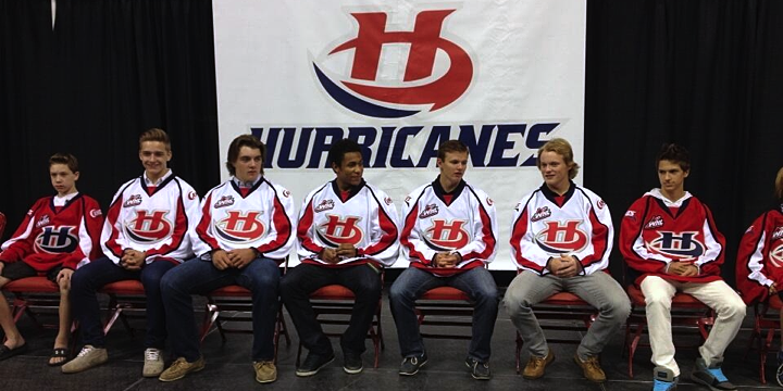
However, it seems that was not the case as Lethbridge unveiled an entirely new logo at a special event on Thursday. You can see it at the top of this post.
 Photo by Patrick Burles (via Twitter)
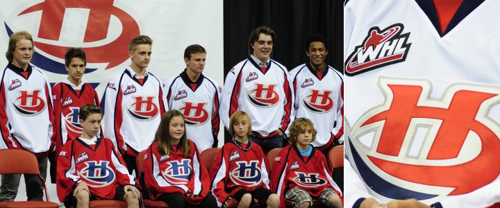
Despite dumping the Caps-style wordmark, the Hurricanes will still basically be wearing Caps jerseys. This is probably a Reebok thing. The new logo has two variations. The stylized H is in blue on the red jersey and red on the white one, as you can see below.

The Hurricanes have struggled with identity issues for as long as I've known them. This logo is an improvement on the ugly wordmarks they've used in the past. It's simple and bold. And original. Well, mostly original. Some readers have claimed similarity to the Hilton Hotels brand, but I think they're really just reaching.
The Hurricanes posted another article on their website about AKQA creative director Chris Polychronopoulos, who I'm assuming led the rebranding efforts for Lethbridge — assuming because article doesn't say so specifically. And all it really is is a bio. It outlines his credentials.
 Photos from Lethbridge Hurricanes
Anyway, if you want to see more photos of Lethbridge's new look, a number of people were tweeting from the unveiling event, including Cody Nickolet (WHL From Above), Joshua Schroeder (CanesCast) and Patrick Burles (Country 95 News).
What's your take? Is this an upgrade for the Lethbridge Hurricanes or not? (Head over to this post to see the original logo.)


Reader Comments (16)
I prefer Joshua Schroeder logo, this is a little boring and do not stand out...
As a Hurricanes season ticket holder, I love the new look. Will definitely buy a jersey.
Doesnt seem like a primary logo to me. It is an improvement only because of what they had before. Using the airplane logo would have been simple and no one would have had anything to say otherwise.
It is too bad they put the new logo on the same old jerseys. Seems really lazy to me.
Terrible logo. Once again Lethbridge is able to screw things up.
This logo is awesome. Its the exact definition of what a hockey logo SHOULD look like. Simple, Iconic, and a child can draw it.
Definitely an improvement over the old design (I hesitate to call that a logo). I don't know what the Capitals' problem is. There are probably lots of teams ripping off other teams for logos and uniform designs. Is it just that they didn't get permission first? We had a team in Kingston Ontario called the Canadians (Major Junior A) and the only difference between their uniforms and Montreal's was instead of an H inside the C, they had a K. We still have a team called the Kingston Voyageurs (Tier Two Junior A) and their only difference is a V instead of the H. And no one knows what the C is for in the CV logo.
Don.
Don't forget the in the same league the Toronto JR Canadians with a JR in the C, and the Hamilton JR Redwings.
As for the logo. i feel like this team should be called the Foxes it looks like a big fox tail.
I agree with Dylan - simple, easily recognizable. One flaw with some of these IceHL logos last week - too much work, too much detail put in them, too complex.
You can use outlines, shading, two-tone lettering and slant/curve/twist the wordmark...and what do you end up with? A minor league logo. What does Lethbridge have? A symbol. The Blues, Flyers, Flames, Wild, Red Wings - - - they all have SYMBOLS.
Ooooh - one more thing. I see a belated Halifax Dragons submission in Lethbridge!
Meh, I'm glad they came up with their own for once. All this time (before it was reported they had to change it originally) I thought they were affiliated with the Caps somehow. Don't like that they still have the jersey design though. The logo is good, nothing special, especially since it doesn't have a unique jersey design to back it up.
I don't have an opinion over either logo, but the jersey still sucks. Not sure why the Capitals' uniform is so highly regarded by hockey fans. I think it's terrible.
Surprised people actually like this logo it is as boring as it gets for me and to just reuse the Capitals Jersey AGAIN!!! Which really isn’t that great of a jersey to begin with is bazaar…. So Lethbridge's third jerseys are one of the nicest jerseys in the WHL and the full time jerseys are the most stale and unoriginal in the WHL. Odd, apparently the reason they didn’t promote the third to full time is “they were worried about getting sued” for copy write infringement for the third straight time because of the Hawker Hurricane Logo (Warner Bros, Washington)… Honestly an extinct airplane brand name cannot sue you, huge overreaction by the Hurricanes throwing away so much potential to wear the third full time.
What do you mean “I like this jersey because a kid can draw it” of course kids can draw it because apparently a Kid drew it for them!! Haha. Awful Jerseys another fail by the Hurricanes and as much as I dislike Prince Albert’s new jerseys at least they tried to do something original.
The logo is good but I think they were being kind of lazy when they just put it on the Caps' jersey. What I would've done is use a recoloured version of Carolina's new jerseys. (Navy instead of black)
To add to what Mcrib said, I think Prince Albert's jerseys are a downgrade from their last uniforms except for the fact that they went green. (no pun intended) :p The Hurricane's new logo is an improvement. It is tough to make logos for a team named the 'Hurricanes' and I think the logo works. However, I agree with Mcrib, that white hawker hurricane jersey is still far, far better than what they are wearing, even with the new logo. Those Capital jerseys are one of the few exceptions with piping on the jersey that it isn't a bad look but come on Lethbridge, you had a chance to be original with the Hawker and you just plastered a new logo onto your Capitals jerseys. As for PA, I am not impressed with the logo and the new uniforms. They should have just made a green version of their last set and called it a day or, went with the old jerseys with the egyptian guy and the Northstar look.
Hawker is actually an operating company: http://hawkerbeechcraftinfo.mobi/aircraft/hawker-400xpr/
The concerns are legitimate. The Hurricames plane logo looks very similar to the Anniversary edition of the Windsor Spitcires logo but instead the plane is level and traced and more than likely traced of of a google'd site: http://www.rcgroups.com/forums/showthread.php?t=1210208&page=45
http://t1.gstatic.com/images?q=tbn:ANd9GcT8GLYGlCK6BuBtTRd_TPlnID2-wovgxacCQbLBcZshrKPe9UGPskAb5YO4
Thoughts.
The original jerseys that were pitched with the new logo couldn't be made in time for upcoming season by Reebok, so they had to stick with the caps style. I've seen the proposal, they were rad.