


Checkers Get New Uniforms
 12 Comments
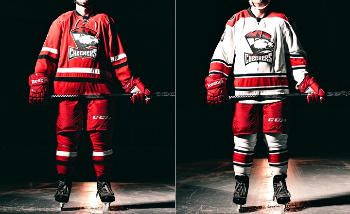
Following the lead of their NHL parent club in Raleigh, the AHL's Charlotte Checkers unveiled new uniforms on Wednesday. The redesigned sweaters are based on those of the Carolina Hurricanes, who revealed their look to the world on June 4.
 Photos from Charlotte Checkers (via Flickr)
On first glance, it looks like they duplicated the Canes and swapped out the crest. But first glances can be deceiving. There are more differences than that and some are key to making this uniform work for Charlotte in a way it didn't for Raleigh.
By now you've probably read my review of what Carolina did. Overall, it wasn't great. But the Checkers have changed some details that really make their version easier to swallow. So let's go through them. The Checkers have made this very easy, outlining the differences on their website.
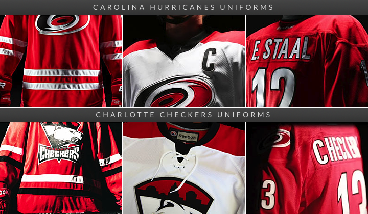 Some differences between the Hurricanes and Checkers' new jerseys
First, and most obvious is the black stripe on the red Checkers jersey. Come on Carolina, how hard would that have been? It wouldn't saved all the Team Canada grief you've gotten over the last week and a half. Then there's the lace-up collar on the white jersey. This isn't a big deal for me. A lot of folks bemoaned the non-matching home-and-roads in Carolina. I kind of liked that.
The Checkers also have a shoulder patch, something the Canes went without. Of course it's the standard Hurricanes logo, but at least it's something. Other changes pointed out on the Checkers' website include the Checkers retaining the shiny silver on the crest while Carolina opted for a matte finish. And, naturally, the collar doesn't have a row of storm flags like it does for the Hurricanes.
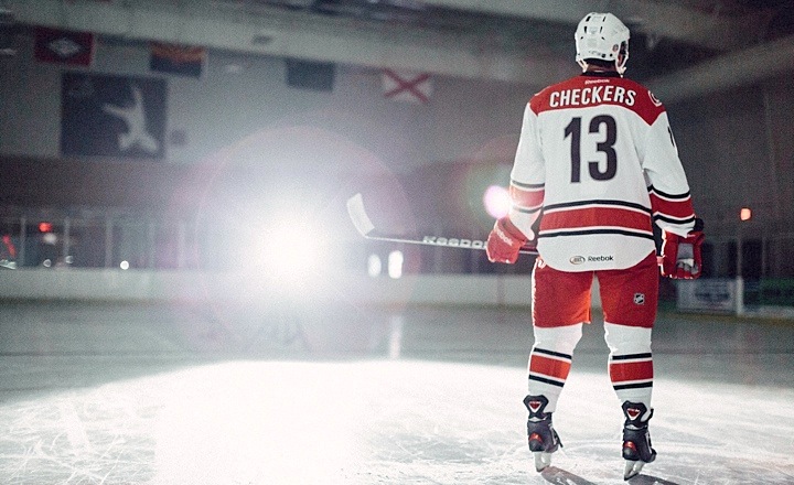 Photo from Charlotte Checkers (via Flickr)
The reason I like Charlotte's version better is quite simply the black stripe on the red sweater and the shoulder patches. Seemingly minor details can turn out to be important.
And there's something else. The Checkers identity dates back to the 1950s in the old Eastern Hockey League. That's about 60 years of history there. Because of that, a traditional-style hockey uniform works for them in a way it doesn't for the 16-year-old Hurricanes. Plus, it never made sense for them to wear those storm flags around their waist like it did for their parent club. Moreso now that the Canes themselves stopped using that particular feature.
So for Charlotte, this is an impressive upgrade to the look. They will be one of the AHL's best-looking teams in 2013. How can two teams wear jerseys so similar and yet look so different? Now you know.
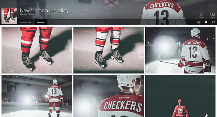 More photos of the new Checkers uniforms on Flickr
The Checkers have posted a series of artsy shots of their new uniforms on Flickr. I highly recommend taking a peek. There's also a video if you're interested in seeing the jerseys in motion.
Your turn. Did the Checkers make the right move? Share your take in the comments.

Reader Comments (12)
I strongly dislike the black stripe on the red jersey - in the photo. It makes it look like there's an awkward cut on the jersey. I'm sure it'll look better on the ice.
I love the white jersey. The black striping makes for a crisper look.
Still a non matching set but it does work better. Just by adding the laces to both sweaters helps to unify the set. The single black stripe breaks up all that red and less team Canada. Ever the crest placement looks more balanced. On the negative side a little too much red for me. I would have gone with black pants but then I'm a Flyers fan and used to contrasting pants. Getting rid of the warning flags also makes sense since they had nothing to do with the name or identity of the Checkers. The canes should have kept them because they are part of their identity. Over all good work on the Checkers part.
Attention to detail does sometimes make a difference between an okay jersey and a really good jersey, and Carolina and its AHL affiliate are proof. I agree that just a little more black on the home jerseys would have made the Hurricanes' jerseys a little more tolerable.
Still not a fan of the red jersey, but the checkers have won me over with the white. Very clean and classic looking jersey, especially with the addition of the lace up collar.
Another element that balances the Checkers jersey more than the Hurricanes is that the Checkers have a large crest, particularly vertically, while the Canes' crest is smaller and relatively wider. Positioning the Checkers crest as high as they do fills most of the jersey, leaving little wasted space and making it feel balanced. Positioning the Canes crest that high leaves the lower half of the jersey blank, while the top half feels way too crowded.
thank goodness. i couldn't stand the checkers old jerseys.
I don't like the black stripe on the red jersey. Granted, I don't like the two white stripes on the Hurricanes jersey. But having one white stripe and one black stripe here? It just doesn't look like it belongs at all.
The checkers still got hosed in their deal with the Canes. I don't know if matching jerseys was part of the marketing deal they have, but really --- they stripped their identity with the association. I felt like they were always an organization that didn't take themselves too seriously - an "out of place" minor league team - they're happy to be entertainment any ways possible, and drive the profit. Check out the oldest jerseys here - the powder blues may have been "cliche" but the fact it incorporated carolina blue was a fan favorite:
http://www.sportslogos.net/logos/list_by_team/1881/Charlotte_Checkers
Meh, I was afraid of this happening, but I knew sooner or later the Checkers would lose the Canes' old look as the parent changed theirs. Though, I have to say, they took Carolina's new look and did it right. Shoulder patches, more color variety, overall this is what Carolina's should have looked like. Maybe, just maybe, the Hurricanes will slightly modify the jerseys too match their AHL affiliate's by the beginning of the season.
@ NASCARFAN160: I don't think so. The jerseys are already on sale on NHLShop. The Lightning when they made changes, they only changed the numbers and pants. Not the jerseys. I fear it's too late... :(
I have to disagree with you on this one. I think the parent club's look with the white stripes on the home uniform is far better than the Checkers look -- cleaner, more symmetrical and eye-pleasing in my opinion.
I don't like the one white stripe, one black stripe look. Again, I'd prefer to see striping on the home jersey that mimics that away jersey. I am a fan of the away jerseys for both teams.
Here's a new video of Eric Staal wearing the white jersey at an event: http://video.hurricanes.nhl.com/videocenter/console?catid=684&id=259537