


Trio of New Jerseys at Q Draft
 13 Comments
The 2013 QMJHL Draft was held in Chicoutimi, Quebec on June 8. And those interested in junior hockey jerseys got treated to a few new ones at the event.

Islanders reveal black jersey at draft
Of course we have to begin with the recently rebranded Charlottetown Islanders, previously known as the PEI Rocket. Their new black sweater was on display at the draft and also given to their draftees. I haven't seen the white one so I'm not sure if it's the same style.
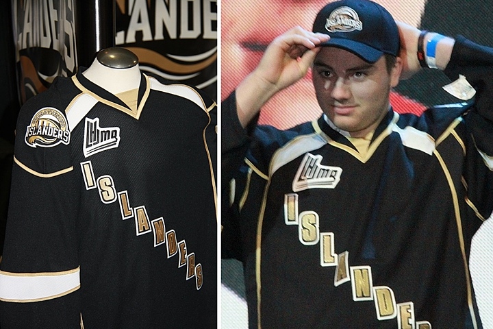
This is a bit disappointing. It's not like they knocked it out of the park on the logo, but why go even blander with a black text jersey? Charlottetown could've learned a thing or two from the mistakes of their NHL friends in Dallas. And what is with all the crazy piping?

Tigres switch from yellow to black
The Victoriaville Tigres have apparently dropped their yellow sweaters in favor of black. Seems like an odd move considering the trend in hockey jerseys these days, but these actually look pretty solid.
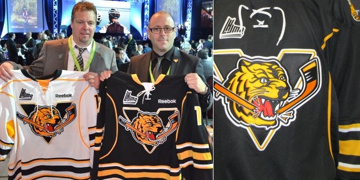 Photos from Victoriaville Tigres (via Facebook)
The Buffalo Sabres Edge template we're all quite familiar with, but it is an improvement on the Pens/Sens template they used to wear. And overall, it works.

Lastly, the Shawinigan Cataractes apparently have a new alternate jersey. I say "apparently" because they only seemed to give it to one player at the draft. And because almost everything written about all these teams is in French — a language I don't speak.
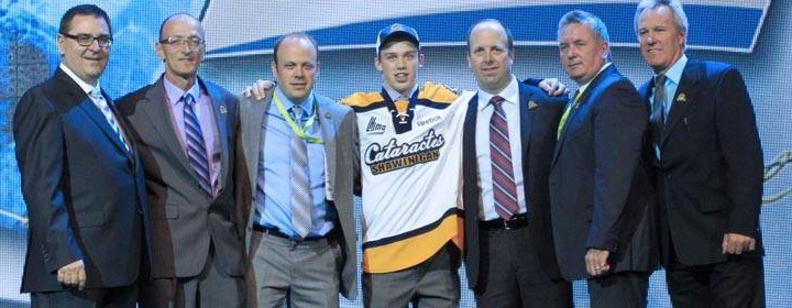 Photo from Shawinigan Cataractes (via Facebook)
Maybe some of my bilingual readers might have some more information to pass along. Keep an eye on the comments for updates from those in the know.
As for me, I'm taking a step back from the blog for a little while. Not to worry, if there's news to report, it'll be here. But I need some time to get the next IceHL yearbook together and that means making the time for daily blog posts will be difficult.
That said, I'm expecting jersey news from Buffalo, Minnesota, San Jose, Montreal and possibly Calgary over the next few months. So as soon as I know anything, I'll be sure to let you guys know.

Reader Comments (13)
In the case of the Shawinigan Cataractes, it their new white jersey and not a new alternate jersey.
Source : http://www.lhebdodustmaurice.com/Cataractes/2013-03-16/article-3201427/Un-nouveau-chandail-pour-les-Cats-!/1
some people @ the helm of these decisions... (shake my head emoticon)
http://www.lhebdodustmaurice.com/Cataractes/2013-03-16/article-3201427/Un-nouveau-chandail-pour-les-Cats-%21/1
"Les Cataractes de Shawinigan auront un nouveau chandail dès la saison prochaine, qui remplacera ainsi l'uniforme blanc présentant plusieurs anciens logos de l'équipe, qui a été utilisé au cours des dernières saisons. "
If my french hasn't abandoned me, a rough translation would be "The Shawinigan Cataractes will have a new jersey next season, which will replace the present white uniform which sports the older team logos, and which has been utilized over the course of the last seasons."
It's kind of crazy to say but the Tigres black jersey almost looks retro considering the trend of brighter colors in the NHL.
Did you notice on the Charlottetown jersey there is no reebok wordmark opposite of the QMJHL logo?
Here's the lowdown regarding the Cataractes new Jersey..
Last march, they unveiled it..
http://www.lhebdodustmaurice.com/Cataractes/2013-03-16/article-3201427/Un-nouveau-chandail-pour-les-Cats-!/1
Translated :
"The Shawinigan Cataractes will have a new jersey next season, it will replace the white uniform representing old logos from the past. The new jersey has been revealed to the fans at the traditional season tickets draft. Zachary Taylor went on ice with the new blue, white and yellow jersey. The wording "Cataractes Shawinigan" on front and the player numbers are dark blue."
Note the yellow name tag on the back.. Nice touch IMO..
So here it is, the new white jersey for the Cats.. :)
Those Tigres jersey's and logo are outstanding, it's such a shame they have piping.
UUUUUGGGHHHHH!
CHARLOTTETOWN! You're promoting a new team and a new brand. WTF is up with the... OK, let's just call it what it is... LAZY jersey with the more boring possible cresting ever. As for the black jersey, ya, well I saw that coming when the logo was unveiled.
Charlottetown: Their jersey would've looked good if they had their logo on the torso. But the wording makes it really bland. Disappointed.
Besides that, the Tigres don't look bad with their new jerseys. There are a few teams (Sabres, Hershey Bears), who have the same template, but even with the unnecessary piping around, it looks solid.
Charlottetown is too bland. The colours suck and the logo seems non-existent or lacking. As silly as the rocket name was at least they had a logo to work with. Even the Rangers like wordmark is a total miss. Would much rather see arched lettering. Overall its just boring.
I think it's worth noting that if the new Shawinigan white jersey is intended to '...remplacera ainsi l'uniforme blanc présentant plusieurs anciens logos de l'équipe,...' that would suggest that this is the new alternate jersey. The Cataractes had a white alternate jersey that features an old Cataractes logo, as well as those of the Shawinigan Bruins and Dynamos over the past few seasons, and these new ones would be replacing this one. The blue dark jerseys and gold light jersey likely won't change.
I'm sad to see the Tigres losing their gold jerseys, but it was a little odd that the Tigres used a gold jersey as their primary dark, and the Cataractes used a gold jersey as their primary light jersey. I wish the Tigres would have gone with a gold jersey and a black jersey, rather than a white and a black...
Both are too similar to Cape Breton's jersey (in my opinion the best looking jersey in the Q). The Victoriaville logo even has the same "V" shape as Cape Breton. Their old yellow jersey's were a little bit bold but it made them distinct.
For anyone complaining about Charlottetown, let's not forget, this team was supposed to be called the Prince Edward Islanders, but a midst the chaos that surrounded a possible relocation to Sorel, and then the change to Charlottetown, I essentially give them a pass. If/when another rebrand of this team happens, I imagine that they'll get it right.