
 Official 20th anniversary logo vs. March sneak peekThe Ottawa Senators announced plans on Thursday to celebrate their second decade of NHL hockey during the 2011-12 season.
The club also unveiled its official 20th anniversary logo which, as you can see in this side-by-side comparison (right), differs from the 20th logo we saw in March when the team gave us a sneak peek at the Heritage Jersey.
Two things bug me right off the bat. The official anniversary logo, which is no better than the prototype seen in March, is awfully generic. Generic fonts, generic banner. Nothing about it furthers the Senators brand.
The other thing is the beige, or vintage white as we've come to know it. It's trendy, we get it. The 86-year-old Bruins used it in their Winter Classic throwback jersey. The Rangers used it last year when they turned 85. A little less understandably, the Sabres did it at age 40. But guess what. Two years ago, the Montreal Canadiens celebrated 100 years without that dingy shade of white.
So why is a team that's barely 20 breaking out the antique colors? This is not the same Ottawa Senators club that was a founding member of the NHL in 1917. There was a massive 58-year gap between that team and this one.
I'm not against them celebrating their city's hockey heritage, I just think that trendy beige is silly. And it's just being overused now. I mean, look at that logo. It says 1992—2012 on what's meant to look like a white material that's been aging in the attic for a century or more. Silly.
The Senators did not unveil their new Heritage Jersey at yesterday's press conference, though the design was leaked on the blog this week. The official release will come closer to the season, and the team confirmed some details about when it will be used.
Twenty home games this season will be devoted to the first two decades of the modern franchise. Another 11 are being set aside to recognize the 11 Stanley Cups won by the original Senators, a founding member of the NHL and the league's first true dynasty. The current team will break out a new 'heritage' jersey on those occasions.
In Tuesday's leak we also learned that the Heritage Jersey will see action twice on the road, in Montreal and Toronto. The Canadeisn and Maple Leafs already have white throwback jerseys so I can't help but wonder if they'll wear them for those games against Ottawa.
Though it's not in the press release on the Sens' website, the Ottawa Citizen reported yesterday that the Heritage Jersey will make its game debut on Oct. 13 when the Senators host the Colorado Avalanche.
 CTV falsely reports jersey unveilingThat brings me to some shoddy reporting that needs to be cleared up. CTV Ottawa said yesterday that the Senators had unveiled their 20th anniversary jersey. Which they hadn't. Le Journal de Quebec also used the same image in their story, though in their defense, a translation of their article from French reads "the jersey will be unveiled," not that it had been already.
And get this: The design these "news agencies" published was nothing more than a concept pulled straight from this very website more than a year ago.
On March 10, 2010, I posted artwork designed by Tyler Allen that, in terms of design, is identical to what was posted by these two news outlets. Only the shoulders, name and number have been altered (right). The overall design remains completely intact. Lay one on top of the other and you'll find no differences.
Granted, this design isn't far off from what was leaked earlier this week, but it is enough for us to notice. Check out the sleeves and the striping around the waistline. Plus, the numbers on the back are supposed to be white, not black. And where's the new shoulder shield?
I understand CTV Ottawa wanting to give their web vistors and viewers an idea of what the jersey will look like, but reporting "Senators unveil new jersey" is flat out false. They haven't yet. We'll certainly know it when they do.
I hope that clears up any confusion. I know a number of you had emailed me links and been left scratching your heads.
One other thing before I move on from the Senators. I thought this was pretty cool. The Ottawa Citizen referenced Icethetics on Wednesday regarding the leaked Heritage Jersey. They were able to get a response from the team on its validity:
“There have been a number of jerseys that have been produced online and speculated upon as the new heritage jersey,” Brian Morris, the Senators director of communications, said Tuesday. “We anticipate the heritage jersey will be well received by the fan base, but we won’t confirm its design until it is officially revealed prior to the season.”
Nice to see the site getting a little recognition from the big guys. Now one more item, unrelated to the Sens...
Olympiques go colorless in 2011
 The QMJHL is getting another black-and-white team this season. The Gatineau Olympiques are going retro, switching back to the colors (or lack of color, as it were) that they wore when they were known as the Hull Olympiques from 1976 to 2003 — black and silver.
An article from LeDroit (translated) explains the transition and even includes a photo of the newly-painted center ice logo which is now black and white with shades of grey. The author says the team hasn't confirmed this change yet, but the writing is on the ice, as it were.
Plus, the new splash page on the club's official website features the desaturated logo. You can see it at the bottom of this post.
The Olympiques are the third hockey team this year to drop their distinguishing colors in favor of a black and white look. First the Los Angeles dropped the purple, then the Q's Montreal Juniors became the Blainville-Boisbriand Armada and got rid of the red.
That Olympic torch logo may have had an unusual color palette — purple, yellow and orange with orange jerseys — but it stood out and gave the club its own identity. I know my argument falls down when you consider they're just going back to the colors they previously wore for decades, but it's just so bland.
 QMJHL's Gatineau Olympiques alter logo colors / Olympiques
 Friday · Jun 21 · 2013 | 11:39 AM PDT
  13 Comments

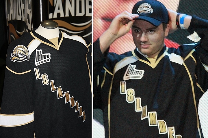

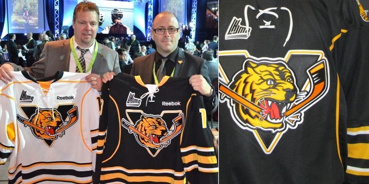 Photos from Victoriaville Tigres (via Facebook)
 Photo from Shawinigan Cataractes (via Facebook)


