


Sabres Expose Another Puzzle Piece
 26 Comments
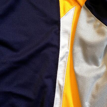 Image from Buffalo Sabres (via Twitter)The Buffalo Sabres tweeted another enigmatic photo of their new third jersey today. And while it doesn't tell us much, it's at least different from other sneak peeks shared recently.
Today's tweet read:
*Exclusive* PHOTO: Here's your next puzzle piece for our new third jersey... pic.twitter.com/ye3AEYs3Hw
Puzzle piece is probably the right term. For the life of me, I can't figure out how these pieces fit together. And with this one, I'm not even sure what part of the sweater we're even looking at.
There's definitely something folded over but that's about as much as I can tell. Is it the sleeve? The shoulders? Something from the sides?
If you have a good guess, I'd love to hear it. Fill the comments with your thoughts. And if any concept artists what to take stab at reproducing it, I know a lot of readers would be eager to see it.

Reader Comments (26)
My best guess is that the picture is rotated and what we are looking at is a navy blue/white waist pattern with a gray sleeve folded over it.
Now they're just being jerks about it.
Whoever is the marketing director for the Sabres needs to be fired pronto. Everyone stopped caring about four 'teases' ago.
Shoulder yoke (left) with the sleeve draped over (right).
This is really getting old. Just reveal the damn jersey already.
Turn the photo 90 degrees clockwise and you can tell that it is the shoulder yolk with the sleeve folded over on top of it.
The picture is of the back of the navy blue yoke with a white stripe running under it ending where the right sleeve comes out of the jersey. If we could see more we would see the reebok wordmark centered on the spine. The sleeve is folded over the back.
Evolution of a "sneak glimpse:"
Hype... trolling... indifference.
All for something that looks like it'll come out to be an inferior 90's era Predators jersey (which I did like though). Whoop-dee-doo.
Is it possible that it's a top view of one of the shoulders?
My best guess would be that it is an underarm piece. Maybe paneling on the sides and a sleeve folded over? The only thing that throws me off is that it would have to be a white sleeve.
For better or for worse (mostly worse), the Sabres have been my team since the mid-70s when I was in tykes' hockey. This annoying shit is causing me to rethink where my misplaced loyalties lie.
I am a Sabres fan and a jersey geek...I have gone from excitement to indifference...Sabres are trying to copy what Carolina did with their tease...but this is just pathetic...kudos for finding a way to spread fan dissapointment to another area of the hockey club...yawn...
I think the 'puzzle' is broken.....bored of this now, just reveal the damn jersey already!!!!
Can they just release the damn jersey its not like its going to be some gorgeous work of art! Another template cut they're making it seem like its the map to fountain of youth. Hype = shitty marketing technique.
The gray is the yoke folded over the yellow torso and the blue is a hem stripe
Wondering if that white strip in the middle is supposed to be the blade of a sword?
I posted this over at SabreSpace, so forgive the cut-and-paste ...
While I am quite certain that there is a white line below the blue shoulders on the back where the nameplate is, I'm not sure this is it. The very first picture posted showed a white stripe below what was likely blue shoulders, but it crossed one seam and then ended squarely at another. That was almost certainly the back with the stripe passing over the nameplate and ending at the arm seam.
This one shows the white stripe ending at a point as it follows a seam that meets the blue at a sharp angle. It also seems to narrow as it moves away from the seam, so it could be the one under the shoulders on the front of the jersey (the blue dips down toward the logo under the collar.) However, that seam comes at a sharper angle than the ones seen on the front. Some have suggested that the sides are blue, so this could be coming up the sides and ending at the seam that angles toward the collar.
they'll keep teasing up until they give it to the first overall draft pick next season
I feel like Reebok had a lot to do with this design from all the random piping (it seems like) they keep showing us and that is not a good thing...
I think if you turned it clockwise 90 degrees, the blue with the white underneath it would be the front/left shoulder. It seems like that white stripe starts at the collar and runs out until it stops at the sleeve. My guess is that what we are seeing on the right side of the picture is the lower portion of the left sleeve folded up.
regardless, it'll be awful. Sabres need a total rebrand (minus the logo, of course!)
They just need to release the whole thing already. I doubt many people aside from do hard buffalo fans care anymore. And the more they hype it up, the more they're going to be ridiculed after its released when its either completely meh or buffaslug 2.0.
I was thinking shoulder yoke, but it looks a little big for that. Unless it's a Hurricanes style yoke. Who knows really...
To me, this is the right underarm, if you're looking at the back of the jersey and the sleeve is folded "northeast."
Meaning that the back is solid navy, and the mess of colors to the right of this pic form the side panel.
This is shaping up to be a really terrible jersey. there seems to be way too much going on. Its like they had seven different designers and took each of their concepts and threw it all together into one jersey. I mean c'mon, having the front gold and the back blue is just plain dumb. Right now I like the fan made gold one over what ever this is going to be.
When are they actually going to release this jersey? Seems like they have been "teasing" it for months already. I have long stopped caring.
They released the captain and alternate patches today. Unique, and pretty cool, but odd color choice if the jersey is gold.