


Providence Bruins Update Uniforms
 16 Comments
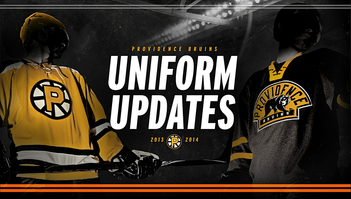
P-Bruins tout tweaks to all three kits for 2013-14
Back on the minor league beat this weekend, the AHL's Providence Bruins launched a new mini-site to promote and explain the updates they've made to their uniforms for the coming season. And because they did it in three elegant graphics, that makes less work for me.
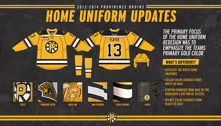
The big takeaway from the new home jersey is that the P-Bruins will no longer wear white at any time. (I think they did a bit of that last season, but now it's official.) The AHL is going to prove that you don't always need one team to be wearing white to tell the opponents apart. When will the NHL get on board? We're looking at you, Nashville.
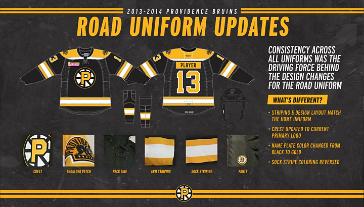
The road jersey is pretty close what we see with their NHL affiliate in Boston. Unfortunately, they've gone with that awful opposite-color name plate. This is a terrible trend that doesn't seem willing to die.
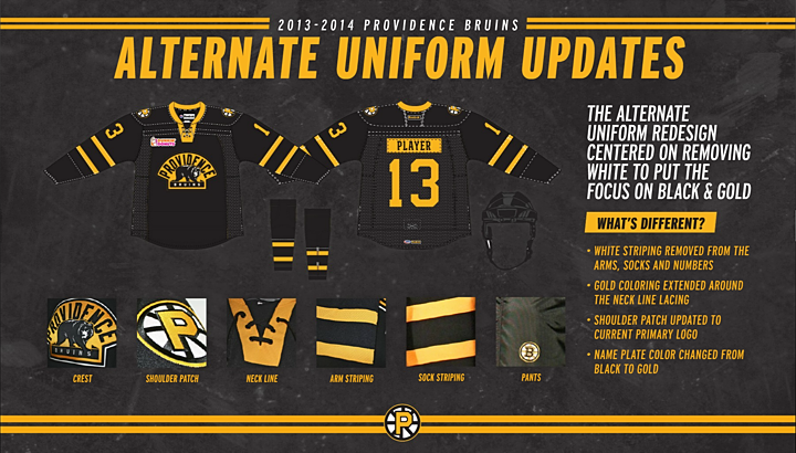
Finally, there's the black alternate jersey. It's a bit plain — not unlike what Boston's third suffers from — but I like what they've done with the collar. It's different. And I really like the complete lack of white in this jersey. There's a bit in the logos, but no white stripes. This is totally a black and gold sweater and it looks great.
What do you think? Did Providence hit the mark with their updates?

Reader Comments (16)
Dont like the P-Bruins because I'm a Wolf Pack fan, but I like this set a lot. They look enough like Boston but not down right copying them. Dont like the off colored name bar on the road jersey and not sure about the yellow helmet with a yellow jersey...might change my mind when they see some game action.
YELLOW HELMETS!!!
I don't understand why they would re-design the uniforms to essentially match the Boston Bruins' uniforms, and then not match it. Now that doesn't matter on Providence's gold uniform because that looks really awesome.
But on the road uniform, the striping bothers me. They re-designed the home uniform to accentuate the team's gold color, but the white stripe on the arms and waist off the road uniform really drowns out the gold. From a distance, I couldn't tell that there was even any gold at all. I much prefer Boston's striping pattern than the one here because the gold and white both stick out. However, I do like the fact that they will use black socks on the black primary, something Boston doesn't do (and something that really bugs me).
As for the alternate uniform, it looks too "Pittsburgh Pirates"-like to me (the baseball team, not the defunct NHL team). And pretty much, it's the Dallas Stars' old uniform with gold instead of white/dark gold. It's slightly better because it has a better logo (by which I mean, "it has a logo"), and not a bad one at that, but with how much I hate Dallas' old uniform, the similarities between the two are too much for me to ignore.
And finally, teams really need to stop doing the opposite-colored nameplate thing. It looks terrible now, and it's always looked terrible. There's a reason why nobody in the NHL was using it at all until the Flyers brought it back in 2008. On the alternate uniform, all it does is make the jersey look even more Pirates-like. And on the road uniform, it hurts way more than it helps.
Certainly better than it was before, but still not the best.
I'm still not and will never be a fan of using any color other than white as a light jersey. It's harder on the eyes on the ice and a little distracting. It's easier to tell white from color than light from dark in split-second reactions.
As a long time Canucks fan, I LOVE the AHL Bruins' new look. It about time that yellow in hockey is used in the same fashion as white. Yellow and gold sweaters should always have a matching helmet. Nashville should take note.
I'd have to say that if Hamilton ever got an NHL franchise, a similar look would look great on them if the Tigers name was brought back or if they went with "Steelers".
The alternate is sort of a nod to the first Boston Bruins jersey, whether intentional or not. These are all ok, nice to see something different. I did like last season's gold jersey better. Can't wait to see how the gold helmet looks.
The home and road are perfect except for the gold nameplate on the black jersey. The alternate could use some work, but it has potential. I'd love to get my hands on one of the gold jerseys! Those are awesome!
As a Hartford Wolfpack fan I have to say myself I like these uniforms it's a throwback to the old mid 60s Boston Bruins home uniforms and road uniforms so I like him a lot
I Don't mind the color changes to gold, should look good. I don't like the little sliver of white near collar, due to the structure of the Reebok edge uniform. I will always be disgusted with these Edge uniforms! On the alternate, I don't like that style of collar at all. The Leafs had this style a few years ago and it ruined their great uniform. I agree with most that the off colored name plates are not necessary, The Flyers can get away with it because it fits them. It's their thing.
I like the fact that the NHL affiliation is shown on the pants wit the spoked B.
Most all tend to forget that the California Golden Seals and LA Kings all wore Gold jerseys at home vs the visiting teams dark jerseys back in the late 60's thru the Seals switching to Pacific blue before heading to Cleveland.
We need more gold, maybe the Sabres new sweater can have some bearing on this.
I like the fact that the NHL affiliation is shown on the pants with the spoked B.
Most all tend to forget that the California Golden Seals and LA Kings all wore Gold jerseys at home vs the visiting teams dark jerseys back in the late 60's thru the Seals switching to Pacific blue before heading to Cleveland.
We need more gold in the NHL, hopefully the Sabres new sweater can have some bearing on this.
Gold sweaters and gold helmets....awesome! Like what they've done as a whole.
1. I kind of like it.
2. I wish they could spell. See the home sweater infographic - that should be 'the team's primary gold color'.
3. Yellow helmets = winning.
This is exactly how a minor league affiliate should look. This uniform takes a bunch of elements in the Bruins history and mashes them up into an original template. It's different enough from the parent club and looks good enough for Boston fans to buy. I wish the Canucks would do this with their affiliate. I'd love to see their farm team use the Johnny Canuck logo in blue and green and eschew all signs of the Orca. Another topic for another day though....... I love a gold uniform instead of white. The only thing I don't like is a yellow helmet. Yellow is too strong and fatiguing for a helmet. It should be white or black instead.
I'm not a fan of using a yellow logo with black spokes on a black jersey. I realize the 80's bruins did it like that, but I like the way the spokes "pop" now since they have yellow and black on them.