


Review: Sharks Unveil New Uniforms
 106 Comments
Before we get into the details of the newly unveiled San Jose Sharks primary uniforms, it might help to ask why they redesigned them in the first place. After all, they just redesigned their entire identity — logos and jerseys — in 2007. Why do it again after just six years?
Performance, in a word. According to the Sharks, the players love the lightweight third jersey. Why do you think they wear black every year come playoff time? So the main idea behind revamping the primary jerseys was to drop weight.
Sure, we can ask whether a few ounces here or there really makes any kind of difference. But then we've never played hockey at the NHL level, so what would we really know about that?
 All photos and images from San Jose Sharks
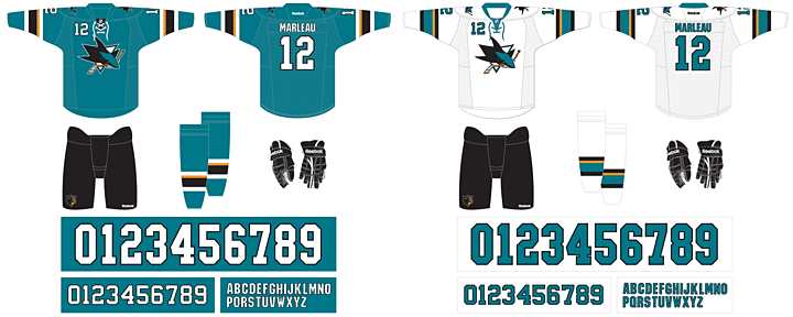
On first glance, we see a highly simplified style compared to the previous jerseys. No shoulder yoke and no waist stripes. Now the teaser photos from the last couple of days make sense. The details they showed us were the only details they could. There's not really much else to see.
We'll start with the features the Sharks are touting in one of their new videos.

Right off the bat, it's all about performance. This is a unique story this summer. The Stars wanted a color palette they could own and the Hurricanes wanted a more traditional sweater design. The Sharks, however, wanted to keep their players from being weighed down by a heavy jersey.
This was made very clear in another video the Sharks posted, in which Sharks GM Doug Wilson and COO John Tortora talk about the design process. Here's what Wilson said:
The jersey was designed mainly with performance in mind. Remove extra weighting. Make it as efficient as our third jersey, the black jersey.
From the performance side, just the weight of it. If you take a look at our black jersey, the players really love that one. Not only the success they had with it, but weight of it. For movement and everything.
The players and trainers had the most input.
Interesting here how involved the players and trainers were. Clearly, these jerseys are more about utility and less about vanity. So good or bad, they probably won't be favorites among Icethetics readers.
Even if the look wasn't the primary focus, it's still a critical part of any jersey. While it's important to have something the players like, the reality is it's just as important to have something the fans like. They're the ones who are supposed to be buying them.
That in mind, the Sharks listened to the feedback they were getting from fans. And if it's anything like what I read on a regular basis, they wanted the orange gone. I'll admit the original teal and grey jerseys were nice, but the orange accents were an upgrade in 2007. Sounds like I was in the minority there.
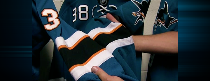
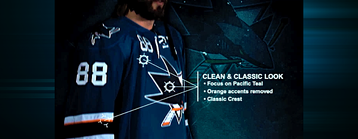
To that end, the orange has been removed entirely from the numbering and lettering. And there's now just one thin stripe on the sleeves to keep that part of the palette represented. It still works, and hopefully it will incur less wrath from Sharks fans. The picture above shows a side-by-side comparison of the old design (left) and the new.
And is it just me, or has the shade of teal been changed again? Looks the smallest bit greener.
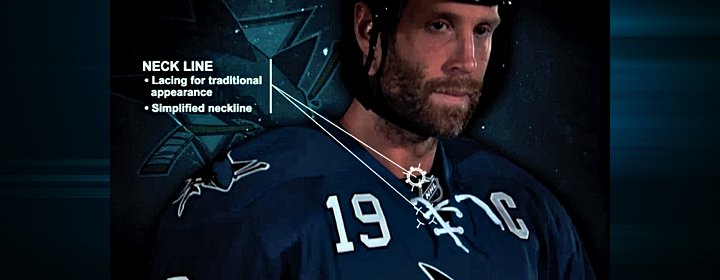
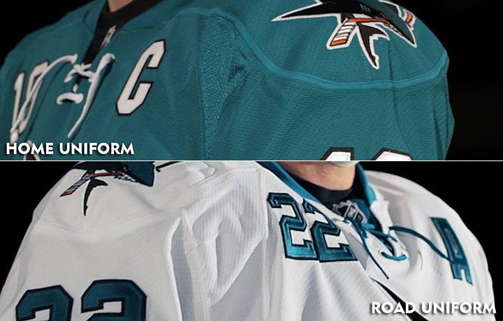
One of the big changes was to the neck line of the jerseys. The multi-color collar has been simplified to teal — even on the teal jersey where it blends right in. And new this year are the laces you find on the black jersey. My first thought was, wouldn't the laces add extra weight? But it's become clear the Sharks just want teal and white versions of the third jersey the players love so much.
And the "traditional appearance" argument is getting harder and harder to sell in this NHL. So far, every new jersey we've seen this summer has them — except Buffalo's third which hasn't actually been released yet. Counting San Jose, 17 of 30 teams are now sporting lace-up collars. That's more than half the league.
Guess how many teams wore lace-up collars 20 years ago. Zero. How about 30 years ago? Still zero. If we go back 40 years, we find that just five of 16 team wore them. And the Sharks never have — until the black third. The point is, this is a new trend in hockey.
I'm not saying I dislike this collar style. I'm just asking that we stop using the word "traditional" to describe them. It's just not accurate.
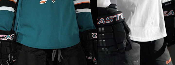
Let's move to the shoulders. The yoke and its piping are gone, which is a relief to some. The reason I like it is that it does have the feel of a more traditional Sharks jersey. Their original sweaters didn't have shoulder yokes and they looked great.
What I am disappointed about is the shoulder patch. I was hoping for an update in that department to one of the other marks in their arsenal. In particular, I had my fingers crossed for the fin logo I included in yesterday's post. But perhaps it has too much orange. All I know is that the existing patch is basically the primary logo without the triangle. Why not try another option?
It's also disappointing to see them stick to their guns on the chest numbers. I really hoped that was going away. Only the Sharks and Sabres are still using them and it looks awful. On a more practical note, wouldn't those numbers add weight? I guess as a player you could just switch to one digit to cut weight. I assume No. 1 would be lightest but none of San Jose's goalies use it.
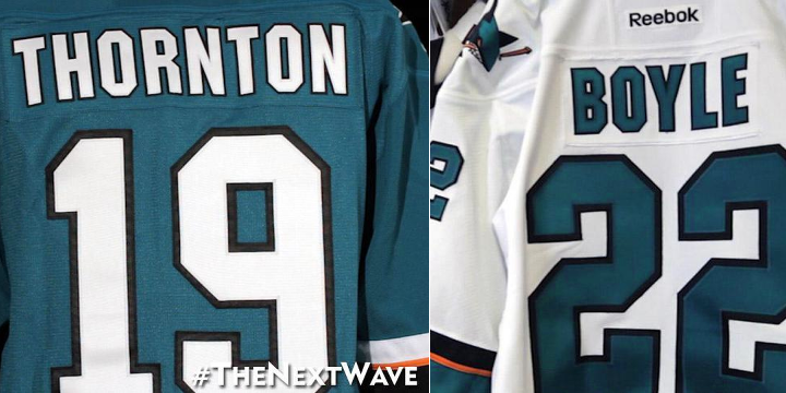
Here's something I like. The simplified palette of the numbers and letters was definitely a good move. Yes, it reduces weight by losing the orange layer, but it just looks more... "Sharks" to me. I don't know how else to put it. Might be a good time to use the word "traditional."
Now here's something I don't l ike. Where are the stripes? Logically, I get it. I understand the weight reduction aspect of these redesign. But I just can't reconcile that with my desire for good hockey sweater design. Twitter's ablaze with commentary on how much these resemble practice jerseys because of the lack of waist striping. And I don't disagree with the sentiment.
But if the players want it, if they say it makes a difference, we'll just have to live with it.
By the way, I shudder to even suggest this, but strictly as a way to keep the waist striping, I think I would've been all right with a little sublimation. I know, it sounds awful. But would it be worse than this?
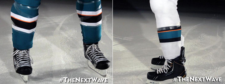
It should also be noted that the sock striping was changed to match the sleeves.
I think I've hit all the important points in this review. I'm sure you guys will let me know if I missed anything. As I've said in previous reviews, I'm not good at giving out grades, but I can do a summary.
Summary
Here at Icethetics, we're so accustomed to thinking of hockey sweaters as simply pieces of design. We can therefore describe why the design is good or why it's bad. Or both. But if the Sharks' redesign has reminded us of one thing, it's that hockey sweaters are critical pieces of equipment to some of the planet's most talented athletes.
What may look cool doesn't necessarily translate to athletic performance. Anyone remember Cooperalls? I'm not trying to say they were cool, but it was an instance where design curbed performance. Those things were flat out dangerous if you took a spill. Here, it's not as drastic, but it's just as understandable.
The players asked for lighter weight jerseys. But there also needs to be a good design. It's hard to be the servant of multiple masters. With that in mind, I think the final product works. They used the opportunity to address fan issues such as the use of orange while also addressing player concerns.
The end result is a bit of a mixed bag. But then with multiple masters, so was the starting point.

Now that you've read my take, get to the comments and let me read yours.

Reader Comments (106)
wow, just WOW! AWFUL AWFUL AWFUL. These look like practice jerseys! The hurricanes, now these pieces of trash! Makes me wonder.
When a fan buys the replica of this jersey it's going to look pretty plain without Name and Numbers on it. That being said I do like it! I might be one of the few but I also like the front chest numbers. Out of ten I 10 it's a 7.5
I dislike the lack of horizontal stripes on the bottom, however if it must be done, at least the pants are a different color from the shirts. The black version (like the RBK Toronto stripe-less home unis) looks like one-piece pyjamas.
Shoulder numbers were always awful, but are embarrassing at this point. Poor form to continue with them, especially when the weight of seams was considered an issue. The only logical reason to keep them then, would suggest that someone felt the design benefits of shoulder numbers trump the weight disadvantages (which are greater than the seams removed elsewhere).
Somebody was really wrong and should stop making design decisions.
Lastly, the keeping of the orange/gold single stripe is a bit of a hiccup in the design as well, but can be forgiven as an in-between phasing out version before an eventual redesign that eliminates that ill-conceived color altogether.
PS - I like shoulder yokes very much, but these unis work nicely up top without them. I would probably like them just as much with.
I don't understand what the big deal with dropping the waist striping is. It's a very clean look, the Dan Boyle action shot at the end sold me on that point. Everything's simpler, more streamlined, and frankly better looking. Not to mention its nice to see a team test new things
I'm surprised they changed their uniforms. The old ones were totally fine. All they had to do was drop the jersey numbers from the chest and it would've been great.
The new design is ok, except for one thing: The FREAKING jersey number on the chest!
I love that they got rid of the shoulder yokes, but what a missed opportunity to lose the chest numbers! It makes no sense to keep them, especially if they're saying this "weight" issue was so important. They're awful! These would have been real nice with the chest numbers removed and some waist stripes.
I'm very torn on theese as a player I understand the want for a light easy to move in jersey but as a designer I can't stand some of the things here. I really like the new stripping patern it's just a shame they opted for nothing on the bottom even if it was just a trim on the hem. I feel the top is way to cluttered with number the. Ties then captain letters they added a stripe of white and black there I stead of the bottom. As for the practice jersey comment I'm going to go with you guys obviously have never seem a practice jersey because they generally don't have any stripes at all.
I am not pleased with this change at all. In these months leading up to now, hearing the rumor about how the Sharks were getting new jerseys for this upcoming season, I was so excited and perhaps had too high of an expectation.
I was thinking maybe they would make some sort of a comeback towards the pre-Reebok jerseys, which featured silver, the true original trim color for the sharks, not orange. There was a concept posted in the concepts section made by Justin Cox that pretty much nails the design. I would've been SO happy if it had any resemblance to that, or the previous jerseys.
Excluding the removal of orange from the numbers/letters and overall prevalence from the jersey, there is nothing else that I like about the New Wave. The new striping pattern is essentially the same minus one orange stripe, the removal of waist stripes makes this jersey look top-heavy, the removal of color from the collar makes everything seem so dull, the "traditional" look of laces doesn't go well with a "modern" logo like the Sharks', and they didn't even try anything "New Wavey" about this design. Oh, and the shoulder yoke which worked quite beautifully on the previous jersey is gone too. I can't believe they even put the widely hated front numbers on all of the jerseys now. This is my opinion, but I never even thought that any new jerseys can come close to looking worse than Carolina's...
Also, the teal color does seem to be a bit greener. If this is the case, one more reason to be upset. I absolutely love the previous teal color.
I'm quite disappointed. I guess I can be partially glad that they're still wearing the black jerseys.
I like the removal of the shoulder yoke. However, they need a waist stripe.
Also, the striping looks unbalanced with the one orange stripe. Either keep both orange stripes or get rid of the orange altogether.
I think it is the first team in the NHL to not have a different colour for its collar. It works really well. I hope others will follow.
Less orange is good. A small black line at the bottom of the jersey (à la caps) would have helped a lot. And getting rid of the awful chest numbers too...
No hockey jersey is complete without horizontal waist stripes. It's a big miss on an otherwise nice looking jersey.
At least the shark got a tail, it's a start.
How broke are the Sharks if they need to take their aborted 2007 RBK jerseys out of the trash can just to make a fast buck? The hockey world has spoken on this for the last 6 years and reached a consensus: THIS IS NOT A GOOD LOOK.
Terrible fail on the Sharks. I can't believe they retained that number on the front.
This look is so disappointing because of the lack of hem stripes. The striping in the old uniforms was perfect to me and didn't need to be changed. I like the shoulder yolk change, but the collars and the numbers could have been better. I would have kept the numbers the same minus chest numbers (should be gone), but the collars I would have had a black collar on the teal. Socks should've stayed the same as well and I would add a teal cuff to the black gloves.
Wow, did the Sharks blow it or what?! Their uniforms were one of the best to come out in the last few years, and they went ahead a screwed it up. I can't for the life of me understand why NHL teams continue to get rid of horizontal stripes at the bottom of a jersey.
You had me at 'Cooperalls'.
Honestly, I just can't reconcile the explanation of 'increasing performance' in regards to removing the waist stripes when they decided to keep those silly numbers on the front of the jersey.
As well, anyone who has held an Authentic Reebok sweater can tell you that the heaviest part of the jersey is the fighting strap, not the stripes or shoulder yokes. If you don't fight, or you tuck your sweater into your pants, there's a few ounces you can shed right there; more than the yokes and stripes combined.
Wow, the Sharks, just like that, go from having one of the nicest jerseys in the League to one of the, if not the absolute, worst.
I really have no other words to say about it. It's just that bad. I know I have to get one to keep my collection up to date, but I really want to go with option d) for which Sharks jersey to get now.
None of the above.
I'm very late to the party here, but first and foremost, I'm pretty disappointed. There really isn't anything that I like about the changes other than the removal of the shoulder yoke.
My opinion what they should've and shouldn't have done
-should've switched to the fin logo on the shoulders
-shouldn't have removed the waste stripe
-should've eliminated the chest numbers
Overall, these new jerseys are a downgrade in my opinion.
Now I've heard it all. What excuse will they come up with next for choking in the playoffs? The helmets were too tight? The ice was too cold?
How wimpy does a man have to be where decreasing an ounce from his jersey makes a big difference to him?
And what part of these jerseys was removed to decrease weight? The yokes are still there, just a different color.
I didn't know colors weighed anything. Good thing they removed those orange stripes for performance.
Anyone else think jerseys are getting simpler (fewer stripes, no yokes etc) so that sponsors will fit on the jersey better?
I don't hate the new jerseys... But I hate seeing less orange. The fin logo Chris included would have looked good on the shoulders... The numbers look good with no orange though. If they would have added hem stripes though I definitely would have liked them more
I've got to say, I'm pretty surprised with the amount of hate these are getting. Yes, the chest numbers are stupid, but you don't need waist stripes for a hockey jersey... Just ask Montreal. It works.
We had both Jerseys in studio yesterday here in the Bay Area. While the Home (teal) is plane it looks really sharp and sleek in person but the white (away) is hands down the better of the two - teal collar, contrast of lettering/numbering. Been a Sharks fan from the beginning (so may be bias) but I'd rank the white away 3rd on all-time sjsharks list behind both originals
Good review and great mix of suggestions from the readers! My only input is; like Carolina, San Jose has an opportunity to 'brand' their jersey different than most teams. Not saying go wild or all 'minor league', but maybe incorporate a waist stripe with a bit of a 'wave', as Carolina should be adding the hurricane flag to it's waist line? Something subtle that finishes the jersey off so it looks complete? Staying classy and not taking away from it's simple look, but even just a top stripe of two with a few ripples in it? Fins on the shoulders would have also been nice. Front numbers, my hope is that they look to remove those after this season? I like the laces.
looks great for a warm up/practice jersey. but why would they do a big reveal of those? .... oh you mean these are their actual game jerseys? ummm big fail. if you are so concerned about the wait of them use fewer little pieces of fabric for the jersey to be sewn from and sublimate the stripes on, youre sure to loose a pound or two. whats the point of having a couple of elbow stripes and have nothing else on the jersey. no thank you. didnt like it on the 'yotes jersey dont like it here.
and as far as the weight argument... remove the silly extra numbers on the front. why would you keep those on?!?!?!?!
Stupid, stupid, stupid. I don't think I can say anything that hasn't been said, but I would like to restate one thing: Shoulder yokes didn't hold the Bruins back from a cup, nor did lots of waist striping hold the Blackhawks back. If you're blaming the weight and constriction of a uniform system that's one of the lightest and least constricting ever used for your inability to perform, your organization and players have some deep underlying issue with accountability. That's an incredibly poor excuse. I'm all for player comfort, but you're already there. It's not like you're being made to wear the old 6100s.
HEY LOOK, it's another long sleeve football jersey! Ok I agree the diaper hem makes waist stripes look silly/outta place but these aren't NFL jerseys which are tucked in, these aren't MLB jerseys which are tucked, these aren't even button down dress shirts (rounded hem/gets tucked in), these are Hockey jerseys damn it, bring back straight hems and waist stripes. Is it time for the Edge crap to go yet, sooooo over and sooooo tired of the edge crap ruining NHL jerseys. Loved Phoenix's pre edge jersey (hmmm had waist stripes). Loved the Sharks pre edge jersey (Teal/Gray/Black), not to mention that rbks idea of idea of gold on my Pens jersey looks closer to Khaki or Beige (my Khaki St. Johns Bay dress pants that I wear to work are identical in color to that of the Edge Pens jersey...wth??)
The front numbers look even worse without the shoulder yoke. They're just floating there, out of place. The single orange stripe on the sleeves makes no sense. The whole thing looks bush league and I doubt that a lighter jersey is going to solve the Sharks' playoff woes. Worst jersey in the Pacific Division and terrible waste of and awesome logo. Grade: F
All this performance talk is a joke! We had to listen to that nonsense when the edge jerseys came out. The pre edge jerseys had the hem stripes as part of the jerseys, but now it is extra weight? The Shark executives come off as fools! Then as others have mentioned they keep the extra weight of the number on the front at the same time. the fact that this is even being discussed by the team is very lame. As Chris pointed out they then add the heavier tie neck collar. The Sharks are a mess. While I am at it , I have always wondered why everyone is so in love with their black 3rd jersey? I never liked them from the beginning,
The thing to do would be to put the orange stripe in the middle of the other 2 so it would be symmetrical!?!
Such sweeping disdain for this new look. I thought feedback on the Dallas Star(buck)s was bad. As a Sharks fan, I was quite displeased with the '07 redesign. This newest tweak addresses a lot of the issues I had with the '07 jerseys. Minimalist use of orange without completely eliminating it, removing the yoke as it made the jersey look busy, and removal of the waist stripes for a sleeker look. I know most people say a jersey HAS to have waist stripes, but with the different color pants to break it up, the waist stripes are useless. I can go either way on the chest numbers. I neither like nor dislike them. I see 'fail' tossed around a lot when describing these new jerseys, but they're hardly a fail. There have been several genuine jersey fails, but this is hardly one of them. I look forward to seeing these in action. I give them a solid B (8/10)
Why is everyone hating on the Sharks for going with a design geared towards performance? They are hardly the first to make this request, nor are they the first to benefit from equipment redesign. They never said it will make them better players, or a better team, or win the Stanley Cup. They want to be more comfortable when playing. Wouldn't you? The whole UnderArmour line is designed with player performance in mind. Lighter composite sticks, fogless face shields, helmets with increased padding, baseball jerseys with newer fabric to allow for more breathability in the summer in the heat, swimsuits to reduce drag in the water, a complete NFL uniform overhaul to improve player comfort and performance...I can go on and on. If you pick on the Sharks for wanting to improve comfort and performance any way they can get, you're basically saying every athlete is a puss for donning the newest innovation. I have to wear a tie to work. If I could wear a dress shirt that had a tie printed on the shirt and get to wear my collar open, I'd choose that for sure. It has no real impact on my job, but it'd feel a lot better throughout the day.
Backward step for me. Chest numbers are just awful and at first glance , all I can think is practice jersey. :(
Seems like change for the sake of change more than anything. They had a near flawless home/away set and while their alternate uniform was incredibly boring and definitely should have never seen as much time as it did in the past few playoff campaigns, it wasn't that awful. The new striping is a win and the loss of the shoulder yoke makes for a pretty sleek look with all that teal but losing the hem stripe is what makes this a downgrade in the end. Meh.
Can't understand why teams are going to bland designs like this from a fan base and marketing perspective. At best this set makes for decent practice jerseys.
From a player / weight perspective, I'll tackle this two ways.
First, if it really is all about shedding a couple ounces of weight these athletes are asking for, ditch the lace up neck. Ditch the front numbers. I can't believe with all the innovation put into the materials already that players are complaining they're too heavy compared to what players used to wear (and not whine about). How about your shoulder pads, pants, goalie pads, etc. With all your money maybe have enough to switch between periods in a game to gain that extra edge in dryer/lighter equipment guys!
Second, maybe it's time someone holds reebok / NHL r&d accountable. Ron Wilson is quoted as mentioning better 'movement' as a player benefit to this design. Much more than the weight, I can see this being a legitimate player complaint. The reebok era jerseys may just be a little too restrictive? While I'm at it, when I was a kid I had a couple CCM replica jerseys. The material may not be the space-ace material players are wearing now, but one thing that stands out to me is that the stripes were a part of a continuous fabric. It wasn't layers of additional material. Does reebok not know how to do this anymore? Maybe check in with the companies that make elaborate, breathable soccer jerseys?? You could still have your fashion and function.
But hey, what do I know?
Battman: I like your wave idea. And it could have been as simple as a 1-1.5" thick wave a couple of inches from the bottom of the sweater; a black wave on the teal jersey, a teal wave on the white.
Alex Hackert: Neither a lighter jersey or a better or worse looking jersey will help the Sharks in the playoffs. The best they could have done jersey-wise (and should have done before this) was simply switch jerseys just for the sake of change. I bet they would have won a few more games just by doing that. Though their final playoff results would have been the same.
BTW, nobody's mentioned the lack of a special inside-the-collar design. A repeating black silhouette of a swimming woman would have been AWESOME! IMO, it would have counter-balanced most negative opinions on the lack of waist stripes.
The chest number, however... Unforgivable. Also, while I previously said I like the laces, I said so with an image of the jersey with no chest number. As someone else said, the combination of chest number and laces is too much, and that's not even considering the captain "C" and alternate "A".
Anyhoo...
need stripes on the bottom, fin logos on the shoulders, and numbers off the front and San Jose are up there like 23 years ago as having one of the best looks in the NHL, now just blah. Here's hoping for the original teal on their 25th Anniversary.
Jumbo Joe's and the players look says it all, needs stripe on the bottom even if it was on black one would make it pop, fin on the shoulders and chest numbers gone. Montreal's sweaters do have stripes on the bottom both jerseys
So everyone is complaining that these jerseys are to simplistic yet when we vote on IceHL jerseys, the simplest ones always win? Confusing. Apart from the ugly chest numbers, I think its an upgrade because it reminds me of the old Sharks.
7.5/10
Imagine if the Sharks held a press conference for these. The people in attendence would have been stunned in silence, because of how awful they are.
I'd give their old uniforms a solid 8/10 for the unique color scheme, good logo, and good striping. I'd say these are 5/10... they're definitely taking a big step backwards in terms of design. Just look how unhappy Leafs and Oilers fans were with their new uniforms... they put the waist stripe back
Im sorry to say but they jerseys make me embarssed to be a sharks fan. The Sharks went from having one of the top 5 jerseys in the league, to have one of the worst ones. They basically just switched designs with Dallas (who for me, had previously held the title of worst jersey in the NHL) Dallas went to a REAL traditional look aka nothing fancy, arm stripes, waist stripes, logo (what SJ had before). San Jose than dug Dallas's old jersey scheme out of the garbage and came up with this horrendous design. I was NEVER a fan of the black jerseys, I just dont like black jerseys, they have no personality. Black jerseys with no waist stripes are even worse. So now SJ has 3 of the same terribly designed jerseys... Also the arguement that they did it to reduce weigh is nonsense. Black material on the shoulders vs teal material is the same weigh, one color does not weigh more than about. The waist stripes MAY add some weight, but Boston & Chicago didnt have a problem winning the cup with that "added weight" And also about "replicating the success they have with the black jerseys in the playoffs" Well, thats nonsense to, since they only wear black in the playoffs, you cannot compare it to the teal jerseys -- oh also, last I checked SJ hasnt had much success in the playoffs lately. Winning 1 or 2 rounds every year isnt much of a success story for me -- Maybe they arent advancing because of the black jerseys?? hmmm
Bottom line, the design is bad, and the reason behind it is laughable. Jerseys without "bottoms" look terrible. I really hope majority of SJ fans are like me and refuse to buy these awful things. I also wonder how long they have to wear them, cause this needs to be changed back ASAP... Maybe an 0-12-0 start to the season will help with that process.
Overheard in the Jersey Design Room:
"If we keep waist stripes, that will be another hairline of orange and that's just too much."
"We CAN'T remove the shoulder numbers, someone's going to think they're practice jerseys!"
"I know a company that makes TEAL LACES!"
I really like these. They are clean and simple. Only problem is that there is no stripes along the bottom of the jersey. I HATE it when jerseys don't have stripes on the bottom. Overall, very happy, Hopefully this is the continuing trend of simplifying jerseys across the NHL.
And meanwhile the 2006 Swedish Olympic Gold Medalists are laughing at how ridiculous all these North American players are.
If someone, somewhere - anywhere can post a spec sheet showing that they actually had legitimate reason to do this I will accept it. Otherwise I'm going to accuse San Jose for sacrificing their jersey integrity for 5 grams of stitching in the jersey.
However - the lace up collar may release more heat, and the lack of stitching in the shoulder yolk and striping may allow sweat to drip off the jersey better.
Hey Hitmanhockeycards -- you said it!! As I posted in another thread, these are embarrassing for Shark fans. The ONLY good thing about these is that I should be able to run to the Sharks store (or somewhere) and hopefully buy last season's road jersey at a good discount (I already own a teal one). This organization seems to be degrading and providing one lame excuse after another. What's next if they fail to advance in the playoffs? They going to try those old NCAA football rip away see-through mesh jerseys? Really sad and laughable.
Not bad but I definitely liked their previous uni's more than the new ones. I personally was a fan of the orange but if they are going to cut back on it I'd rather them just get rid of it altogether. The one single, tiny orange stripe just looks weird.
More than anything I'm relieved they didn't do something incredibly dumb like make their black jerseys their new home jersey. Those things need to be burned.