


Review: Sharks Unveil New Uniforms
 106 Comments
Before we get into the details of the newly unveiled San Jose Sharks primary uniforms, it might help to ask why they redesigned them in the first place. After all, they just redesigned their entire identity — logos and jerseys — in 2007. Why do it again after just six years?
Performance, in a word. According to the Sharks, the players love the lightweight third jersey. Why do you think they wear black every year come playoff time? So the main idea behind revamping the primary jerseys was to drop weight.
Sure, we can ask whether a few ounces here or there really makes any kind of difference. But then we've never played hockey at the NHL level, so what would we really know about that?
 All photos and images from San Jose Sharks
On first glance, we see a highly simplified style compared to the previous jerseys. No shoulder yoke and no waist stripes. Now the teaser photos from the last couple of days make sense. The details they showed us were the only details they could. There's not really much else to see.
We'll start with the features the Sharks are touting in one of their new videos.

Right off the bat, it's all about performance. This is a unique story this summer. The Stars wanted a color palette they could own and the Hurricanes wanted a more traditional sweater design. The Sharks, however, wanted to keep their players from being weighed down by a heavy jersey.
This was made very clear in another video the Sharks posted, in which Sharks GM Doug Wilson and COO John Tortora talk about the design process. Here's what Wilson said:
The jersey was designed mainly with performance in mind. Remove extra weighting. Make it as efficient as our third jersey, the black jersey.
From the performance side, just the weight of it. If you take a look at our black jersey, the players really love that one. Not only the success they had with it, but weight of it. For movement and everything.
The players and trainers had the most input.
Interesting here how involved the players and trainers were. Clearly, these jerseys are more about utility and less about vanity. So good or bad, they probably won't be favorites among Icethetics readers.
Even if the look wasn't the primary focus, it's still a critical part of any jersey. While it's important to have something the players like, the reality is it's just as important to have something the fans like. They're the ones who are supposed to be buying them.
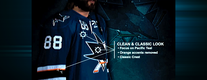
That in mind, the Sharks listened to the feedback they were getting from fans. And if it's anything like what I read on a regular basis, they wanted the orange gone. I'll admit the original teal and grey jerseys were nice, but the orange accents were an upgrade in 2007. Sounds like I was in the minority there.
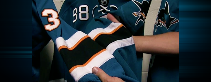
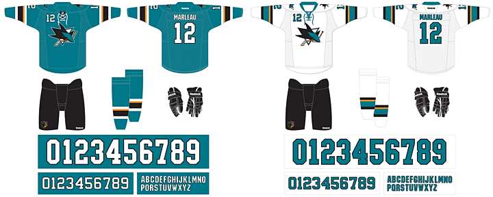
To that end, the orange has been removed entirely from the numbering and lettering. And there's now just one thin stripe on the sleeves to keep that part of the palette represented. It still works, and hopefully it will incur less wrath from Sharks fans. The picture above shows a side-by-side comparison of the old design (left) and the new.
And is it just me, or has the shade of teal been changed again? Looks the smallest bit greener.
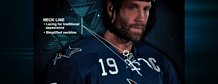
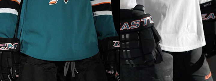
One of the big changes was to the neck line of the jerseys. The multi-color collar has been simplified to teal — even on the teal jersey where it blends right in. And new this year are the laces you find on the black jersey. My first thought was, wouldn't the laces add extra weight? But it's become clear the Sharks just want teal and white versions of the third jersey the players love so much.
And the "traditional appearance" argument is getting harder and harder to sell in this NHL. So far, every new jersey we've seen this summer has them — except Buffalo's third which hasn't actually been released yet. Counting San Jose, 17 of 30 teams are now sporting lace-up collars. That's more than half the league.
Guess how many teams wore lace-up collars 20 years ago. Zero. How about 30 years ago? Still zero. If we go back 40 years, we find that just five of 16 team wore them. And the Sharks never have — until the black third. The point is, this is a new trend in hockey.
I'm not saying I dislike this collar style. I'm just asking that we stop using the word "traditional" to describe them. It's just not accurate.
Let's move to the shoulders. The yoke and its piping are gone, which is a relief to some. The reason I like it is that it does have the feel of a more traditional Sharks jersey. Their original sweaters didn't have shoulder yokes and they looked great.
What I am disappointed about is the shoulder patch. I was hoping for an update in that department to one of the other marks in their arsenal. In particular, I had my fingers crossed for the fin logo I included in yesterday's post. But perhaps it has too much orange. All I know is that the existing patch is basically the primary logo without the triangle. Why not try another option?
It's also disappointing to see them stick to their guns on the chest numbers. I really hoped that was going away. Only the Sharks and Sabres are still using them and it looks awful. On a more practical note, wouldn't those numbers add weight? I guess as a player you could just switch to one digit to cut weight. I assume No. 1 would be lightest but none of San Jose's goalies use it.
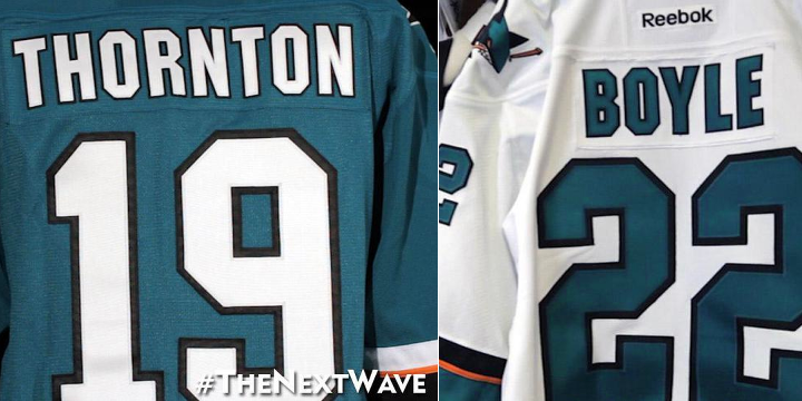
Here's something I like. The simplified palette of the numbers and letters was definitely a good move. Yes, it reduces weight by losing the orange layer, but it just looks more... "Sharks" to me. I don't know how else to put it. Might be a good time to use the word "traditional."
Now here's something I don't l ike. Where are the stripes? Logically, I get it. I understand the weight reduction aspect of these redesign. But I just can't reconcile that with my desire for good hockey sweater design. Twitter's ablaze with commentary on how much these resemble practice jerseys because of the lack of waist striping. And I don't disagree with the sentiment.
But if the players want it, if they say it makes a difference, we'll just have to live with it.
By the way, I shudder to even suggest this, but strictly as a way to keep the waist striping, I think I would've been all right with a little sublimation. I know, it sounds awful. But would it be worse than this?
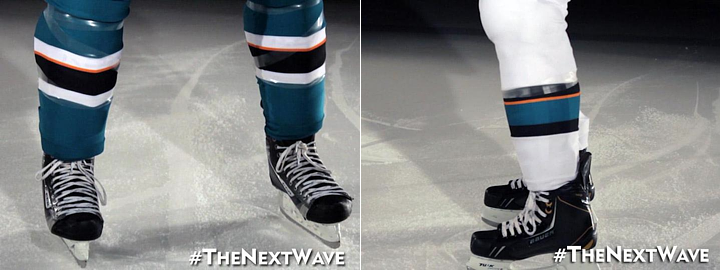
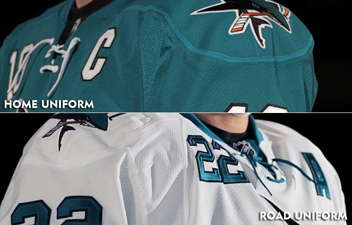
It should also be noted that the sock striping was changed to match the sleeves.
I think I've hit all the important points in this review. I'm sure you guys will let me know if I missed anything. As I've said in previous reviews, I'm not good at giving out grades, but I can do a summary.
Summary
Here at Icethetics, we're so accustomed to thinking of hockey sweaters as simply pieces of design. We can therefore describe why the design is good or why it's bad. Or both. But if the Sharks' redesign has reminded us of one thing, it's that hockey sweaters are critical pieces of equipment to some of the planet's most talented athletes.
What may look cool doesn't necessarily translate to athletic performance. Anyone remember Cooperalls? I'm not trying to say they were cool, but it was an instance where design curbed performance. Those things were flat out dangerous if you took a spill. Here, it's not as drastic, but it's just as understandable.
The players asked for lighter weight jerseys. But there also needs to be a good design. It's hard to be the servant of multiple masters. With that in mind, I think the final product works. They used the opportunity to address fan issues such as the use of orange while also addressing player concerns.
The end result is a bit of a mixed bag. But then with multiple masters, so was the starting point.

Now that you've read my take, get to the comments and let me read yours.

Reader Comments (106)
I like that it is a simpler design, but dropping the waist stripes is definitely a problem. So is keeping the number on the front. They have numbers on the front of the helmets now, so they really don't need them.
Overall, I find it underwhelming. Not a fail, but not a high grade either. C-.
Want to shed weight? Lose the chest numbers. Sure, they can't weigh much anyways, but they certainly still look terrible. Win-win if they had removed them.
I can understand the changes. In an age where the fans are becoming a bigger part of the game, I'm happy that the players were able to have some input. They're not the best jerseys, but I like no yokes better than a black yoke. The alternate shark (as a patch) looks much better on teal than black.
Agreed on the numbers/letters. Traditional can be used. I just wish there was a hem stripe to complete the jersey, but I understand the decision. Now all three jerseys look alike, except for the awkward orange stripe on the elbows.
6/10
Major downgrade....
I totally get what they were going for in replicating the performance of the alternate jersey, and overall, I think it looks pretty good. Their previous jerseys were too busy. I do wish they had sacrificed a little bit in the weight department for some waist striping, but I guess then the players would still prefer the alternates. My biggest complaint is that they kept the shoulder numbers. Also, I think over half of the league having a jersey with a lace-up collar is a bit ridiculous. Perhaps they should be reserved for original 6 teams only.
Yeah not a fan... I liked the orange accents and losing the bottom stripe makes the jersey look cheap. big down grade
errr, are those the warm up jerseys?? Sorry, HUUUUGEE fail, even worse than carolina.......
@Jeremy: Good point! I thought of that when I first saw them but initially forgot to include it in my review.
Poor Dan Boyle, now no one's gonna second guess his number
_....I count 10 two's on his uniform, talk about overkill !MEH/10
Yeah, I bet those waist stripes were really breaking Joe Thornton's back all these years. Its gotta be brutal lugging all those stripes around. Lol, weight reduction...
Totally agree with you Chris and the first four posters. So they wanted to get faster --- hmmm . . . . instead of redesigning the unis, maybe they should have redesigned the roster. Apparently all that striping didn't deter Boston and Chicago over the past few seasons. Typical lameness from the Sharks. Heard it again and again from these guys. One reason (besides the ever increasing $$$$) why I figured it was time to give up on season tickets.
forgot to say, do the players lose their right to an opinion (on jersey design) when the sales of the replicas fall through the floor???
More HORRIBLE REEBOK EDGE CRAP!!!!!!!!! Players asked for it??? Proves even more that all those players are idiotic illiterates with no taste and care only for the bucks in their pockets....... But then who would think they would have taste when you see some of them in their million dollar suits and flip-flops....
@Vaytch: Well if you're counting the numbers on his helmet — and you must to be get past eight — there are actually twelve 2s on his uniform. Four on his helmet alone (front and back).
you missed the fact that they kept the Numbers on the front of the jersey. Other than that though you did a good job
It would've looked 10 million times better if they had completely eliminated the orange stripes. Keeping just one looks really bad. Overall it's a great improvement over what they had, but nowhere near as good as their original jerseys. The numbers on the front need to go also. Personally I don't care about the missing waist stripes.
I miss the waist stripe, but overall they're still definitely a step up from what they had before. More teal, less black = good for everyone.
I really liked the orange, but if you're going to eliminate it, eliminate it. Having one lonely stripe in an otherwise symmetrical elbow arrangement looks unfinished, like they forgot to finish the striping.
In general, I think it's a worse look.
I'm a Sharks fan and I think they are great. They are the most similar to the original jerseys that they've had since the initial uniform change. With the shirt-tail hem, I think it looks better with no stripes at the waist. Nice job guys!
For the love of all the beautiful things tinted orange...this isn't one! Why on earth is there orange on this jersey? Great job losing the orange trim on the numbers, but why leave it on the sleeves and socks? NHL uniforms designers have just lost their way. SIMPLE IS BETTER most of the time (Leafs, Red Wings). 2.5 out of 10 from me...I'm feeling generous today!
It's like the reverse of what the leafs did. Real jersey to practice practice jersey this time. And the numbers are still crammed up there.
You know the funny thing about these uniforms? Given the trend six years ago, this is exactly the kind of design we should have expected back in 2007 when Reebok Edge took over. And I think we all know how many of THOSE jerseys got criticized for being too simple and looking like they belong in practice.
I'm sorry, but the Sharks just took a step backwards. They were one of the few teams who actually had nice looking jerseys coming out of the Edge takeover. By the way Chris, funny stat - in this era of constant uniform changes - as of today, know how many teams have redesigned their 2007 original edge uniforms? 12, with a half each for Florida and Minnesota due to their upcoming road jersey (although if it looks anything like a white/cream version of that green third, I don't think it will be long before the red jersey is retired and they join the list).
Great review. These jerseys are a bit of a more sleek take on the jerseys they introduced in '07 (not a bad thing).
I like your point about the waist striping. As a Leafs fan, I was abhorred that they took out this in their '07 redesign. The difference here is at least the San Jose jersey has black pants to offset it. So it still makes some sense with the different color pants. If they wore teal on the bottom half as well that would just be terrible.
if they wanted to drop weight off the jerseys they should have tossed the Chest Numbers. I hate numbers on the player's chest and are they really necessary? Numbers are also on the front of helmets.
Forward numbers are a joke as is the one last lame orange stripe. They brought back the teal-black-gray combo for the new practice jerseys, they should've done the same for these. Big missed oppprtunity to bring us back to an updated version of the originals.
I'm disappointed. Waist stripes gone, orange still on the jersey and those chest numbers..unfortunately they are the worst jerseys in their franchise history in my opinion.
I wonder what the weight of the jerseys would have been with a horizontal stripe at the bottom and without the numbers over the right breast.
Just a thought...because I never really liked the numbers being on the front of the jersey.
I thought the third jerseys were a joint marketing venture with another company. So when I saw these new Home and Away sets I figured they were just trying to recreate the Third. Preferred what they wore last season. I understand the need for better performance but at what cost do you sacrifice a good design?
The Hurricanes are probably happy these are out now so the heat of a poor redesign won't be focused completely on them.
Awful. What was wrong with their old ones
My suggestions for making this better? Lose the front numbers, replace the shoulder jumping logo with the fin logo, and make the collar on the teal jersey black. I don't care about the waist stripes personally, but those few things would greatly improve this.
The "tradtional" aspect of that stupid lace-up collar comes from the Original Six era, when five out of six used it at some point. The Red Wings never used it, not until their Winter Classic jerseys at least.
"Traditional" looks also included sweaters made of wool.
It's all the Rangers' fault for reintroducing that stupid-ass element back in 1997.
Great review! I always love reading your take on things Chris! For me, I find the jersey to be a slight upgrade. I found the old jerseys had too much orange, and with the shoulder yokes and chest numbers, etc, the jersey looked crowded and almost cartoonish. With less orange, I feel like it looks a lot cleaner. However the numbers on the chest, should have been the FIRST thing to go. Dissapointed in that aspect. I also wish there was waist stripes. What I would love to change to these new duds, is to a) drop the numbers on the front, and b) add a single solid black stripe on the bottom of the teal jersey, and a solid teal stripe on the bottom of the white jersey. Then im sold. Everyting else I like.
a simple fix that makes both look a lot better, 1 thin white stripe and 1 thin black stripe round the waist of the teal jersey and 1 thin teal stripe and 1 thin black stripe round the waist of the white jersey. lose the chest numbers and i'm sure the weight would be the same.
The way I see it, the Sharks didn't really need to change their jerseys. Perhaps a few tweaks but other than that they had a pretty sharp look. I can understand reducing the weight of the uniforms, but at the same time, they simplified their look a bit too much. The top half of the jersey I'll say works good, but the bottom half misses the mark entirely.
The first thing I'd like to point out is the home jersey's collar. On the third jersey the black on black works, but on the home jersey, the teal on teal stands out too much. A white collar would have looked much better. Next is the Orange, I will say reducing its presence was a good idea (too Anaheim-esque IMO), but they really should have done away with it everywhere on the uniform except the crest. Now of course, the big one... The lack of Waist Stripes. Up until now I felt NHL teams were slowly drifting away from this trend, but I guess the Sharks thought otherwise and it singlehandedly ruins the entire look. Look San Jose, it didn't look good for Toronto, it didn't look good for the Edmonton, and it sure as heck doesn't look good for you. I'm Hoping we see a revised version a few years down the road cause I feel this is a failure. (Let's hope this jersey set isn't a ploy to make them go black full time)
Overall, it has been a real hit and miss Summer for new NHL jerseys. Carolina simplifying their jerseys, Dallas unveiling their new logo and uniforms and now San Jose has oversimplified their set. Lets hope Buffalo and Minny's new sweaters do better. (I have a bad feeling about Buffalo's though...)
I give it a 4 out of 10.
P.S. Who wants to wager they still wear Black in the Playoffs :P
As a player, something speaks to me that an NHL team - who usually uses jersey as an identity and money-grabber - actually made a jersey that their players requested so they could play better. On that note, I'm willing to look at the changes in a more positive light than if they had just said this was an aesthetic change.
Given that, there are only three things I would change:
1) Lose the chest numbers
2) Go with the fin logo on the shoulders
3) The collar on the teal jersey should be black
And that's it, otherwise, given what they were designed to do, these jerseys look great.
One of the best in the league to one of the worst! Dropping weight.....Really? If they win the cup in these then maybe I'll understand the change
IMO, the Sharks HAD on of the nicest uniforms in the league. All they needed to do to improve it was to ditch the stupid chest numbers. Now they've gone and made a dull, boring uniform with stupid chest numbers,
So ... if you're a betting man, are the Sharks FINALLY going to sport teal in the playoffs instead of just going with the black? If they actually use their new jerseys, it'll at least be better than just being an all-black home team.... I'll take that as a bit of solace.
Losing the waist stripes is the only difference between an amazing, 5 stars out of 5 jersey and a practice jersey. It's amazing how much of a difference that it makes. And in my own opinion, the road jersey is even worse than the Hurricanes' new road jersey, which I didn't think was possible, and certainly not by a team like the Sharks. And I've never heard anybody have any legitimate complaints about any uniform in their history.
And also, what is the point of removing orange from the jerseys, which is a good decision, if you're going to just leave one awkwardly-placed stripe on the sleeves? Removing it from the numbers was a great decision, but if you're gonna have one stripe on the sleeves, would leaving the second stripe on really be that big a deal? That would have made such a HUGE difference, and it wouldn't have added hardly any more weight to the jersey.
Also, and maybe it's just me, but the sleeve numbers look incredibly small in these photos. Not a big deal, although it does look a little bit weird to me.
The jersey's might not look the best on a fan, but they look stellar on a player as a whole with the uniform.
Hey, neat...someone brought back the old Oilers pajamas that we loved so much. Wait, what? Hated? Oh...umm...carry on.
Terrible look...the old ones were fantastic.
dd the white, orange, and black on the bottom of the jersey so the black goes into the pants, remove front numbers, and we have a winner. simple is good, but this is too simple. reminds me of the dallas stars old jersey.
The lack of waist stripes making the jerseys look like practice togs is much more obvious on the away whites, IMO. But I think the other game jersey aspects outweigh that impression enough. The orange stripe on the home darks are barely noticeable against the white stripe above it. Especially when compared to the orange stripe on the away whites. I think it would have looked good placed in the middle of the overall striping group. The thin orange stripe does a great job of distinguishing the border between the black and teal on the aways, but since only one is used... Maybe the single orange stripe on the homes would show up better if it was thicker. As for the rest of the jersey, add me to those who hate the continued use of numbers on the front. I also feel the use of patch logos so similar in look to the crest logo is a waste. I personally like the patch logo much more and would have used it as the crest, and think the fin logo would have been great as a patch. I don't think the amount of orange in it would've mattered, had the patch been made small enough. (I find some NHL shoulder patches are made too big for the jerseys.) And the laces... I like them myself. Anyhoo...
These were a major downgrade. Personally, I think that hey should have kept the second orange stripe, taken off the front numbers and put hem stripes on. As much as I hate Carolina's new jerseys, which are god awful, at least they have hem stripes. These jerseys are too Edgeified. 6.5/10
I'd say this transition is very mixed. There's a lot of good to it, but some bad as well.
As for the good... First, obviously, the design is getting closer to their inaugural sweaters, which is good more than anything. The fact that they're losing the orange makes it even better. Especially on the numbering, that is one huge relief. The simplified look is perfect for the Sharks, I think, I hope they improve on this look even more in the future. Though we may have to deal with these for another 6 seasons.
And now the bad... Well, it's too simple, to be frank. Like the other jerseys that were revealed this year, they're going too simplistic. Logos aside, the designs would probably be something you'd regularly see in like, dare I say the 70's (disregarding the trends in coloring)? The lack of hem or waist stripe severely disappoints me. Though they do get to show off more of the real on the homes, which is a good thing, it's too simplistic and drives itself away even more from the inaugural jerseys. But I can't complain, these are mostly better than the ones they've been wearing since the Edge system took over. And they go well with the alternate now. Speaking of which, the alternate doesn't have any orange on the jersey, why couldn't they do the same to these new ones? Oh well, maybe someday. Like you said, I kinda wanted the shoulder patch to be the fin like on their first sweaters, but that was too good to be true, I guess. The triangleless version of their primary logo looks alright, but lacks creativity and variety. No matter though, as it's not the most prominent part of this jersey. What's important is that it's slowly improving, and that's where we need to be going. Oh, and, they need to scrap the chest numbers. Like, any time now.
I'm overall very happy with the new change, I'm always for a look that harkens back to the days of old. Let's hope they can focus less on performance, and more on what the fans want next time*. Perhaps we'll get full on replicas.
I give this one an 8/10.
*That's not to say I don't care about performance, but dang the color scheme (minus orange) has potential for sharp, eye candy jerseys like they've worn in the past. Hopefully they can make a fair balance between performance and visual appeal enough that they make an epic sweater design that wins us all over.
I actually quite like these! Something about the last set where the modern logo didn't seem to jive with the traditional striping and the shoulder yoke. With most other teams I'd say this doesn't work, but with the Sharks I think it does.
On a related note, I always found it odd that the Sharks didn't use the old EDGE Flyers/Thrashers-white template for their uniforms. The striping at the elbow even made a shark fin shape when looked at from the side!
I know that some people on here will think that what I am about to say is absolutely ridiculous but after seeing the new look and reading this, you might agree with me, notice how I said "might agree". Anyways, this will sound crazy but you know what, I am going to be completely honest, as sad as this is, I think the Sharks would look a lot better if they made a white version of their BlackArmor uniforms and switched to those instead of what they went with. The front #s got to go. I can't believe they kept those. I also think that the full 3D Shark is far better than the teal Shark in the triangle, even that would have been a little better on the new uniforms. I agree with most people on here, the Full-Shark should have been replaced by the Diamond logo with the Fin on the shoulders of all three uniforms. I hope they bring back the 91 jerseys cause over time, their look has deteriorated to what we have now. Finally, I am happy for the people that like these and I completely respect their opinions but, I think their new look sucks even more than the Canadarolina Candycanes.
Good on Team Teal for not dragging this out! I'm not sure I like it yet, but that last picture of Boyle on the ice wearing it looks better than I thought it would.
And darnit, I straight-up called it when I said the Sharks would be abandoning their contrasting shoulder yolks. Not sure I like being right about that though…
Never go back to grey, SJ.
Ewwwwww. Boring, uninspired, uncreative. Reminds me of Edmonton's pyjama jerseys. This organization has shown steady decline in design ever since they dropped thier original uniforms, and have changed so many times they don't even have an identity at all anymore. A terrible waste of a catchy and unique color palette. And I don't buy this weight reduction crap, you can have stripes without increasing weight. Maybe these overpaid nancys should be forced to wear the old wool sweaters from the 20s and 30s. Then they can whine about weight reduction.
0.0/10
Why does this team refuse to put the fin logo on its shoulders? Another shark up there seems like overkill. The chest numbers needed to go also. Other than those things , i think they look real good.