Entries in san jose sharks (13)

Tuesday
Aug202013

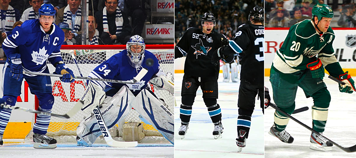
Review: Sharks Unveil New Uniforms

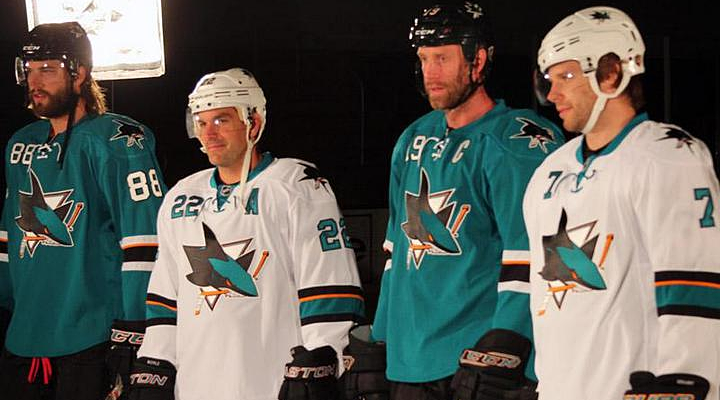
Before we get into the details of the newly unveiled San Jose Sharks primary uniforms, it might help to ask why they redesigned them in the first place. After all, they just redesigned their entire identity — logos and jerseys — in 2007. Why do it again after just six years?

Performance, in a word. According to the Sharks, the players love the lightweight third jersey. Why do you think they wear black every year come playoff time? So the main idea behind revamping the primary jerseys was to drop weight.

Sure, we can ask whether a few ounces here or there really makes any kind of difference. But then we've never played hockey at the NHL level, so what would we really know about that?

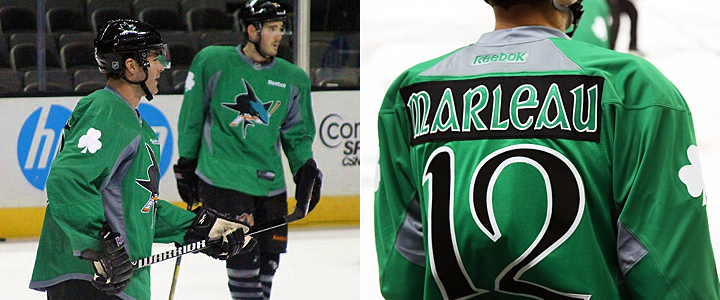
All photos and images from San Jose Sharks

On first glance, we see a highly simplified style compared to the previous jerseys. No shoulder yoke and no waist stripes. Now the teaser photos from the last couple of days make sense. The details they showed us were the only details they could. There's not really much else to see.

We'll start with the features the Sharks are touting in one of their new videos.

Right off the bat, it's all about performance. This is a unique story this summer. The Stars wanted a color palette they could own and the Hurricanes wanted a more traditional sweater design. The Sharks, however, wanted to keep their players from being weighed down by a heavy jersey.

This was made very clear in another video the Sharks posted, in which Sharks GM Doug Wilson and COO John Tortora talk about the design process. Here's what Wilson said:

The jersey was designed mainly with performance in mind. Remove extra weighting. Make it as efficient as our third jersey, the black jersey.

From the performance side, just the weight of it. If you take a look at our black jersey, the players really love that one. Not only the success they had with it, but weight of it. For movement and everything.

The players and trainers had the most input.

Interesting here how involved the players and trainers were. Clearly, these jerseys are more about utility and less about vanity. So good or bad, they probably won't be favorites among Icethetics readers.

Even if the look wasn't the primary focus, it's still a critical part of any jersey. While it's important to have something the players like, the reality is it's just as important to have something the fans like. They're the ones who are supposed to be buying them.

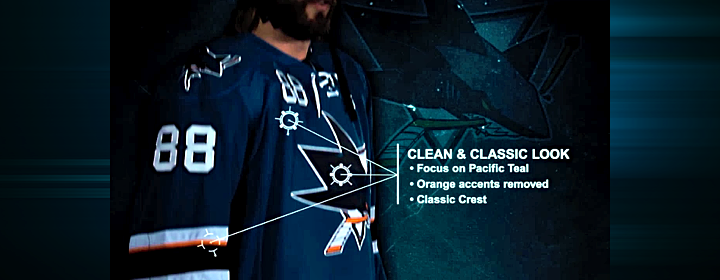
That in mind, the Sharks listened to the feedback they were getting from fans. And if it's anything like what I read on a regular basis, they wanted the orange gone. I'll admit the original teal and grey jerseys were nice, but the orange accents were an upgrade in 2007. Sounds like I was in the minority there.

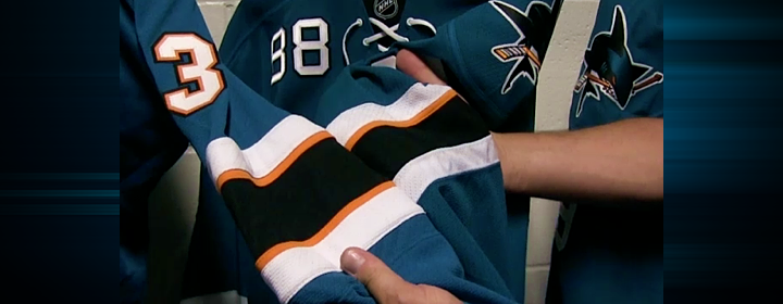
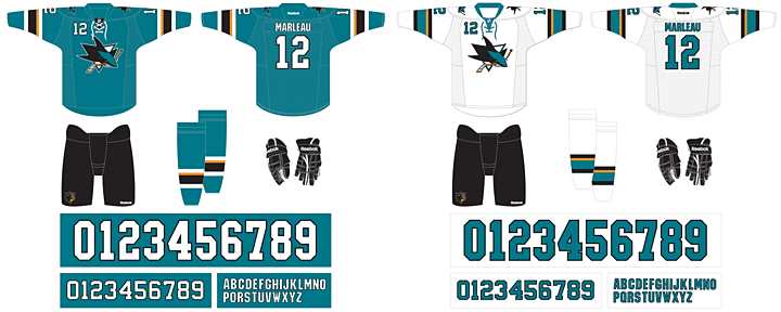
To that end, the orange has been removed entirely from the numbering and lettering. And there's now just one thin stripe on the sleeves to keep that part of the palette represented. It still works, and hopefully it will incur less wrath from Sharks fans. The picture above shows a side-by-side comparison of the old design (left) and the new.

And is it just me, or has the shade of teal been changed again? Looks the smallest bit greener.

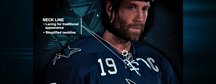
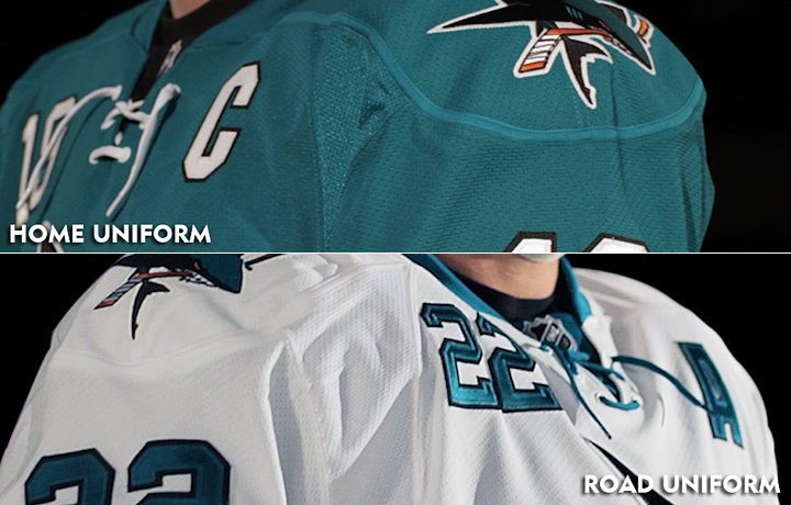
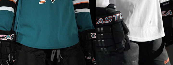
One of the big changes was to the neck line of the jerseys. The multi-color collar has been simplified to teal — even on the teal jersey where it blends right in. And new this year are the laces you find on the black jersey. My first thought was, wouldn't the laces add extra weight? But it's become clear the Sharks just want teal and white versions of the third jersey the players love so much.

And the "traditional appearance" argument is getting harder and harder to sell in this NHL. So far, every new jersey we've seen this summer has them — except Buffalo's third which hasn't actually been released yet. Counting San Jose, 17 of 30 teams are now sporting lace-up collars. That's more than half the league.

Guess how many teams wore lace-up collars 20 years ago. Zero. How about 30 years ago? Still zero. If we go back 40 years, we find that just five of 16 team wore them. And the Sharks never have — until the black third. The point is, this is a new trend in hockey.

I'm not saying I dislike this collar style. I'm just asking that we stop using the word "traditional" to describe them. It's just not accurate.

Let's move to the shoulders. The yoke and its piping are gone, which is a relief to some. The reason I like it is that it does have the feel of a more traditional Sharks jersey. Their original sweaters didn't have shoulder yokes and they looked great.

What I am disappointed about is the shoulder patch. I was hoping for an update in that department to one of the other marks in their arsenal. In particular, I had my fingers crossed for the fin logo I included in yesterday's post. But perhaps it has too much orange. All I know is that the existing patch is basically the primary logo without the triangle. Why not try another option?

It's also disappointing to see them stick to their guns on the chest numbers. I really hoped that was going away. Only the Sharks and Sabres are still using them and it looks awful. On a more practical note, wouldn't those numbers add weight? I guess as a player you could just switch to one digit to cut weight. I assume No. 1 would be lightest but none of San Jose's goalies use it.

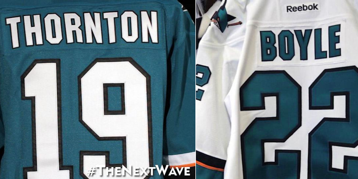
Here's something I like. The simplified palette of the numbers and letters was definitely a good move. Yes, it reduces weight by losing the orange layer, but it just looks more... "Sharks" to me. I don't know how else to put it. Might be a good time to use the word "traditional."

Now here's something I don't l ike. Where are the stripes? Logically, I get it. I understand the weight reduction aspect of these redesign. But I just can't reconcile that with my desire for good hockey sweater design. Twitter's ablaze with commentary on how much these resemble practice jerseys because of the lack of waist striping. And I don't disagree with the sentiment.

But if the players want it, if they say it makes a difference, we'll just have to live with it.

By the way, I shudder to even suggest this, but strictly as a way to keep the waist striping, I think I would've been all right with a little sublimation. I know, it sounds awful. But would it be worse than this?

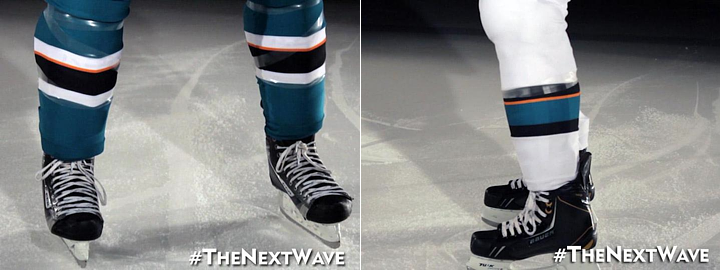
It should also be noted that the sock striping was changed to match the sleeves.

I think I've hit all the important points in this review. I'm sure you guys will let me know if I missed anything. As I've said in previous reviews, I'm not good at giving out grades, but I can do a summary.

Summary

Here at Icethetics, we're so accustomed to thinking of hockey sweaters as simply pieces of design. We can therefore describe why the design is good or why it's bad. Or both. But if the Sharks' redesign has reminded us of one thing, it's that hockey sweaters are critical pieces of equipment to some of the planet's most talented athletes.

What may look cool doesn't necessarily translate to athletic performance. Anyone remember Cooperalls? I'm not trying to say they were cool, but it was an instance where design curbed performance. Those things were flat out dangerous if you took a spill. Here, it's not as drastic, but it's just as understandable.

The players asked for lighter weight jerseys. But there also needs to be a good design. It's hard to be the servant of multiple masters. With that in mind, I think the final product works. They used the opportunity to address fan issues such as the use of orange while also addressing player concerns.

The end result is a bit of a mixed bag. But then with multiple masters, so was the starting point.

Now that you've read my take, get to the comments and let me read yours.

Sunday
Aug182013

Sharks Signal "Next Wave" of Jerseys

Images from San Jose Sharks (via Instagram)

San Jose previews new sweater with Instagram video

Out of the blue tonight, the San Jose Sharks used an Instagram video to give us our first glimpse of one of their new sweaters — slated to debut this fall.

The teaser clip is four seconds long and features a creepy Jaws-like musical stinger with the hashtag #TheNextWave and an incredibly brief one-frame flash of the jersey (seen above). At the end, another title comes up reading "Coming Soon..."

Based on the sharktooth stitching (clever!), we're likely looking at the elbow of the teal home sweater. The key difference — if you can call it that — is we now have one orange stripe instead of two. I'm sure there are at least a few more changes to make this relaunch worthwhile, but we'll probably have to wait to see those.

I think it's funny they're calling the new jerseys "The Next Wave." You may recall the Sharks when the Sharks launched their third jersey in 2008, they nicknamed it "Black Armor".

I'll keep an eye out for any more teasers from the Sharks. I'm sure there will be more.

Wednesday
Jul102013

JerseyWatch Mini-Update

A full NHL JerseyWatch update should be posted within the next two weeks. But there are several items I wanted to touch on briefly right away so we're all on the same page.

Sabres' new third jersey coming Friday, could be gold

A short headline with a lot of new information to digest. But it's true. Yesterday, the daughter of Buffalo Sabres Terry Pegula briefly took over the team's Twitter account for a Q&A session. Among other things, Kelly was asked for details on the forthcoming third jersey.

To which she replied:

I don't know what "sneak glimpse" means exactly, but it sounds like we're getting a look at the jersey on Friday. Will it be prospects modeling it for us? We'll see.

Following that tweet, I heard from a source I trust that Buffalo's new sweater will actually be gold, rather than the blue we've come to expect. Hence the eye-grabbing background color in the graphic above. Is it true? Guess we'll find out in a couple days.

This jersey will replace the royal blue alternate the Sabres wore for two seasons to mark their 40th anniversary. In their four decades, the team has worn blue, navy blue, white, black and red jerseys. But never yellow. That seems to be Nashville territory. Can the Sabres do it without looking like a copycat?

Wild to reveal new road jersey at Minnesota State Fair

Last week, Minneapolis Star-Tribune beat writer Michael Russo let us know that the Minnesota Wild will unveil their new white road sweater at the Minnesota State Fair. He tweeted:

If you're curious, the Minnesota State Fair takes place Thurs., Aug. 22 through Labor Day, Sept. 2. So that's a 12-day span. But obviously late August is a good bet. I'll keep you posted as I learn more.

2014 Heritage Classic announced for Vancouver

The NHL officially announced today something we've all known for a while now. The 2014 Heritage Classic will be held at B.C. Place on March 2 as the Vancouver Canucks host the Ottawa Senators.

I haven't seen the full logo anywhere yet, but the text treatment above has been making the rounds online. It at least gives us a bit of an insight into the type style. That's something, right? Hopefully we won't have to wait long for the full version.

Islanders not changing for Brooklyn. Really!

Chris Botta feels the need to keep reminding us that Charles Wang has no intention of changing the New York Islanders' logo or uniform when the team moves to the Barclays Center in Brooklyn in the next couple years. That's probably because of all the conflicting reports.

Last month, Isles CEO Brett Yormark was seen on the Internet talking about realigning the club's brand with its new location. He never said anything specific but it's easy to read "changes are in store." But every time he says something like that, Wang, the owner, fires back about how the existing identity isn't going anywhere.

But reading between all the lines — and there are a lot of them — everything seems to be leaning toward a third jersey change. The current black one is widely disliked (at least on the Internet) and could easilly be replaced with something more "Brooklyn-ized" by 2014 or 2015.

The Sharks could've been the Oakland Blades

Yesterday, the Silicon Valley Business Journal had an interesting piece on the genesis of the San Jose Sharks' identity from the early '90s. The writer spoke with sports consultant Matt Levine, who was brought on in 1989 to help develop the club's branding.

Levine talks about why the colors are teal and black, how S.J. Sharkie was born, and the significance of the triangle from which the shark protrudes in the logo. But more importantly, he explains that the franchise was almost based in Oakland and a name-the-team contest yielded Blades at the preferred moniker.

I highly recommend reading the story.

That's all. Looking forward to the unveiling of the Sabres' third jersey on Friday. 'Til then!

Friday
May102013

Third Jerseys in the 2013 Playoffs

There's been a lot of chatter on Twitter this week regarding the trio of teams that have opted to wear their third jerseys during the 2013 Stanley Cup Playoffs. For those of you not on Twitter, I present this brief blog post.

The Toronto Maple Leafs, San Jose Sharks and Minnesota Wild are all sporting their alternate uniforms when they play at home this postseason. It's certainly nothing as many teams have done it in recent years — the Sharks included. And the BlackArmor has served them well this year as they swept the Canucks.

For the Wild it was their first time in the playoffs since 2008. I say "was" because they were eliminated by the Blackhawks last night. And by the way, 2008 the only season since 1996 where no NHL team has had a third jersey. That was the inaugural season of Reebok Edge.

The Maple Leafs, I believe, have made a habit of sporting their thirds for the playoffs in recent years. Well, not "recent" as the last time they qualified was 2004. But between 1999 and 2004, their old white alternate got an extra workout in the postseason.

Should we read anything into these decisions? The Kings wore their black thirds in the 2010 and 2011 playoffs before making them their home uniform in 2011-12. But I wouldn't call that typical. The Sharks are supposedly making some changes in the fall but I doubt they'd drop the teal. And Minnesota is only looking at a new road sweater for now.

That said, I'm fairly sure the NHL only permits teams to use two jerseys during the playoffs. So if the Sharks were to win the Cup, they'd only be able to do so wearing black or white.

What's your take? Do you like seeing third jerseys in the playoffs? Or should they be reserved for the regular season only?

Sunday
Mar172013

When Hockey Sweaters Go Green

It's a time for green beer and greener hockey jerseys. Happy St. Patrick's Day, everyone! The only way I can think to celebrate here on Icethetics is by sharing the many green warm-up jerseys being worn around the NHL this weekend. Enjoy!

First up — alphabetically — are the Boston Bruins. On Saturday night, ahead of their game against the Capitals, the Bs skated out for warm-ups sporting a color far from their existing palette.

Photos from Boston Bruins via social media

The team shared a number of photos of these green jerseys online today. A shot of the uniforms hanging in the locker room showed up on Instagram along with another of Shawn Thornton on ice. Then on Twitter, they shared a shot of Dougie Hamilton inspecting his own green threads.

Photos from Boston Bruins official website

UPDATE (3/17): Following last night's game, the Bs added a handful of action shots on their website.

The Columbus Blue Jackets couldn't keep their Irish-themed jerseys off of social media. The team suited up in green ahead of their scoreless affair with the Coyotes on Saturday.

Photos by Alison Pegg via Twitter

Team publicist Alison Pegg was perhaps the most prolific sharer of photos, including these shots of the sweaters from the locker room and auction table. She even offered up a moving picture through Vine. Of course green was not absent from the official Twitter account of the Blue Jackets.

And Icethetics reader Dan Caron even shared some of his own photos with us on Twitter. Needless to say, Columbus' St. Patrick's Day jersey was well-covered on social media.

The Dallas Stars were entertaining as ever with their St. Patty's jerseys on Saturday night. No surnames needed. Just add some Ireland-inspired nicknames to the backs of these bad boys.

Photos from Dallas Stars via Facebook

The Stars posted a picture of every player's jersey on their Facebook page. I pulled a couple of my personal favorites to post above — "McJagger" for Jaromir Jagr and "O'Romeo" for Aaron Rome. They're up for auction starting today if you find yourself in need of one.

The Edmonton Oilers are hosting the Predators tonight and may be among those teams donning green duds during warm-ups this weekend. On Instagram, the club posted a shot of a St. Patrick's Day prize pack which includes a green Oilers practice jersey. They also shared pictures of more St. Patty's-themed team merchandise on Twitter.

Conspicuous on this St. Patrick's Day was the noticeable absence of a recent tradition of the New Jersey Devils. Since 2010, the Devils have sported a throwback jersey which featured their original colors — red and green — every year for a home game on or near St. Patrick's Day. But not this year. And they were home hosting the Canadiens last night and everything. Would've been a perfect game for it.

Beating everyone to the St. Patrick's Day punch were the New York Islanders, who celebrated in green last weekend, when they hosted the Capitals on March 9.

Photo from New York Islanders official website

The Isles posted another great photo on their Facebook page after the game last night.

Photo from New York Islanders via Facebook

The jerseys were auctioned online leading up the big game.

Photo from Ottawa Senators via Instagram

UPDATE (3/17): The Ottawa Senators also joined the St. Patty's Day celebrations with the above photo posted on Instagram this morning. I presume they'll be wearing them during warm-ups today prior to their game later against the Jets.

Photos from Ottawa Senators official website

The Sens posted a couple of photos of the players skating in green on their website.

Later today, the Pittsburgh Penguins will host the Bruins. But before they do, the players will skate a little while wearing the green practice jerseys seen below.

Photos from Pittsburgh Penguins

According to the team: "The unique warm-up jerseys feature a green skating Penguin crest with Celtic lettering and numbering — and shamrocks on each shoulder." They will be put up for online auction beginning Friday.

Photos from Pittsburgh Penguins official website

UPDATE (3/17): This morning, the Penguins shared some more shots of the green on Instagram. There's one in the locker room and another of Craig Adams on the ice. Later, they posted a few more in the game's photo gallery.

UPDATE (3/17): The San Jose Sharks have been celebrating the Irish all week. The Sharks Foundation has been coordinating auctions of these green jerseys on March 9 and 14.

Photos from San Jose Sharks via Twitter and Facebook

Just today, the team tweeted a shot of the players wearing green at a recent morning skate. They've been a bit more prolific on Facebook with close-ups of the backs of these special sweaters, showing Patrick Marleau as well as Douglas Murray and others. (Thanks to @puckguy14 for the help!)

The Tampa Bay Lightning also joined the ranks of St. Patrick's Day teams on Saturday night by warming up in green before taking on the Hurricanes. The team did share some photos with us as well.

The Bolts posted some close-up photos on Instagram and a shot of the full locker room decked out in green gear on Twitter. There are several photos of players wearing the sweaters on the team's website.

Photos from Tampa Bay Lightning official website

Thanks to everyone who pitched in with links on Twitter yesterday! Let me know if you've spotted any teams I've missed and I'll be sure to add them. I'm also working on a separate post to highlight St. Patrick's Day jerseys around the minor leagues.

UPDATE (3/17): Also joining the St. Patty's Day fray were the Washington Capitals, who hit the ice in green tonight prior to defeating the Buffalo Sabres in the nation's capital.

Photos from Washington Capitals

Earlier tonight, the team tweeted a shot of a couple of jerseys hanging up in the locker room. Later, all of the green sweaters were on display at the arena so they could be auctioned off. And for more photos, check out the game's photo gallery.