


Wild Reveal First Jersey Teaser
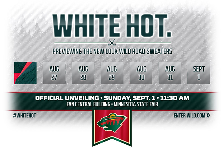 Image from Minnesota Wild
Photo shows green shoulders and two-tone collar
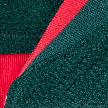 Photo from Minnesota Wild (via Twitter)The Minnesota Wild will unveil their new road uniform this Sunday, Sept. 1 at the Minnesota State Fair. Until then, though, they're releasing new teaser images every day on their website and social media platforms.
A new splash page on their official website (above) shows this first image, which you can also find on Facebook and Twitter.
The first of seven images was released this morning. So what does it tell us? First, based on the marketing slogan, "White Hot.", it's probably a safe bet this will be a white jersey — and not wheat-colored or anything.
And yet, there's not a speck of white in the photo released today (right). It's all green and red. So we know the shoulders are green and the collar is two-toned, green and red.
The other thing we can tell from the cut of the collar is that this will be another lace-up jersey. They already have the ties on their home and alternate jerseys, so it was just a matter of time for this one.
But there's something else about this jersey. It looks to me like an oversized shoulder yoke. On most Reebok Edge jerseys with the yoke/lace-up combo, the yoke ends at the corner of the collar or just above it. See these close-up examples from 2007.
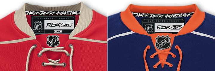 Reebok Edge jerseys / Minnesota Wild & New York Islanders
The yoke on this new Wild jersey continues down. How far, we can't tell from this photo. I don't think this jersey or its template will look much like anything that's come before it. Just a hunch. I could be proved wrong tomorrow with the next teaser image.
What's your take on it? Are you excited to see what the Wild have planned?
 Chris
Chris
Tuesday's teaser confirms new jersey is white
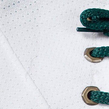 Photo from Minnesota WildThe Wild shared their second of seven teaser photos this morning en route to the unveiling of their new road jersey.
Two critical elements are confirmed with this one. It's definitely a white jersey — despite the fact that the teaser we saw yesterday had no white in it at all — and just as suspected, there is a lace-up collar. And the laces are green.
So far, the preview pictures show just what I'd expect from the Wild, apart from the two-tone collar. Wasn't expecting that.
But it seems they're leaning heavily on the green, a color which is slowly but surely making its way back into the NHL. It never should have left, but that's beside the point. Just happy to have it back.
We'll get five more of these teaser before Sunday's official unveiling at the Minnesota State Fair. If any Minnesotan readers plan to be there that morning, feel free to send any photos my way. I'd love to help get them out the community.
Chris
Third image: Reebok and the hanger effect
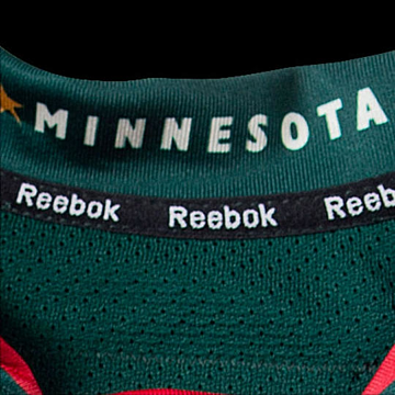 Photo from Minnesota WildIt's Wednesday and that means the Wild have released the third image in their series of sneak peeks leading up to Sunday's unveiling.
Today, we go back to the collar (seen nothing below the laces still). But the primary feature they're showing off this time is that new Reebok trend, the hanger effect.
Inside the collar reads "Minnesota" — an element pulled straight from the club's wordmark. I get teams using inspiring slogans here, but what's with the Stars and Wild just using the name of the place where they play?
Maybe the good news is that this means we won't get a wordmark on the chest or the shoulders. If that's the case, I don't mind a bit.
By the way, I've read a lot of comments on this post complaining about the way teams have been unveiling jerseys this summer — through sneak peeks here and there.
I said in the comments that I don't understand where the issue is. This sort of thing is fun. The Wild set their unveiling date as Sept. 1. Fine. There's probably a good reason for that — having to do with marketing or manufacturing or logistics, all probably having something to do with when the jersey can go on sale to fans. Unveil too soon and you lose some steam when it finally does hit the racks.
Here's the thing. Because Twitter and websites like Icethetics exist in this world, we get the same knowledge as everybody. Really, these sneak peeks are just intended for Wild fans — to get them pumped for the new look. Maybe no one else will care about the teasers, but why does that matter?
One person said, these sneak peeks wouldn't have happened 20 years ago. To which I say, why couldn't they have? If these teams had the sort of marketing focus back then they do today, you don't think they'd try to hype up a new look? Why not come up with a few teaser photos and put one in the newspaper everyday?
Nobody but the local fans have to know about it. That's how this would've gone 20 years ago. Anyway, I've said what I have to say. I'm just surprised at some of the moaning — as if every team should cater to your wants, even if you aren't a fan. Why?
Anyway, I can only speak for myself when I say I'm looking forward to every day's teaser just as much as the final product on Sunday.

Reader Comments (28)
I think they are toying with us to make it seem like the jersey will have a top green stripe all the way across like the old jersey. But... I'm hoping you're right in that this may be some sort of new concept we haven't seen before.
it looks like there are stitches at the bottom of the photo and if you look close you can see a little bit of white at the very bottom of the photo.
So far, this looks like it might be alright.
I think that smidgen of whitish coloring at the bottom is just the start of a lace loop.
first the Canes, then the Sabres and Sharks, now the Wild. FOUR teams this summer have done this "reveal bits of the jersey each day until the full unveiling" thing, and I don't get why. I get the building up the suspense, but why? there's absolutely no benefit to this as opposed to just releasing the whole thing at once. I'm actually getting really tired of it, and I just don't care about the jerseys anymore.
I don't see any white at all. Zero, nada.
Good news so far! I might be in the minority but as much as I like green, I think it would be a bad idea to abandon the red altogether. I also like that the Wild aren't following the off-white/vintage/dirty-looking trend and appear to be putting out a clean-white jersey on the ice.
Looks good, all I want is for it to be similar to the old roads, and not too similar to the Iowa Wild jersey.
ENOUGH with the teases! God, sometimes I wish we could go back a decade or 2 (before internet/twitter/etc) just reveal the damn things and get it over with! I'm pretty much annoyed now by teams that drag this stuff out, GOD HELP ME if my beloved PENS do it!!
These prolonged reveals got really annoying really fast. I think I'll just be back to talk about everything on September 1st.
White hot is the Miami Heat slogan/motto thing.
Cant wait. Ive hated all of the wild road jerseys. Im excited
Wow.
Kevin Y, 91Pens92 & Kurt: Gotta ask, fellas. Why are you spending time on a blog that serves to do little more than hype up jersey unveilings? This sort of thing is Icethetics' bread and butter. It's what I do.
So I can't help but laugh at these comments. Kevin says he doesn't care about jerseys anymore. So he spends time commenting on a blog about them. The futility of it all has me dumbfounded.
Anyway, thanks for visiting.
The Sabres have really hurt the whole sneak preview method. Everyone else does a few day or, in this case, a week. The Sabres? What are we at now, 6 weeks and counting? Ridiculous! Like Chris, I enjoy the process. Trying to figure out the puzzle is fun. But ... there has to be a reasonable time limit.
@ Chris, brother Thanks for putting this site together. I LOVE this site but its getting to the point where teams are making me NOT care about their uniforms. Like I said, wish we could go back a decade or 2, there used to be a time when teams would unveil their new jerseys at the Draft (which is why I WATCHED said Draft). Take the Canes, all that hype for what (they didn't change logos, they didn't change color scheme, so all these teases were for what really? It would be like the Pgh Steelers teasing a new look helmet (it has become Iconic that the logo is only on one side of helmet), a tease here, a tease there, here a tease, there a tease...only, ONLY to reveal that the Yellow Gold stripe on the helmet was made a smidge thicker, all that filler over nothing! The Stars made a complete overhaul, I could understand the teasing of info there.
I get why some people think the teases are annoying, but they definitely serve their purpose of building up hype prior to the unveiling. I enjoy it for the most part, especially if it's a week or less and not the whole summer like the Sabres.
I wonder if the cut on the collar of this jersey will be similar to that of the Bruins Winter Classic jersey. I was checking out a Bruins Winter Classic jersey on ebay and a close-up pic of the collar got me thinking that there might be some similarities. I don't know off hand if any other WC jerseys had the same cut.
+1 Chris. Keep up the good work. Next we'll need to see that Wild Winter Classic jersey with the big "N" on it.
It looks like it will be green laces, looped through gold circles, secured in a white jersey, overlaying a red triangle neck with the NHL logo? Sounds good to me!
Also, I'll be at the Great Minnesota Get-Together on Sunday so I'll try and snag some pictures if they reveal it when I'm there and tweet them out to you.
@Tom - From what we can see and what I'm hoping they are doing is transitioning from Red heavy to a more Green heavy design while utilizing their Red color in a complementary manner. I kinda wish their current Red home uniform would switch the Red with Green and put the primary logo in place of the circle mess up logo.
The "vintage white" trend is over used and looks terrible, crisp white looks a hundred times better.
I agree that white is better than vintage white overall but I think it would have been a really neat change if the Wild had an off-white road jersey instead of a white one. If they weren't already unique, having a cream road uniform would have really stood out, especially when every team in the league has a white road uniform. If there is one team that could pull off an off-white uniform to wear full-time, it would be the Wild. Anyway, today's teaser makes me feel a little better about the new uniform. After seeing today's teaser, here is my guess: The road uniform will be a white version of their green uniform except it will have a green shoulder yolk and their logo will be on the front instead of the wordmark on the green jersey.
These teases have become absurd.
Maybe I should clarify. I love jerseys and I myself have a nice collection of NHL jerseys from 12 different teams. All I meant with my comment is that I'm beginning to grow tired of the way that teams are revealing their new uniforms now. It was a cool idea when the Hurricanes did it, but now that BUF, SJ, and MIN have all done it also, it just doesn't do anything for me. It's like how I loved the "hanger effect" when the Rangers did it in 2010, but now every team does it and it seems like for no realy reason other than that "another team did it, and people loved it".
The whole point of doing the "reveal part of the jersey day by day" thing is to draw attention to the team, and I totally get that, but it's gotten to the point where I personally would just rather them unveil the whole thing at once and get it over with. The "I don't care about the jerseys anymore" comment was only about my frustration with how these teams are drawing it out for as long as possible and that makes the final reveal less interesting to me. I would rather be surprised to see an entirely new jersey than slowly seeing pieces of it and knowing almost exactly what it will look like before they actually show it. That's just my personal preference. To me, the fun of seeing a team get a new jersey is not knowing what to expect.
All that being said, I LOVE Icethetics so much and have been a true follower of this site ever since the NHLToL days and it continues to be one of the first sites I open every morning. I appreciate very much all that you do for us hardcore hockey fans who care about stuff like this.
While I'm not a fan of the hanger effect, it doesn't really bother me since I care about the on-ice look of the jersey and you'll never see it. I wouldn't mind if the inside of every jersey were pink and yellow polka dots because, while I may not like the look, who's gonna see it?
As for this new picture, it all but confirms that it will have a green collar. And I'm starting to get the feeling that the new road jersey will be essentially the green alternate (but in white, of course) with a real shoulder yoke and possibly some green and red stripes on the sleeves. I originally thought it would be just green, but the red in the collar makes me think that there will be some red elsewhere in the uniform (although I felt that way about the Hurricanes' home uniform with the black collar, and there was no other black in the uniform except for the logo). But in this case, I can't imagine having a two-toned collar and not use one of those colors elsewhere in the uniform. Just doesn't make sense to me.
Now, I'm just hoping that the main logo is on the front of the sweater. Not the logo in a circle. Not the stupid wordmark. The actual logo. They have one of the best logos in the league, and it's a shame that they don't use at as much as they should.
I for one wish we could have had cream colored jerseys instead of white. Also I definitely agree that they better have the primary logo on this jersey, which is one of the classiest in all of sports.
It wont take much to beat out some of this other jerseys that teams have released this summer, those hurricanes ones are not cool at all and dont get me started on that pathetic new dallas logo is.
Anyways these look like they could be some sharp new threads.
I don't mind the hanger effect, but why stop at just the name of the state? "State of Hockey" is already part of their portfolio and underused in their on-ice look, or "North Star State," although Dallas may have an issue with it.
@R: If they went with a vintage white road, then what color would their helmet be? Vintage white?
@BrianBrideau Yes, it would.