


Nike Unveils Olympic Team Jerseys
 70 Comments
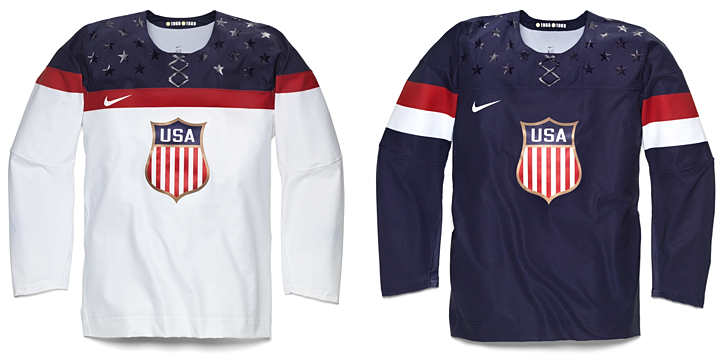 All images from Nike
United States gets classy new look for 2014
Nike has been using this week to unveil the hockey jerseys slated for use during the 2014 Winter Olympics. Today, they revealed the new look of the United States. Team USA will be sporting these classy numbers. They're minimalist in their overall aesthetic and very tasteful.
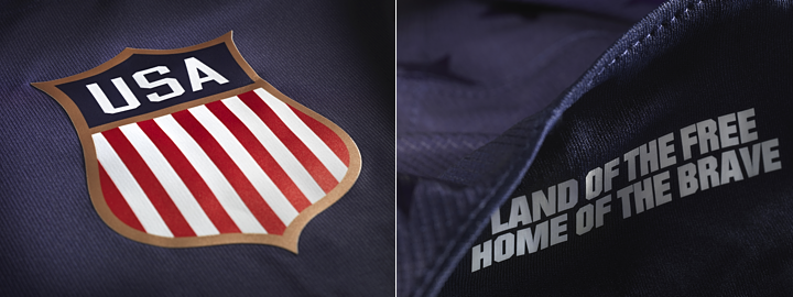
I particularly like how they swapped out the tired collegiate text for a beautiful new crest. Another feature of the jersey is the slogan "land of the free, home of the brave" printed inside the collar. I suppose that's just a feature for the players to see as they pull their jerseys over their head before they hit the ice. There's no other way to see it, really.
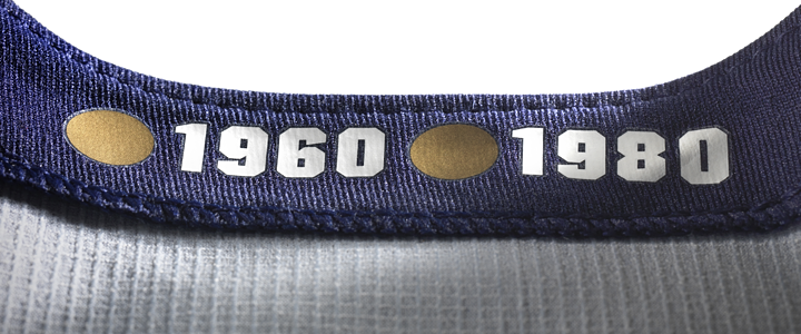
It turns out even Nike isn't immune from Reebok's "hanger effect" trend. The inside of the collar pays tribute to the years the U.S. brought home gold medals. It's a nice touch, even if it's only visible when it's hanging on a rack in a store. Still, it's probably a good reminder for the players when they walk into the locker room.
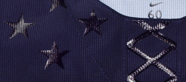
We'll wrap up with the feature that was exploding Twitter at last check. The same effect used to create the twinkling stars on on the shoulders has been fashioned into a fake lace-up collar. I guess the point is that the lace-up collars on hockey sweaters are strictly for appearances. So Nike figures, why not make them even more pointless.
But if that's the worst thing these jerseys have to offer, I think we're in pretty good shape. Some might question the lack of sleeve and waist striping — a problem I noted for the San Jose Sharks not long ago — but there's a different aesthetic to national team jerseys. They don't need bells and whistles. They need to be classy. I think Nike hit the mark for Team USA.
But wait, there's more...
 All images from Nike
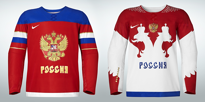
Russia revises uniforms for Sochi
As the host country of the 2014 Winter Olympics, Russia was first to show off its new uniforms. The designs were revealed by Nike on Monday, and once again, we get a solid pair of jerseys.
The red one features the Russian flag wrapped around the sleeves while the white one has an entirely different feel — both with lots of Russian iconography. In fact, that's addressed in Nike's media release:
Taking inspiration from Russia’s national emblem of the two-headed eagle, the jersey has been redesigned with streamlined design lines, lighter graphics and a modern neckline reinforced with Nike Flywire. The result is a lightweight, breathable jersey that moves naturally with the body, and is steeped in hundreds of years of history and heritage.
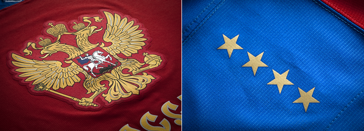
Featured on the shoulders of the red jersey are eight stars — four on each side — commemorating what Nike refers to as "past successes." A similar feature is on the white jersey but in the form of eight gold crowns on the right sleeve. But by my count, Russia/Soviet Union has only won seven gold medals in Olympic hockey. What am I missing? Anyone know what the eighth star references?
UPDATE: I was forgetting about 1992 Olympics and the Unified Team, for which Russian players suited up. That accounts for the eighth gold star/crown. Thanks to Corbin LeGrand for pointing that out.
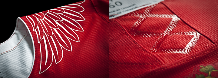
Speaking of the white uniform, here's a look at some of the detail. That faux lace-up collar shows up again — on both jerseys, in fact. Too bad, and Nike had such a good thing going otherwise. The other thing that got some negative feedback, at least through Twitter, was the eagle wing graphics on the shoulders.
I may be in that group. It doesn't really feel like it belongs with the rest of the jersey. Especially when you see it on Alex Ovechkin. Check out these shots.
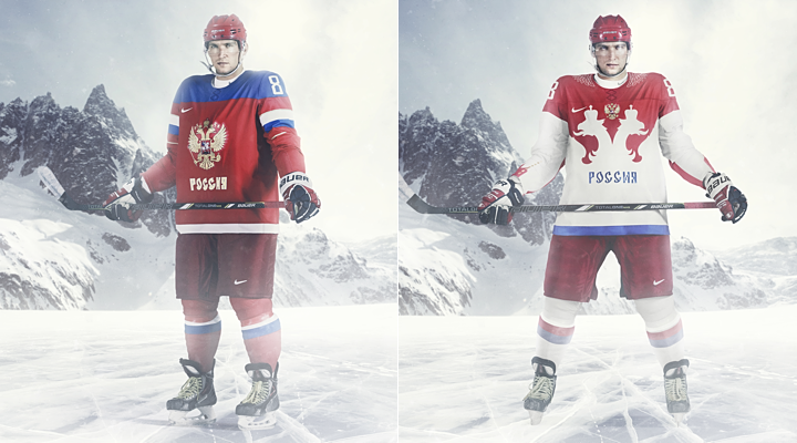
The red one looks incredibly cool. The white one... well, let's just say I hope they get to play more games while wearing red. Both designs are very Russian, but I'm partial to the red, obviously.
How about you? How do you feel about what Nike's done for the U.S. and Russia?


Reader Comments (70)
Oh ... dear ... god ...
And I thought that the start of the Reebok Edge era in the NHL was terrible. Please, please, please never let Nike get the NHL contract.
Not a fan of the US jerseys. I just feel that they can be much...better. I don't know...I'm not a huge fan of the crest, and the stripes and fake laces could be avoided.
The 8th Russian gold that they are claiming came as a member of the 1992 "Unified Team" that was made up of some of the members of the former Soviet Union.
The Unified team in 1992 is the 8th win.
I prey Canada's does not get ruined by Nike... Last Olympics they were so beautiful
'classy'?? these look more like soccer jerseys (or those cheap fake hockey jerseys) and whats with those fake laces?? sorry, not for me.
Least favorite usa logo - looks like Peter Griffin's face.
The Russia red looks sharp, the white is odd with the silhouette but they're hosting so they can do what they want. As for my Americans, I'm not a fan. The 2010 on was better because it pronounced USA front and center with an homage to 1980. With these, it just seems to be very tacky. The crest looks like a police badge and the fake lacing? Why not real lacing? just seems odd. But if they bring home gold, I'll have no complaints.
These are brutal - absolutely brutal.
I'm highly disappointed with the USA, the 2010 (especially the blue home one) one look better!
I don't understand the dislike on with the White Russian one.. I find it to be gorgeous! Very creative and stand out the best.
Someday, the US will pull it's head out of it's bottom and just go back to the 1980's design. Today, though, is not that day.
navy one is okay, but the white is horrible. shield is an okay touch. not in love with it but don't mind.
The only thing I like (at all) about the USA jersey is the shoulder colors/stripes on the white jersey. Everything else just annoys me. The fake laces, the stars that look like stickers, the unnecessary, propaganda-esque message written inside (I really don't get why teams keep doing this... nobody can see the writing), the soccer crest, and the lack of stripes or details just irritate me. How did they go from such AMAZING jerseys in the 2010 Olympics to this abysmal set? The worst part is that all of these things seems to be trends that are picking up. But hey, it could be worse. We could be wearing those white Russian jerseys...
The Russian red is the only sweater out of the four that I can tolerate. Why navy stars on a navy field, when the Russian sweater has gold stars? Silver or white would have looked better.
You want classy, and a classy, simple, and clean looking sweater is easy. What happens is Nike or Reebok want to jazz up the clean look to move product. We end up with oddly placed tiny gold accents on one sleeve, and bizarre fake lace-type lines. At least the red sweater has balanced stars on a logical location for secondary markings.
Personally, I liked the late 80s-early 90s USA sweaters. I own white and blue and if you improve the logo in the middle, and cut down on the waists stripes, I find that sweater design remarkably enduring. The yoke going from wrist to wrist, or even the modification made in the late 90s to mimic the Flyers' look was clean and sharp.
I'm also perturbed that these are shaping up to be simple color swaps of a template that I don't get excited over to begin with.
Ah well. It'll only be for 2 weeks, right?
Hey! It's a jersey unveiling where we see the jerseys, and talk about the jerseys, instead of speculating for weeks about what things may or may not look like. Such a novel idea.
The location of the numbers being on the shoulders rather than the triceps is unusual and probably just a bi-product of the stripes being in non-classic locations. I'm definitely not a fan of the glossy stars when displayed like this but they will probably be subtle to the point of barely being noticeable when they're actually playing. That being said, the faux-laces are super tacky. Just get rid of them. All in all, I don't think they'll look bad on the ice but aren't very desirable as a fan, and the whites in particular give me the feeling of a soccer kit rather than hockey jersey.
The Russian red jerseys have most of the same issues as the US whites. The Russian whites on the other hand are... unique. They're gaudy but maybe that's just Russia's thing now
I know that all this dye sub and iron-on is done in the interest of creating lighter, more breathable, and generally better performing jerseys, but man do they look cheap. I hope that they produce regular embroidery/tackle twill for fan jerseys.
As for the actual design, the USA shield logo looks kinda small. They're likely playing off of these old jerseys but I think they could still stand to be a bit larger.
not a fan of the USA jerseys. big time fail on these ones. there isn't one redeeming quality on them.
The fake laces look silly, but, oh my, the White Russian is magnificent. For ages now pretty much every design in hockey, at every level, has been about the tyranny of the horizontal lines. Great to see someone smashing through that boring and exhausted old paradigm so successfully with the iconic double-eagle shape as the main geometric element. The use of negative space is ingenious, beautiful, and aggressive. The wings on the shoulders look cool too; could they be mean to evoke the winged Hussar cavalry of old Russia? (OK, that was usually Polish Hussars, so perhaps not...) In any case, again, looks great and, as far as hockey goes, very original, since most of the time the only design option for shoulders is "to yoke or not to yoke."
I think it's safe to assume that Nike likes the subliminated/glued-on look. They all look very light, and very cheap. The USA looks like it's the soccer team with sleeves.
But unfortunately that might be what we're headed to with the NHL. The new materials allow for them to do a lot with printing and pressing. If the players want an even lighter jersey (see San Jose), that's the next logical step while keeping them durable enough for play.
"Meant to evoke the 1980s look"? The USA wore diagonal block letters in 1980, not the shield. They wore a shield at the top right in 1960, along with diagonal print. And they didn't wear a shield in the 80's at all, as far as I can tell. So really, what are you talking about?
USA Hockey did wear a shield front and center from 1920-56, and they've sold 1932 gear for a while. At a hunch, they're trying to throw back to that era, not the 80's.
Classy and tasteful?
I'm surprised that somebody that tends to hate gimmicks would use those words to describe the USA jerseys.
These are awful. Minimalistic and traditional are words that should be used to describe national jerseys. Iron-on plastic stars and a faux, iron-on lace don't fit that description. They look like those cheap, replica jerseys that they make for toddlers.
The red Russian jersey has the same problems on what could otherwise be a sharp looking jersey. The white is way too flashy.
I simply don't get Nike (or Reebok). Why do they think they need these stupid gimmicks? They don't even add any functionality and actually make the jerseys appear cheaper.
Zeus: You're right. I was thinking of the 1960s. (And then I went off on a tangent about the 1980 team.) Thanks for catching that.
Those USA jerseys are some of the ugliest hockey jerseys I have seen. Absolutely putrid.
For both these looks I'd say their Home Jerseys look solid, the Away Jerseys are kinda meh. I will also say the faux lace-up collar was unnecessary. Anyway, onto the Jerseys.
Team USA:
The home jersey, I'd say is an improvement over their 2010 Jerseys, I would object to a lack of waist stripes, but the difference between a jersey like this and the recently unveiled Sharks jerseys is that the colour of the jersey is dark enough that it doesn't necessarily need waist striping. On the other hand these probably would have been perfect had they added them. The away jersey meanwhile is slightly lacking below the crest and would benefit from both waist and sleeve stripes. Perhaps a big blue stripe and a small red stripe on top of it to match the shoulder yoke. To conclude I'm glad to see them go back to a more traditional looking USA logo and not the block lettering we've seen before. The stars on the shoulders are also a nice touch.
Home: 8 Out of 10.
Away: 3 Out of 10.
Overall: 7 Out of 10.
Team Russia:
Russa's home jersey is a nice solid look though when I look at it, something seems off about it. I find it's the shoulder yoke that turns me off this jersey. It almost looks like it's photoshopped onto the jersey. Perhaps the jersey just needs a collar, maybe there needs to be a gold stripe going around the yoke, I just can't think of what extra it needs. Their away jerseys on the other hand looks like a combination between a third jersey from the Mid-90s and Team Canada's 1972 Summit Series Jerseys. What more can I say... it looks absolutely ridiculous their home jersey looks like a perfect 10 when placed next to it.
Home: 7 Out of 10.
Away: 1 Out of 10.
Overall: 5 Out of 10.
Hopefully if Team Canada is going with this jersey style they do it right. After seeing Russia's awful away jersey I'd like to see the 1972 Jerseys brought back to show Russia how it's done.
USA jerseys absolutely horrendous! Same with the Russians! I will not even watch. Last Winter games, I think it was Latvia that had the way cool jersey. Maybe that is the team I will watch.
I heard bauer is gonna try to get the nhl contract in 2016. Since Nike and Reebok Are kinda sorta discusting im excited to see what a bauer jersey would look like. As for those, i kinda like the subtle stars but thats about it
The face laces are very similar to the nike NFL jeresys
I see the word "flywire" in the Nike release excerpt, and I immediately cringe. "Flywire" is what Nike calls their neckline technology that they use with most (not all) NFL teams and several college teams, that creates that oddly large V-neck with that glossy shit on the front of it. The "flywires" are supposed to be under that shit, but the gloss part is really unneccessary - it's basically a "Look at our proprietary junk!" move. And now Nike's spreading that garbage to hockey jerseys?
I've also never been a fan of what they've been doing in recent years with the sleeve treatments - sleeve stripes shouldn't be coming out of the armpits, they should be closer to the elbows, and sleeve numbers should be on the sleeves, not the shoulders.
Bleh.
I am now really scared about what they have up their sleeves for Canada's. I really like what's currently being used already. If they make any alterations to the uniforms I just hope it's VERY minimal (like the the Hockey Canada logo on the chest - stay with something that defines the national identity within the maple leaf again).
These look like football kits. I don't understand this trend to remove the waist stripes either, they look like a warmup that someone would throw off before they jumped into a game. Agree with Rob, why does Nike insist on stripes that ride so high up the arm?
The crest is what the team wore in the 30s and then got pushed to the collarbone patch in the 60s (and 2010). It's so oblong and antique looking. On the correct sweater it may look right-- maybe a cream colored white with waist stripes? But that would be super weird for an international match. It just feels wrong on all fronts. At least the waving USSSSA flag didn't come back.
Nike's done the olympic jersey 5 times now and gotten it pretty wrong 4 times.
Just Don't Like! Awful....that is all.
Not a big fan of either set. There are some redeeming qualities in each jersey, but the total package amounts to less than the sum of its parts. These jerseys just look off and remind me of team sweatshirts you can find in the NHL store in NYC.
The Russian set would likely need fewer tweaks to make it more palatable. I do not know whose bright idea it was to plaster the flag at the top of the sleeves on the red Russian jersey and the feathers on the shoulders of the white jersey are downright atrocious (on the same level as the fake laces). However, a differently shaped collar and a straight hem are nice touches. Also, the negative space pattern on the Russian white jersey evokes the memory of Canada's 1972 Summit Series sweaters.
Holy shit... this crap is terrible. I've agreed with you on every single jersey commentary you're ever made, but this is THE WORST jersey in SPORTS HISTORY. Of every jersey and sweater ever used professionally, this one takes the cake as the SHITTIEST. Just the other day you were saying you disliked the lack of striping on the Sharks new Jersey, this one has even less, none on the bottom sleeves as well! What a hypocritical thing to say. And those bedazzling stars, why?!?! And the fake laces, the ugly fake laces. And the ugly stripe placement! WHY? All this and I haven't even touched on the atrocious dis-proportional K-swiss logo slapped on there. UGLIEST JERSEY IN SPORTS, EVER. Completely disagree with you. I came on this site to check the post and say huh, I wonder how much hate Chris will give these awful jerseys, and then this happened.
I just threw up in my mouth a little. First they brutalize many of the NFL jerseys, and now this. Please NHL, please stick with Reebok/Adidas and stay the hell away from Nike!
I like the USA crest (though it's not my country so I'm not as fussed either way). I think it's odd that the arm stripes are up above the elbows - the designs seem a bit top-heavy, at least without players in them. But you know what? I love what Nike's done with Russia's away design. Too often it seems like all jersey design is destined to converge on one perfect template with a shoulder yoke and basic sriping at elbow and waist. I like that they've mixed it up for once. Though as host country, I bet Russia rarely suits up in the whites. Who decides that, anyway?
I like the simplicity of the USA jersey, but really feel that Nike dropped the ball on the overall look. Faux laces, dark stars on the shoulder yoke... On top of that, the logo looks like a stand-up, anorexic version of the Rochester Americans logo. It might take some getting used to.
Rob S, are flywires the opposite of underwires?
The US jersey would've been fine without the Gloss. The faux laces.... really?!? The sheild logo is great.
It looks like something that would be sold at Forever21. As a women's national team jersey I think this would've been great! Men's... not so much.
Russia- the feathers on the shoulders- yeah... that's Nike. Reminds me of Oregon State Ducks' many, many football jerseys.
I like the wording on the collars and the homage to history on the sleeve's. Reminds me of soccer jersey. That's fine- that's more for the fan's than anything else. But overall not a fan of either design.
All I can say about the USA jerseys are that they're boring and tacky. It was a good start with the shield logo, but everything just goes downhill from there. I wish there was blue and red arm stripes on the white jerseys, and that the red 'chest stripe' was gone. Also, why the need for the star stickers? Either make them stars or not.
My vision of a good Team USA Jersey is something along the lines of the Capitals' Winter Classic Jersey with more blue.
I'm just curious, why does it feel like the USA loves almost blank sleeves? Is it something to do with the Nike format?
Oh well, at least Russia has a good home jersey.
I actually really like all four of these, and if I was a fan of either county I'd buy any one of them.
Firstly, I don't know why people are throwing out comments about "soccer" jerseys with such scorn. They call that sport The Beautiful Game for a reason.
Secondly, I'm not sure I'd want to see some of these design elements on an NHL jersey but it's the Olympics - even including the women's teams (who I assume will also be wearing these), you're only going to see each one 10 or so times on the ice. Why not take the chance to do something interesting instead of the horizontal stripes and shoulder yokes everyone around here seems to have such a passion for? (Also, I hope that none of the people complaining about these jerseys were also whining about the lack of originality in the IceHL rebranding concepts last month. These might not please everyone but at least they're not boring). Sure, they could just trot out the 1980s sweaters over and over again, but remember that Olympic jerseys are basically just glorified All-Star jerseys, and anyone who thinks otherwise is drastically overvaluing the importance of national pride vs. marketing and hype at the Olympics.
Thank God Nike isnt doing NHL jerseys, wow and people complain about Reebok. Ewww. Are the stars bedazzled on? The USA 2010 Jerseys were perfect and figureing they were going to use them again I was very excited to buy one. I am very disappointed.
As time goes by, uniform design just keeps getting worse. They make me think of the Pontiac Aztec - did someone in the position to approve these designs look at them and say "Ya, that looks good"? It doesn't matter what Ovechkin's jersey looks like, he'll just jam it into the back of his pants anyway.
ugh. and i thought the NHL's reebok's were bad. FAKE LACES?? WHY. why not just not have any??? so ridiculously tacky. Russia Jerseys are ok. but i do not like USA. blue stars on blue are weird, fake laces and NOTHING below the shoulders??? a jersey can nonly be so "clean/classic/simple/sharp/etc." before it becomes completely empty and boring and bland. and thats what the USA jerseys are.
i fully expect most of the other jerseys to be awful as well.
I wish I had more hands to I could give those unis 4 thumbs down
Also these big shoulder yokes have me conviced the sabres jerserys are going to awful
I like the USA jerseys but I feel the crest it too small. Look at the red Russia jersey, the logo takes up a big chunk of the jersey whereas the USA's crest could fit on some jerseys like a shoulder patch, maybe it's because there aren't any player models, but the crest just looks so tiny,
I like the Red Russian and the White USA. They have a nice simple look and that is appealing to me. I also oddly like the red chest stripe on the white USA. it is in an interesting location that I haven't seen on a hockey jersey before but at the same time its not super flashy. Is it just me though or are the Russian jersey's sleeves longer and more tapered? Maybe it is just the modeling of the jersey in the pictures.
The uniforms are alright, although the Russian and US uniforms remind me of old hockey sweaters that you would find at say, a Hockey Museum. Besides that, I bet the San Jose Sharks players that will be on both teams will be telling these teams that shoulder yolks and extra designs on the uniforms will make them too heavy. XD
Those U.S. jerseys are good from afar but far from good! They're fine looking at them from a distance but as soon as you get up close - aaack! The faux laces look so strange but not as bad those stars. They look like cheap replica jerseys to me.
Now the Russian jerseys on the other hand are really nice. I love how the Russian flag wraps around the sleeve on the red one. The design of the white one is really interesting too. I don't mind the feathered wings on the shoulders - I think it breaks up the red a little bit.
I hope the Canadian jerseys are done better the those U.S. ones.
The U.S. jerseys look like women's fashion jerseys to me. They look really cheaply made. Just because you have new jersey technology doesn't mean you should use it Nike. I f'n hate those flywire collars. This is the first Olympics where I probably wont buy the U.S. hockey jerseys.
I LOVE the Russian jerseys though, except those stupid flywire collars. If authentic versions of those are available I will buy them. Probably wont buy if all we can get are the cheap ass replicas Nike usually sells though.
I actually like both USA jerseys. They pay homage to the first Olympic medal winning team for USA in 1920. The laces thing is tacky, but other than that I think it's a rather nice updated throwback.