Nike Unveils Olympic Team Jerseys
 Tuesday · Aug 27 · 2013 | 10:49 AM PDT
  70 Comments
 United States gets classy new look for 2014
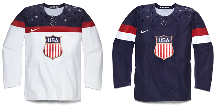
Nike has been using this week to unveil the hockey jerseys slated for use during the 2014 Winter Olympics. Today, they revealed the new look of the United States. Team USA will be sporting these classy numbers. They're minimalist in their overall aesthetic and very tasteful.
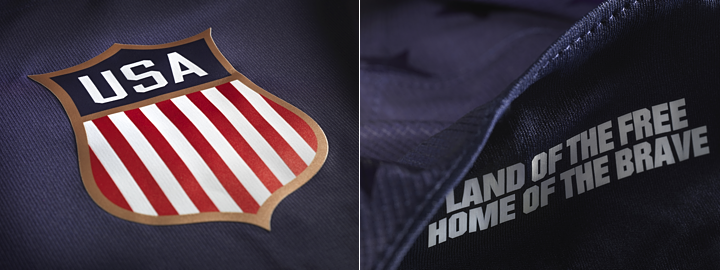
I particularly like how they swapped out the tired collegiate text for a beautiful new crest. Another feature of the jersey is the slogan "land of the free, home of the brave" printed inside the collar. I suppose that's just a feature for the players to see as they pull their jerseys over their head before they hit the ice. There's no other way to see it, really.
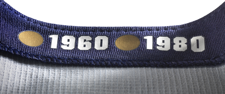
It turns out even Nike isn't immune from Reebok's "hanger effect" trend. The inside of the collar pays tribute to the years the U.S. brought home gold medals. It's a nice touch, even if it's only visible when it's hanging on a rack in a store. Still, it's probably a good reminder for the players when they walk into the locker room.
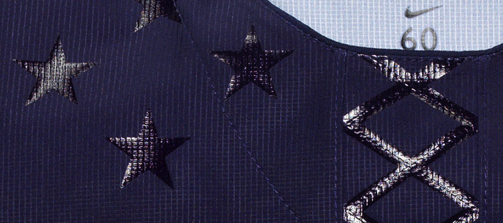
We'll wrap up with the feature that was exploding Twitter at last check. The same effect used to create the twinkling stars on on the shoulders has been fashioned into a fake lace-up collar. I guess the point is that the lace-up collars on hockey sweaters are strictly for appearances. So Nike figures, why not make them even more pointless.
But if that's the worst thing these jerseys have to offer, I think we're in pretty good shape. Some might question the lack of sleeve and waist striping — a problem I noted for the San Jose Sharks not long ago — but there's a different aesthetic to national team jerseys. They don't need bells and whistles. They need to be classy. I think Nike hit the mark for Team USA.
But wait, there's more...
Russia revises uniforms for Sochi
As the host country of the 2014 Winter Olympics, Russia was first to show off its new uniforms. The designs were revealed by Nike on Monday, and once again, we get a solid pair of jerseys.
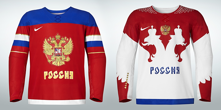
The red one features the Russian flag wrapped around the sleeves while the white one has an entirely different feel — both with lots of Russian iconography. In fact, that's addressed in Nike's media release:
Taking inspiration from Russia’s national emblem of the two-headed eagle, the jersey has been redesigned with streamlined design lines, lighter graphics and a modern neckline reinforced with Nike Flywire. The result is a lightweight, breathable jersey that moves naturally with the body, and is steeped in hundreds of years of history and heritage.
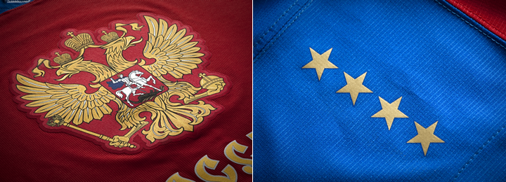
Featured on the shoulders of the red jersey are eight stars — four on each side — commemorating what Nike refers to as "past successes." A similar feature is on the white jersey but in the form of eight gold crowns on the right sleeve. But by my count, Russia/Soviet Union has only won seven gold medals in Olympic hockey. What am I missing? Anyone know what the eighth star references?
UPDATE: I was forgetting about 1992 Olympics and the Unified Team, for which Russian players suited up. That accounts for the eighth gold star/crown. Thanks to Corbin LeGrand for pointing that out.
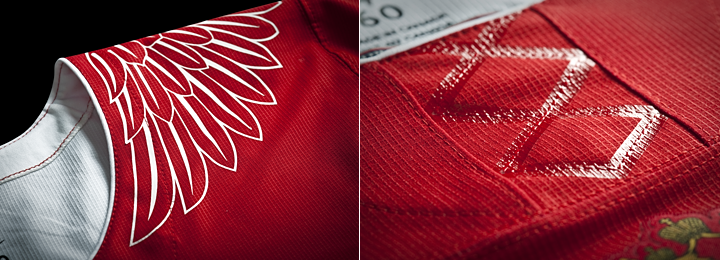
Speaking of the white uniform, here's a look at some of the detail. That faux lace-up collar shows up again — on both jerseys, in fact. Too bad, and Nike had such a good thing going otherwise. The other thing that got some negative feedback, at least through Twitter, was the eagle wing graphics on the shoulders.
I may be in that group. It doesn't really feel like it belongs with the rest of the jersey. Especially when you see it on Alex Ovechkin. Check out these shots.
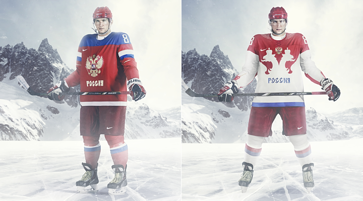
The red one looks incredibly cool. The white one... well, let's just say I hope they get to play more games while wearing red. Both designs are very Russian, but I'm partial to the red, obviously.
How about you? How do you feel about what Nike's done for the U.S. and Russia?



Reader Comments (70)
First look, these are plain weird but I really think they are going to grow on people. I agree that these would be terrible as a NHL sweater but as an USA jersey I honestly like it, it's very simple but it works. Another thing I noticed is that Nike sort of matched the Olympic hockey and World Cup soccer jerseys, and I don't mind.
One word: Dandruff
The stars look like dandruff.
Somebody tell team America to go wash their hair
I actually really like MOST aspects of the USA jersey. IMO, there are a few easy fixes that would make it a beautiful look. Firstly, either make it an actualy lace-up collar or get rid of the fake lace-up. Secondly, make the stars white or get rid of them.
The USA jerseys look like soccer uniforms to me. And that's not a bad thing. But as for the logo, I don't understand why they don't just use this logo. http://unitedstatesofhockey.files.wordpress.com/2012/12/logo_usa_hockey.gif
As for the Russian jerseys... LOVE the red, but the "white" jersey... I get that the double-eagle is a Russian symbol, and I have no problem with the host nation having their own national symbol represented in their uniform, but it just doesn't look good. Can't put it any other way... Also, I'm slightly bothered that the stripes on the white socks are "white/red/blue" considering the flag is "white/blue/red", but that's more nitpicking than anything else.
Absolutely a horrible, terrible design on USA Team. Dark sticker type looking stars, flag of Poland on sleeves on a home jersey, Olympic GLORY and national pride being hidden on an inside of the jersey plus a cheap clip art looking crest on a front with that bad color scheme - NO GO!!! Somehow, a BALD Eagle needs to land on USA jersey - the sooner, the better!!! And a fake laces that looks more like a DNA logo. Love that away jersey for team Russia - a sensational design idea. An " archangel " wings around a collar - pure and brilliant ( perhaps, something for Red Wings to think about it ). I would add some gold details at the bottom of each wing on a sleeve, same detail as the wings around the collar have and make them a bit narrow . Other than that, Russian jersey looks 100 times better than USA. Shame on designer(s) to produce a horrible concept for USA.
I was actually feeling a tad guilty for not liking the USA jerseys, but after seeing the plethora of discontent in the comments, I guess I am actually in the mainstream.
They're bad. They're really bad. The white one is horrible. The navy one could be salvaged with a few tweaks:
1. Change the crest (What is this crest anyway? Is it some sort of official crest or did Nike just pulled it out of their hiney?)
2. Add some sort of design to the bottom of the jersey (even just one stripe... please!)
3. Move the Nike logo to somewhere less prominent than where it's currently located.
Russia's jerseys are pretty bad too, but I really don't care what Russia looks like.
@ Kevin Y
That's USA Hockey's logo. Can't put a corporate mark on an Olympic jersey. Needs to be something representing the country. Same reason Hockey Canada's logo isn't on the jerseys anymore
@Anyone else
Anyone knows if there is a schedule to these releasing? When will Canada, Sweden, Finland, Czech Rep be unveiled?
I can't tell if half the comments are serious or just overly dramatic for comedy's sake.
FEINSKYLIX PUCH's whole comment is definitely comedy gold regardless of intention.
"USA jerseys absolutely horrendous! Same with the Russians! I will not even watch." -ROB S
I take issue with the Nike logo on the chest. Get over yourself, Nike. I remember your 1996 Team USA World Cup uniforms with the bronto-sized swoosh on the shoulder. Flagrant, in-your-face self-promotion that was. Just awful.
Manufacturer logos belong at the bottom on the back (Yay, CCM!). Anywhere else kills the aesthetic - including the present-day Reebok logo on the back above the player name.
Some Vancouver 2010 closing ceremony performers wore the Team Canada sweater with the Nike chest logo covered with a strip of tape. I wish a brave player would take a stand like that.
The USA jerseys are horrendous. They're more suitable for figure skating.
what a crap! don't let nike ruin hockey jerseys. this looks like plastic soccer jerseys. the fabrics of jerseys are cheap. we can see sublimated graphics and colors. fake lacing is the last nail in the coffin.
I really hate the old/normal USA hockey logo, so I'm at least glad they can't and don't use that anymore. I really liked the 2010 jerseys though, even if the throwback was miles away better than the other two. They were just sharp, and these jerseys just let me down. I'm not sure if its the way the striping is in weird locations, but they don't even look like they are cut right. I don't like the fake laces, I don't like the stars unless they are white, and the crest is just a tad oddly colored and small.
I like the idea of a bald eagle crest someone mentioned. That could look beautiful.
If you look at the Russian photo gallery on the Nike site, you can see that these are really that cheap. No decorative stitching. All graphics are dye-subliminated into the fabric (including stripes). The numbers and some other graphics appear to be laser-cut twill and heat-pressed/glued on. The kicker is the crests are printed and then heatpressed on.
They scream of cheap. If you want to see what fabric this is, go to a Nike store and browse the golf section. You'll find plenty of examples. I have a polo which has what appears to be an identical fabric, complete with the UV spot treatment.
Nike delivered flywire collars to the NFL creating a toliet seat effect for collars for NFL uniforms (Buffalo, Baltimore, Saint Louis, New Orleans, etc). Looks like Nike now believes in Flywire 'Laces'. Too Funny Nike.
Keep Calm
and
Fail On.
I like using the shield. That's a good move on their part and a nice recall of the 1920 sweater.
That aside, the whole jersey fails to have an aestetically pleasing look. The stars and fake lace are terrible. The red and white stripes on the blue jersey makes me think of the Polish flag. The placement of the Nike symbol on the white jersey is awkard because of where it sits within the red stripe. To me, it's a very disjointed look, and really off the mark for what it should be.
Hmmmm.... stars on the shoulders... a stripey round bottomed shield..... I think Nike may have their Americans mixed up> http://www.sportslogos.net/logos/list_by_team/44/New_York_Americans/
FAIL! Fake laces?! WTF? Cheesy glossy stars on the side...dumb. The french flag wrapped around the blue jerseys sleeves? I hate you Nike.
These will go down as some of the worst hockey jerseys in history... The equivalent of Anaheim and L.A.'s thirds. I would constructively criticize but it doesn't take a plumber to call a turd a turd.
I STILL maintain that, IMHO, the 2002 Olympic jerseys were the finest ever designed. 2010, I would give them a solid B. 2006, B+, but only because they got to keep the USA Hockey Federation logo.
For this sweater, the striping on the white is okay-ish (the blue looks fine in terms of striping), I like the crest, but the thing that puts my knickers in a twist the most is the fact that these look like soccer goalie shirts, not hockey SWEATERS... Reebok got ripped to shreds for the cut and construct of their Edge 1.0s, and these are WORSE! The cut of the body and sleeves are jacked--it looks stupid on Ovechkin. and those sparkly stars and lace-up? EW EW EW EW EW EW EW EW. The 2006's bug me slightly because they feel like golf or track windbreakers, and have that annoying "swish, swish, swish" sound any time you move in them, but they LOOK good. My 2006 GC Robert Esche fits really well, which I was suprised at. I don't even mind the squared-off collar.
Please, Nike, pull your head out of your collective six-hole and quit trying to PRO COMBAT-ify or OREGON DUCKS-ify everything. Hockey has a hard enough time preserving their once-good name, they don't need YOU making them look like freaking clown shoes on the ice. I can only think of what god-awful letter and number font they're going to pair with these cringeworthy monstrosities.
I took some time to let this soak in. At first, I wasn't impressed, but I looked at them often from time to time to let the design sink in. What I can say is I like the crest. No, I love it. I think it gives us a classic look. In contrast to that, the shoulder design and faux laces do not fit. As someone said, I hope they become barely noticeable while they're playing, but it certainly becomes a turnoff for marketing these things to the public. This would be a time, in my estimation, where a corporate logo should be left off or subtle; put it out of the way or on the inside or something, but not prominently on the jersey, and certainly not above the team logo (which, for a national team jersey, is some form of a national logo).