Entries in florida panthers (26)

Friday
Oct152010

Blue on the Schedule

The Pittsburgh Penguins will unveil their 2011 Winter Classic sweater later this month and plan to wear it more than once this season.

Yesterday, the Penguins also released a third jersey schedule for 2010-11. The powder blue duds will hit the ice 10 times this season, including tonight's debut, while the yet unreleased Winter Classic sweater will see action twice beyond New Year's Day.

Here's how the schedule shakes out for the third jersey:

  • Fri., Oct. 15 - vs NY Islanders
  • Sat., Oct. 30 - @ Carolina
  • Wed., Nov. 17 - vs Vancouver
  • Sat., Nov. 27 - vs Calgary
  • Mon., Dec. 6 - vs New Jersey
  • Sun., Dec. 26 - @ Ottawa
  • Sat., Jan. 8 - vs Minnesota
  • Sat., Jan. 22 - vs Carolina
  • Wed., Feb. 23 - vs San Jose
  • Sun., Mar. 27 - vs Florida

Note that the powder blue sweater will be worn twice on the road against Carolina and Ottawa. Both of these teams have black thirds and red homes. Think we could see a night or two without white sweaters? That would be a treat.

Additionally, the release tells us the Penguins will unveil their new Winter Classic threads later this month, but doesn't cite a specific date. Icethetics has it on good authority they will be dark blue.

  • Sat., Jan. 1 - vs Washington
  • Thu., Feb. 10 - vs Los Angeles
  • Sat. Mar. 12 - vs Montreal

This new sweater will see action at least twice after the outdoor game at Heinz Field. And more than likely, it will be the Pens' new third jersey in 2011-12.

Panthers Promoting Throwback Nights

The Florida Panthers will be holding three Throwback Nights this season, according to the team's season ticket packages.

Panthers season ticket holder Brian E. wrote in yesterday to let us know about about the events, which haven't yet been explained by the team. But we can only hope it means the red jersey will make a brief but welcome comeback.

Panthers celebrating Throwback NightsHere are the dates:

  • Tue., Dec. 7 - vs Colorado
  • Sat., Jan. 15 - vs New Jersey
  • Thu., Mar. 17 - vs Toronto

The Dec. 7th game against the Avalanche has been dubbed "Throwback to 1996," referencing the only season in which the Panthers made it to the Stanley Cup Final. Unfortunately, they were swept by the Avs, but making it that far is pretty respectable in itself.

It seems obvious that the Panthers would use the old red sweaters based on the photos used on the tickets. Plus, it's the only thing they could "throw back" to after only 17 years of existence. However, "Throwback Night" may not necessarily refer to the uniforms. It's entirely possible it could just be an in-arena promotional thing with special appearances by former players and such.

We'll have to just wait and see, but how great would it be to see the Cats back in red?

Wednesday
Aug182010

“P” is for Patches & Primary Logos

So it's been a good seven days since the last blog update. I feel really bad about that, but then I was on a cruise for at least four of them — so, I don't feel that bad. But I do have a bunch of updates to get through now — dealing with all three NHL teams whose names start with "P." Total coincidence!

Penguins Put Out New Arena Patch

Pens' new commemorative patchOver the weekend, the Pittsburgh Penguins started selling a new jersey patch that commemorates the inaugural season of the team's new arena.

Season ticket holders got their first look at the patch and the new CONSOL Energy Center at an open house event this past Saturday.

I don't have any information as to whether the patch will be worn on the uniforms, but why wouldn't they be? If you're wondering what that might look like, Steve Z. has been kind enough to share a photo. Though my guess is we'll see it on the front rather than the shoulder, if it's used on the sweater at all.

Also special thanks to Jeff S. for the above photo of the patch itself. Got lots of emails about this while I was gone. Thanks to all of you!

And if you're in Pittsburgh and dying to see the new building for yourself, here's a useful link.

Panthers Mulling a Reduction of Red?

Miami Herald writer and Florida Panthers blogger George Richards posted an article on Monday mulling the possibility that the team may drop the red, not this season, but the next.

He says the Panthers are considering using their new third jersey design as a base for new home and road sweaters, while keeping the same leaping panther primary logo. But he says it more colorfully:

Word on the street is the Panthers are likely going to keep the leaping Panther as their primary logo in 2011-12 while changing the team's colors from the H. Wayne picked blue-gold-red to the Tampa Bay Rays scheme we saw last year.

The blue-on-blue color scheme (what do we call it? The JetBlues? The Sunrise Rays?) apparently will be the Panthers uniform look by that season.

In 2011-12, the current thirds would become the home jersey with a new white/blue/light blue coming for the road. The third jersey — if the stick breaking panther is indeed the primary logo — could incorporate the head crest. If there is a third jersey. Probably won't [be] for the first few years of the redesign.

I'm sure there are people hard at work on this as we speak. Here's hoping they fix the dopey FLA logo... And leave the palm tree/hockey stick shoulder patch alone...

There's a lot more to the article, very much worth reading, but I don't want to copy it all here. Richards does say that he has yet to confirm these "plans" with team brass and that the stick-biting panther is the "logo of the future."

Meanwhile, the team's official website was recently redesigned to highlight the two-tone blue and gold color scheme. Red is still a key accent color, but it does appear the Cats are headed in a new direction with their marketing efforts. We'll keep an eye on all this.

Related: Panthers Reworking Primary Logo?

Predators Sending Out Mixed Messages

Taking bets now. Which logo will the Predators use this fall?

In the spring, it was all but confirmed by Reebok that the Nashville Predators would have new home and road jerseys for the 2010-11 season. The assumption being that the Preds would give the spotlight to their third jersey — along with a white version of it.

Lately, we've heard lots of reports from Nashville-area hockey retailers that nothing is changing with regard to the Predators uniforms. But at the same time, notice the redesign of the team's website to accentuate the dark blue and silver — the colors of the logo on the alternate sweater.

New Logo on Social LinksCheck out the graphics they use to link fans to their Twitter and Facebook pages right there on the home page! Where's the orange and gold? Gone, that's where!

I know it's getting late in the summer, but the Sabres are waiting until the start of the preseason before they give up their new look. Who's to say the Predators aren't doing the same? — just much more quietly.

In fact, if you remember back to the draft a couple months ago, the Predators only handed out hats with the recolored primary logo. Then again, they've still been handing out the current jerseys all summer.

When Shea Weber was announced as captain, he got one. As did the club's new bosses just last week. So I don't know.

It seems like an obvious choice, but we'll really just have to wait and see. The suspense is just killing you, I know.

Monday
Mar222010

Early Cats Concept Art

Panthers unveil Den of HonorThis past weekend, the Florida Panthers unveiled their Den of Honor, a tribute to the brief but colorful history of hockey in South Florida.

Among the many exhibits at the BankAtlantic Center is a display that showcases some of the team's early logo concepts — of obvious interest to Icethetics readers.

Some early Panthers conceptsIt features two framed canvases with over a dozen different sketches of potential logos, designed back in the early '90s. 

These images come from a video about the unveiling of the Den of Honor, posted on the Panthers' website Saturday. Click here to watch it.

One of the most unfortunate sketches appears to be that of a panther stretching in a downward position, head on the ground and hind quarters way up in in the air. The witless puns almost write themselves.

More Cats concepts on displayThankfully, based on the majority of the concepts, it seems clear that management was in favor of a leaping panther. The only question dealt with the positioning of the paws.

Take a look at the sketch in the center of this image (right), the differently-positioned paws may be more anatomically realistic, but leave the logo feeling a bit unbalanced. And anatomical realism has no place in sports logos anyway.

See the small logo just above that one? It's nice to see they avoided the temptation to go with the three-quarter view — unlike some teams (Ottawa).

Personally, I think the Panthers have one of the coolest hockey logos despite its intricacies. And after 17 years it's neat to see the team finally showing us what could have been.

Just call it a third already

Bruins don classicsThe Boston Bruins broke out the Winter Classic threads for the fourth time this season on Sunday.

The Bruins donned their specially-designed duds before the home crowd, beating the New York Rangers 2-1 in their first indoor win while wearing gold.

At this point, they just need to call it the third jersey — officially. After all, the current black thirds could use replacing. The Bs arguably have the best home and road sweaters in the NHL along with the worst alternate.

Whether it returns this fall for the 2010-11 campaign remains to be seen, but it might be a safe bet that we'll see it again before this season is out. All the previous occurrences of the jersey were weekend matinee games.

Of course, the Fenway Park game was an afternoon match. The Bs wore the golds next on Saturday, Jan. 23 for a 1:00 PM start against Ottawa and again on Saturday, Feb. 6 for another 1:00 PM start against the Canucks. Yesterday's game against the Rangers started at 12:30 PM.

The Bruins now have two more afternoon home games left on the schedule. The first is Mar. 27 against the Flames and the other is Apr. 10 against the Hurricanes. Could it show up again at one or both of these games?

Tuesday
Nov242009

Panthers Unveil 3rd Jersey!

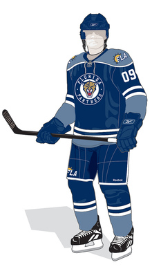
Last night just prior to their game, the Florida Panthers unveiled their brand new third jerseys. The sweaters are primarily dark blue with gold accents and introduce an entirely new color to the scheme — light blue.

The Cats then debuted the new sweaters in the game against the Pittsburgh Penguins. It shouldn't go without saying that these jerseys do feel awfully reminiscent of the Winter Classic sweater the Pens introduced in 2008 — which later became their third.

Keith Ballard, Nathan Horton and Bryan McCabe in their new threads

It also seems to borrow elements from the Minnesota Wild home and St. Louis Blues third jerseys. So unfortunately it's not a totally original look. Having said that, I like them a lot more than the home and road looks. It's a solid design and when you really get down to it, they look like hockey jerseys should.j

Where the design falls down is that new secondary mark on the helmet, pants and shoulders. Yes, the Sunny FLA. Why? I'm intrigued by the irony that Reebok starts introducing abbreviation-based NHL logos and uniforms just after dumping their own abbreviated (Rbk) logo. (I know, I can't blame Reebok for everything.)

Despite that, I wouldn't be surprised to see that panther head logo soon take over as the team's primary mark. They've already chopped off the legs. Seems like a natural progression. What's disappointing is that along with that will probably see the end of red in South Florida. But it's been a staple since 1993 when the team first joined the league.

In fact, their original road jerseys were red. But suddenly in the last couple of years the red jersey was relegated to third status when the dark blue alternate was promoted. Then in the Age of Reebok, the red jersey went away completely. Fans hoping to see it return with this third were left disappointed as it's not even an accent color. In fact, they just added another shade of blue.

Still, it's always nice to see a team try something different. I have to give the Panthers credit for going out on a limb. But traditional sweaters in a non-traditional hockey market just seem to clash. St. Louis and Minnesota got it right. Nashville and Florida need some work.

I'll finish my analysis with something positive. I do like the custom type used for the lettering on the nameplate as well as the numbers. At first glance, it looks like a standard block font, but look closer.

The Panthers have said the jersey will be worn for 12 home games this season — including last night's — but I have yet to come across the schedule. If I do, I'll be sure to add it to the calendar in the sidebar.

So what do you guys think of the new threads?

Wednesday
Nov112009

Panthers 3rd Leaked!

That didn't take long. Remember how yesterday I said the Florida Panthers' new third jersey seemed leak-proof? Yeah, that's not true anymore.

Uni Watch, of all places, posted this sneak peek at the new threads.

Sneak peek at the Florida Panthers new third jersey

I was prepared to be disappointed by Florida this year, but based on this sliver of an image, I am only impressed. It feels somewhat like a carbon copy of the Blues' third jersey, which debuted last year, but I do like that jersey. Hopefully it can differentiate itself enough to stand out.

Looking forward to November 23 — the official launch date!