Entries from February 20, 2011 - February 26, 2011

Friday
Feb252011

Preds Confirm Plans for New Sweater

Predators announce new jersey / Seth WrightThe Nashville Predators have confirmed to season ticket holders that a "newly re-designed jersey" is in the works — and they can have one for free.

Icethetics reader Seth Wright has written in with some solid information. Back in January, he was first to provide a photo of the white version of the Preds' blue third jersey — which was the subject of speculation regarding a new road sweater. The team has since refuted that theory via social media.

Now Seth is sharing some marketing materials sent to Nashville season ticket holders. Specifically, this:

Free Newly Re-designed Jersey

Be the first in "Smashville" to own the new look Predators home jersey to be debuted for the 2011-12 season. This jersey is exclusively available for season ticket holders and those that choose to upgrade to full season tickets by March 19th.

First of all, they reference the "new-ness" of the jersey about five times in that little paragraph, so it's probably a safe bet we're not looking at a promotion of the third jersey. This will be an entirely new sweater.

Second, there's nothing about a new road jersey, though if we pay attention to Reebok, we should be expecting one. But the away uniform isn't necessarily a selling point for your home crowd so why mention it to season ticket holders? We should also probably assume that the third jersey will remain the same.

And finally, let it be said that this note serves as official confirmation from the team that there will be a new home uniform beginning in 2011-12. Will the NHL's uniform changes in the Age of Reebok never end?

Season ticket holder renewal booklet / Seth WrightThe big question remains: What will this new jersey look like? Seth contends that the color of the marketing materials seen here (left) may be an indication. They're yellow.

Paired with last week's report from a fan, via his ticket agent, that a new mustard-colored sweater was being considered, maybe we're on the right track. Or maybe not.

It's obviously too soon to guess at this point and all the "evidence" we have is inconclusive. Still, it's worth noting that this Season Ticket Holder Renewal booklet does not feature the third jersey logo — but rather the same primary mark that's always been in use. It seems the logo won't be changing.

Based on all this, any guesses as to what's cooking in Smashville? Is it okay that I called it Smashville?

Wednesday
Feb232011

Lightning Listen, Add Bolts and Black

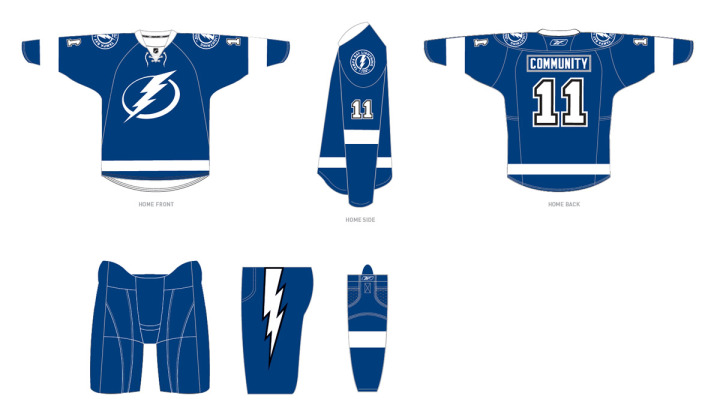
The Tampa Bay Lightning announced today the final design of their new uniforms for the 2011-12 season, which includes changes requested by fans.

Most notably, the revamp includes the additions of lightning bolts on the pants, a fixture of Lightning uniforms since the club's inception, and black trim, one of the team's original colors. The newly unveiled logos will remain unchanged.

The team released this image on its website:

Lightning unveil changes to 2011-12 uniforms / Tampa Bay Lightning

For what it's worth, it seems the regular blank jerseys that will go on sale to fans will not actually feature black at all, as it will only be used to trim the numbers and the bolts on the pants. But that seems to make sense from the standpoint of merchandising as the jerseys are likely already in production. To make changes to the sweater itself would mean scrapping everything that's already been manufactured.

Here's the statement from team management regarding the changes:

“After our multiple announcements in the past weeks we listened, as we always will, to feedback from our stakeholders,” said Leiweke. “While we have received overwhelmingly positive response regarding the direction Jeff Vinik is taking this franchise, we did hear from some fans regarding the traditions of black and a bolt on our pants. Thus, after consultation with the NHL and our design team, we are adding black as a third accent color and an elegant white bolt to our pant.

“While we are committed to pushing our franchise to new heights, we will forever honor the 2004 Stanley Cup and the other traditions and great efforts of those before us. The addition of the lightning bolt and the incorporation of black trim is an opportunity to send a message to Phil Esposito and the other pioneers that Lightning history will always be a part of who we are.”

The team also confirmed the BOLTS third jersey will stick around for years to come. Though they will likely swap out the shoulder patch with the new logo.

Now as a Lightning fan, here's my take: I love that they're keeping the bolts on the pants! That was the biggest thing in my mind missing from the new look. They're still leaving out the victory stripes, but most people outside of jersey geeks like us would have never noticed anyway. I'll miss it but it's not the end of the world.

Regarding the black, it seems they've tried to do as little as possible to placate fan complaints. Personally, I never thought we needed black, but if we have to have it, let it be in the small doses seen above. Overall, I'm ecstatic about the new look, especially now that the bolts on the pants are back.

So to those who didn't like the initial design, what do you think of the changes? Did the team address your concerns to your satisfaction? To those who did like it, do the alterations change your mind at all?

Tuesday
Feb222011

A Look Back at the Infamous Slug

Taking a quick break from the somewhat fun but tedious work of creating new Jersey Galleries to keep the blog fresh. (By the way, Montreal is up next.)

Today marks the start of a new era for the Buffalo Sabres as a new owner takes the reigns. So you might wonder why I'm using the old logo in this post.

Charlie from Sabres Not Slugs directed me to a discussion last week on the SportsLogos.net forums regarding the genesis of the 2006 uniform and logo. The team's creative services director, Frank Cravotta, posted some early sketches to his online portfolio — which were later removed.

As luck would have it, that doesn't mean they're gone from the Internet at all.

Early sketches of 2006 Sabres logo / Frank CravottaVery cool to see the evolution of a mark that was so despised — and to see it from its earliest stages when it both looked like a bison and incorporated the swords for which the club is named. But the question remains, why were they removed at all? Usually that signals an artist claiming work not his own.

Well, that's not exactly the case here, as explained by Kristopher Bazen, a member of the team involved in the rebranding efforts. He wrote about the process and the harsh condemnations the logo received. 

I have several rounds of work where you can see how the "Buffaslug" took shape, so when I was given a heads up ... and saw the work online, I felt the need to speak up. I spoke to Mr. Cravotta and stated how the postings of some images could be misleading, due to the fact that the re-brand was a collaborative effort, and I thank him for removing those images in such a timely manner.

It's funny, I never really thought I'd be speaking on behalf of this project, especially since they've all but abandoned the mark, but since I'm on the subject, I guess I'll let it rip! The thing that frustrates me the most is a lot of people have no idea of the amount of work that goes into these projects, yet fire off at the mouth (or keyboard) like they are seasoned veterans at this stuff. ...

The truth of the matter is there was months of work that came from our team before this logo was decided upon. It's common for designers to work up a ton of sketches and options to please a client, but when the client has their own idea of how things should look.

Honestly, I'm thankful because I've grown thick skin by reading people's bashings and critiques. I don't believe I'm a bad designer, despite people calling for me (or should I say, "the designer") to be castrated, among other things. Does anyone remember www.fixthelogo.com, an online petition to have the Sabres logo scrapped immediately after the unveiling? I sure as hell do! That sucked because I was a young designer just trying to do my job and service a client, and happy for the opportunity to be able to accomplish a childhood dream.

In the end, I've learned to chalk it up as a learning experience and move on. I am happy to report that since that catastrophe, I've worked on other sports identities and luckily, response has been rather positive. I won't go into detail on that stuff, but I just figured I'd clear the air on that. ... It's all good!

Bazen has it right. As I've learned, you can never please everyone, so you just have to accept that people will shoot their mouths off even over things they know nothing about. But almost everyone is guilty of that at some point, myself included.

So with all the bad-mouthing this logo received during its short tenure, especially on websites like Icethetics, I felt it only fair to present the other side of the story. Consider it presented.

We seem to be a little concept-heavy these days, but I think most of us enjoy seeing the "what-might-have-beens." So continuing on that note, Cravotta had also posted a few of the early designs of the new third jersey the Sabres launched this year. It was also removed.

Early sketches of the 2010 Sabres third jersey / Frank Cravotta

Again, it's fun to see the options that were considered. Personally, I think my favorite of the four is the "Force Uniform" as it incorporates more gold. But they're all very cool. And I like that Cravotta included a picture of the number stitching that was the inspiration for the final design.

Lastly, since this seems to be a tale of two artists, I'll finish with the other one. Bazen's portfolio features a lot of sports branding and identity work, including other NHL teams. Here's a little preview.

NHL identity concepts / Kristopher Bazen

If you want to see more, check out his website.

Sunday
Feb202011

The Return of the Jersey Galleries

Redesigned jersey galleriesI recently started to revamp one of the site's signature features — the Jersey Galleries project. I've been noting updates via Twitter and Facebook, but if you aren't involved on those sites, you may have overlooked it. You can find easy access via the Jerseys tab above.

The Galleries were a feature launched just over a year ago, featuring primarily alternate and specialty uniforms. Each gallery features game photos as a sort of historical record. The old section was laid out in a way that didn't really provide any context.

The new look rectifies those problems by incorporating home and road uniforms as well as the logos used on them. You can also find trivial details like the unveiling and debut dates and other information.

There are already seven galleries online and I'm hoping to have all 30 NHL teams done within a couple of months. For now, I'm cataloging only uniforms currently in use, but after that, we'll expand to as far back as I can find photos.

I'm not limiting the project to only the NHL. I'd like to tackle the AHL and ECHL this year but finding photos will be more of a challenge. It may require making friends with some team photographers. Same with the Canadian Hockey League, which has some of the best uniforms in all of hockey.

One question I get a lot I will answer right now. The order of the teams is being determined by you guys. On a recent Facebook post, I asked readers to make recommendations. I'm going in the order they were asked. If you have any others questions about the galleries, you can ask them in the comments.