Just To Freak You Out XI
 Saturday · Oct 20 · 2007 | 5:20 PM PDT
  7 Comments
 Finally! I know I failed you guys yesterday in that Freak Out Friday never came to pass. But perhaps you'll allow me to get away with a Freak Out Saturday. The Everblades game aside, yesterday was a very busy day for me. Not to mention Blogger has been having issues with image uploading, an important piece of this puzzle. Anyway, here goes.
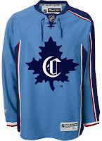
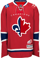
We'll kick things off with the team whose logo was named the champion here at NHLToL — the Montreal Canadiens. Some very strange artwork has made its way to my inbox — and now to your computer screen.
The concept on the left makes use of a little-known logo that the Habs wore back in 1910, prior to the formation of the NHL. As you can see it's on a Thrashers home jersey, which is weird, for more reasons than the light blue. The one on on the right is just as intriguing if not more so. It's a half maple leaf, half fleur-de-lis. And check out the Flames-influenced shoulder patches. The 100-year logo at the bottom is what puts it over the top. Well, then there's that logo of course. And the team name above it.
There just aren't any words for that. Nightmares.
Speaking of nightmares, the Nashville Predators have been trying to get more folks in the building this season so as to avoid something like this from happening.
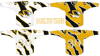
Somebody really wants a hockey team in Hamilton? Raise your hand if you think that's going to happen. Now keep your hand up if you think they'd wear a jersey like this. Put your hand down. You're looking at a computer screen.
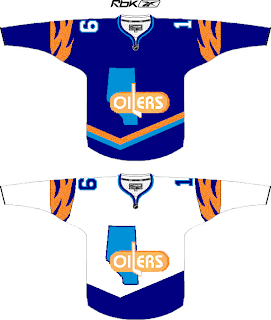
Before I leave Canada, I just got this one emailed to me today. It may be a little harsh that I'm sticking it in the Freak Out post, but it scares me just a little.
I realize I suggested attempting to work Alberta into the logo, but I'm not sure this is the winner. I do like the wordmark part (not as a primary!), but the province is weighing the whole thing down on the left side.
Wow I just had a weird visual. Imagine going on one of those insane diet pills. Maybe they get the formula wrong and you only lose weight on your right side. Sorry, just freaked myself out there. What's going on with me tonight?
Anyway, I know the new Washington Capitals secondary logo has been a big hit, but here's exactly how not to use it.
That's so bad I almost want to see what it would look like on a player. Damn.
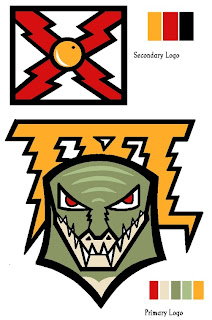
Since we're on the subject of really bad, we'll top things off tonight with my team.
I was seriously considering posting this and trying to make you guys guess what team this logo concept was designed for, but I'm not sure you'd ever figure it out. I think the secondary logo is meant to resemble the state flag of Florida. Hmm. But as for the primary, I have no clue what's going on there. However, I have woken up in the middle of the night in a cold sweat with this as the last visual in my brain.
As we inch ever closer to Halloween, the freak-outs seem to be getting more freaky. Thanks to everyone who's sent in work!
And if you have any of your own or have spotted anything crazy out there on the web, feel free to email it to me at nhllogos@gmail.com and I may make it part of next week's Freak Out Friday. (And I plan to actually post it on Friday this time.)




Reader Comments (7)
I must be weird. I actually like most of those designs. Except the Tampa Bay one.
The blue one would be good for the Leafs, just change the C to a T or ML .
The red one I love. I actually like the other one you posted awhile back better, the one with the fleur de lis as the stem of the maple leaf.
The Hamilton one is awesome. I love it actually.
The Capitals one is nice too.
I like the montreal one the right, and imo the lightning one is probably the best bolts concept you have posted except maybe the one with the skyline. And whats with the tiger stripes on the oil jersey?
Unfortunatly the Hamilton one will never happen because of the CFL team the Hamilton Tiger Cats....(We could get rid of them but then Winnipeg would have to work for a playoff spot)
I'm guessing someone else has figured it out by now, but I'm pretty sure the primary Tampa logo is supposed to be a crocodile, with TBL spelled out in lightning behind it.
Also, the Hamilton logo is the logo for the University of Missouri Tigers.
Nothing says "Oilers" like tiger stripes!
Like the red Habs concept, but I'm not sure how it would go over in Montreal.
I like the Hamilton concepts if they ditch the diagonal tiger stripes. Looks too much like that AFL Zubaz uniforms from the 90s. And for the record, Hamilton should totally have a team. Definately before most of the cities that the league is talking about for this silly expansion they're talking about.
The Caps concept...nightmare. The players arms would look like a couple of candy canes in those.
The 'Ning...there are no words for the horror.
A little talking about that oilers concept.
With Calgary taking the Alberta Flag on their Uniform I think it would be suiting for the Oilers to try a secondary logo of the province of Alberta in the future.
Though I don't like the concept in this thread I feel that it would be intresting to see the Current Oilers Logo Crunched into the outline of Alberta, Similar to the other Concepts we've seen such as the Wild and Canucks using current logos with the outlines of their home State or Province.