Double Up!
 Monday · Oct 22 · 2007 | 3:04 PM PDT
  17 Comments
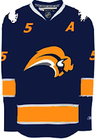
 We're doubling up on the concept art tonight. Check it out! We begin in Buffalo with the Sabres.
On the left appears to be a recolored Canucks jersey. Not sure why the artists decided to put upside down buffaloes on the shoulders. But I'm sure the traditionalists will enjoy seeing the '70s logo element on this jersey. Unfortunately, the "slug" is still there.
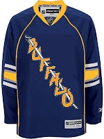
On the right is an element we've seen before. I posted the crest you see here in a Freak Out post from a few weeks ago. I wondered what it would look like on a jersey. Wonder no more. Unfortunately, this concept is based on the new Oilers jersey. And a yellow collar? That's pretty nutty. This might've been worthy of the Freak Out series itself!
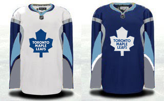
Speaking of freaky Sabres artwork, check out this Maple Leafs concept.
That's just weird, isn't it? Although the splash of color for the Leafs isn't completely unwelcome if my opinion counts for anything (and it doesn't). A simpler solution to the Toronto simplicity problem could be below.
I kind of like that outlined leaf. Not sure about the collar here or the shoulder piping.
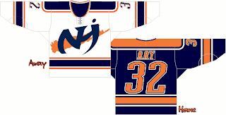
But going back to New York now, I've got a pair of Islanders designs.
Pretty cool logo. Anyone think this jersey could work as an alternate at some point in the future? It does have a very distinct Oilers feel to it, but that could be fixed by swapping the orange and blue.
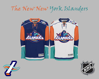
And finally, a little something out of the ordinary.
For as much as folks hated the "fish sticks," this is a much better-looking jersey than the current one — at least so says I. However I did like the old lighthouse logo more for the shoulder patch. I just really like that color combination more than anything. In fact, while we're at it, why not go with the lighthouse logo across the chest?
Anyway, what do you guys think of all these? Let me know below with your comments.



Reader Comments (17)
i've always loved those islanders jersey's no matter what everybody says.
I LOVE THE BUFFALO TEMPLATE MAPLE LEAF JERSEY!!!!!!!!!
So far every Sabres jersey concept on this site is by far worse than the original... come up with something good already.
the isles jerseys look sweet... i always liked their color scheme with the seafoam green.
that leafs jersey is awesome
if you are going to use 'that' islanders logo, you need to have the waving trim on the arms and waist.
THE MAPLE LEAF JERSEY IS WAYYY BETTER AND COOLERR THAN THE CURRENT ONE..
u sud send em the sample or sumthin if u can..
sweet isles jersey
I guess that I am in the minority because I felt that the Iles logo was a great step forward when it was introduced. The addition of the sea foam green added a great dimetion. While it's good, there is a bit too much green on this concept. I also loved the lighthouse secondary logo as well. Overall that design is much better than their current one.
Lets see...
Actually like both Buffalo jerseys. Second one is better though.
The first Leafs concepts aren't bad, but I think I like what we have better. Same with the second Leafs'.
Fan of the first Isles' jersey.
I was afan of the Original sailor, but this one just doesnt do it for me. Needs the waves.
I just noticed this after seeing the '90s Islanders logo and taking part in the Tournament of Logos: doesn't that Isles logo look like it should be an AHL logo rather than an NHL one?
Do I even have to comment on those Sabres jerseys?
"In fact, while we're at it, why not go with the lighthouse logo across the chest?"
Because it sucks, that's why.
Is SabresNotSlugs.com too much of an abstract and ambiguous website name?
its quite mindblowing to see how many people actually approve of the 'fishstick' logo, and think that the light green and blue look awesome on the jersey...
and it is for this reason i am glad they never took outsider point of views on designing the jersey cause god help the islanders if they did.
any "islander fan" who thinks that the fishsticks was the way to go...do us a favor and please jump off the islander wagon and dont let the wheels crush your head...after all...maybe some other NHL team can use your "wonderful taste in jerseys"...
and ill correct myself before anyone tries to jump on my case...i meant to say the addition of the light green and grey...not blue obviously...
NO MORE FISHSTICKS! The other islanders jersey is kinda cool but I speak for the majority of the isles fans when i say we are happy to finally go back to the retro jerseys