Everybody Loves Buffalo
 Thursday · Oct 25 · 2007 | 2:49 PM PDT
  10 Comments
 This should be a strange enough topic for a concept art post. You'll see what I mean in a second. First, here's a jersey for the Buffalo Sabres I think is way better than what they have. I say that not being a fan of the current blue and gold color scheme.
Stop throwing things at me.
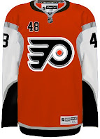
So anyway, here's what I was really getting at. People keep sending it concept art based off of the Buffalo Sabres "template," so to speak. Check out this Flyers jersey.
To be fair, it's a pretty cool design. For a jersey everyone hates, there sure are a lot of folks interested in using it for their own team. And I'll tell you what else. I'm curious to see how into this you guys are. Let's see if we can do one for every team in the league!
And if someone wants to scour through the Concepts Gallery to find any others, we'll start keeping a list. I just think it's kind of funny. And I'm sure there are Sabres fans reading here, just giddy over the idea.
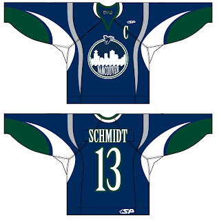
Here's a Canucks jersey design.
Interesting new logo concept, right? Well there's more where that came from.
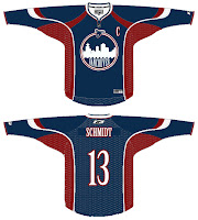
Maybe a nice secondary? Not sure about using it for the crest.
All right, I await your Sabres-based concepts, everyone. Don't let me down.


.jpg)


Reader Comments (10)
Those Red and Blacks are actually pretty sharp. I would like to see the Black Jersey with the 3rd Alt Crossed Sabres on it..... I might actually try that out myself.....
Chris,
In actuality, it's more the logo that everyone hates.
In actuality, it's more the logo that everyone hates.
Fair point.
4/5 for sabers gid rid of the # on the front and it gets a 5
I'll try that out Doug.
I don't like that Canucks crest. The use of a a cities skyline only works if its a really recognizable skyline (like New York). The crest is the first time I've ever seen a picture of the Vancouver skyline.
That uni honestly looks BETTER in black and red than it does in blue and gold. I hate our current uniforms, but in those colors, it honestly looks pretty sharp.
But the Sabres should never revert back to black and red. Blue and gold forever.
Surprising though what a difference the color swap makes.
Interesting. The jersey definitely looks better in black and red, and of course the old buffalo head is a much better logo than the slug. But I still like Slabyk's concept best. It's amazing that the Sabers picked the current jerseys over his.
If we've learned one thing, and one thing only, it's that the Sabres need to return to their vintage unis. The slug, the goat, the red, the black, the silver and the midnight blue, all of it, every last bit of it, needs to be dumped for the original colors and logo.
"It's amazing that the Sabers picked the current jerseys over his."
Those folks at Reebok can be very persuasive.