Guess What! Concepts!
 Monday · Oct 29 · 2007 | 3:22 PM PDT
  5 Comments
 There's no new poll today and I couldn't very well go without a single new post, now could I? Naturally, I have reader-submitted concept art to share. Let's begin in Pennsylvania.
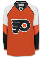
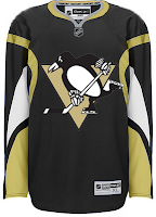
On the left is a great option for a third jersey — we've been told to expect one as early as next season for the Flyers. In fact, the team itself said so. On the right is an example of be careful what you wish for — because sometimes you get it.
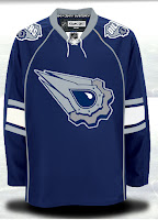
I really like the added use of gold on that Penguins jersey, little flightless birds don't have horns so a redesign would be required here. Next up is the Edmonton Oilers.
Not a bad idea for third jerseys, but those elbow stripes have got to go!
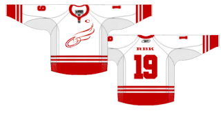
We'll finish with a concept logo for a team that will never change its logo, of this I'm sure.
It would never pass a professional sports logo, but if the Wings had/have some sort of foundation or something, it might make a good logo for that. Of course it's entirely possible I don't have a clue what I'm talking about. Wouldn't be the first time.
So that's that for today. Likely more to come tomorrow so keep checking in. I'm really trying to get done more than a post or two per day, but as you know, I have a Wii. It's pretty addicting.


Reader Comments (5)
That red wings logo looks alot like the arena football team the philadelphia soul
i like the philly and pittsburgh concepts, i do think that gold needs a bigger spot on their jerseys
Oilers need to fix their regular set before worrying about thirds. But that's not too bad. Fix the stripes, take off the piping maybe the laces (something about them looks off there) and it's pretty good.
as much as i dislike the red wings, the red wings concept logo is great! not too crazy about the jersey, though. great job!
The Flyers need to use that as a primary. I want orange jerseys back!
I love that logo for the Oilers.
The piping and elbow stripes are awful though.