


Tuesday
Oct302007
Poll: Sabres vs Whalers
 38 Comments
 |  | |
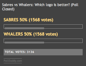
SABRES | WHALERS |
This is the deciding round for the Vintage Logo Tournament. Who's it going to be? Whalers or Sabres? Which is the best vintage logo in the NHL?
Place your vote and then feel free to leave a comment as to how you came to your decision. Tell all your friends to drop in and vote! The more voices heard, the more accurate the results!
| Poll opening date Tue Oct 30 | Poll closing date Sat Nov 3 |
07VNTRN | #4 | BUF70vHFD79


Reader Comments (38)
The Whalers will harpoon the Buffaloes with their own Sabres!
No chance against pucky.
Im really suprised that the Sabres, who can best the Jets, are losing to a green W. If i had my way, the sabres logo would be up against the jets for the best vintage.
Sabres should win this one.
Sabres should win. But I think people are too sentimental for the Whale. A shame.
Still, the fact that the Sabres Vintage has made it this far speaks volumes.
Someone tell Larry Quinn, if you can get his attention from Reebok.
I love both, the Sabres logo has more interesting elements though. Tough one.
There's beauty in simplicity!
i really hate everything about the sabers (No offence drew) I dont like the colours, dont like the players, dont like the team, they beat the jets. I did like them at one time and that was during the red and black colour scheme
That's some hate there sharky. I don't get where it stems from, but you're entitled to your opinion.
I love the Sharks, just so you know. Hell, I love just about any team if they have talent and play an entertaining game of hockey.
And sorry bro, but blue and gold > teal and orange. Should have stuck with the gray. ;-)
From the current Sabres logo losing to a Bird stirring himself into a glass of tang and now to the vintage Sabres logo, poised to win this tourney should tell you how stupid management was for changing the logo to begin with.
It was the Sabres 25th anniversary patch that set them on the path to the destruction. Some marketing genius thought "hey, our logo would look pretty good in black and silver."
I don't know what you mean james ... i always thought http://i135.photobucket.com/albums/q124/cdnuniguy/sabres25th.gif" REL="nofollow">this was a pretty sweet patch actually ....
It's just like the last game at the Aud: The Sabres vs. the Whalers. Hopefully the result will be the same, too. :D
The Sabres logo just catches your eye more than the whalers. Buffalo's has a way better design.
Being a Graphic Designer, with logos being my specialty and passion. I can't understand how the sabres logo is winning!
The Sabres logo has absolutely no creativity to it! Crossed swords and a bull thrown into a circle. The 2 main elements don't even interact. It looks like clip art tossed together. Or maybe somebody is sharpening there knives for a tasty dinner of Buffalo.
The Whalers logo is brilliant using negative space to create an H. Multiple elements interacting together to create one imaginative cohesive unit!!
I disagree about the Sabres logo looking like clip art. If you want to talk about graphic design, I'd say it's from the old school! Which I guess is fitting, in a vintage contest. It reminds me of a family crest.
Dank, you're aware that there's a difference between a bull and a buffalo, right?
I love Hartford's logo as well. But the Buffalo Sabres logo spells it all out without writing a single word or letter.
yea the orange doesnt work with the sharks
I think there's a lot of Sabres fans on this site, and not any Hartford fans. And the Sabres fans are winning. Which is fine, but I'm of the opinion the Whalers logo was the best in hockey, and still would be.
This is all about logos, what team you're a fan of doesn't have much to do with it. I voted Sabres, go Wings
The Whalers logo is more than just a "green W."
The whale tail over the top of the W creates an H in the middle, for Hartford.
You get all the elements of the team within the creativity of the logo.
I love the Sabres logo as well, but it's just not as good as the Whale.
Hail The Whale!!!
The Whalers Logo is awesome! The Colors, The Creativity and The Name! Think about it..."The Whalers." Very cool. If only they could have lived up to their name and whaled on some teams more often, they would still be in Hartford with all those beloved fans.
#1 Mike Liut for President!!!
I've always known the original BUFFALO SABRES LOGO was the baddest logo in the NHL!
It says it all 'BUFFALO SABRES'
And why they would change it,
say's how greedy some people must be! Salt the SLUG!
50-50! Close vote!!!
Come on whalers.. only a couple more votes to vanquish them =]
Both logos are fantastic.. this has made to be a great tournament.
I voted Whalers,this is a great final /its gonna be a photo finish..