Fan Art For Ducks, Stars, Coyotes
 Wednesday · Oct 3 · 2007 | 1:20 PM PDT
  Post a Comment
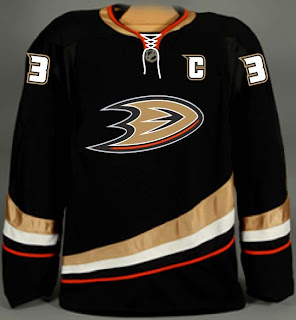
 I've been getting some really awesome concept art sent to me lately so let's dive right into some of it, starting in alphabetical order with the Anaheim Ducks.
If this had been sent to me sooner, it would've been part of the Ducks, Here's How You Fix It post from a week ago. That team would look so good in this jersey and I'd eat all my words.
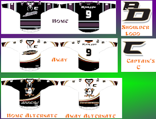
Then I was sent another set that I'm having some difficulty with.
That was making my head spin a little. So as to save me from having to explain it, a description straight from the horse's mouth:
I really wanted to pull together the Ducks' history in the jerseys. I tossed around a lot of ideas but landed on this set of home/away and two alternates. The home and away follow the current script years in Anaheim and I took a page from baseball for having different scripts for home and away. The home jersey features the 04-06 Anaheim script with Ducks in place of Mighty Ducks. The road is basically the current road jersey with an updated name font, captain's "c" and the script/oval logo. Both home and away jerseys feature and interlocking "AD" shoulder patch in the team script as well as front laces.
For the alternate I just changed the current sweaters up a bit but the new shoulder patch, front laces, a recolored Disney logo, and Anaheim, and Ducks wordmarks on the bottom of the home and road jerseys respectively. Just something a little different.
I like the jerseys independently of each other, but together they don't make a good set. I've heard of teams using different logos for their home and away sweaters, but never completely different color schemes. I think your team starts losing its identity when that happens.
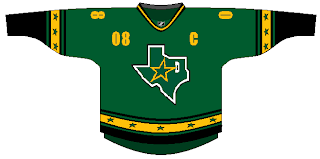
I've also got a Dallas Stars concept that puts the state of Texas right on the crest. Not a bad idea, but it should be the white logo. It needs more contrast.
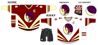
And finally, someone went a little nutty with the look of the Phoenix Coyotes. It's a harsh mix of the old and new.
I'm not really sure I have the words to describe it. Perhaps you do so feel free to leave a comment.


Reader Comments