Maple Leafs, Here's How You Fix It
 Wednesday · Oct 3 · 2007 | 1:39 PM PDT
  2 Comments
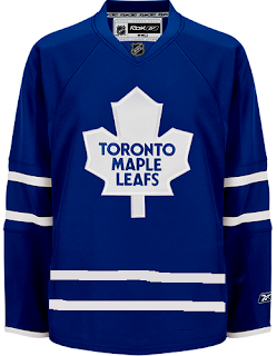
 The Fix It series has worked its way into the double digits today. In this episode, we explore ways of improving the Toronto Maple Leafs' brand new Rbk EDGE uniforms.
No question, the biggest complaint has been its simplicity and the fact that while wearing the home uniform, a player is nothing more than a giant blue blob. One minor change some feel might rectify this is adding the same double-stripe found around to the elbows to the waist.
If that's not entirely to your liking, however, I've got more. No, your eyes aren't playing tricks on you. These are the new Phoenix Coyotes jerseys recolored to blue and featuring the Leafs logo. If you look closely at the shoulders you'll see the remnants of the "PHX" patch.
But isn't that a sight to behold? Something about them just makes those jerseys look quite nice in my eyes.
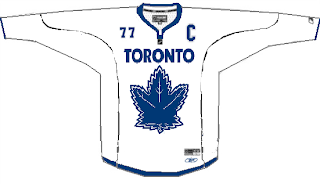
And then if that still isn't your cup of tea, perhaps you enjoyed the new Vancouver Canucks sweaters. Perhaps Toronto could go that route.
Or perhaps not. That scares me a little bit. So let's pretend you never saw that one.
That's all I got. Up next: Nashville Predators.


Reader Comments (2)
I dunno. The middle two concepts are nice, the last awful, but having watched the Sens/Leafs game on TSN today, I think the "plain jane" uniform actually looked pretty sharp.
i think the major problem is the jerseys do not match the socks. adding the stripes on the waist help.
there either needs to be a third stripe in the elbow (and waist) or less stripes on the socks.
also, bring back the TML logo on the shoulders. while i have your attention, all original 6 should have laces. just my opinion, thanks