NHL Tournament of Logos

Entries in whalers (24)

Saturday
Mar222008

Just To Freak You Out XXXI

I began the last Freak Out post with a similar image, so this is not a repeat. Look closely.

Yes, the duck is wearing himself on his own jersey. This is like some sort of weird fractal, right?

Anyway, we've also got an odd Minnesota Wild concept that scares me.

There's a reason teams choose bright colors. I can't remember what that is at the moment.

Got some stuff for Toronto and Montreal.

Does that Leafs logo look familiar to anyone? I've always thought the Habs should try blue — but on the jersey, not the logo.

And then of course we've got a string of "If They Mated" concepts for some of the clubs that found new homes in the '90s.

The Hartford Hurricanes?

The Quebec Avalanche?

The Winnipeg Coyotes?

No, no and no. Lastly, I've got a little something to celebrate St. Patrick's Day albeit a bit after the fact.

He's got shamrocks on his shoulders! You guys absolutely slay me.

Wednesday
Mar122008

Dropping Into Carolina

Today's concept art subject is the Carolina Hurricanes. Got a lot to share so I'll get started right away.

First up, a simplification of the current uniforms.

It basically drops some striping. Not much to speak of. There's also an idea for a black third jersey using the current primary logo.

I like the triangular shoulder designs. However, a lot of the rumors we've heard suggest that the secondary logo will don the chest of a new alternate sweater.

The one on the right is funny because of the waves. Reminds me of the Lightning's sole attempt at a third jersey in the mid-'90s.

But as many have pointed out, that flag is actually a tropical storm flag. It's simpler and therefore makes a more balanced logo. Technically, a hurricane flag would look like this.

What do you think of that secondary logo?

Now we'll go back in time a little to when the 'Canes were the Hartford Whalers. We've got some Rbk EDGE designs for them.

That's nice but I don't think the folks from Hartford will be able to identify well with the hurricane flags around the bottom.

Probably a better design there. I like that green jersey a lot. Thoughts on these? Post a comment.

Thursday
Feb282008

Odd, Unique Logo Designs

Tonight's post is dedicated to those of you who've used your imagination to create entirely new logos for your favorite teams.

We begin in Anaheim with a neat logo design I featured earlier this month. Prepare yourself. It's very purple.

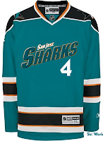
Next to it is a Sharks concept that probably should never been seen by anyone — ever. But I thought it could at least serve as just one more reason why teams should definitely not do this. I thought it was all right for the Stars as a one-of-a-kind sort of deal. But the all-star jerseys this year worried me.

Moving on to Canada now, here's a Canadiens sweater with an interesting new secondary logo created by a reader some time ago.

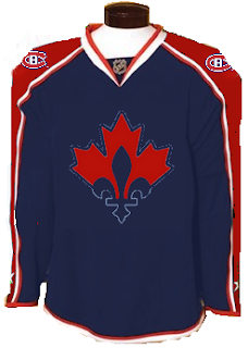
It probably needs the fleur-de-lis in white, but otherwise it's a really cool, symbolic logo.

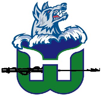
Now to Hartford, where someone has created a new brand for a team called the Whales. (Not to be confused with the Whalers despite the logos seen here.)

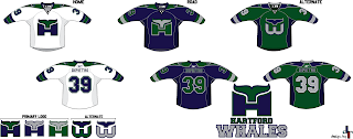
Those are some pretty snazzy jerseys. (Yes I said snazzy. What?) I like the "H" logo but the "W" logo is more effective with that hidden "H."

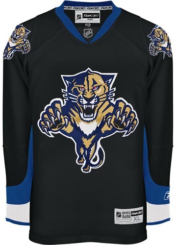
Next is a simply Panthers design.

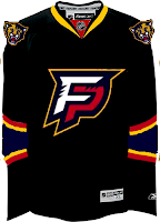
I'm not really a fan of letter logos in cases like this. Put the "FP" on the shoulders and the panther head on the crest, that's what I say. But what does my opinion really matter?

And finally — you know I've gotta do it — in preparation for my trip to Vancouver, here's a new logo design for the Canucks.

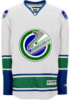
I hate to be mean, but I'll come right out and say I don't like it. Ever since I saw the new Johnny Canuck logo, I haven't been able to imagine another symbol that would work better for that club. Still, no idea's too dumb to put out there, right?

Don't forget to go cast a vote at ToHL for which CHL league goes first when the new tournament begins on March 14. And if you're wondering, I haven't yet decided what tournament will follow the Quest For The Worst here at NHLToL. I'll keep you posted.

Wednesday
Feb132008

Poll: Canucks vs Whalers


vs
Vancouver
CANUCKS
Hartford
WHALERS


REMEMBER: You're choosing the WORST logo!

Place your vote and then feel free to leave a comment as to how you came to your decision. Tell all your friends to drop in and vote! The more voices heard, the more accurate the results!

Poll opening date
Wed Feb 13
Poll closing date
Sun Feb 17

Thursday
Feb072008

Poll: Lightning vs Whalers


vs
Tampa Bay
LIGHTNING
Hartford
WHALERS


REMEMBER: You're choosing the WORST logo!

Place your vote and then feel free to leave a comment as to how you came to your decision. Tell all your friends to drop in and vote! The more voices heard, the more accurate the results!

Poll opening date
Thu Feb 7
Poll closing date
Mon Feb 11

Tuesday
Jan292008

Poll: Hurricanes vs Whalers


vs
Carolina
HURRICANES
Hartford
WHALERS


REMEMBER: You're choosing the WORST logo!

Place your vote and then feel free to leave a comment as to how you came to your decision. Tell all your friends to drop in and vote! The more voices heard, the more accurate the results!

Poll opening date
Tue Jan 29
Poll closing date
Sat Feb 2

Friday
Jan252008

Just To Freak You Out XXV

Time for this week's Freak Out Friday post — which happens to be the 25th ever. You know you love it. By the way, you're going to start to notice a very specific theme. Just go with it. I'll begin with a little something to startle you.

Now something to downright disgust you.

Who would do that to the Blues logo? And why?

Beware of purple sweaters.

And scary Tim Burton penguins.

Also white sweaters, apparently.

And sweaters with trees on them.

Yellow ones as well.

There's so much to be wary about these days that you might hope to find solace in the Vancouver Canucks.

All hope is lost.

And any notion of a sensible design.

Finally, the fisherman you all love so much may not have worked for the Islanders, but if the Whalers every make a return, I think we've found their man.

Hope you guys enjoyed this episode. Stay tuned for a brand new one next week. Same bat time. Same bat channel. (Batman on the brain. Just watched Batman Begins again today.)

Friday
Dec212007

Just To Freak You Out XX

The quality of Freak Out art I've become accustomed to was sorely lacking this week and that'll be clear after you get through tonight's post. It's not that nobody sent anything, it's that they were either trying too hard or not trying hard enough. I've got to have some standards, right? Perhaps not, but I'll forbear any further deliberation if for no other reason than to quite simply get on with it. Good plan?

What's wrong with this picture?

Yes, it seems like some of the colors there are a bit off. These too.

And don't even get me started on the absurdity of tropical storm flags surrounding a jersey with a Hartford Whalers logo on it. My head would explode.

Next is a Philadelphia Flyers concept logo that I think fits fairly into the "freaky" category.

At first, I liked this New York Rangers jersey. But the more I stare at it, the more it disturbs me. I don't care how old that team is. They need a new logo.

And finally, this one I just can't figure out. My brain tells me this is a nice Photoshop job, but a small part of me fears someone, somewhere actually made this jersey.

Islanders fans, I apologize. That's just horrible.

Anyway, that's all I've got for this week. Hope you got a little freaked out. And I hope you guys will keep sending in good Freak Out Friday material so we can keep this series going. Enjoy your holiday weekend!

Sunday
Dec022007

Just To Freak You Out XVII

Welcome to the belated 17th installment of the Freak Out series. Time's been getting away from me the last few days so I apologize for the delay. Anyway, this week's art has a very specific theme. I asked for you guys to send me stuff of the "If They Mated" variety and some of you actually responded.

We'll start with a couple of logos I thought were "special."

If you're staring at that and just can't place it, look no further than the Ottawa Senators. You'll recognize his cap from the Columbus Blue Jackets' shoulder patch. That one just cracks me up every time I look at it. It's like the guy took the day off to go to a baseball game but he still can't seem to wipe that constipated look off his face.

The next one goes out to all my Connecticut readers.

It's a combination of the Hartford Whalers and Hartford Wolf Pack. And the more astute among you might notice the nod to the New England Whalers. That's three leagues covered in one logo. Impressive.

So going back to Ontario now, try to imagine what would happen if the Leafs and Sens (perish the very thought) were to swap uniforms and colors?

Don't send me hate mail. I'm illiterate anyway.

And now for a rivalry absolutely no one could care less about.

Personally, I'm disgusted by this but it does make me laugh a little. What's with the black tongue on the panther? Someone should tell him to stop chewing on his pen.

This here is more of a fusion of past Coyotes jerseys. We've got the old colors on the new uniform. How many of you like me would prefer to gouge out your own eyes before watching a team wear a jersey with two different color shoulder yokes? That's got to be breaking some sort of law.

Speaking of law-breaking, remember the scary Blackhawks logo I used to kick off last week's Freak Out post?

Somebody glued it on a jersey. D'oh!

And then I thought this was mildly amusing if nothing else.

But this is what happens when you guys stop sending in the really good stuff. Hope you enjoyed another week's worth of Freak Out art. Hopefully I'll be back with more on Friday. Enjoy what's left of your weekend!

Wednesday
Nov282007

If They Were Still Around Today

In today's concepts post, we'll be getting all nostalgic for the old teams that doesn't exist anymore. The fun part is we're going to take a glimpse at what some of those classic clubs might have looked like if they'd made it into the Rbk EDGE era. Just to make things easy, we'll go geographically from east to west.

Kicking things off in Hartford, how about a Whalers logo that covers the entire jersey?

The sweater on the right features the Atlanta Flames logo in a design borrowed from the Chicago Blackhawks. If that's not classic enough for you, remember the old Cleveland Barons? Here's what they might look like if they had hurricane flags wrapping around the waist.

And next to that is a Kansas City Scouts design sans the yellow in the flavor of the Phoenix Coyotes. Speaking of the Coyotes, enjoy this irony.

The Winnipeg Jets logo you see on these jerseys is a concept design that I posted a while back here on the blog. As you can see, these jerseys borrow from the New York Rangers and, ironically, the Coyotes. And we'll finish our trip westward in Colorado. Here's what the Rockies might've looked like in a uniform modeled after that of the Buffalo Sabres.

Don't forget that if you have any concept art you'd like to share with the folks here at NHLToL, you can always email me at nhllogos@gmail.com.