Friday
Oct052007
New Sabres Logo Concept
 Friday · Oct 5 · 2007 | 3:07 PM PDT
  9 Comments
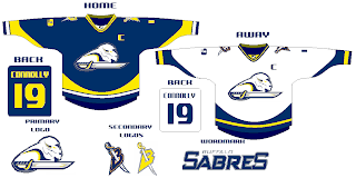
 Got some interesting artwork from a reader trying to redesign the Buffalo Sabres logo. Personally, I think John Slabyk has the perfect design which could never be improved upon — but then my opinion isn't the only one that matters. Shockingly.
Seriously, though, check this out and see what you think.
He even put it on a jersey for us.
Leave your comments as I'm sure he'd like to hear what you think.
UPDATE (5:14 PM): By the way, just so as not to confuse anyone, Slabyk did not design the logo posted here. This was sent in to me by a reader of the blog. Just wanted to clear that up.


Reader Comments (9)
I don't know... I like the other logos/concepts on his website more...
that looks like a chimpanzee with horns :)
"that looks like a chimpanzee with horns :)"
...from the Bufaslugs to the Bufapanzees
I thought it look pretty cool until it got associated with a chimpanzee
i think that is a way better logo than their current one. it looks pretty badass if you ask me. although i do think the coloring on the logo could be switched around/changed/redone. but other than that-it looks great!
Slabyk's stuff is great. This, not so much. Better than their current stuff, but that's not saying a lot.
very hard to see the buffalo in the logo. all i see is the monkey. the saber looks really out of place, a total after thought.
it is easier to see the buffalo in the current slug logo. but, it needs more height. this monkey logo also has too much horizontal.
just my opinion, not that i could do better. thanks
No thanks. Please give us a return to our original, or a modern version of it. That's all we want. Honestly.
It does look like a Buffalo jousting but I think this guy is on to something. It needs more detail and lots of refinement...but its a very creative concept and idea!
And still better than the slug.
Yikes.