Just To Freak You Out IX
 Friday · Oct 5 · 2007 | 2:59 PM PDT
  3 Comments
 It's time for another Freak Out Friday! Let's not waste time.
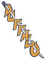 I've had this Buffalo Sabres concept for some time now. I think the idea is that this text would run down the front of the jersey, just like the Rangers.
Cracks me up though. But, hey, nothing says "Buffalo" and "Sabres" more than the city on a skewer. Anybody else getting hungry?
No? Just me?
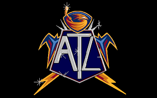
Moving right along then to one of the scariest bits of artwork ever to grace my inbox.
Aptly titled Thrash Bling, this image frightens me to my very core. What you can't say, though, is that it isn't creative. The things people come up with.
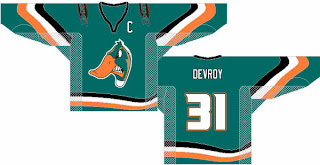
I think the Anaheim Ducks missed an opportunity.
That is one pissed off duck. I think someone splashed him.
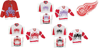
You might have to enlarge this next one to grasp its full scope.
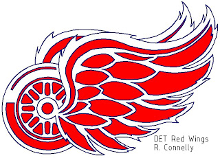
I get the octopus thing, but where does it stop exactly? I'm voting for the purple one. Speaking of scary Detroit Red Wings art, look at this.
I mean it's not half bad as far as that goes, but yikes! I think the wings are swallowing the wheel. Poor wheel.
Apologies for the short post this week, guys, but it was a slow week in terms of "freak out" art. Hopefully you guys will send in more for next Friday's installment. Until then...
Freak.
Out.




Reader Comments (3)
I actually really like the Sabres thing. That does not freak me out at all. lol
Slow week? Bah! I sent you in that whole Before and After thing ("Carolina Miami Hurricanes") with 6 different Photoshops!
Not my fault you made them their own post rather than having them as part of Freak Out Friday :p
I hereby dub that Wings jersey concept series the "Cthulhu Wings".