Sabres, Here's How You Fix It
 Saturday · Oct 6 · 2007 | 4:55 PM PDT
  7 Comments
 Apologies for the late posts tonight. I've been working on something I'll tell you more about later. But at the moment, I'm watching the Lightning game via NHL.tv since I no longer live in the Tampa market (sadly). I'm debating whether to go ahead and buy the Center Ice package.
Anyway, that's not what this post is about. We all know the Buffalo Sabres' new uniforms need fixing. I mean it kind of goes without saying. And I think we all know exactly how.
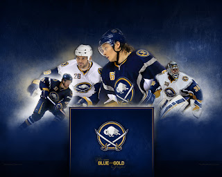
As any Sabres fan knows, John Slabyk's work epitomizes exactly what needs to be done for this team. There should be no question, yet for some reason these designs have yet to hit the ice. What are you guys waiting for anyway?
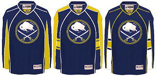
Anyway, here are a couple of other options borrowing from the designs of some of the other new Rbk EDGE sweaters.
Not sure how I feel about the chest piping, though. I think if you're going to go with a traditional-style logo, you should have the jersey match it. My exception to that rule is the San Jose Sharks.
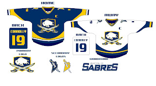
I also just got sent this design which I really like, as well.
The artwork needs a little cleaning up, so try to see past that. But here we see how to use the buffalo and sword elements without just arbitrarily placing them inside a circle.
But I know there are a lot of Sabres fans reading here, so I'm really interested to see what you guys think your team needs to be wearing. The floor is yours.


Reader Comments (7)
Love the Slabyks. I'm not liking the Florida and Edmonton recreations, however, I can't place where the one on the left is from. I want to say Nashville or maybe Colorado. All in all, pretty good. Also, I didn't mind the logo on the last picture.
I think everyone knows how I feel. Traditional logo, either the original, or one of John Slabyk's amazing designs. I still don't care for the new style jerseys we have, but with a better logo, it would go a long way to convince me.
Anything, ANYTHING, but the slug.
I like most of Slabyk's stuff except for the shoulder patch. It looks too fruity, they should stick wit the current B with a sabre through it.
Chris - I'd get the package...you're a fan and its your team - I do it for my Bruins games
Darryl, I sort of agree. The cursive B John came up with is well-intentioned with its traditional look, but it doesn't do it for me overall.
I'm not a big fan of the current sword with B, but it's not bad, and I'd happily leave it on the shoulder.
this shield logo looks much better than the previous monkey logo.
Slabyks' jerseys are just what buffalo needs on the ice. they haven't been playing good because of the damn slug on the front.