NHL Tournament of Logos

Entries in fix it (13)

Wednesday
Oct312007

Flames, Here's How You Fix It

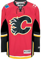
Haven't done one of these in almost a month. Got some good stuff, though. Here are some suggestions for the Calgary Flames on how to fix their new Rbk EDGE jerseys — not that they will.

On the left, we see two simple fixes. One, you drop a stroke around the Albertan flag since blue on red looks bad — but that's only true on TV and computer screens. When looking at the shoulder patch with my own eyes, I think it looks fine. Good, even.

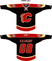
And two, for the piping haters, let's grab the bucket tool and fill in everything below that black stripe. I guess that's preferable to dumping the stripe altogether. But what do I know? On the right is a different idea which involves switching to a black jersey with a red flaming C. It's also got a shoulder yoke that extends to the elbows. Of which, I am not a fan.

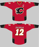
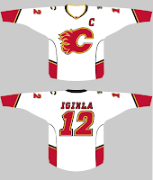
So then what about just simplifying? Ease off on all the striping a little. These here, they work. I'm still a little weirded out by the piping thing under the arms. Looks strange there. But I like the more classic feel of the arm stripes.

Anyway, those are just a few of many options for the Flames. But they're on the ice now. Nothing will change at least for a little while.

Saturday
Oct062007

Sabres, Here's How You Fix It

Apologies for the late posts tonight. I've been working on something I'll tell you more about later. But at the moment, I'm watching the Lightning game via NHL.tv since I no longer live in the Tampa market (sadly). I'm debating whether to go ahead and buy the Center Ice package.

Anyway, that's not what this post is about. We all know the Buffalo Sabres' new uniforms need fixing. I mean it kind of goes without saying. And I think we all know exactly how.

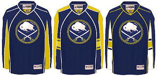
As any Sabres fan knows, John Slabyk's work epitomizes exactly what needs to be done for this team. There should be no question, yet for some reason these designs have yet to hit the ice. What are you guys waiting for anyway?

Anyway, here are a couple of other options borrowing from the designs of some of the other new Rbk EDGE sweaters.

Not sure how I feel about the chest piping, though. I think if you're going to go with a traditional-style logo, you should have the jersey match it. My exception to that rule is the San Jose Sharks.

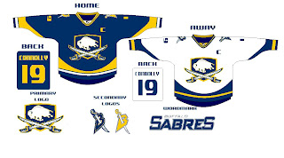
I also just got sent this design which I really like, as well.

The artwork needs a little cleaning up, so try to see past that. But here we see how to use the buffalo and sword elements without just arbitrarily placing them inside a circle.

But I know there are a lot of Sabres fans reading here, so I'm really interested to see what you guys think your team needs to be wearing. The floor is yours.

Friday
Oct052007

Predators, Here's How You Fix It

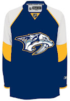
I used to believe the Nashville Predators were among the clubs with the best jerseys. With the introduction of their Rbk EDGE sweaters, I'm now less than convinced of that. Anyway, it's not horrible, but some folks thinks it needs fixing. Hence this.

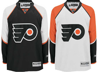
Here is one solution. Flyers fans should be able to pick out the design in a heartbeat.

This jersey is in fact based on Philadelphia's. Only the colors and logo have been changed. I do like that blue.

I don't know, though. I'm not sure it's that much of an improvement on what they're wearing now. But it certainly isn't a bad alternative.

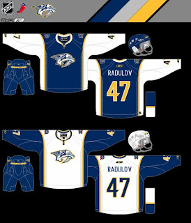
Nor is this.

I think it looks an awful lot like the Buffalo Sabres — perhaps a little too much — but there you have it. Count me as a fan though. We'd have to lose the anniversary logo off the shoulders, however, before I'd fully approve. Otherwise, I really like the idea of contrasting the sleeves and torso like that.

What do you guys think? Do either of this fix it? Did it need fixing to begin with? You be the judge.

Coming next: Buffalo Sabres.

Wednesday
Oct032007

Maple Leafs, Here's How You Fix It

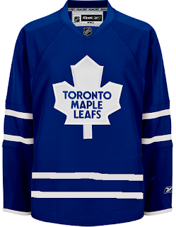
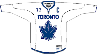
The Fix It series has worked its way into the double digits today. In this episode, we explore ways of improving the Toronto Maple Leafs' brand new Rbk EDGE uniforms.

No question, the biggest complaint has been its simplicity and the fact that while wearing the home uniform, a player is nothing more than a giant blue blob. One minor change some feel might rectify this is adding the same double-stripe found around to the elbows to the waist.

If that's not entirely to your liking, however, I've got more. No, your eyes aren't playing tricks on you. These are the new Phoenix Coyotes jerseys recolored to blue and featuring the Leafs logo. If you look closely at the shoulders you'll see the remnants of the "PHX" patch.

But isn't that a sight to behold? Something about them just makes those jerseys look quite nice in my eyes.

And then if that still isn't your cup of tea, perhaps you enjoyed the new Vancouver Canucks sweaters. Perhaps Toronto could go that route.

Or perhaps not. That scares me a little bit. So let's pretend you never saw that one.

That's all I got. Up next: Nashville Predators.

Tuesday
Oct022007

Stars, Here's How You Fix It

Now that I'm posting the ninth part of this series, I think I should note that, by and large, I'm a big fan of all the new Rbk EDGE jerseys so don't let the fact that I'm posting so-called "fixes" make you think otherwise. I just think it makes for an interesting feature to ponder what might have been.

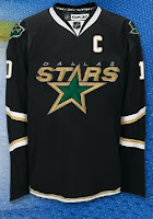
That said, let's see what we can do about the Dallas Stars. I think the home black jersey — which now features the city name as its crest — is very cool and unique. I like it if only because no one else has done it.

I think this is probably the easiest and most obvious fix — essentially the white jersey in black.

It uses the primary logo on the crest and the secondary logos on the shoulders along with a bit of piping at the bottom of the sweater. The current black jersey has the word "DALLAS" arched above the jersey number on the front and the primary logo on the shoulders. It's also solid black all the way to the bottom.

Personally, I like the real one better.

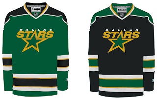
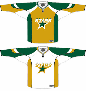
Moving along, we have a completely different design. Imagine more green and more apparent striping.

Obviously that's not a home-and-away set as neither is white, but it would make a good home-and-alternate set. While I do like the new black jerseys, I was always a fan of the Stars wearing green. Seems like teams aren't liking that much these days as the Wild also recently ditched their green sweaters.

So if green's not your thing, what about gold?

While it's a decent concept, I don't think it would translate well to a uniform. I can't imagine that looking very good on the ice.

How do you feel about it? Do the Stars need to rethink their new duds? Or will keeping the jerseys make them look like studs? Har.

Coming up: Toronto Maple Leafs.

Monday
Oct012007

Flyers, Here's How You Fix It

I think many Philadelphia Flyers fans would argue specifically that if it needed changing, the only thing that would be necessary is an orange jersey instead of a black one. Having said that, the Flyers have already announced plans to introduce an orange third jersey next season.

Still, one fan emailed me this suggestion that extends the sleeve panel down past the elbow and shrinks the stripe around it. Have a look for yourself.

It's a minor tweak that, in my eyes doesn't really look that much different.

On a totally separate note, another fan emailed in an interesting concept that looks at altering the captains' letters.

Any thoughts? I'd love to hear them. Comment below.

By the way, apologies for the limited posts today. I've been a bit under the weather and I'm going to be needing to get to bed soon. Coming shortly will be the uniform review for the Columbus Blue Jackets.

Next up: Dallas Stars.

Sunday
Sep302007

Sharks, Here's How You Fix It

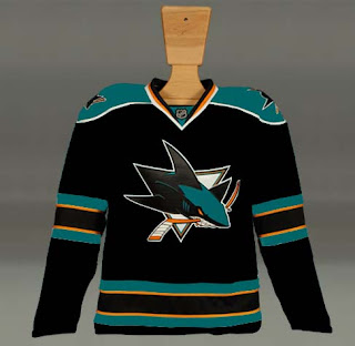
Speaking personally, I'm a fan of the San Jose Sharks' new logo and uniforms. So I don't see a need for "fixing" it necessarily. But others have complained that the modern logo design clashes with the more traditional jersey design.

One alternative to the stripes they currently wear would be something more along the lines of what the Florida Panthers do. I guess those designs match a little better. But for my money, I'd go with white piping over the orange on the home sweater.

Other complaints deal with not being able to move past orange gaining more prominence on the jerseys. Here's a solution.

I like this one because it looks like there are shark fins under wavy water on the sleeves. I think it works a little better on the white. But here's hoping the Sharks consider something of the like for a future third jersey. Speaking of the whole "fin" element, here are a bunch of ideas, seen with orange versus silver.

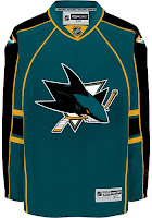
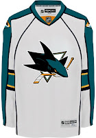
What I really like is the black jersey. Perhaps that would serve as a better third jersey as it has the last few years for the Sharks. But what do we think of it with the current striping pattern?

I know I said I like how the San Jose sweaters are now, but I'd be lying if I didn't say these were pretty awesome too. I guess it's hard to go wrong with the Sharks. So if they need fixing, there are plenty of ways of doing it.

Next up: Philadelphia Flyers.

Saturday
Sep292007

Capitals, Here's How You Fix It

The sixth entry in the Here's How You Fix It series will take a look at the Washington Capitals' new duds.

One of seven teams to introduce new or updated logos, the Caps we the route of the old days by creating a wordmark logo that harkens back to the 1970s and the arrival of the team on the NHL scene. Now it may just be a personal complaint I'm voicing, but I don't really understand the striping patterns on the new sweaters. They just do something strange along the arms and sides if you ask me.

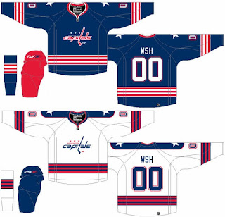
So in the interest of considering a more traditional — heaven forbid — striping pattern, I thought I'd post this concept which was emailed to me by a reader.

The striping is simple and I love the stars on the shoulders. I also like the Capitals in blue as opposed to red or black — like the had been wearing. Another neat aspect of this concept is that the colors of the logo are swapped for the home and road jerseys. Little things like that are what make me like a uniform.

How do you feel about it? Leave your comments below.

Coming up: San Jose Sharks.

Thursday
Sep272007

Oilers, Here's How You Fix It

The Fix It series trudges on tonight as we consider improvements to the new Rbk EDGE NHL uniforms. I told you yesterday that you'd be in for a treat on this one.

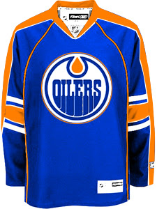
As far as I'm concerned, the Edmonton Oilers have gotten stuck with one of the worst new sweaters in the league. That's a personal opinion, but I stand by it. Many have complained that the Rbk EDGE jerseys look a lot like practice jerseys. I disagree with that statement as a generalization. But here, I find it appropriate.

I have several designs to show you and I'll save the best for last. We'll start out by making some very slight alterations that would improve the jerseys on a major scale.

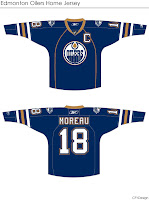
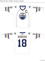
By simply extending the stripes on the sleeves to wrap completely around the elbows and adding a shoulder patch — one borrowed from last year's third jersey — you already end up with a sweater that doesn't look quite so blank. It's disappointing to see that the Oil couldn't manage something as easy as this on their own.

Then we have another design very similar to this but with a brand new shoulder patch.

I think that's a very interesting logo and with a little work, it could be great. I also truly believe that fixing the elbow stripes and adding something to the shoulders is all this jersey needs to really make it shine.

But speaking of shining, this is what you've been waiting for. Personally, I feel like it's one of the best Edmonton concept designs I've seen this summer.

The pattern was borrowed, obviously, from the Florida Panthers' new duds, but these colors are what Oilers hockey is all about. Imagine Gretzky and Messier wearing this. You almost can't help it. I am very impressed with this design, but as a Bolts fan I'm not sure I really have a say. I'll leave it to the rest of you now to decide. Especially Oilers fans.

Tell us how you feel about these fixes in the comments.

Up next: Washington Capitals.

Wednesday
Sep262007

Ducks, Here's How You Fix It

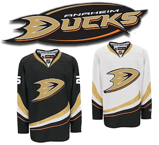
We're working our way through the less accepted jerseys that have been introduced at the hands of Reebok this offseason. Today we're addressing the Anaheim Ducks, specifically.

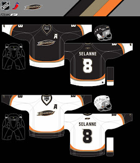
One of my pet peeves is wordmarks passing themselves off as logos. So you can imagine my disdain for the Ducks' new logo when it was introduced last summer. Now it's the smallest crest on any of the new Rbk EDGE uniforms (Dallas' home sweater doesn't count because that's another animal altogether). So here's a simple fix.

How hard would that have been? Really? So disappointing.

But let's just say for the sake of argument that this suggestion is too drastic. What about this?

It's very subtle, but adding that black oval behind the wordmark does wonders for it. If you ask me, it doesn't do enough, but it's definitely better.

Am I way off base here? Ducks fans, do you approve? If you have any suggestions yourself, email me and you might just see it posted here one day soon.

Coming up next: Edmonton Oilers. And Oilers fans, you aren't going to want to miss it. Man, did your club miss the boat on this one. Knowing you guys the way I do, you're going to love it.