From The Pacific Northwest
 Friday · Nov 23 · 2007 | 1:24 PM PST
  7 Comments
 I think I'm finally going to be able to start getting back into this again. As you guys have probably noticed, I haven't been as fully involved with the site as I was over the summer. But with all the new Rbk EDGE jerseys out there, I no longer seem to be a useful source of information.
Still, I think we've found a niche with the concept art, so as long as you guys keep sending stuff in, I'll keep posting it. Having said that, here is today's collection. (Let's clock it and see how long it takes for someone to baselessly point out how I "always" write about the Canucks. I love messing with people.)
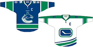
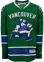
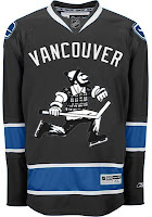
Here's a simple redesign with green incorporated into the logo. It also takes advantage of using different logos for the home and away sweaters. And to go along with that, here's a green alternate jersey.
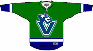
But an even better-looking green jersey might look more like this.
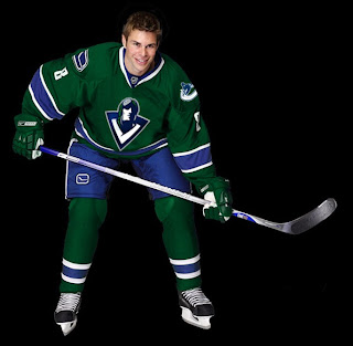
What you see there is the incredibly well-designed logo created by John Slabyk. It would certainly be nice to see a team in a green jersey. White, black, red and blue (orange and teal as well, I suppose) seem to be the only permissible uniform colors for this season.
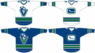
I like the use of the "V" logo so I felt like adding these to the pile.
Worth considering, I suppose. And finally, let's just throw out everything we know and try something totally new. Grey and green.
The grey and blue look awesome together. I think that should be the color of a Lightning third jersey. (Anyone want to put together a concept for me?)
Comment now and let us know what you think.



Reader Comments (7)
Wow, more crappy Cansucks concepts. This is ridiculous. It's no wonder why people don't visit this site.
John Slabyk is a talented guy...The Sabres should have went with his new blue and gold vision when he presented it to Larry Quinn back in 2003.
Instead Larry went the jackass route with the slug.
check him out at newblueandgold.com
Slabyk is amazing. I will never tire of seeing his concepts. Him and GhettoFarmBoy ... what ever happened to him? Haven't seen a GFB concept in a while after it seemed like he was chruning them out fairly regularly.
It's amazing how putting a little green improves the logo and jersey in a big way.
I think Green is the way to go for the Canucks. I never realized it before, but after seeing those concepts..
That V logo makes me think too much of Vachon sweets...people are already pissed off at the Orca because it represents a business..
As always, Mr Slabyk comes up with a winner. It's amazing how beautiful it is.
The last concept is nice too...I'm not huge on the grey, but the green one is nice, I like the logo..only get rid of the Vancouver written on it.
Wow, more crappy Cansucks concepts. This is ridiculous. It's no wonder why people don't visit this site.
Thank you, J.R. I wrote this post especially for you. But if no one visits the site, why do you still return?
Thanks for the comments, all!
i was looking at the first two pics (the home and away) and something wasn't quite right - thought i kinda liked the white one.
i think it would look better if the logos were higher up on the jerseys instead of down almost to the waist.
I definitely love the green sweater with the classic Johnny Canuck logo. As much as I love the original Stick and Rink logo, the Canucks need to give Johnny Canuck a chance. This classic character bears our team name and furthermore, there are two elements from past Canuck logos: Johnny is holding a stick(Stick and Rink logo) and he's wearing skates(Skate logo from 80s and 90s). Yes, the Orca may represent Canada's west coast, but it's too corporate. Also, Vancouver was built on the lumber industry. The Canucks are Canada's third oldest NHL franchise and it is time that Johnny Canuck is placed on the front.