Just To Freak You Out XVI
 Friday · Nov 23 · 2007 | 1:59 PM PST
  11 Comments
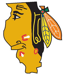
 It's another Freak Out Friday here at NHLToL and boy have I got some weird crap today. I have to start out first with something that might cause you to fall out of your chair laughing.
The funny part is I think that's what Homer Simpson would look like if here were an Indian. Anyone agree with that?
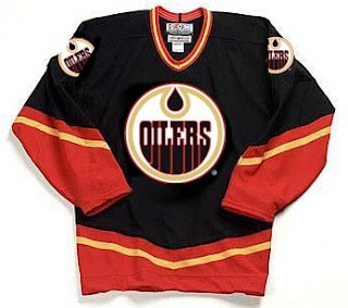
The next image is sure to stir the pot a little bit. It's like one of Conan's "If They Mated." Albertans might not be able to take this. Imagine if the Oilers and Flames got together.
We should make a habit out of that. Pretty funny stuff.
This cracks me up. Twice in the same week, two separate people emailed me concept logos for the Montreal Canadiens — replacing the "H" with an "M."
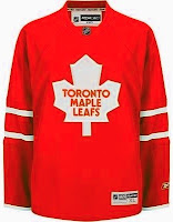
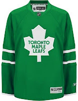
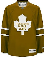
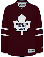
The graphic on the right incorporates the old Montreal Maroons logo so that's kind of cool. But regardless, it's still just weird seeing that. Let's keep it in southern Canada for a moment. A few different readers felt like giving new colors to the Toronto Maple Leafs' uniform. Everything but blue.
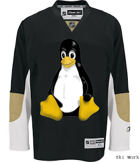
We'll finish off this week's Freak Out Friday on a fairly obvious route.
Yes, that's the Linux penguin. Can't believe I didn't get that one sooner.
Hope those served up a good laugh, or at the very least made you smile on the inside. And don't forget to send in your Freak Out art for next Friday's post. Enjoy your weekend!




Reader Comments (11)
the green leafs jersey makes for a nice homage to the st. pats and the first leafs jerseys. they gotta do something, plain blue is tired and boring to look at. but i suppose "change" is a word that MLSE is either not aware of or afraid of.... interesting concept that flames/oilers jersey turned out to be.
If you go http://www.logoserver.com/UKH.html" REL="nofollow">here, you can see that there was a Britsh hockey team (the Swindon Chill) that a actually did use the Linux penguin in their logo.
w00t! color replacement tool for the win. yeah, i like the flames/oilers tho. thats secksy
hee hee.
The red and green Leafs jerseys are quite nice.
That Hawks logo is great!
That Flames/Oilers jersey is evil, but at least our logo won out!
that blackhawks logo better be in the shape of Illinois or Chicago or there is no excuse for that nonsense
That Blackhawks logo cracks me up. Incorporating the silhouette of a state/province really only works for states/provinces that have iconic shapes. I don't know how recognizable that is as Illinois..
That Hawks logo is the best thing ever. It's quite rare that I see something online and actually laugh out loud. Awesome.
no need to hold a tournament the hawks logo is best logo, ever!
Came here via a search for "Homer Simpson Blackhawks jersey" because last night, at the Caps-Thrashers game, I saw someone walking around in a 'Hawks jersey that used Homer instead of the Indian, and man oh Manischewitz, was it great!