Rebranding The Sharks
 Sunday · Nov 25 · 2007 | 1:12 PM PST
  15 Comments
 Yesterday we got a look at some first class concept art. And afterward I promised some more from a designer we've all come to think very highly of. He's been on a mission to rebrand the NHL and teams he's already seen to include the Islanders, Thrashers, Senators and Bruins. Most recently, his work on the Panthers and Ducks has been stunning.
Now, he's taken on a new challenge. Witness the rebranding of the San Jose Sharks.
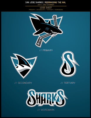
The logo set is unbelievable. It's different yet recognizable in that it's mainly an upgrade of the old logo — essentially what the Sharks did over the summer, anyway.
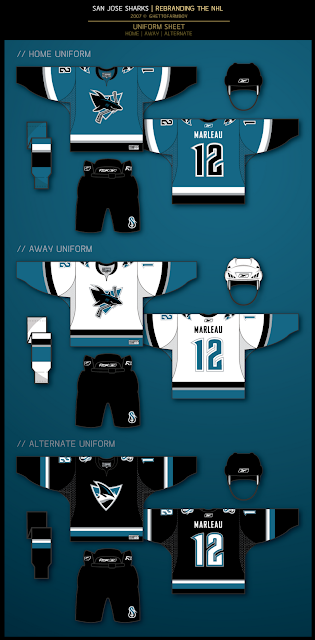
My personal favorite is the secondary mark. That by itself, should be the primary. The wordmark is notably nice as well, but it's the fin logo that I think is spot on. That's why the alternate jersey here is the one that gets my vote.
And that's not to say I don't love the other two jerseys. Even the lettering and numbering is pitch perfect if you ask me. This design shows that while it makes a nice accent, the orange isn't necessary at all. You can achieve an amazing look with just the teal, black and silver. We can only hope that one day any team looks as good as this.
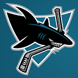
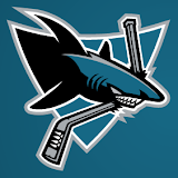
Finally, there was a slight change the designer made before unveiling his design. Take a look.
The logo on the left is the one he ultimately went with but I certainly see the validity of the other one. It adds more color to the shark, yes, but it's not entirely necessary since the triangle behind the shark is teal (as opposed to white).
I'm very interested in seeing what you guys have to say about this latest design by GhettoFarmBoy, as he is known. He says his next rebrand will focus on the Washington Capitals. No word yet on when we should expect to see it. I, for one, am looking forward to it.


Reader Comments (15)
typically, I like his work a lot, but sorry, this one just doesn't really work for me as his other work has. I do like the color scheme, I think the orange-yellow color doesn't belong in the current sharks scheme. but the shark just doesn't work for me.
I agree. The jersey design and colors are great. Classy and restrained but also distinctive. The fin logo and wordmark are also great. I love the waves in the letters.
But the primary logo doesn't work. The fins are strangely shaped and positioned. And the front of the shark is rounded and seems to taper towards the fins (particularly on the bottom), making the whole thing look like a retro rocketship, while the back is incongruously wide. The lines just don't make sense.
Oh, and Chris, do you really think this looks better than any current NHL team? Wow. I mean it's a good concept, but better than Montreal? Boston? St Louis? That's a pretty bold statement.
Anyone else agree?
Like the 3rd jersey a lot.
The colour scheme, numbering, and jersey design of the main two look great.
The only thing is if your going to rework the shark logo, ditch the whole breaking the stick in half - in that way their logo has always looked minor league to me.
are u kidding me
this is the best work GFB's done so far
i luved every part of those logos
and yes I think it is better than the bruins and habs, maybe not the blues though
im not a fan of the shark logo. the fin one is much better. the shark just doesnt look as fierce as their current logo.
As I have stated before, a return to the original logo is what the Sharks need to do. This logo still doesn't look right. While not as cartoonish as the current one, it just seems to miss the mark with me. The return to the Teal, Silver and Black pallete is good. No orange is a good thing! I am a big fan of the updated fin logo. The original one should have never been taken off the jerseys. While I do like the fin logo, I don't think it's strong enough to be a alternate crest. I am not a fan of the retro striping that the Sharks currently have, but this one blends the old and the new very well. The wordmark feels wrong. It looks nice, but it doesn't seem to fit. It reminds me of the Seals; too 70's like. Unfortunatly, with the way the Sharks do their logo schemes, a third logo would probably be left off of everything (current fin logo). Not bad effort, but a return to last year's designs is what's needed.
Oh, one last thing. While the numbers look good, there might be some logistical issues. 2's looking like 8's for example.
although i really do enjoy the designs and look of the logos/jerseys that GFB does, i think everything looks kind of the same. the bold exterior lines, the cartoon/anime feel. although the designs are great there isnt any stylistic change that would make the logos stand apart from one another.
if the league went with these logos, it would be cool for a little while then get boring fast.
then again, i might be over analyzing.
keep up the good work though.
id like to see a Sabres logo
Very nice work! The only thing I question is the "S" being made to look like a fishing hook. I don't get how that is supposed to be a postive thing for a team called the Sharks.
no i his other work and last year this would be a hit but i just like the new logo more the fins are too small and its not original
ducks was his best work second is a tie between sharks wordmark/sharks alt jersey
I like these jerseys a lot. The logo needs a little work, though. To me, he picked the lesser of the two logos as I think the one with more shading looks a lot better. The only problem with that is that the shading is in the same teal color as the background. Better use of silver and white really could have made that logo pop and would have looked great on those jerseys.
All in all though, it's great to see some more work from GFB. His best work, IMO, was the Senators jerseys ... the logo is dead on and the third jersey is amazing.
i don't really think the sharks need a jersey change but i wouldn't die if it was this they changed it to
ps great website i've been looking at it since early summer
VERY SHARP!
man, I love the concept. Being a diehard Sharks fan since their inception, I always love seeing new looks for my favorite team. The color schemes, the fin logo, and especially the wordmark... F'in amazing. However, if I wanted to use this pallates for NHL '09 or whatnot, the Shark logo itself seems to be the weakest of all the rebrand series.
I know it's just an opinion, and it seems negative... I guess I'd take the cartoon-y Shark logo over that thing any day of the week.