More Fancy Concept Jerseys
 Thursday · Nov 29 · 2007 | 1:12 PM PST
  16 Comments
 Do you guys remember the incredibly sharp concept art I posted back on Saturday? If not, I just linked to it, so go look at it. Anyway, a guy named Pete designed the jerseys and basically, he's got a lot more where that came from.
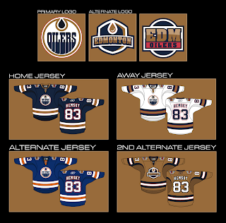
For example, you're about to see an Edmonton Oilers concept that I think rivals the Anaheim Ducks artwork created by GhettoFarmBoy. It's that good. Just look.
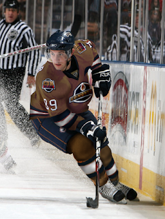
I like the idea of reworking the Oilers logo to have an oil drop in the proper color. Oil is black, not copper. However, I don't know how I feel about the copper circle. Might take a little getting used to. But my personal favorite is the copper "2nd alternate" jersey. I'm also a huge fan of that alternate logo. And if you were wondering what such a jersey might look like on a player, well look no further.
I would almost buy that if I were the kind of person who could buy a jersey that had anything but a Lightning logo on it. I like that uniform a lot. Can you tell?
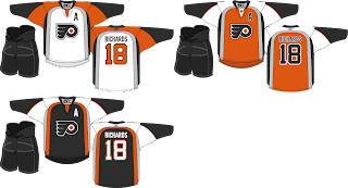
Anyway, Pete also did a little work on the Philadelphia Flyers. The striping pattern is unique — and not in a bad way.
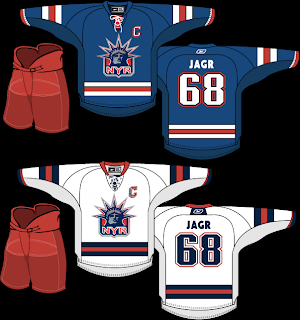
And finally, this isn't entirely the work of Pete. In Saturday's post, you saw his Rangers jersey with the words NEW YORK spelled out across the front instead of RANGERS. I suggested that the jersey might be improved with the Lady Liberty logo. So a couple of you made some modifications.
I think I was right. (Modesty is rarely my strong suit.) Thoughts?
Feel free to comment below. I'm sure Pete would like the feedback on his work — which is obviously rather excellent.


Reader Comments (16)
i hate posting first but, here goes
the oilers second logo was great
luvved it and i loved the 1st alternate
i actually always hated the old colours but after seeing that i kinda like it
i don't like the second alternate because it looks too copper
well, it is too copper
the rangers jersey didn't improve much with the liberty logo
but the flyers stuff looked awesome
i like that silver striping along the side of it
While the Liberty logo is beautiful, it's absolutely horrendous on a uniform whose stripes don't go all the way around.
Love the Oilers concept though. A copper uniform, now there's an idea.
All of that Oilers stuff looks AWESOME! I do think the Rangers jerseys are improved with the Liberty logo, but I just have trouble thinking "Rangers" without actually seeing that word diagonally across the chest.
If the next Oilers jerseys still have half-stripes on the arms, there will be blood in the streets. But the dark swoosh on the 2nd Alt jersey fixes them nicely. I actually like that jersey (as an alternate) and I didn't think a copper jersey could ever look good. Nice job.
Not crazy about the changes to the main logo. The shoulder patch looks better by itself than on the jerseys, for some reason. Interesting concepts.
Wow, if only Rbk had this kind of talent, the uniforms would look awesome! I also think that the Lady Liberty logo only belongs on the blue uniforms. It seems out of place on the white.
apparently you guys are forgetting about the white lady liberty jersey worn in 98-99.
http://nhluniforms.com/1990s/Images/Rangers7.gif
I like most of the Oilers designs, but I'd leave the logo colours the way they are now. Not sure about that copper jersey. Again, no full sleeve striping? I guess 3/4 is better than 1/2.
i think the 2nd alt logo is well done but im not feeling the copper jersey still good though
I love the copper!!! I hate the idea of all NHL home jerseys being red, blue or black... It sucks completely...
this is a great series. these would look great on the ice as third and primary uniforms.
are the sleeves really that baggy? i thought that rbk made it more streamline. they look bigger than the traditional ccm cut.
great job, cannot wait to see more!
I dunno how important it is to have the oil in the "right" colour.. obviously NHL logos aren't exactly true to life in most cases :)
tbh, the Oilers primary logo is my favourite in the NHL. I like the alternate logos but nothing can top that main logo. I'm definitely a fan of the copper jersey though. That paired with their primary would be an excellent new uniorm for the Oilers.
I like the Oilers look, I would prefer that the stripes go all the way around the sleeve. I really like the third jersey with the old blue and orange. The copper jersey will have to grow on me. The alternate logo looks pretty cool to. I have always liked the lady liberty look of the Rangers. I think it works better on a darker blue jersey. Why didn't Reebok consult you for jersey designs before all these bland practice looking jerseys were approved.
Those are the most god-awful Oilers designs I have ever seen! Copper is not a colour you can use in that great of amount. It would look absolutely horrible in real life. You have to remember copper isn't really a colour, it, like gold and silver need to be shiny or sparkly. If there isn't sheen to the fabric then gold becomes yellow, silver becomes grey and copper becomes brown. And imagine having and entirely shiny uniform or a completely flat brown one. Not very good choices really now is it? I'm all in favour of deviating from the common uniform colours but copper is certainly not the way to go. Frankly they need to wear a lighter version of their navy sweaters with a darker less vibrant orange colour than they had in the 80's in my opinion. That way everyone is happy, whether you are a retro lover or you like the modern jerseys. This shouldn't be about hey we're butt ugly but at least we're different and unique. Copper is such a limiting colour, so I say get rid of it and go back to orange, the colour that was famous with the Oilers. As far as the logos go, leave the primary alone, it looks great as it is now and is one of the most recognizable logos in sports. The second and third logos are okay but not great. They would be good as a helmet logo or at most a pant logo but not on a jersey. If you are going to have a shoulder logo at all let it be the rigger logo that was nice. Oh and I would also like to add the classic Oilers stripes are crucial to the look of the sweater. Just like they were on the old 80's jerseys and also in the 90's. They made a mistake changing them and these designs here are making that same mistake again.
I really wish only ranger fans would critique their jerseys, because it seems too many people want that hideous logo that was create to make nhl marketing happy.
Chris can you give us an example of a shinny copper oilers jersey? I believe there a few college hockey teams that use shinny jerseys. I think Denver and North Dakota, but not absolutely sure. I think that the Oilers had on of the best looking jerseys.
sorry about the spelling it should be "shiny".