If They Were Still Around Today
 Wednesday · Nov 28 · 2007 | 1:43 PM PST
  8 Comments
 In today's concepts post, we'll be getting all nostalgic for the old teams that doesn't exist anymore. The fun part is we're going to take a glimpse at what some of those classic clubs might have looked like if they'd made it into the Rbk EDGE era. Just to make things easy, we'll go geographically from east to west.
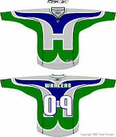
Kicking things off in Hartford, how about a Whalers logo that covers the entire jersey?
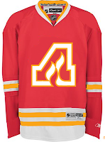
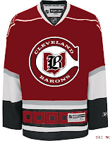
The sweater on the right features the Atlanta Flames logo in a design borrowed from the Chicago Blackhawks. If that's not classic enough for you, remember the old Cleveland Barons? Here's what they might look like if they had hurricane flags wrapping around the waist.
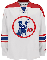
And next to that is a Kansas City Scouts design sans the yellow in the flavor of the Phoenix Coyotes. Speaking of the Coyotes, enjoy this irony.
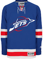
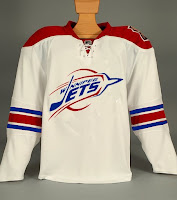
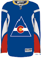
The Winnipeg Jets logo you see on these jerseys is a concept design that I posted a while back here on the blog. As you can see, these jerseys borrow from the New York Rangers and, ironically, the Coyotes. And we'll finish our trip westward in Colorado. Here's what the Rockies might've looked like in a uniform modeled after that of the Buffalo Sabres.
Don't forget that if you have any concept art you'd like to share with the folks here at NHLToL, you can always email me at nhllogos@gmail.com.




Reader Comments (8)
Chris, when are u gonna have the Center Ice tournament?!!
Thats the one I'm waiting for!
If you want to you can send me a e-mail with the teams ur missing and I'll try and find them..
atownjacket@gmail.com
whalers W looks like udders.
Barons would look good without the hurricane flags.
i like the chiefs and barons with out hurricane flags the rockies is done well others not so good
That Jets set looks great!
I really like the Jets and the Flames. The Whalers... I prefer a more traditional look. KC and Winnepeg's white jersey need some horizontal stripes on bottom. It would be great to see those Jets jerseys on the ice.
yes, jets and flames look great.
perhaps calgary and phoenix can have an outdoor game next season and wear their original city jerseys
great job.
Anything with that awesome phoenix template looks good. I have said this on here before, but the Pheonix jerseys are my faves.
This just reminds me of how superior the Atlanta Flames logo is to Calgary's.. something about the flaming "C" just puts me off