Johnny Canuck
 Saturday · Nov 3 · 2007 | 5:24 PM PDT
  11 Comments
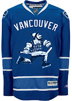
 Folks in Vancouver have been hard at work putting together concept art for their team. I'll share some of it with you now.
When the Canucks unveiled their new uniforms a few months ago, I was of the belief that they'd planned to introduce a completely new look and a brand that could last a very long time. Well, that's where this team seems to be really challenged. They need an identity and this logo — among the new marks unveiled this season by the club — could've have been just the thing. I really do hope it makes its way onto a jersey one day.
Even one just like this. Although it does stink of Whalerness. Maybe not so much with the silver or something. I don't know.
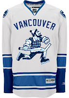
Or we could just go all out with the old Johnny Canuck logo.
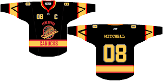
Personally, I prefer that "V" logo. It's just killer. Oh, and where's the green? Perhaps you ought to just revert to the '80s colors.
That's a heck of a jersey. And 08 as a sweater number? Weird. This barely escaped the clutches of Freak Out Friday.
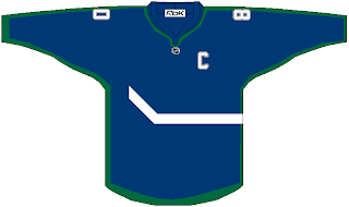
And lastly, there's this.
What say we just go nuts with the crest and wrap it completely around the sweater? That would be interesting if teams started experimenting with something like that. Remember those original Mighty Ducks third jerseys from the '90s? On second thought, maybe not such a great idea.
More later, perhaps.
Oh yeah! Don't forget to get your votes in on the Vintage Logo Tournament final if you haven't done so yet. It ends tonight!
Tomorrow I'll have lots of big announcements on TWO new tournaments beginning next week. That's right, two! Should be exciting! Be sure to check back.


Reader Comments (11)
Some Bizzare concepts, but the 'Nucks have always been an Identity Crisis, my concept (posted in "Some Simple Fixes") wasn't bad, right? But the "Whalerness", we need to go back to the 70-72 striping, so we can get rid of the accusations the Canucks "copied" the Whalers.
"08 as a number?" - some people use that as a placeholder...in the EA NHL series, the addon makers slap the year number if the jersey had a front number..
- Jordon
Personally, I don't like the "V" logo for the Canucks... It's a mix of simple and detail which I don't like. The Orca logo looks just fine IMHO. On the other hand it's the "canucks" and not the "orcas" so that's not 100% fitting either. Therefore I'd like to see some fan-created logo-concepts, I think that would be very interesting...
vince - how do you really depict a 'canuck', though? I like the orca logo too, it's the only logo they've ever had that actually gives some regional identity to the jersey. A rink with a stick in it could be worn by any peewee team in the country.
orca's fine for now, expect a change during the olympics
I actually like the last picture. It could be used as an experimental jersey in practice or an exhibition game. That simplistic jersey reminds me of the 1970s Team Canada jerseys, comprising of only a maple leaf.
@ matthew:
Ya, you're right... that was my thought too.. so that's why I came up with the idea of the fan-created logos, because I was wondering if someone would come up with a more fitting idea which really brings the "canucks" to the logo. But as I said, I do like the orca logo a lot.
I don't really like the Johnny V logo. It seems too cartoonish to me.
I absolutely LOVE the second version with the classic and historic Johnny Canuck logo. The orca may represent Canada's west coast, but there are no orcas around the city of Vancouver. Furthermore, Vancouver was built on the lumber industry. Having Johnny Canuck as the primary crest would give the Canucks that long-awaited identity that the original six and many of the post 1967 clubs have had. Also, if you look carefully, Johnny Canuck has a couple of elements from past Canuck logos...he's holding a stick(stick in the rink logo) and he's wearing skates(speeding skate in the puck logo). Let's hope that Johnny appears on a third sweater next season and eventually as the permanant crest on both the home and away sweaters. Let's hope the Canucks finally do the right thing-BRING BACK JOHNNY CANUCK!!
i always thought http://humanot.com/_/vancouver_id_02.jpg" REL="nofollow">this was a cool canucks concept
@ unda: wow, i totally forgot about this concept! yeah, you're right, that's a hell of a good look for the canucks!
the team should go back to the skate logo and vintage 80's colors...
this is a concept I came up with:
http://img374.imageshack.us/img374/6533/vblk80el2.jpg