Connecticut Day
 Wednesday · Nov 7 · 2007 | 2:16 PM PST
  14 Comments
 One last post for today. It's Connecticut Day over at the Tournament of Hockey Logos blog. Reason being the state's two AHL franchises are going head to head in the AHL Tournament of Logos today. Head over and vote!
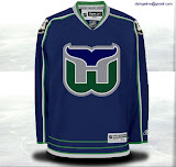
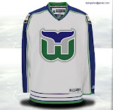
Meanwhile, I figured I'd draw in The Nutmeg State's NHL connection — the Hartford Whalers. Got some concept art, of course.
It's a peek at what the Whalers might've looked like had they made it to the Rbk EDGE era — and hired the same designer as the Calgary Flames. Notice the shield from the state flag on the shoulders.
I do like the designer's choice of thin lines on this jersey. I bet it would look killer on the ice. Too bad we'll never find out.
Anyway, I hope you enjoyed Connecticut Day. Perhaps one day soon will be Pennsylvania Day. I've got a ton of Flyers/Penguins artwork.


Reader Comments (14)
Damn you Carolina. We miss the Whale. :(
Yeah... I miss the whale...
But I love my team to death.
carolina should have been called the carolina whalers
Those colours and that logo are so great.
So missing the Whale right now... I think this would be my fav. of the new edge jerseys if it had happened. Love the way the H seems to "pop" out of the crest.
Sigh.
That Whalers jersey design is based off the current Blue Jackets jersey
That's a pretty nice looking jersey. What a shame.
i loved the whalers...i lived (i go to school in NYC now) in connecticut and when i started watching hockey they were my favorite team...and then they moved a year into my hockey fandom...
i like the shoulder logo but id love to see the return of pucky the whale...
i was going to get on designing some whalers concepts (that is if i could ever get my copy of photoshop to start working...)
the connecticut crest actually doesnt clash with the scheme of the jersey as calgary's does
even though im a rangers fan living in CT, i still love this uni
It would be great to see the old whalers colors back on the ice, at least for one game. Maybe Carolina would use an old Whalers jersey for their third jersey in next couple of years. I think every team that has relocated should adopt the original jersey for thier third alternate. I would love to see my Dallas Stars in the old North Stars jerseys.
I miss the Whale. That would be a great looking EDGE jersey.
bring back the whalers
There's no pucky :X
WOW! These two jerseys are AWESOME! Maybe the CT Whale should reconsider their look. I think the CT logo or flag on the shoulders is a nice touch. This jersey would have fit perfectly in the modern era of jerseys. Certainly better then the Hurricanes present designs. Thank you for sharing.