Just To Freak You Out XIV
 Friday · Nov 9 · 2007 | 2:29 PM PST
  12 Comments
 It's the end of another work week and we all know what that means — Freak Out Friday! A series, which by the way, has become very popular. So as long as you guys keep sending in crazy crap, I'll keep posting it every week. I'll start things off tonight in New York.
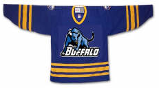
I felt I couldn't properly begin a Freak Out Friday without involving the Buffalo Sabres somehow.
See? This is what happens. What is that anyway? Somebody call Paul Bunyan. We found his ox. Yay.
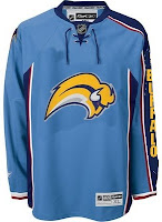
Easily the most maligned logo in the NHL, imagine the "Buffaslug" on what's been one of the most maligned jerseys here at NHLToL. How much do you guys love this concept right here?
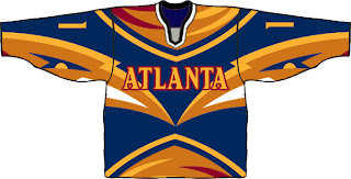
Not that much? Just when you thought it couldn't get any worse. Anyway, while we're on the subject of the Atlanta Thrashers, see if you can endure this monstrosity.
I know that wasn't easy, but don't worry, it's over now. Let's not let this happen again, all right?
Gradients on jerseys is a personal pet peeve of mine. Who was it that thought these looked good?
Oh yeah, those guys did.
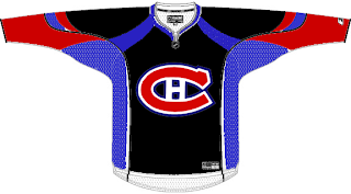
Have you ever tried to use red, blue and black together? Here's why you don't.
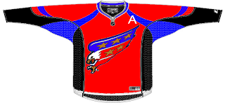
And here's another reason.
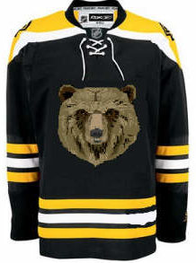
Finally, I'll leave you this evening with one simple concept and a profound statement.
Only you can prevent forest fires.
Until the next time, try not to freak out too much.



Reader Comments (12)
HAHAH! I love the bruins one!
That cracked me up.
i love the canucks one!
the first buffalo logo is the University at Buffalo's logo.
It's also a bull, and not a buffalo in the UB logo. Apparently all quadrapedic mammals look alike to some people. Horrid.
And this confirms it, the slug sucks no matter what you put it on.
when i meant the first buffalo logo, i meant the team in general. i know thats a bull. I go to UB.
I would like to come out and clearly state my hatred of gradients on jerseys. Gradients elsewhere can be beautiful, but on hockey jerseys, they look too much like a joke.
Brian, not calling you out bro. I meant the designer. I'm willing to bet whoever did that mash-up thinks a bison and a bull are one in the same.
I graduated from UB myself. ;-)
oh..ok, sorry. I get defensive sometimes
No worries man. I'm the same way. Believe me, if I'm going to call someone out, you'll know it. lol
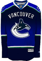
i'm no fan of gradients either... but that canucks one is pretty cool
Wow..that's Atlanta one is something Original idea, you have to give it that much, but just way too busy.
Thank God the Caps got rid of that bird before Ted Leonsis saw that disaster and mistook it for something we'd pay to get.