Just To Freak You Out XX
 Friday · Dec 21 · 2007 | 3:13 PM PST
  9 Comments
 The quality of Freak Out art I've become accustomed to was sorely lacking this week and that'll be clear after you get through tonight's post. It's not that nobody sent anything, it's that they were either trying too hard or not trying hard enough. I've got to have some standards, right? Perhaps not, but I'll forbear any further deliberation if for no other reason than to quite simply get on with it. Good plan?
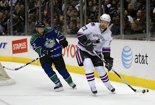
What's wrong with this picture?
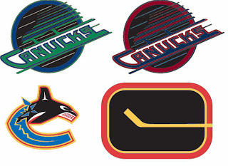
Yes, it seems like some of the colors there are a bit off. These too.
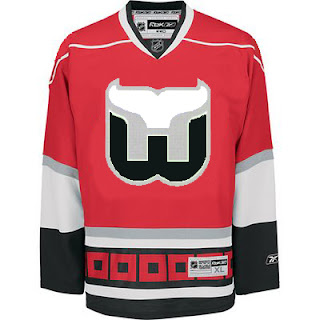
And don't even get me started on the absurdity of tropical storm flags surrounding a jersey with a Hartford Whalers logo on it. My head would explode.
Next is a Philadelphia Flyers concept logo that I think fits fairly into the "freaky" category.
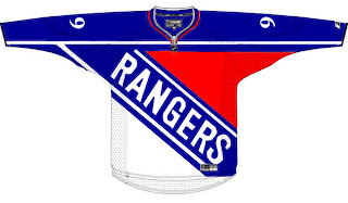
At first, I liked this New York Rangers jersey. But the more I stare at it, the more it disturbs me. I don't care how old that team is. They need a new logo.
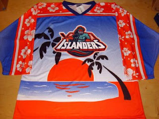
And finally, this one I just can't figure out. My brain tells me this is a nice Photoshop job, but a small part of me fears someone, somewhere actually made this jersey.
Islanders fans, I apologize. That's just horrible.
Anyway, that's all I've got for this week. Hope you got a little freaked out. And I hope you guys will keep sending in good Freak Out Friday material so we can keep this series going. Enjoy your holiday weekend!




Reader Comments (9)
That Islander's jersey is sweet!
A guy in Hawaii makes those jerseys. You can buy them on ebay.
link?
Maybe the NHL will play a game in Hawaii on the beach and use two of the sunbelt teams say, Dallas v. Tampa. Just think of how those jerseys would look! Happy Holidays everyone.
That is Terry Tate's favorite jersey to wear on casual Fridays at the office.
The Kings would look good in blue green in white just if the logo was photoshopped it would look better. Blue Green and White Skate logo...I'd swap the colours a little. No comment on the third freakout. Flyers, Looks good and bad. Rangers, Would love to see that in a game.
If an Expansion team ever landed in Hawaii they should use that jersey minus the Islanders Logo as a third jersey. it wouldn't work as a main jersey logo. Crop part of the design on the front and use that in a outlined circle. Other than that keep the rest of the jersey the same and swap on the away jersey.
As for the Canuck concepts, I absolute LOVE the Stick 'n Rink logo in the Skate colours. The yellow, red, and black look was a great look. What the Canucks should have done back in '78, when they changed the colours, was keep the Stick logo instead of going with the V-design. Many people criticized the new colours, especially the home yellow, which was very cool. It was the gaudy V-design that was the problem. Just imagine players like Stan Smyl, Tiger Williams, and Pavel Bure wearing the classic and elegant Stick 'n Rink logo in the Skate colours. Absolutely sweet!
That Philadelphia logo would work if they changed their name to the 770s.
There won't be an expansion team in Hawaii.. I just flew there recently and it takes 13 hours to fly there from North Carolina.. Those would be some brave guys to play for Hawaii.